
Plotting Heat Maps in Python using Bokeh, Folium, and hvPlot
Heatmaps are a useful visualization, and Python has several great tools to make them

I have always loved maps, however, creating compelling visualizations for spatial data can be challenging. One area that can be particularly difficult for Python programmers is creating maps when our data has many points. Too many points can quickly become cumbersome both to view and for the browser to render.
Heatmaps can be particularly helpful in these kinds of situations since they can quickly give a sense of the density and spatial distribution of your data without discretely plotting each point. This contrasts with a scatter map, which is essentially just a scatter plot of points overlayed on top of a map. Scatter maps are easy to make but they are more difficult to view due to overplotting when you have many data points.
In this post, we will learn how to use Bokeh, Folium, and hvPlot to visualize the occurrence of 1.8 million wildfires across the United States. We will discuss the pros and cons of each library, and figure out which one is the best to use in 2022.
Our Data
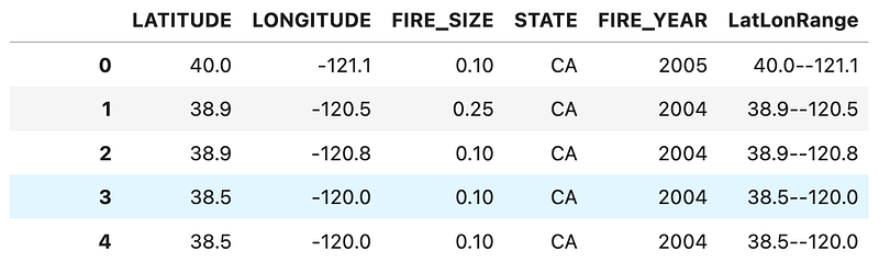
The data we are working with has records of over 1.8 million wildfires that occurred in the United States from 1992 to 2015. Each fire record contains information like the location, final fire size, discovery date, and more. It’s an interesting dataset and is large enough to showcase some challenges of visualizing big datasets without being too big for most laptops to work with.
Let’s quickly import our wildfire data from a SQLite database into a Pandas DataFrame.

Data Aggregation
There are many ways we can go about aggregating data so that we can more effectively visualize it; some libraries can even handle all of that for us. To start, let’s try to group fires that occurred close to each other.
We can do this by truncating the latitude and longitude values, creating a new column combining the truncated latitude-longitude values, and then grouping our DataFrame by our new column. It will make sense once you see the code:
We now have 64,250 groups of fires rather than 1.8 million discreet fires. This helps us reduce the number of data points to render, and now we can aggregate information like the count of fires or the average fire size in each group.

This is a very simple way to go about aggregating our fires into groups, but I think it helps show some of the challenges of working with larger spatial datasets. There is a balance of preserving information while reducing the visual clutter that can make a map too difficult to read.
Bokeh
Note: Interactive plots can be found on this live notebook.
Bokeh is a great Python plotting library that is well equipped to make plots that can be shared online. One of Bokeh’s strengths is that it is highly interactive, allowing for things like zoom, pan, and searching for a specific coordinate. We can use our aggregated dataset to create a scatter map that functions like a heatmap:
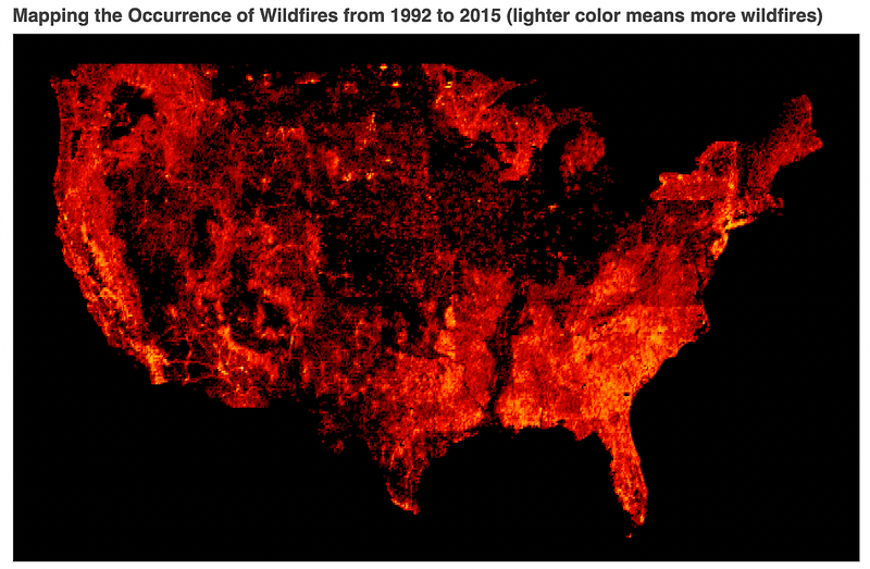
This isn’t too bad! I kept this first plot simple to emphasize the cool colormap from Colorcet. Plus, since wildfires have occurred across the United States, we don’t necessarily need a base map to understand what we are looking at.
Of course, this plot is pretty limited in terms of what it can actually teach us, and there are better ways to make this kind of heatmap rather than plotting 64,000 discrete points — even if 64,000 is fewer than 1,800,000. We are likely overplotting, so we lose detail from having so many points laid on top of each other. It looks cool, but we will see more useful plots later on.
Let’s make our second plot since we have the data ready to go:
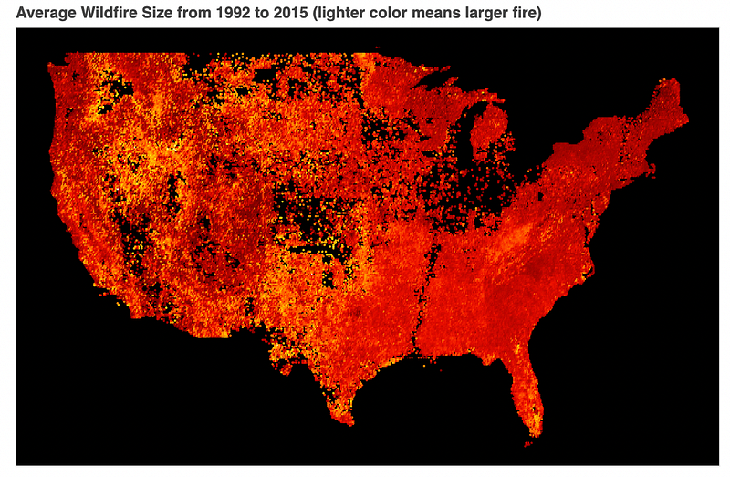
While this plot is quite similar, comparing the two does help us understand that fires in the Western US tend to be larger even though they occur less frequently.
Folium
Folium is a Python wrapper for the excellent JavaScript library, Leaflet.js. While it can suffer from some of the limitations of wrapper libraries — less customization than using Leaflet directly — Folium still brings a lot of the strengths of Leaflet.js into the Python ecosystem.
Let’s showcase a more unique heatmap that converts our data into a proper gradient for us. The process of converting discrete data points into a grid of values — an image — is called rasterization. This way we can aggregate our discrete fire data points into a grid of values. While we lose information on each individual fire, we get a much more responsive map.
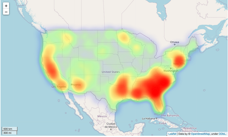
I should note that we could probably change this plot drastically by adusting the gradient, which Folium makes really easy. It might look like a lot of code for this plot, however, the plot is very responsive and the built in HeatMap function is a great tool for easily creating a proper continuous visualization from discrete data points.
hvPlot
Folium is a powerful libary, but once again I’m finding my favorite tools for the task come from Holoviews. I am getting consistently better plots in less time using Holoviews, hvPlot, Colorcet, Datashader, and Geoviews.
That may sound like a lot of libraries, but you don’t have to interact with most of them unless you need something specific; otherwise everything just happens under the hood for you. Let’s recreate our plot using the tools from Holoviews.
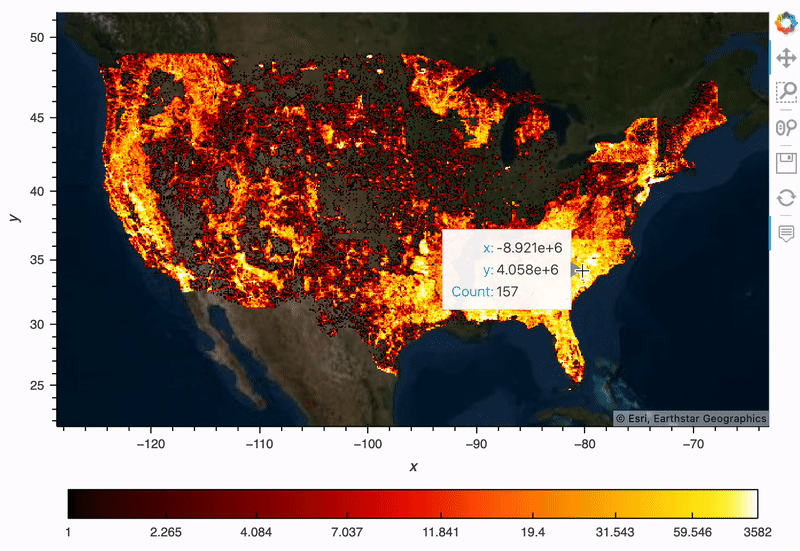
This is absolutely the best heatmap of the bunch. I need to fix the x/y labels to be lat/long on our popup window, but otherwise, hvPlot did everything I wanted for me. It even gave me a decent color bar as a legend, which can be a pain with other libraries.
You’ll notice that I did have to pull from several libraries to put it together:
- Holoviews for access to the base map tiles.
- Datashader for rasterization and gave me access to an easy way to convert longitude and latitude to meters, which is preferred by hvPlot.
- Colorcet for the color map.
The key piece to all of this is the rasterize=True , which tells hvPlot to let DataShader rasterize the data, making it much easier to work with. Datashader is really interesting, but it deserves its own post to discuss how it works in depth; for now, it’s just important to know that it is handling the conversion of our many discrete data points into a grid of values that is easier to render and much easier to visualize.
Wrapping Up
It is amazing how far Python’s spatial visualization tools have come in the past few years, and there are plenty of great options to choose from to create the plot you have in mind.
I continue to be impressed by the features and ease of use that Holoviews is able to provide without causing endless errors with confusing stack traces. It has been fun to make new plots and dashboards and encounter so few issues along the way.
Resources
Note: If you are enjoying reading my and others’ content here on Medium, consider subscribing using the link below to support the creation of content like this and unlock unlimited stories!
Citations
- Wildfire Data — Public Domain (CC0)
Short, Karen C. 2017. Spatial wildfire occurrence data for the United States, 1992–2015 [FPAFOD20170508]. 4th Edition. Fort Collins, CO: Forest Service Research Data Archive. https://doi.org/10.2737/RDS-2013-0009.4


