
Data Science, Machine Learning
PCA Clearly Explained -When, Why, How To Use It and Feature Importance: A Guide in Python
In this post, I explain what PCA is, when, and why to use it, and how to implement it in Python using scikit-learn. Also, I explain how to get the feature importance after a PCA analysis.
1. Introduction & Background
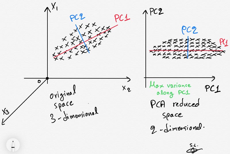
Principal Components Analysis (PCA) is a well-known unsupervised dimensionality reduction technique that constructs relevant features/variables through linear (linear PCA) or non-linear (kernel PCA) combinations of the original variables (features). In this post, we will only focus on the famous and widely used linear PCA method.
The construction of relevant features is achieved by linearly transforming correlated variables into a smaller number of uncorrelated variables. This is done by projecting (dot product) the original data into the reduced PCA space using the eigenvectors of the covariance/correlation matrix aka the principal components (PCs).
The resulting projected data are essentially linear combinations of the original data capturing most of the variance in the data (Jolliffe 2002).
In summary, PCA is an orthogonal transformation of the data into a series of uncorrelated data living in the reduced PCA space such that the first component explains the most variance in the data with each subsequent component explaining less.
NEW: After a great deal of hard work and staying behind the scenes for quite a while, we’re excited to now offer our expertise through a platform, the “Data Science Hub” on Patreon (https://www.patreon.com/TheDataScienceHub). This hub is our way of providing you with bespoke consulting services and comprehensive responses to all your inquiries, ranging from Machine Learning to strategic data analytics planning.
2. When/Why to use PCA
- PCA technique is particularly useful in processing data where multi-colinearity exists between the features/variables.
- PCA can be used when the dimensions of the input features are high (e.g. a lot of variables).
- PCA can be also used for denoising and data compression.
3. Core of the PCA method
Let X be a matrix containing the original data with shape [n_samples, n_features] .
Briefly, the PCA analysis consists of the following steps:
- First, the original input variables stored in
Xare z-scored such each original variable (column ofX) has zero mean and unit standard deviation. - The next step involves the construction and eigendecomposition of the covariance matrix
Cx= (1/n)X'X(in case of z-scored data the covariance is equal to the correlation matrix since the standard deviation of all features is 1). - Eigenvalues are then sorted in a decreasing order representing decreasing variance in the data (the eigenvalues are equal to the variance — I will prove this below using Python in Paragraph 6).
- Finally, the projection (transformation) of the original normalized data onto the reduced PCA space is obtained by multiplying (dot product) the originally normalized data by the leading eigenvectors of the covariance matrix i.e. the PCs.
- The new reduced PCA space maximizes the variance of the original data. To visualize the projected data as well as the contribution of the original variables, in a joint plot, we can use the biplot.
4. The maximum number of meaningful components
There is an upper bound of the meaningful components that can be extracted using PCA. This is related to the rank of the covariance/correlation matrix (Cx). Having a data matrix X with shape [n_samples, n_features/n_variables], the covariance/correlation matrix would be [n_features, n_features] with maximum rank equal to min(n_samples, n_features).
Thus, we can have at most min(n_samples, n_features)meaningful PC components/dimensions due to the maximum rank of the covariance/correlation matrix.
5. Python example using scikit-learn and the Iris dataset
import numpy as np
import matplotlib.pyplot as plt
from sklearn import datasets
from sklearn.decomposition import PCA
import pandas as pd
from sklearn.preprocessing import StandardScaler
plt.style.use('ggplot')
# Load the data
iris = datasets.load_iris()
X = iris.data
y = iris.target# Z-score the features
scaler = StandardScaler()
scaler.fit(X)
X = scaler.transform(X)# The PCA model
pca = PCA(n_components=2) # estimate only 2 PCs
X_new = pca.fit_transform(X) # project the original data into the PCA spaceLet’s plot the data before and after the PCA transform and also color code each point (sample) using the corresponding class of the flower (y) .
fig, axes = plt.subplots(1,2)axes[0].scatter(X[:,0], X[:,1], c=y)
axes[0].set_xlabel('x1')
axes[0].set_ylabel('x2')
axes[0].set_title('Before PCA')axes[1].scatter(X_new[:,0], X_new[:,1], c=y)
axes[1].set_xlabel('PC1')
axes[1].set_ylabel('PC2')
axes[1].set_title('After PCA')plt.show()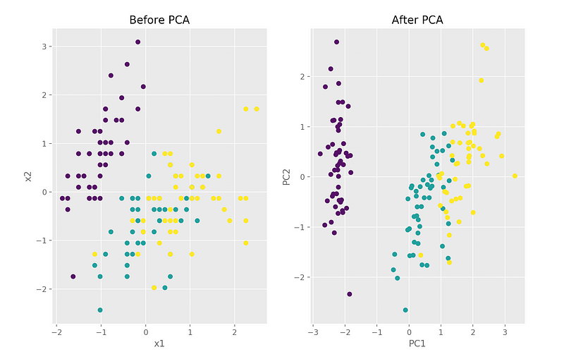
We can see that in the PCA space, the variance is maximized along PC1 (explains 73% of the variance) and PC2 (explains 22% of the variance). Together, they explain 95%.
print(pca.explained_variance_ratio_)
# array([0.72962445, 0.22850762])
6. Proof of eigenvalues of original covariance matrix being equal to the variances of the reduced space
Mathematical formulation & proof
Assuming that the original input variables stored in X are z-scored such each original variable (column of X) has zero mean and unit standard deviation, we have:

Λ matrix above stores the eigenvalues of the covariance matrix of the original space/dataset.
Verify using Python
The maximum variance proof can be also seen by estimating the covariance matrix of the reduced space:
np.cov(X_new.T)array([[2.93808505e+00, 4.83198016e-16],
[4.83198016e-16, 9.20164904e-01]])We observe that these values (on the diagonal we have the variances) are equal to the actual eigenvalues of the covariance stored in pca.explained_variance_:
pca.explained_variance_
array([2.93808505, 0.9201649 ])
7. Feature importance
The importance of each feature is reflected by the magnitude of the corresponding values in the eigenvectors (higher magnitude — higher importance).
Let’s find the most important features:
print(abs( pca.components_ ))[[0.52106591 0.26934744 0.5804131 0.56485654]
[0.37741762 0.92329566 0.02449161 0.06694199]]Here, pca.components_ has shape [n_components, n_features] Thus, by looking at the PC1 (first Principal Component) which is the first row
[[0.52106591 0.26934744 0.5804131 0.56485654]we can conclude that feature 1, 3 and 4 are the most important for PC1. Similarly, we can state that feature 2 and then 1 are the most important for PC2.
To sum up, we look at the absolute values of the eigenvectors’ components corresponding to the k largest eigenvalues. In sklearn the components are sorted by explained variance. The larger they are these absolute values, the more a specific feature contributes to that principal component.
8. The biplot
The biplot is the best way to visualize all-in-one following a PCA analysis.
There is an implementation in R but there is no standard implementation in python so I decided to write my own function for that:
def biplot(score, coeff , y):
    '''
    Author: Serafeim Loukas, [email protected]
    Inputs:
       score: the projected data
       coeff: the eigenvectors (PCs)
       y: the class labels
   '''
xs = score[:,0] # projection on PC1
ys = score[:,1] # projection on PC2
n = coeff.shape[0] # number of variables
plt.figure(figsize=(10,8), dpi=100)
classes = np.unique(y)
colors = ['g','r','y']
markers=['o','^','x']
for s,l in enumerate(classes):
plt.scatter(xs[y==l],ys[y==l], c = colors[s], marker=markers[s]) # color based on group
for i in range(n):
#plot as arrows the variable scores (each variable has a score for PC1 and one for PC2)
plt.arrow(0, 0, coeff[i,0], coeff[i,1], color = 'k', alpha = 0.9,linestyle = '-',linewidth = 1.5, overhang=0.2)
plt.text(coeff[i,0]* 1.15, coeff[i,1] * 1.15, "Var"+str(i+1), color = 'k', ha = 'center', va = 'center',fontsize=10)
plt.xlabel("PC{}".format(1), size=14)
plt.ylabel("PC{}".format(2), size=14)
limx= int(xs.max()) + 1
limy= int(ys.max()) + 1
plt.xlim([-limx,limx])
plt.ylim([-limy,limy])
plt.grid()
plt.tick_params(axis='both', which='both', labelsize=14)Call the function (make sure to run first the initial blocks of code where we load the iris data and perform the PCA analysis):
import matplotlib as mpl
mpl.rcParams.update(mpl.rcParamsDefault) # reset ggplot style
# Call the biplot function for only the first 2 PCs
biplot(X_new[:,0:2], np.transpose(pca.components_[0:2, :]), y)
plt.show()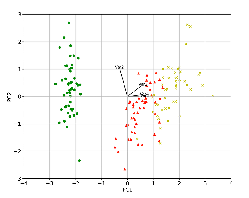
We can again verify visually that a) the variance is maximized and b) that feature 1, 3 and 4 are the most important for PC1. Similarly, feature 2 and then 1 are the most important for PC2.
Furthermore, arrows (variables/features) that point into the same direction indicate correlation between the variables that they represent whereas, the arrows heading in opposite directions indicate a contrast between the variables they represent.
Verify the above using code:
# Var 3 and Var 4 are extremely positively correlated
np.corrcoef(X[:,2], X[:,3])[1,0]
0.9628654314027957
# Var 2and Var 3 are negatively correlated
np.corrcoef(X[:,1], X[:,2])[1,0]
-0.42844010433054014That’s all folks! Hope you liked this article!
Another resource. Learn Data Science and ML with the help of an 🤖 AI-powered tutor. Start here https://aigents.co/learn choose a topic and he will show up where you need him. No paywall, no signups, no ads.
Latest posts
Stay tuned & support this effort
If you liked and found this article useful, follow me!
Questions? Post them as a comment and I will reply as soon as possible.
References
[1] Jolliffe, I. T. Principal component analysis. New York, NY: Springer, 2002.
[2] https://en.wikipedia.org/wiki/Principal_component_analysis
[3] https://stattrek.com/matrix-algebra/matrix-rank.aspx
Get in touch with me
- LinkedIn: https://www.linkedin.com/in/serafeim-loukas/
- ResearchGate: https://www.researchgate.net/profile/Serafeim_Loukas


