
Why Paul Klee’s Art is an Ingenious Blend of Process and Imagination
Where artistic possibility and technical excellence meet
The paintings of the Swiss-German artist Paul Klee have the beguiling quality of old European folklore. For me, their meaning is so often ambiguous, seeming to fall into a chasm of possibilities without ever meeting the firm ground below.
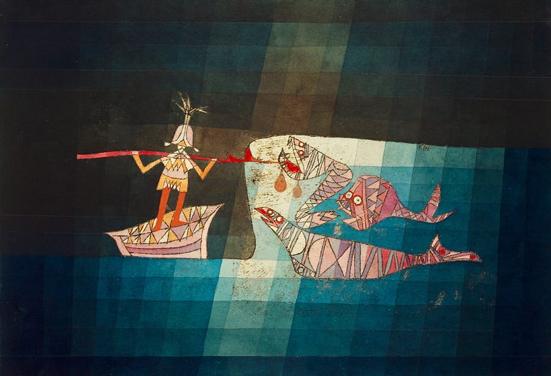
The Seafarer is everything a work of art should be: There is light and dark. There is humour and danger. Through contrast, symmetry, colour and form, the painting maintains visual engagement to the point where it becomes a complete world in itself.
If you take a moment to adjust your eyes to the teeming myriad of shapes that zigzag through the image, you can connect with something that is both cerebral and instinctive, dancing with your imagination.
So how did Klee achieve this?
Technical Imagination
One way of exploring Klee’s imagery is to see how his working methods moved continually between formal technical procedures and the imaginative possibilities of storytelling.
You can see, for instance, how this painting must have been made: carefully laid washes of watercolour placed one on top of another in horizontal and vertical bands, steadily darkening towards the outer edges.
As is customary with watercolour, Klee almost certainly worked from light to shade, so that the richer tones consist of multiple layers of paint, deepening the tone each time.
The effect is theatrical, like a shaft of light above a stage.
What is formed is a grid pattern, an organic abstract texture that acts both as the background to the painting and a primary motif within it. It becomes a vital part of the fabric of the image — indeed, just like a textile, it gives the painting a sort of structural weave.
The brilliance of Klee’s painting technique is how he would allow the underlying structure to become something. Animate things emerge from the grooves and transformations take place before our eyes.
Look for instance at the suggestion of a landscape that cuts through the centre of the painting, where the light emerges through a stretched S-shape. It is an important part of the formal design, but it also becomes something tangible.
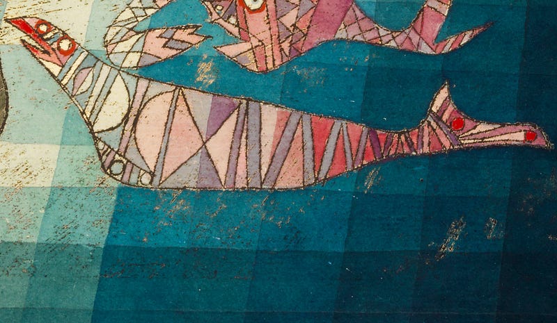
And so the grid of colour becomes something more: a terrain where the action can play out. Three bizarre sea monsters writhe inside the water, or seemingly just beneath the surface. Or are they on top of an iced island?
Nothing is quite certain.
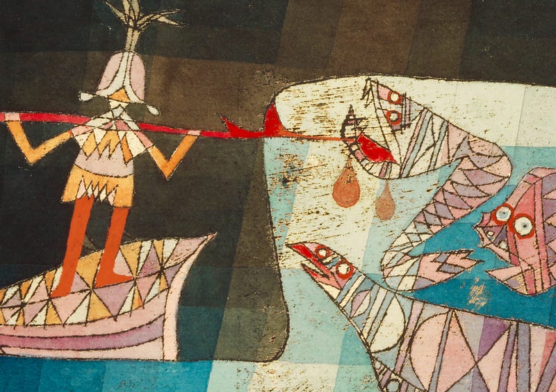
Klee has added a seafarer on a small boat, complete with a pair of orange legs and a curiously-shaped helmet. He carries a spear and appears to be attacking or else defending himself from the trio of monsters. In this way, the painting seems to offer a story — a parable — yet one that remains vitally obscure.
The drawn outlines and shapes of the sea monsters and the sailor were made using a technique known as oil transfer, which gives the painting much of its textural energy.
Initially, the design for the painting would have been sketched on a separate piece of paper with the reverse side subsequently coated in black oil paint.
Klee then pressed the blackened side against the watercolour paper and traced the drawing, transferring the oil onto the new surface, thereby providing a stable foundation for additional layers of water-based paints over the top. Random patches of smudged paint also transferred due to the pressure applied during the tracing process, which is evident as a “grain” in the painting.
The Linear Element
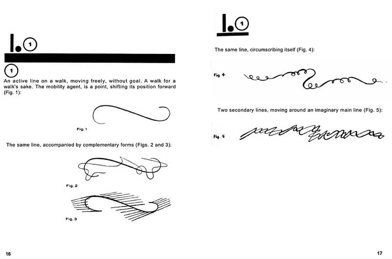
Klee often made a deliberate point of keeping intact what he called “the linear element” in his paintings. That is, the strict simplicity and clarity of lines and their expressive potential.
He had a strong belief in the evocative nature of drawn lines, how for instance a curved line might have “active energy”, whilst an angular line might be limited by its fixed points.
At the time of the painting’s making, Klee was working at the Bauhaus in the German city of Weimar, and many of these principles were collected in his Pedagogical Sketchbook — intended for his course in design theory. The school of art promoted the unity of all the arts, most especially the unison of fine art and functional design. For Klee, teaching at the Bauhaus helped to develop his system of painting, and resulted in the most technically inventive years of his career.
What’s in a Name?
The titles of Klee’s artworks often add a further layer of signification: in this case, Battle scene from the comic fantastic opera ‘The Seafarer’ is suggestive of a wider (although completely invented) musical performance.
Klee was a talented musician. Both of his parents were musicians, his wife Lily was a first-rate pianist, and his personal diaries are full of visits to concert halls and opera houses. His acquaintance with music offered a rich vocabulary of material to refer to, both visually and in his titles, which in turn prompt the viewer’s own sense of invention with spontaneous connections.
What I really appreciate about this painting is the fine balance it maintains between decorative beauty and grotesque surrealism. As the viewer, we are simultaneously torn between one and the other.
In the end, the precise meaning of the painting must remain elusive, owing to its brilliantly improvisational, comical and fantastical nature.

If you liked this, you may also be interested in my book Great Paintings That Tell Stories, which focuses on some of the most iconic objects in art history.
Would you like to get…
A free guide to the Essential Styles in Western Art History, plus updates and exclusive news about me and my writing? Download for free here.
Join me…
On Instagram for more great paintings on the go!


