
DATA SCIENCE FUNDAMENTALS
Partial dependence plots with Scikit-learn
Towards explainable AI
Partial dependence plots (PDP) is a useful tool for gaining insights into the relationship between features and predictions. It helps us understand how different values of a particular feature impact model’s predictions. In this post, we will learn the very basics of PDPs and familiarise with a few useful ways to plot them using Scikit-learn.

📦 Data
We will use subset of titanic dataset (the data is available through Seaborn under the BSD-3 licence) for this post. Let’s import libraries and load our dataset. Then, we will train a random forest model and evaluate its performance.
import numpy as np
import pandas as pd
# sklearn version: v1.0.1
from sklearn.model_selection import train_test_split
from sklearn.ensemble import (RandomForestClassifier,
AdaBoostClassifier)
from sklearn.neighbors import KNeighborsClassifier
from sklearn.metrics import roc_auc_score
from sklearn.inspection import (partial_dependence,
PartialDependenceDisplay)import matplotlib.pyplot as plt
import seaborn as sns
sns.set(style='darkgrid', context='talk', palette='Set2')columns = ['survived', 'pclass', 'age', 'sibsp', 'parch', 'fare',
'adult_male']
df = sns.load_dataset('titanic')[columns].dropna()
X = df.drop(columns='survived')
y = df['survived']
X_train, X_test, y_train, y_test = train_test_split(
X, y, random_state=42, test_size=.25
)rf = RandomForestClassifier(random_state=42)
rf.fit(X_train, y_train)def evaluate(model, X_train, y_train, X_test, y_test):
name = str(model).split('(')[0]
print(f"========== {name} ==========")
y_train_pred = model.predict_proba(X_train)[:,1]
roc_auc_train = roc_auc_score(y_train, y_train_pred)
print(f"Train ROC AUC: {roc_auc_train:.4f}")
y_test_pred = model.predict_proba(X_test)[:,1]
roc_auc_test = roc_auc_score(y_test, y_test_pred)
print(f"Test ROC AUC: {roc_auc_test:.4f}")
evaluate(rf, X_train, y_train, X_test, y_test)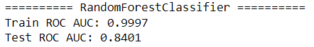
Now, let’s learn the basics of PDPs.
📊 Introduction to Partial Dependence Plots
Let’s start by looking at a PDP as an example. We will plot one for pclass using PartialDependenceDisplay:
var = 'pclass'
PartialDependenceDisplay.from_estimator(rf, X_train, [var]);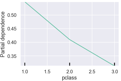
PDPs show the average effect on predictions as the value of feature changes.
In the plot above, vertical axis shows the predicted probability and horizontal axis shows pclass values. The green line captures how average predicted probability changes as the pclass values change. We see that the average survival probability decreases as passenger class increases from 1 to 3.
To better understand PDPs, let’s briefly look into how one can manually build the previous plot. We will first find the unique values of pclass. Then️ for each unique value, we will replace values in pclass column in the training data with it and record how predictions change.
values = X_train[var].sort_values().unique()
print(f"Unique values: {values}")
individual = np.empty((len(X_train), len(values)))
for i, value in enumerate(values):
    X_copy = X_train.copy()
    X_copy[var] = value
    individual[:, i] = rf.predict_proba(X_copy)[:, 1]
individual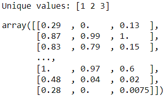
Here we see how individual predictions (a.k.a. individual conditional expectation, ICE) for each record in the training dataset will change if we change the value of pclass. By averaging these predictions (a.k.a. partial dependence, PD), we get the inputs for PDPs.
individual.mean(axis=0)
By plotting these values along with the unique values of pclass, we can reproduce the PDP. Plotting from raw values ourselves gives us more flexibility and control over how we visualise the PDP compared to using PartialDependenceDisplay.
sns.lineplot(x=values, y=individual.mean(axis=0), style=0,
             markers=True, legend=False)
plt.ylim(0.2,0.6)
plt.ylabel("Partial dependence")
plt.xlabel(var);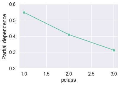
Manual calculation like above is great for learning and understanding concepts, however, it’s not practical to continue using the approach in real use-cases. In practice, we will use Scikit-learn’s more efficient partial_dependence function to extract raw values.
raw_values = partial_dependence(rf, X_train, var, kind='both')
raw_values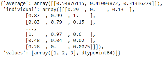
Here, we specified kind='both' to see the individual predictions as well the average predictions . If we are only after the average predictions, we can use kind='average':
partial_dependence(rf, X_train, var, kind='average')
Of note, average predictions from partial_dependence(…, kind='both') and partial_dependence(…, kind='average') may not always match exactly for some machine learning algorithms where more efficient recursion method is available for the latter.
Let’s check if our manually calculated values match to the Scikit-learn’s version:
print(np.array_equal(raw_values['individual'][0], individual))
print(np.isclose(raw_values['average'][0],
                 np.mean(individual, axis=0)))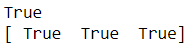
Lovely, they match!
PartialDependenceDisplay allows us to plot a subset of individual predictions along with the average to get a better sense of the data:
n = 50
PartialDependenceDisplay.from_estimator(
    rf, X_train, ['pclass'], kind="both", n_jobs=3, subsample=n
)
plt.legend(bbox_to_anchor=(1,1));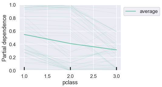
This provides more context. We can reproduce a similar graph ourselves from the raw values:
sns.lineplot(x=values, y=individual.mean(axis=0), style=0,
             markers=True, legend=False)
sns.lineplot(data=pd.DataFrame(individual, columns=values)\
                    .sample(n).reset_index().melt('index'),
             x='variable', y='value', style='index', dashes=False,
             legend=False, alpha=0.1, size=1, color='#63C1A4')
plt.ylabel("Partial dependence")
plt.xlabel(var);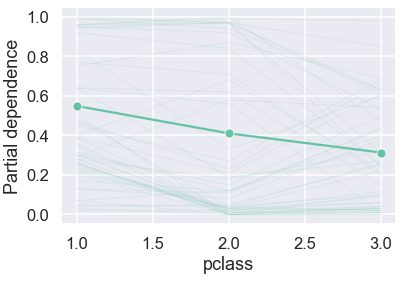
For discrete variable like pclass, we don’t have to limit ourselves to a line plot and can even use bar plot and since we have the full freedom to build any chart from the raw values:
raw_df = pd.DataFrame(raw_values['individual'][0],
                      columns=raw_values['values'])
sns.barplot(data=raw_df.melt(var_name=var), x=var, y='value')
plt.ylabel("Partial dependence");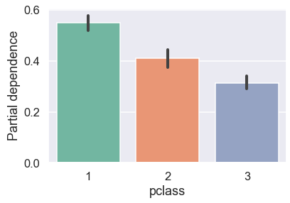
It’s likely that we would want to look at PDPs for multiple variables. Having learned the basics, let’s look at a few ways to plot PDPs for multiple variables.
📈 PDPs for multiple variables
Since our toy dataset has handful of features, let’s plot PDPs for each feature. We will first use PartialDependenceDisplay:
n_cols = 2
n_rows = int(len(X_train.columns)/n_cols)
fig, ax = plt.subplots(n_rows, n_cols, figsize=(10, 12))
PartialDependenceDisplay.from_estimator(rf, X_train, X_train.columns, ax=ax, n_cols=n_cols)
fig.suptitle('Partial Dependence Plots')
fig.tight_layout();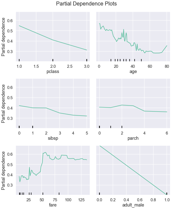
From these plots, we can see the type of the relationship between a feature and a prediction. Some relationships look linear whereas other are more complex.
Now, let’s plot PDPs from the raw values extracted with partial_dependence:
fig, ax = plt.subplots(n_rows, n_cols, figsize=(10,12), sharey=True)
for i, x in enumerate(X_train.columns):
    raw_values = partial_dependence(rf, X_train, i, kind='average')
    loc = i//n_cols, i%n_cols
    sns.lineplot(x=raw_values['values'][0],
                 y=raw_values['average'][0], ax=ax[loc], style=0,
                 markers=True, legend=False)
    ax[loc].set_xlabel(x)
    if i%n_cols==0:
        ax[loc].set_ylabel('Partial dependence')
fig.suptitle('Partial Dependence Plots')
fig.tight_layout()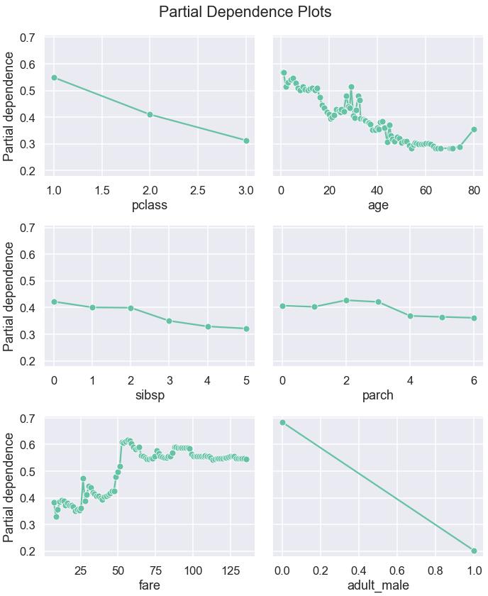
Alternatively, we can also plot subset of the individual predictions to give us a bit more context behind the average values:
plt.figure(figsize=(10,12))
for i, x in enumerate(X_train.columns):
    raw_values = partial_dependence(rf, X_train, i, kind='both')
    ax = plt.subplot(n_rows, n_cols, i+1)
    sns.lineplot(x=raw_values['values'][0], y=raw_values['average'][0],
                 style=0, markers=True, legend=False, ax=ax)
    sns.lineplot(data=pd.DataFrame(raw_values['individual'][0],
                                   columns=raw_values['values'][0])\
                        .sample(n).reset_index().melt('index'),
                 x='variable', y='value', style='index', dashes=False,
                 legend=False, alpha=0.1, size=1, color='#63C1A4')
    ax.set_xlabel(x)
    ax.set_ylabel('Partial dependence')
plt.suptitle('Partial Dependence Plots')
plt.tight_layout()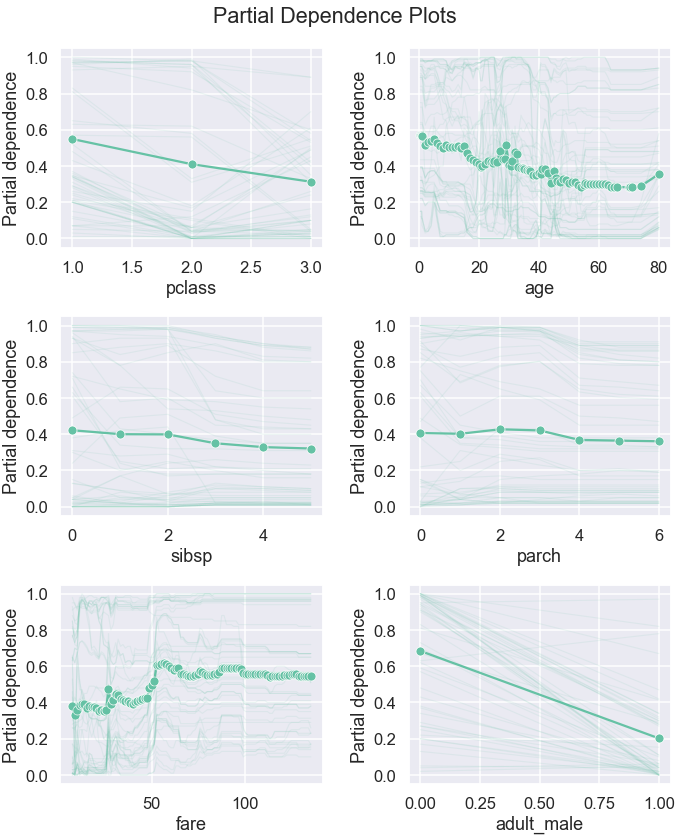
These plots help us understand the relationship between features and their effect on the target prediction and sense check if the patterns the model learned are sensible and explainable. PDPs can also be used to intuitively assess and compare models. In the next section, we will look at how we can plot PDPs for multiple models.
📉 PDPs for multiple models
Let’s build two more models and extract the raw values for all three models:
pclass_df = pd.DataFrame(columns=values)
pclass_df.loc['rf'] = partial_dependence(
    rf, X_train, var, kind='average'
)['average'][0]
ada = AdaBoostClassifier(random_state=42)
ada.fit(X_train, y_train)
evaluate(ada, X_train, y_train, X_test, y_test)pclass_df.loc['ada'] = partial_dependence(
ada, X_train, var, kind='average'
)['average'][0]knn = KNeighborsClassifier()
knn.fit(X_train, y_train)
evaluate(knn, X_train, y_train, X_test, y_test)
pclass_df.loc['knn'] = partial_dependence(
knn, X_train, var, kind='average'
)['average'][0]
pclass_df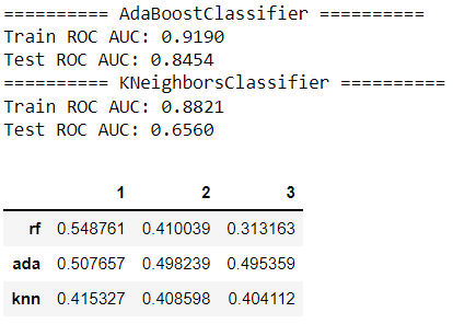
Now, we can plot partial dependence for each model:
pclass_df = pclass_df.reset_index().melt('index')
sns.lineplot(data=pclass_df, x='variable', y='value',
             hue='index');
sns.scatterplot(data=pclass_df, x='variable', y='value',
                hue='index', legend=False)
plt.legend(bbox_to_anchor=(1, 1))
plt.ylabel("Partial dependence")
plt.xlabel(var);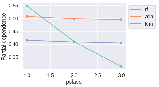
For AdaBoost and K-nearest neighbours classifiers, the predicted probabilities are almost indifferent to passenger class.
Let’s now plot the similar comparison for all variables:
summary = {}
fig, ax = plt.subplots(n_rows, n_cols, figsize=(10,12), sharey=True)
for i, x in enumerate(X_train.columns):
summary[x] = pd.DataFrame(columns=values)
raw_values = partial_dependence(rf, X_train, x, kind='average')
summary[x] = pd.DataFrame(columns=raw_values['values'][0])
summary[x].loc['rf'] = raw_values['average'][0]
summary[x].loc['ada'] = partial_dependence(
ada, X_train, x, kind='average'
)['average'][0]
summary[x].loc['knn'] = partial_dependence(
knn, X_train, x, kind='average'
)['average'][0]
data = summary[x].reset_index().melt('index')
loc = i//n_cols, i%n_cols
if i==1:
sns.lineplot(data=data, x='variable', y='value',
hue='index',ax=ax[loc]);
ax[loc].legend(bbox_to_anchor=(1, 1));
else:
sns.lineplot(data=data, x='variable', y='value',
hue='index', ax=ax[loc], legend=False);
sns.scatterplot(data=data, x='variable', y='value',
hue='index', ax=ax[loc], legend=False)
ax[loc].set_xlabel(x)
if i%n_cols==0:
ax[loc].set_ylabel('Partial dependence')fig.suptitle('Partial Dependence Plots')
fig.tight_layout()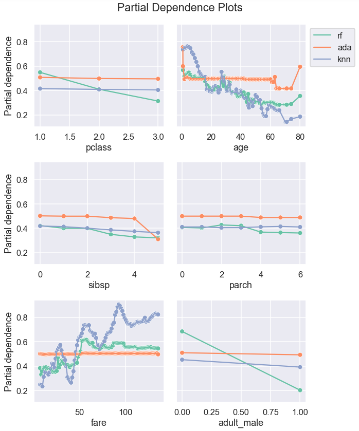
Looking at PDPs by different model can help choose a model that is more sensible and explainable.
Partial dependence plots provide insights on how predictions can be impacted by the change in features. One disadvantage of PDPs is that it assumes that features are independent of each other. While we have looked at classification use-case, PDPs can be also used for regression. In this post, we have focused on simplest form of PDPs: 1-way PDPs. For keen learners who are curious to learn more about the PDPs, 2-way and/or 3-way PDPs that can provide insights on interaction between features are interesting topics to look into.

Would you like to access more content like this? Medium members get unlimited access to any articles on Medium. If you become a member using my referral link, a portion of your membership fee will directly go to support me.
Thank you for reading this article. If you are interested, here are links to some of my other posts: ◼️️ Explaining Scikit-learn models with SHAP ◼️️ Meet HistGradientBoostingClassifier ◼️️ From ML Model to ML Pipeline ◼️️ 4 simple tips for plotting multiple graphs in Python ◼️ Prettifying pandas DataFrames ◼ Simple data visualisations in Python that you will find useful️ ◼️ 6 simple tips for prettier and customised plots in Seaborn (Python)
Bye for now 🏃 💨


