
Override TextField Border Color for Different States in Material UI
I spent quite a few hours recently on a seemingly simple task: customizing the border color of a Material UI TextField when a variant and disabled state were applied. It was difficult to find good documentation and I expect others may benefit from a few examples presented here.
Override TextField Border in Disabled State
Let’s start with a pretty simple disabled TextField component.
<TextField
   disabled
   variant='outlined'
   label='Text Field 1'
   InputProps={{
      classes: {
         root: classes.root
      }
   }}
/>
Initially, it seems we should just add a borderColor to our root class in our JSS file:
root: {
   borderColor: 'orange'
}
We see it applied in dev tools, yet we don’t see an orange border around the TextField. Unfortunately, targeting the root class applies the borderColor to an inner element of the TextField that doesn’t actually control the border color.
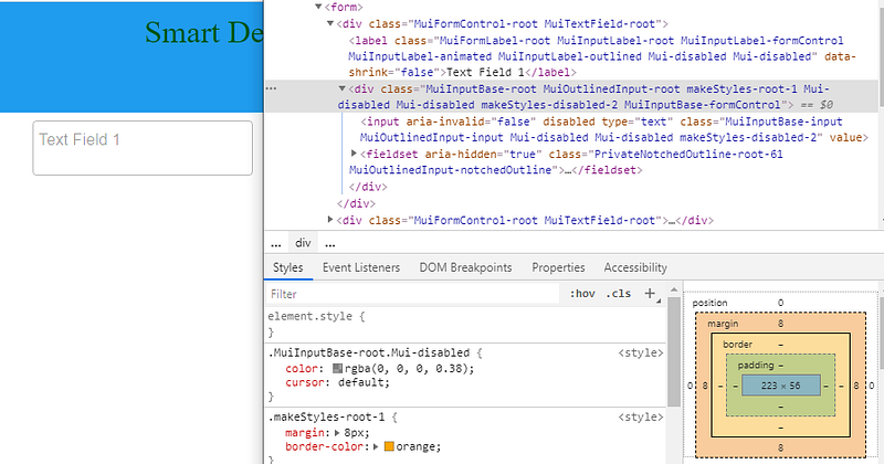
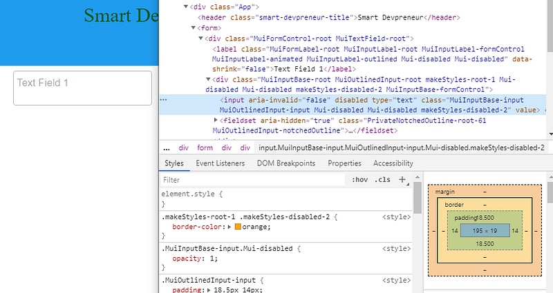
So let’s try again via trial-and-error. Let’s select the input element which is a child of the div previously targeted:
//component
InputProps={{
   classes: {
      root: classes.root,
      disabled: classes.disabled
   }
}}
//styles
root: {
'& $disabled': {
borderColor: 'orange'
}
},
disabled: {}Still no luck. The input is targeted properly, but the border is not yet orange.
Trying again, let’s target the fieldset. It looks promising since it has a class named MuiOutlinedInput-notchedOutline. We target it with the following:
//component
InputProps={{
   classes: {
      root: classes.root,
      disabled: classes.disabled,
      notchedOutline: classes.notchedOutline
   }
}}
//styles
root: {
'&$disabled $notchedOutline': {
borderColor: 'orange'
}
},
disabled: {},
notchedOutline: {}A couple points about the code above: First, notice that there is no space between & and $disabled. Second, notice that there is a built in class called notchedOutline in the InputProps API that Material UI intends for us to target.
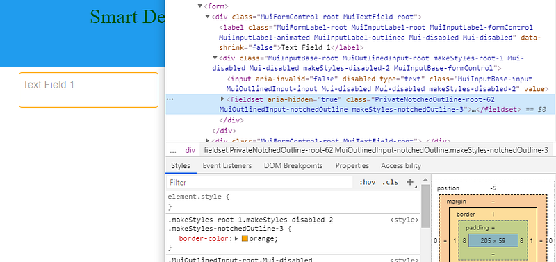
Success!
There are more examples below, but if you want to gain an in-depth understanding of Material-UI syntax and APIs for styling components, I recommend you read my book, Styling Material-UI Components (affiliate link). I cover the class object API, Styled Components, and overriding components using the theme. Furthermore, there are many more examples of custom component styling.
Override TextField in Focused State
Overriding the focused state style is similar:
<TextField
   disabled
   variant='outlined'
   label='Text Field 1'
   InputProps={{
      classes: {
         root: classes.root,
         focused: classes.focused,
         notchedOutline: classes.notchedOutline
      }
   }}
/>
//styles
root: {
'&$focused$notchedOutline': {
borderColor: 'orange'
}
},
focused: {},
notchedOutline: {}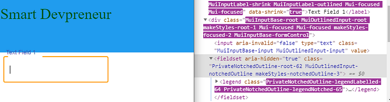
Override TextField in Hover State
Hover is a psuedo class, so the syntax is a little different:
<TextField
   disabled
   variant='outlined'
   label='Text Field 1'
   InputProps={{
      classes: {
         root: classes.root,
         notchedOutline: classes.notchedOutline
      }
   }}
/>
//styles
root: {
'&:hover $notchedOutline': {
borderColor: 'orange'
}
},
focused: {},
notchedOutline: {}Other Override Options
Another strong alternative is to use withStyles HOC and override TextField, creating a new component.
const CssTextField = withStyles({
  root: {
    '& .MuiOutlinedInput-root': {
      '& fieldset': {
        borderColor: 'orange',
      }
  },
})(TextField);
And a more detailed example of setting a custom margin is here. The withStyles override is useful when you are having difficulty targeting an element using the provided classes API.
Originally published at https://smartdevpreneur.com.


