
Options trading data analysis — Part 2-Visuals
In Part 1, we started our journey by first obtaining and learning about transactional brokerage data, creating Pandas dataframe, and performing basic analytic techniques to calculate the running capital and principal based on this data. Though this is a start, I am personally a visual person so in this part, let’s explore what’s available to us to visualize the information we’ve gathered. There are several popular visualization libraries available, such as Matplotlib and Altair. Let’s explore how we can utilizeAltair for visualization.
Continuing from where we left off, we simply import altair.
import json
import pandas as pd
from pandas.io.json import json_normalize
import numpy as np
import altair
What we’re interested in plotting here is the principal and capital over time. In our dataframe, we can use the transactionDate as the time axis. We’ll first notice, however, it is represented as a string, for example: 2020–06–22T19:56:19+0000. Pandas has a to_datetime operation that can help us do the conversion. We can either specify the exact datetime format or let the function does the inference for us. We’ll specify errors=’raise’ so we’ll get notified in case there’s a conversion problem.
#transactionsDf.loc['transactionDate'] = pd.to_datetime(transactionsDf['transactionDate'], errors='raise', format='%Y-%m-%dT%H:%M:%S%z')transactionsDf['transactionDate'] = pd.to_datetime(transactionsDf['transactionDate'], errors='raise', infer_datetime_format=True)We can then create a slice of the dataframe with just the 3 columns.
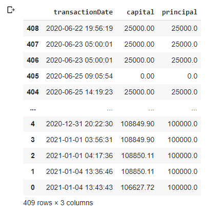
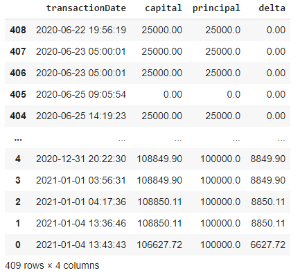
capitalPrincipal = transactionsDf.loc[:,['transactionDate', 'capital', 'principal']]The output for my sample data looks something like this:
The following code will generate the capital and principal plot over time and display them side by side.
capitalPlot = altair.Chart(capitalPrincipal).mark_point()  \
    .encode(x='transactionDate', y='capital') \
    .properties(height=300, width=300)
principalPlot = altair.Chart(capitalPrincipal).mark_point() \
.encode(x='transactionDate', y='principal') \
.properties(height=300, width=300)capitalPlot | principalPlot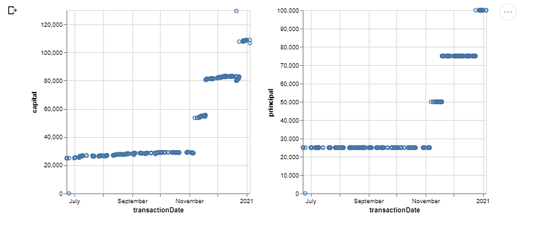
We can use the + instead of the | to put both the capital and principal in the same graph: capitalPlot | principalPlot

It’s also a good idea use different colors for capital and principal. We can do this by specifying the color we want in the mark_point call.
principalPlot = altair.Chart(capitalPrincipal).mark_point(color='orange')
    .encode(x='transactionDate', y='principal') \
    .properties(height=300, width=500)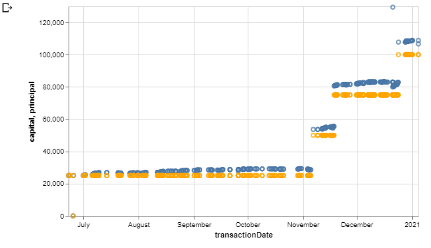
Though it’s easy to create separate plots for different data series and combine them, this doesn’t scale. We can actually apply some reshaping technique to the dataframe so that the data are combined for us. We can do this using the melt operation provided by Pandas, which will combine all columns given an identifier column. In our case, the identifier column would be the transactionDate. We’ll create a new column called amount for the values.
capitalPrincipalRs = capitalPrincipal.melt('transactionDate', var_name='capitalPrincipal', value_name='amount')This will shape the dataframe as follow:
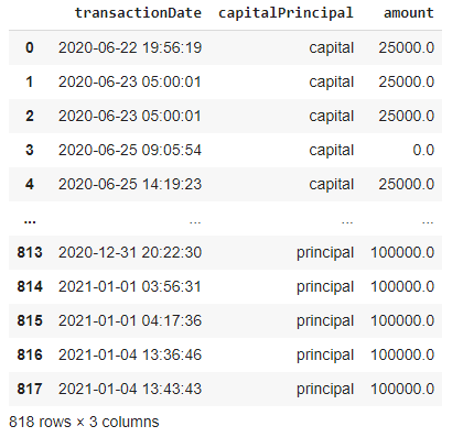
As you can see, we’ve doubled the number of rows compared to the original dataframe since the capital and principal columns have been combined into a single capitalPrincipal column and the original column names had became the values. The original values are now in the amount column. We can now generate a single graph.
rsPlot = altair.Chart(capitalPrincipalRs).mark_point()  \
    .encode(x='transactionDate', y='amount', color='capitalPrincipal') \
    .properties(height=300, width=500)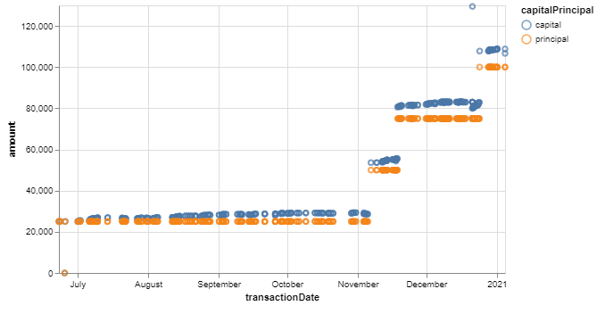
We let Altair know to differentiate the values in the capitalPrincipal column and use that to generate different colored series. We also get a nice legend there.
So far, we can see a general picture of what’s happening overall. Capital generally stays above principal which is a good thing. But, with this plot, we’ll have to constantly keep a mental state of this fact as we look at the plot. You might start asking, “This is not good enough? How lazy are you?”, but I want a little extra. If we can get the delta between the capital and principal, then I won’t have to carry this mental state around. We’ll generate a new column for the dataframe.
capitalPrincipal['delta'] = capitalPrincipal['capital'] - capitalPrincipal['principal']The output looks like this:
And we can simply generate a chart.
altair.Chart(capitalPrincipal).mark_point()  \
    .encode(x='transactionDate', y='delta') \
    .properties(height=300, width=500)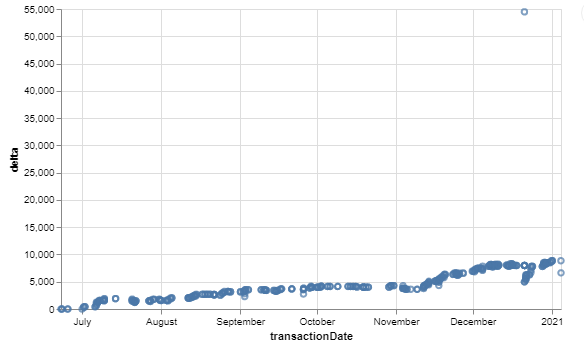
Now with this chart, I can sleep better at night seeing it doesn’t go below 0, in fact, it needs to go up over time. Also, notice there’s an outlier in the data. This is likely due to some options being assigned or exercised, probably from a vertical spread. We can actually smooth this out by resampling. Pandas being really good with time series, is basically made for this. We can do resampling based on a 7 days average as follow:
capitalPrincipalResampled = capitalPrincipal.resample('7D', on='transactionDate').mean().reset_index()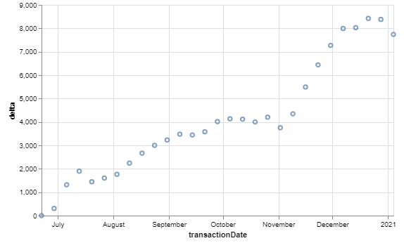
Now we can see that the outliers’ effects are alleviated. And while we’re at it, let’s also generate and plot the delta as a percentage of the principal.
capitalPrincipal['deltaApoPrincipal'] = (capitalPrincipal['delta'] / capitalPrincipal['principal']) * 100capitalPrincipalResampled = capitalPrincipal.resample('7D', on='transactionDate').mean().reset_index()altair.Chart(capitalPrincipalResampled).mark_point() \
.encode(x='transactionDate', y='deltaApoPrincipal') \
.properties(height=300, width=500)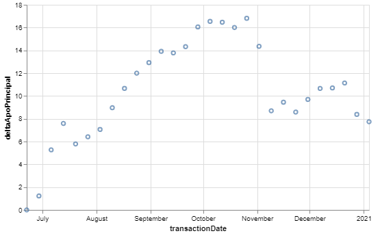
There we have it. Thanks to all the available useful tools and with a bit of motivation, we are able to extract information and develop insights from data. Thanks for reading and let’s continue our journey soon.