
OOTD: Thinking about color theory today.
My 100 Day Project (Day 20)
I spent some time today thinking about color theory — specifically personal colors. Very specifically, I tried to parse out why I’m a spring and not an autumn.
And lucky you! I’m going to share what I learned. First though, I’ll share what I wore today. Just in case my rabbit hole doesn’t interest you.
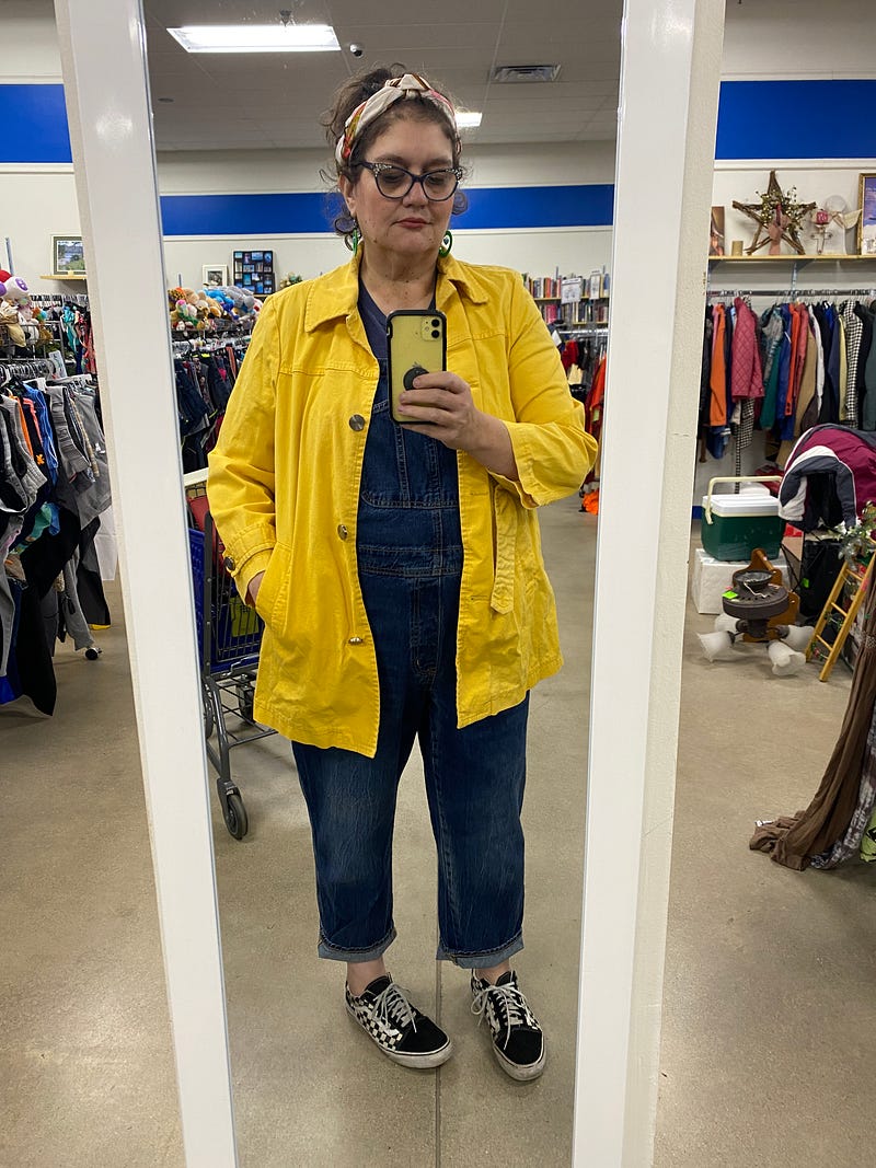
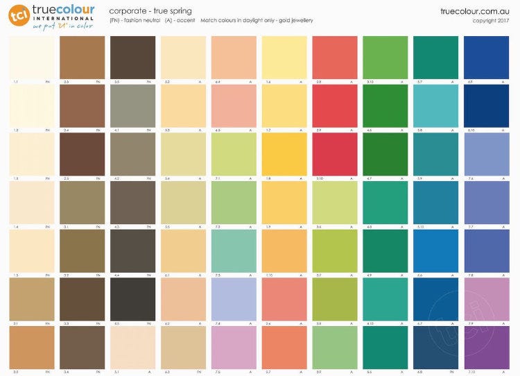
I loved this outfit. Denim is usually good for me. It’s not really my dramatic, but close. I feel like this blue is in my palette. Like that blue on the bottom, second from the right.
My jacket is too bright — but that’s okay. Overall, I liked this one.
Okay, now. Color theory. Let’s do it.
Colors have four parts.
I’m sure, actually, that they have more than four parts. But there are four that we think about when we think about personal colors. Temperature, value, chroma, and contrast.
Let’s take a look at them.
Temperature
Temperature refers to whether a color is warm or cool. Most colors can be made more warm or more cool, by adding either blue or yellow to them.
True red is actually a neutral color. Neither warm nor cool. But when you add blue, the color gets progressively cooler. Add yellow and it gets warmer, veering toward orange.
Orange is actually a completely warm color. There is no way to make it cooler.
Value
Value relates to how dark or light your personal coloring is. Think about a gray scale. Pure white on end, pure black on the other, and graduated shades of gray between. That’s a value scale.
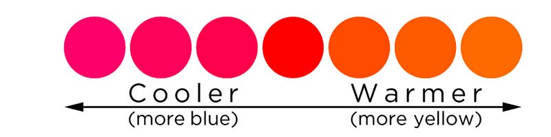
To find your own coloring’s value, take a photo of your face and desaturate it (make it black and white.) You’ll be able to see if your natural coloring is dark, medium, or light.
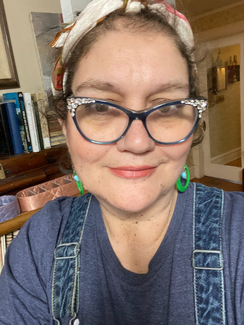
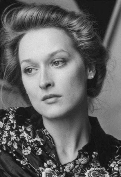
It’s hard to judge your coloring’s value in a color photo. When I look at the image on the right, I see that I have brown hair and hazel eyes that read brown in a photo, and relatively fair skin. Am I dark? Am I light?
But in the desaturated image, it’s very easy to see that I’m — medium. Very mid-tone. Nothing stands out as particularly light or dark.
Chroma
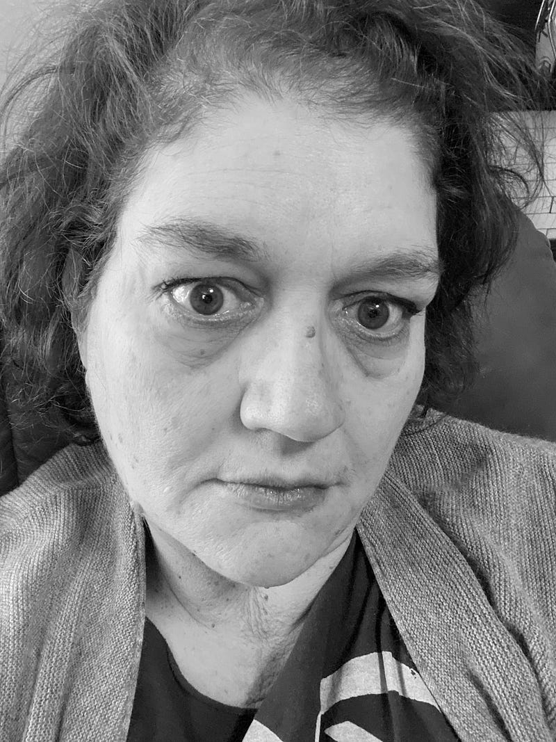
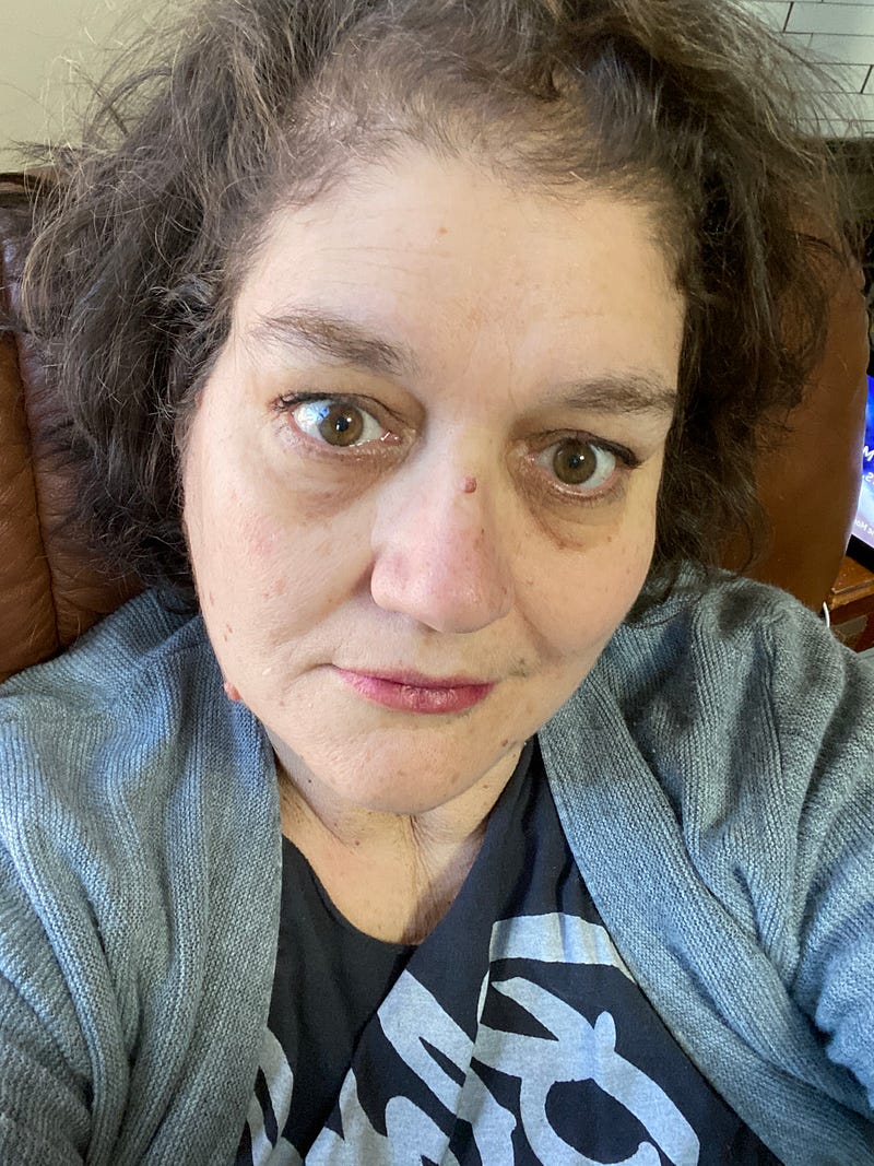
Chroma refers to how saturated your coloring is. Or how bright. One way to try to judge your own chroma is to put your picture between the pictures of people who you know are low and high chroma.

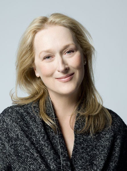
I’ll take the guess work out for you and tell you that Christina Hendricks has high chroma and Meryl Streep has low Chroma. I’m not wearing any make up in the image I’m using here.
Meryl Streep is very blended and soft in her coloring. Christina Hendricks is very bright in her coloring. If I look at just me next to Meryl, I’m not blended the way she is. While my coloring is very different from Christina’s, the quality of mine is closer to hers than to Meryl’s.
So. I’m high chroma. It helps that David Zyla told me that I am, but I can see it here.
I think a good exercise is to look at your features. Are they soft, or do they stand out? Meryl’s are soft. There’s no strong delineation. Christina and I both have more defining lines around ours.
Contrast
Lastly, contrast is the way your personal colors relate to each other. Look again at the desaturated photo of yourself and pay attention to your hair, eyes, mouth, and skin. Ask yourself if each of them is light, medium, or dark.
All four of my answers are medium. That makes me low contrast. It’s very easy to see that when you see me next to someone who is very high contrast and someone is very low contrast.
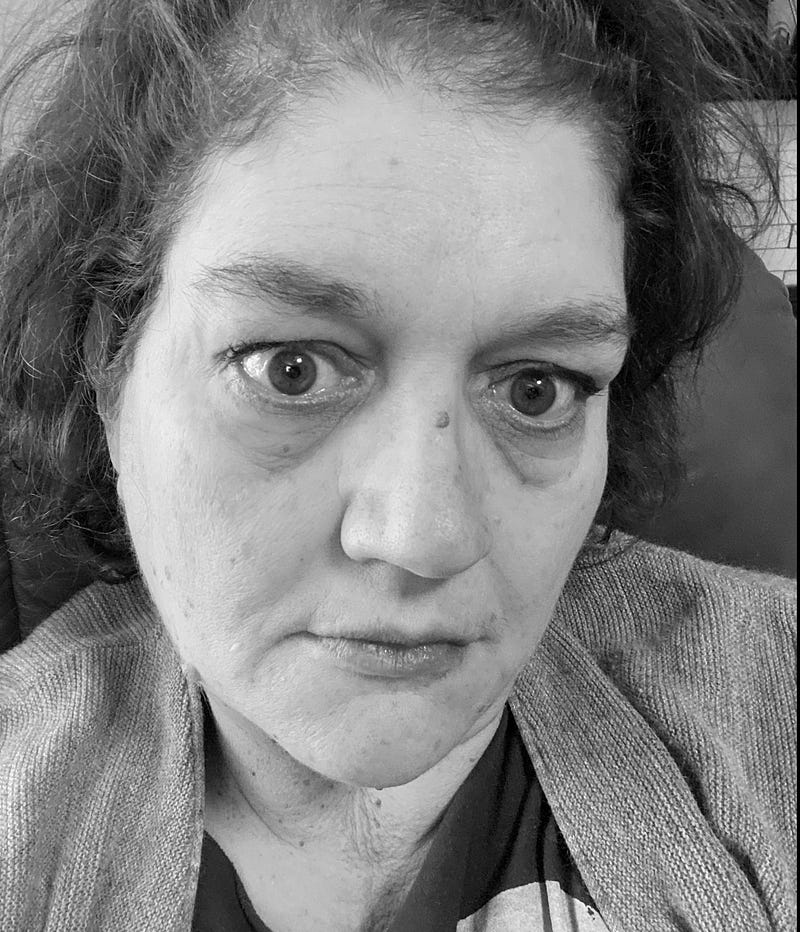
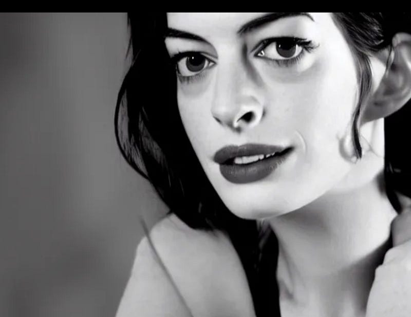
What I can see here is that I’m pretty low contrast, but not as low as Meryl Streep. Mostly because my eyes contrast with my other features. I’m am most definitely not high contrast like Ann Hathaway is.
I’d say I’m medium, leaning toward low, contrast.
So, what does that all mean?
First of all, let’s talk about the four base color seasons: Winter, Spring, Summer, Fall. And how they fall on the temperature, value, chroma, contrast scale.
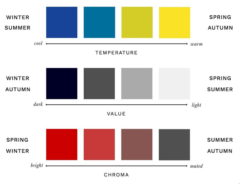
In very broad terms that don’t take human variation into consideration:
- Winter is cool, dark, and bright.
- Spring is warm, light, and bright.
- Summer is cool, light, and muted.
- Autumn is warm, dark, and muted.
I am warm, medium, and bright. Medium isn’t on the list, right? But you can add medium to all of them. Winter and autumn are medium to dark. Spring and summer are light to medium.
So — I’m warm, medium, and bright. And that, friends, is why I’m a spring and not an autumn.
My journey to figuring this out.
When I was a little girl, my mother went to a color party — which were a thing in the 1970s and 80s. She was a summer. the woman who did her colors told me I was an autumn.
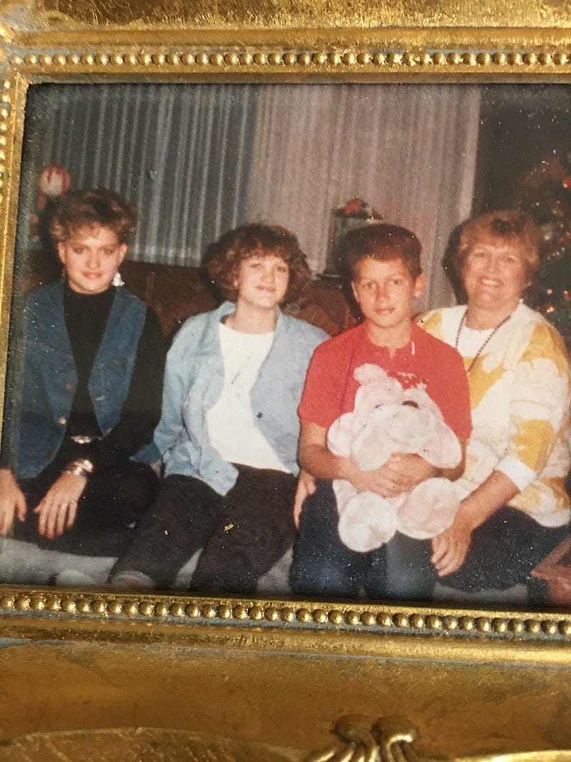
This photo is me, my sister, my brother, and our mom. I was fifteen. My sister is a winter. Mom is a summer. I’m not sure about my brother. He might be an autumn — he seems too warm to be a summer to me.
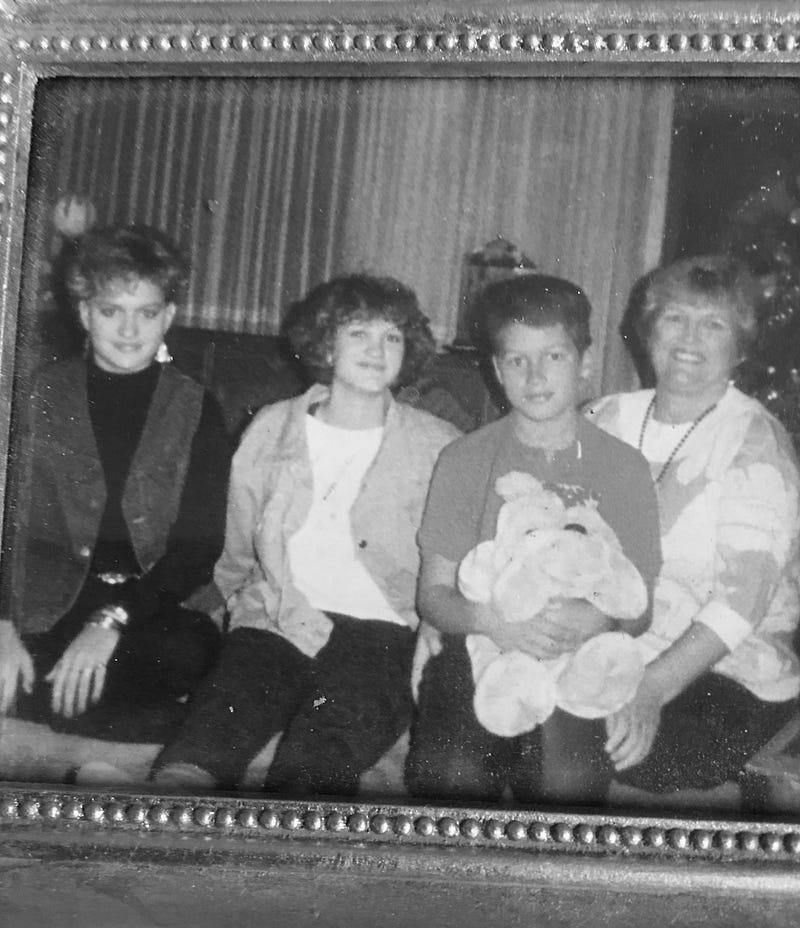
When I desaturate the image, it’s easy to see.
Winter is dark, bright, and cool. Winters are higher contrast. My sisters eyes and hair are dark in contrast to her skin. You can see that she’s a winter because that bright white is lovey on her.
Spring is light, bright, and warm. Spring is the brightest season. You can see the brightness in my face, in the desaturated image. I can’t wear white at all. I barely even have any color that approaches white in my palette.
Summer is light, muted, and cool. Autumn is dark, muted, and warm. See how much more muted and blended my mom and brother are, compared to my sister and I? For what it’s worth, mom is wearing a softer summer white and it’s lovely on her.
Fast forward like forty years. All the way to the day just before Covid happened when I went to Philadelphia and had my own colors done by a color analyst.
She said that I was a dark autumn and I really wanted to cry.
At the time, I wasn’t sure what else I expected. But I spent so much time telling her that I really, really hoped I wasn’t an autumn that she felt bad when she told me that I was.
Here’s the color fan she gave me.
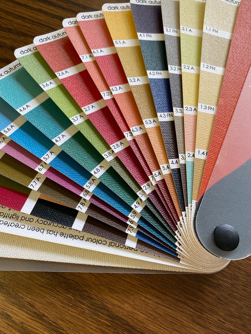
There’s nothing wrong with them. They’re beautiful. But they made me sad.
A few months later, I had a 24-hour layover in Atlanta and on the spur of the moment decided to go see an other analyst. (Don’t judge. I was hyperfixated.)
John Kitchener.
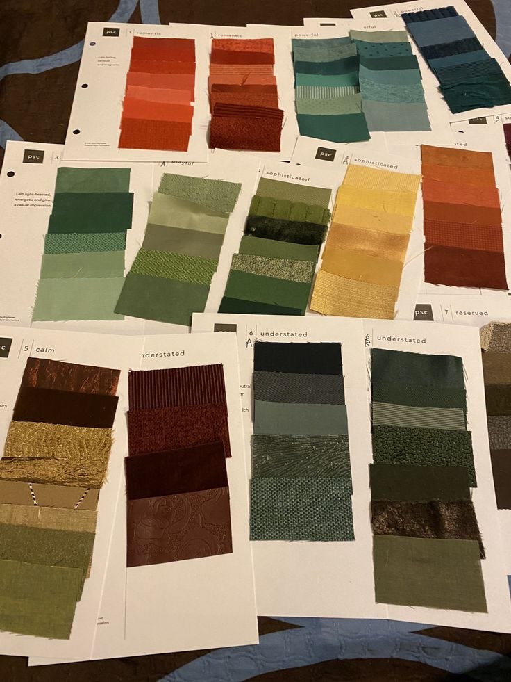
It was a great experience. While the first analyst draped me, John sat across from me and held swatches of fabric up as we talked. In the end, I had a whole binder full of them.
He doesn’t use seasons, but he said that I’m 80 percent ‘earthy rich’ and 20 percent ‘lively bright.’ Or, mostly autumn with some spring. Almost 3/4 of my colors were on pages that called them ‘sophisticated.’
John actually said that I better start liking the symphony.
I was all set to see David Zyla a month or so later.
But Covid happened literally the week before. It was two years before that appointment happened.
David held colors up to me, the way John did. No draping. He used paint chips, not fabric. He told me that I’m a Tawny Spring. But it was looking at the far more limited palette that he gave me (compared to the fan and the binder) that made me so happy, I almost cried.
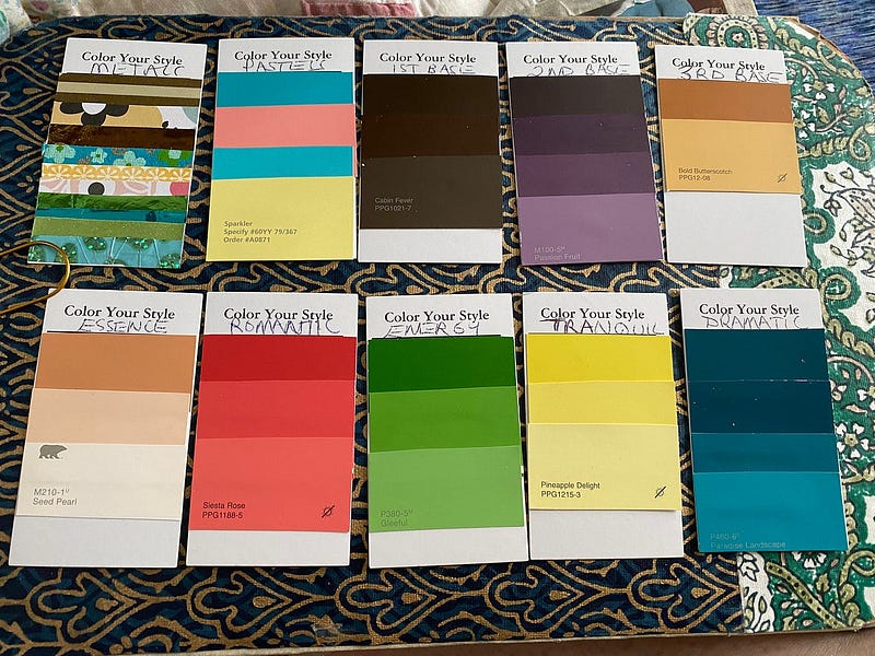
It was so bright. There were so many colors. It wasn’t overly-sophisticated. There was no pumpkin. No orange at all. It’s interesting to me that all of my Zyla palette is represented in Kitchener’s swatches. and in the fan.
Taking them individually, I can see most of them. Not my essence, which is interesting. That’s the one color that Zyla calls his parlor trick. Hold that color to my palm and it’s very clear that it’s mine. My tranquil isn’t there, either.
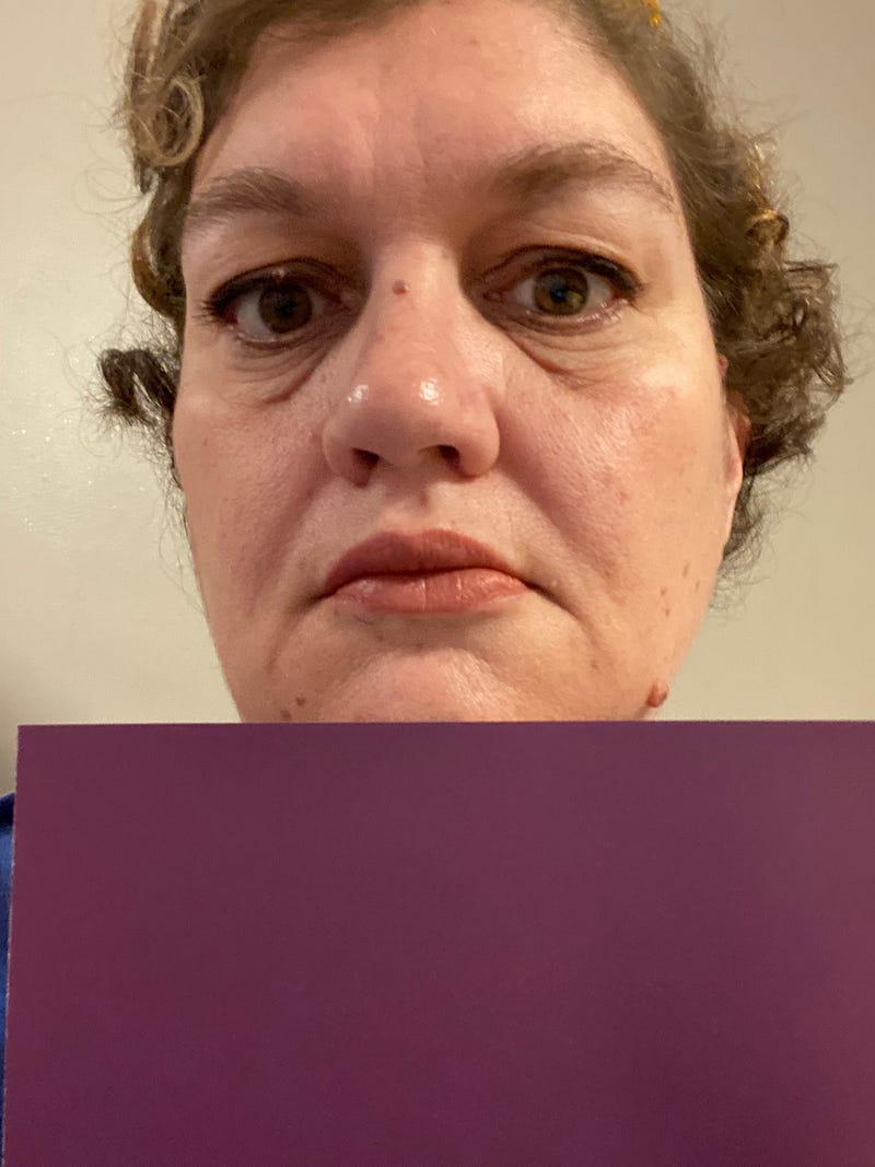
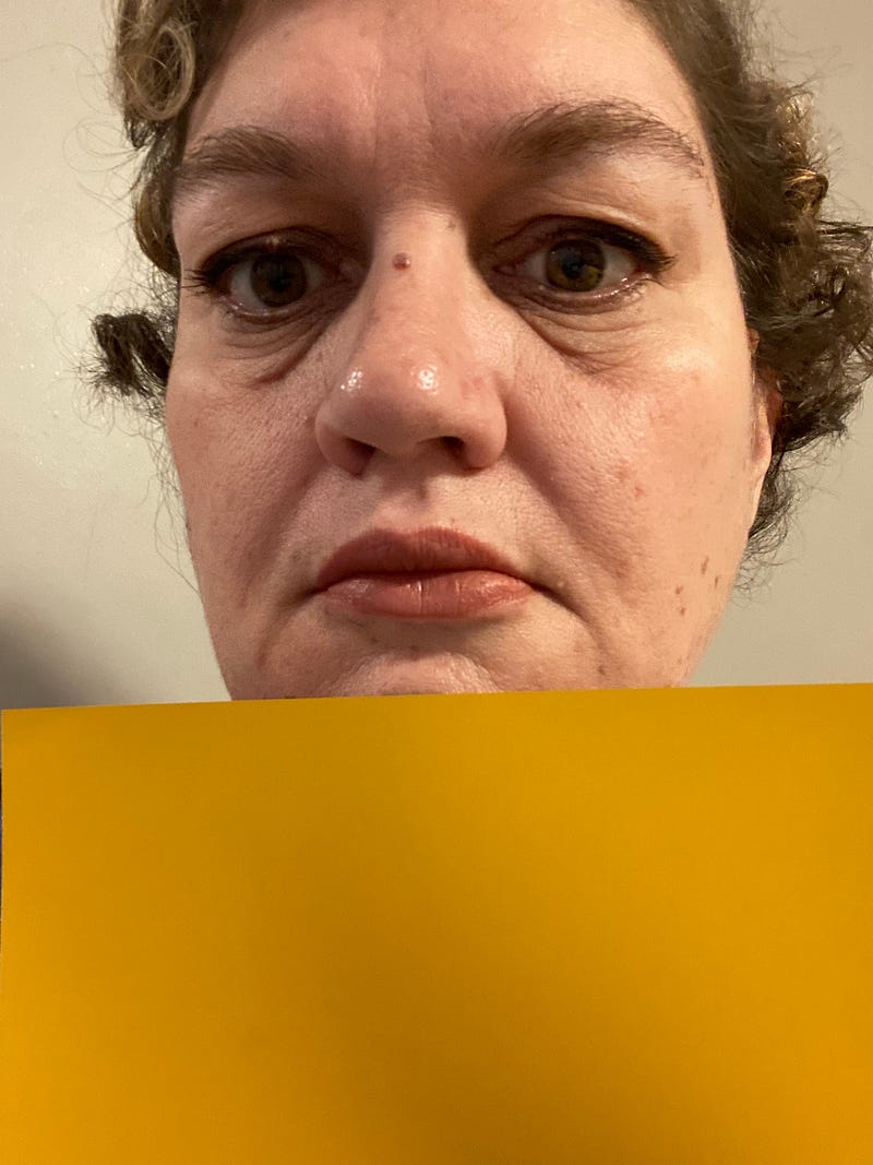
But my romantic color is there. My energy. My dramatic blue. My espresso-brown first base. Concord purple second base. Butterscotch third base. The pink and blues on my pastel card.
Zyla told me that I am warmer than most Tawny Springs. And my colors are darker. A spring is usually Light, Bright, and Warm. I’m Medium, Bright, and Warm.
So, it’s important to think about which element takes precedence. Turns out, it’s chroma. If you’re bright, you’re a winter or a spring. If you’re muted, you’re a summer or autumn.
Then comes temperature. If you’re warm, you’re a spring or autumn. If you’re cool, you’re a winter or summer.
And then value. If you’re light, you’re a spring or summer. If you’re dark, a winter or autumn. If you’re medium, you can be anywhere on the spectrum, so you have to think about if you’re medium leaning dark or leaning light.
Finally contrast. Usually winters and springs are medium to high contrast. Summers are usually medium to low contrast.
In that order, I’m high chroma, warm, medium, and low-medium contrast. That adds up to a spring.
I found this exercise interesting.
Tawny Spring is what Zyla calls a warm or true spring. His dark autumn is called Spicy Autumn. Fun fact, when he said ‘Tawny Spring’ I was so relieved that I actually did cry. Because I was certain that I was a ‘Spicy Autumn.’
I’d become friends with the first analyst I went to and that was what she thought my Zyla type would be. And I had that whole binder of ‘sophisticated’ colors from Kitchener.
So certain that I came with a list of questions ready that I hoped would help me figure out how to learn to love it.
Anyway, Amy Adams is someone he has typed as a Tawny Spring. Sandra Bullock is a Spicy Autumn. So, I thought I’d put my picture between theres and see what happens.
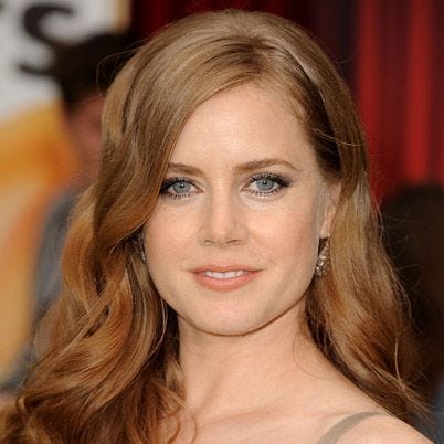
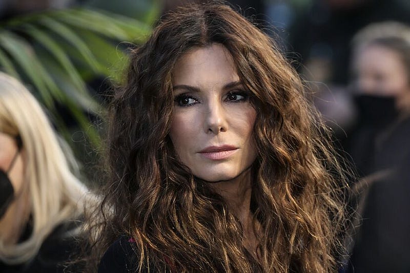
And there it is. Can you see what I see? Amy and I are both high chroma — very saturated. Warm, light, and bright. Sandra is warm, dark, and more muted.
Both of the first analysts discounted my high chroma. My need for bright colors. I think that what threw them off is that springs are usually higher contrast than I am.
I’m lower contrast. Like autumns usually are. But remember — contrast is last on the list. So, despite being lower contrast, the more muted autumn colors don’t work for me. That’s why the true spring purple that’s my second base makes my skin happy and the dark autumn mustard yellow from the dark autumn palette doesn’t as well.
I’m too saturated for the autumn color. I’m more saturated than it is.
Whew. That was a lot. See you tomorrow.
Shaunta Grimes is a writer and teacher. She is an out-of-place Nevadan living in Northwestern PA with her husband, three superstar kids, King Louie Baloo the dog, and Ollie Wilbur the cat. She is the author of Viral Nation, Rebel Nation, The Astonishing Maybe, Center of Gravity and Here I Am. She is the original Ninja Writer.
Sign up for her Substack newsletter, Then See What Happens.


