
NIVEA Night — Perfect Cream For Night
NIVEA Advertisement Analysis
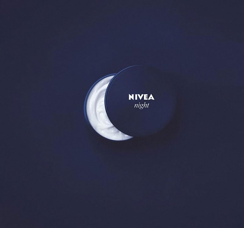
NIVEA is a global skincare and body care company founded over a century ago. NIVEA has always been able to continue its growth into new product categories to satisfy changing consumer needs and lifestyles. Recently, they released a classic packaging ad of their NIVEA Night cream.
NIVEA night cream is the perfect combination of your daily skincare routine to help the skin in its natural nighttime repair and revitalization. If you want to feel smooth and look energized when you wake in the morning, NIVEA night is the best option. NIVEA did an incredible job using its product packaging design to create the thought of “night” in the consumer’s mind…NIVEA night.
Strategy
NIVEA night is a creative packaging advertisement that makes sense. The ad indicates a small tub of NIVEA cream, which has the lid slightly off — suggests the image of the moon, cover, and background are night sky. Plus, the lighting is present to show the moon in this creative advertisement strategy.
Color: The navy blue color has been synonymous with the NIVEA lotion brand for decades. It also works very well in creating the illusion of a night sky with a pleasing deep blue color. The area around the container is slightly lighter than the rest of the image, impressing the viewer that the lotion is glowing like the moon and will likewise give the skin an equally glow complexion.
Hierarchy: By placing the dark blue jar of white lotion on a background of the same color, light to the dark scale is created. The viewer’s eye automatically goes toward the bright white of the lotion in the jar and then to the white NIVEA text.
Form: The way the cover of the bottle is positioned illustrates a crescent moon shape, cementing the idea of the lotion being particular to a night cream. This creates a stark shape that contrasts nicely in color with the navy blue background, which has famously been the NIVEA blue packaging color for years.
Text: In this advertisement, ‘NIVEA’ is written in a bold white color to make it stand out, and the word ‘night’ helps the consumer and viewers to understand the print advertisement’s suggestion. When someone goes to buy a new lotion, they will be able to recognize the stark white text against their classic bottle’s navy blue.
Balance: The simplicity of the image also suggests the simplicity of the lotion’s formula. There are not very many distracting visual elements in the advertisement, which gives the sense of a clean, classic simple formula that is effective and works best for the night.
Summary
The ad is perfect for women between the ages of twenty and sixty and looking for a simple night time skincare treatment. It is also an excellent cream for women who want something simple, classic, and useful for their skin. The image’s overall simplicity and the bold and striking deepness of the blue create a memorable mental image that the viewer can take with them on their next trip to the lotion aisle.
Thank you for reading!
If you would like to read another advertisement analysis, check out the one on Pepsi!


