
New SHAP Plots: Violin and Heatmap
What the plots in SHAP version 0.42.1 can tell you about your model

One of the biggest concerns about SHAP has to do with the package itself. It hadn’t been updated in a while and the GitHub issues were piling up. To the relief of many users, contributors have been more active. In fact, they’ve given us new charts — Violin and Heatmap. We will:
- Give the code for these plots
- Discuss what new insights we can gain from them
You can also watch this intro on the topic:
Existing SHAP Plots
We continue on from a previous SHAP tutorial. You can find this in the article below. You can also find the full project on GitHub. To use the new charts you will have to update the SHAP package. I am using version 0.42.1.
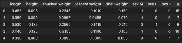
To summarise, we used SHAP to explain a model built using the abalone dataset. This has 4,177 instances and you can see examples of the features below. We use these 8 features to predict y — the number of rings in the abalone shell.
The tutorial goes on to calculate SHAP values and display various SHAP plots. Having an understanding of some of these is useful for understanding the new SHAP plots. We will see that they provide similar information.
The first is the mean SHAP plot seen in Figure 1. For each feature, this gives the absolute mean SHAP value across all instances. Features, that had made significant contributions to predictions, will have a high mean SHAP value. In other words, this plot tells us which features are most important in general.

The other plot is the beeswarm plot in Figure 2. This is a visualisation of all the SHAP values. On the y-axis, the values are grouped by feature. For each group, the colour of the points is determined by the feature value (i.e. higher feature values are redder). Now, let’s see how the new SHAP plots compare to these.

SHAP Violin Plot
The code for the violin plot is similar to what we’ve seen with other SHAP plots. We just input our shap_values object (line 2). To be clear, these are the values we calculated in the previous tutorial. You can see the output in Figure 3. Comparing this to Figure 2, we can see the violin is a different style of beeswarm plot.
# violin plot
shap.plots.violin(shap_values)
An additional style is the layered violin plot in Figure 4. With this one, the variation in feature values at each SHAP value is more clear. That is if we compare it to both the original violin plot and beeswarm.
# layered violin plot
shap.plots.violin(shap_values, plot_type="layered_violin")
Due to the similarity, the insights we gain for these are similar to the beeswarm. These plots can highlight important relationships as we can see which features tend to have large SHAP values. By colouring by feature value, we can also start to understand the relationship between the feature and model predictions. Now let’s see if the heatmap can provide more insights.
SHAP Heatmap
You can see the output of the heatmap function in Figure 5. There’s a lot going on:
- On the x-axis, we have a tick for all 4,177 instances
- The y-axis gives the feature
- The line above each instance is coloured by the SHAP value for that feature
- The f(x) line gives the predicted number of rings for that instance
- The bars on the right give the mean SHAP values we saw in Figure 1
Like the beeswarm, this is a plot of every shap value. Expect now we focus on patterns between SHAP values and groups of instances.
# heatmap
shap.plots.heatmap(shap_values)
By default, the instances are ordered using a hierarchical clustering algorithm. According to the developers, “This results in samples that have the same model output for the same reason getting grouped together”. I have found choosing your own instance order to be more useful for finding patterns.
Ordering the heatmap
To do this, we pass in an instance_order parameter. This must be an array of integers the same length as the dataset (i.e. 4,177). The values give the order of the instances. In the code below, we order the instances from lowest to highest predicted value.
# order by predictions
order = np.argsort(y_pred)
shap.plots.heatmap(shap_values, instance_order=order)
In the output in Figure 6, we see some patterns emerging. Notice 3 groups of SHAP values for shucked weight. There are two groups of positive values — one for when the SHAP values for shell weight are both small and large. A potential interaction? Something we could explore further with SHAP interaction values.

Another option is to order the instances by a feature’s values. Below, we order them using shell weight. We can see the predicted number of rings tends to increase with this feature. We can also see that the SHAP values for this feature tend to increase. In other words, the larger the shell weight value the higher the predicted number of rings.
# order by feature's values
order = np.argsort(data['shell weight'])
shap.plots.heatmap(shap_values, instance_order=order)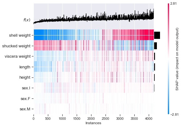
We can order the heatmap in any way we want. This flexibility can help us understand our model in a way that the other plots can’t. Personally, I’m excited to see these sorts of developments. More features and visualisation options will be appreciated by the package's many users. What would you like to see in future updates?
If you want to learn more about SHAP, check out the articles below:
I hope you enjoyed this article! You can support me by becoming one of my referred members :)
| Twitter | YouTube | Newsletter — sign up for FREE access to a Python SHAP course
References
S. Lundberg SHAP Python package https://github.com/slundberg/shap
S. Lundberg & S. Lee, A Unified Approach to Interpreting Model Predictions https://arxiv.org/pdf/1705.07874.pdf
SHAP heatmap plot https://shap.readthedocs.io/en/latest/example_notebooks/api_examples/plots/heatmap.html
SHAP violin summary plot https://shap.readthedocs.io/en/latest/example_notebooks/api_examples/plots/violin.html


