
New in SwiftUI 4 : Chart Axis Configuration

Apple Chart’s API gives us access to configuration at the component level. In this article, we will explore options to configure Chart Axis and related components.
Let’s explore with an example. We will start with a data structure.
struct Workout: Identifiable, Hashable {
    var id = UUID()
    var day: String
    var minutes: Int
}
Sample data:
extension Workout {
    static var walkData: [Workout] {
        [
            .init(day: "Mon", minutes: 23),
            .init(day: "Tue", minutes: 45),
            .init(day: "Wed", minutes: 76),
            .init(day: "Thu", minutes: 21),
            .init(day: "Fri", minutes: 15),
            .init(day: "Sat", minutes: 35),
            .init(day: "Sun", minutes: 10)
        ]
    }

    static var runData: [Workout] {
        [
            .init(day: "Mon", minutes: 33),
            .init(day: "Tue", minutes: 12),
            .init(day: "Wed", minutes: 45),
            .init(day: "Thu", minutes: 54),
            .init(day: "Fri", minutes: 87),
            .init(day: "Sat", minutes: 32),
            .init(day: "Sun", minutes: 45)
        ]
    }
}
View setup:
struct ChartXAxisConfiguration: View {
let workouts = [
(workoutType: "Walk", data: Workout.walkData),
(workoutType: "Run", data: Workout.runData)
]
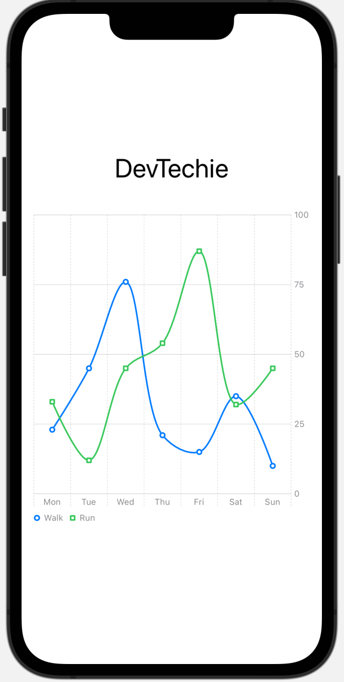
var body: some View {
VStack {
Text("DevTechie")
.font(.largeTitle)
Chart {
ForEach(workouts, id: \.workoutType) { series in
ForEach(series.data) { element in
LineMark(x: .value("Day", element.day), y: .value("Mins", element.minutes))
.interpolationMethod(.catmullRom)
}
.foregroundStyle(by: .value("WorkoutType", series.workoutType))
.symbol(by: .value("WorkoutType", series.workoutType))
}
}
.frame(height: 400)
.padding()
}
}
}
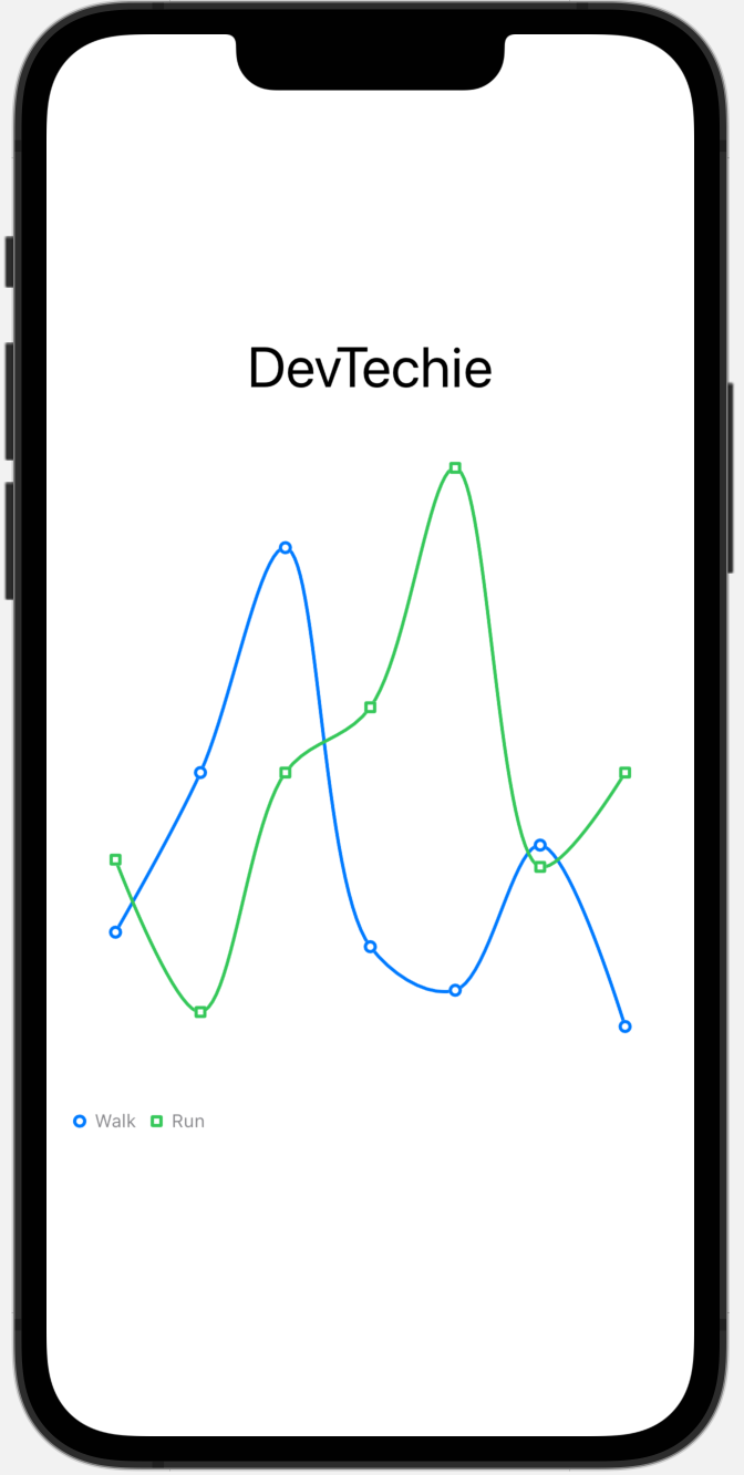
Axis Configurations
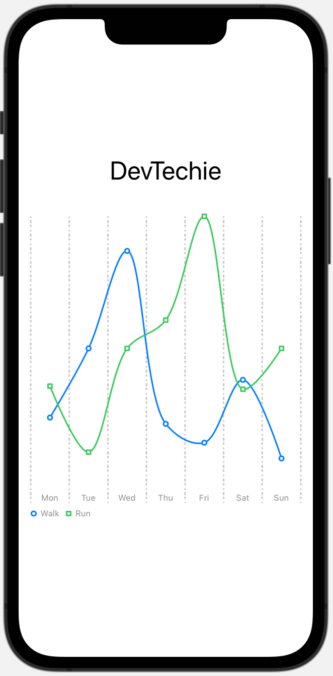
We can display charts without any plot line or axis information by hiding them with .chartXAxis(.hidden) and .chartYAxis(.hidden) modifiers.
struct ChartXAxisConfiguration: View {
    let workouts = [
        (workoutType: "Walk", data: Workout.walkData),
        (workoutType: "Run", data: Workout.runData)
    ]

    var body: some View {
        VStack {
            Text("DevTechie")
                .font(.largeTitle)
            Chart {
                ForEach(workouts, id: \.workoutType) { series in
                    ForEach(series.data) { element in
                        LineMark(x: .value("Day", element.day), y: .value("Mins", element.minutes))
                            .interpolationMethod(.catmullRom)
                    }
                    .foregroundStyle(by: .value("WorkoutType", series.workoutType))
                    .symbol(by: .value("WorkoutType", series.workoutType))
                }
            }
            .chartXAxis(.hidden)
            .chartYAxis(.hidden)
            .frame(height: 400)
            .padding()
        }
    }
}
Our chart looks like this now:
chartXAxis(content:) is an overload for chartXAxis modifier which sets the x axis for charts in the view. Trailing closure for chartXAxis is used to define various different settings for example: AxisMarks. AxisMarks is a group of visual marks that a chart draws to indicate the composition of a chart’s axes.
struct ChartXAxisConfiguration: View {
    let workouts = [
        (workoutType: "Walk", data: Workout.walkData),
        (workoutType: "Run", data: Workout.runData)
    ]

    var body: some View {
        VStack {
            Text("DevTechie")
                .font(.largeTitle)
            Chart {
                ForEach(workouts, id: \.workoutType) { series in
                    ForEach(series.data) { element in
                        LineMark(x: .value("Day", element.day), y: .value("Mins", element.minutes))
                            .interpolationMethod(.catmullRom)
                    }
                    .foregroundStyle(by: .value("WorkoutType", series.workoutType))
                    .symbol(by: .value("WorkoutType", series.workoutType))
                }
            }
            .chartXAxis(content: {
                AxisMarks(position: .top)
            })
            .chartYAxis(.hidden)
            .frame(height: 400)
            .padding()
        }
    }
}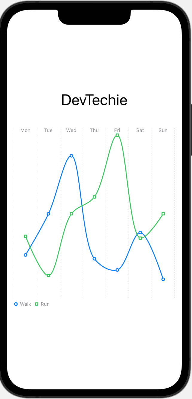
We can set AxisMarks to different positions.
AxisMarks(position: .leading)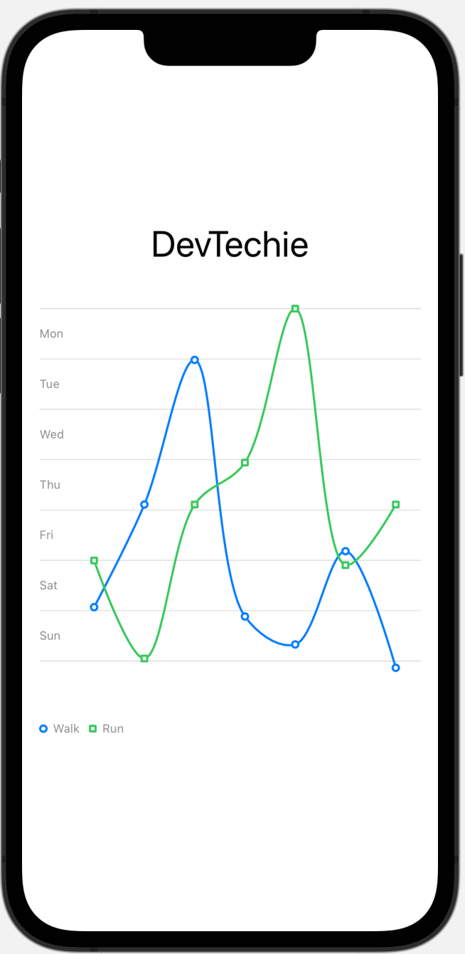
AxisMarks(position: .trailing)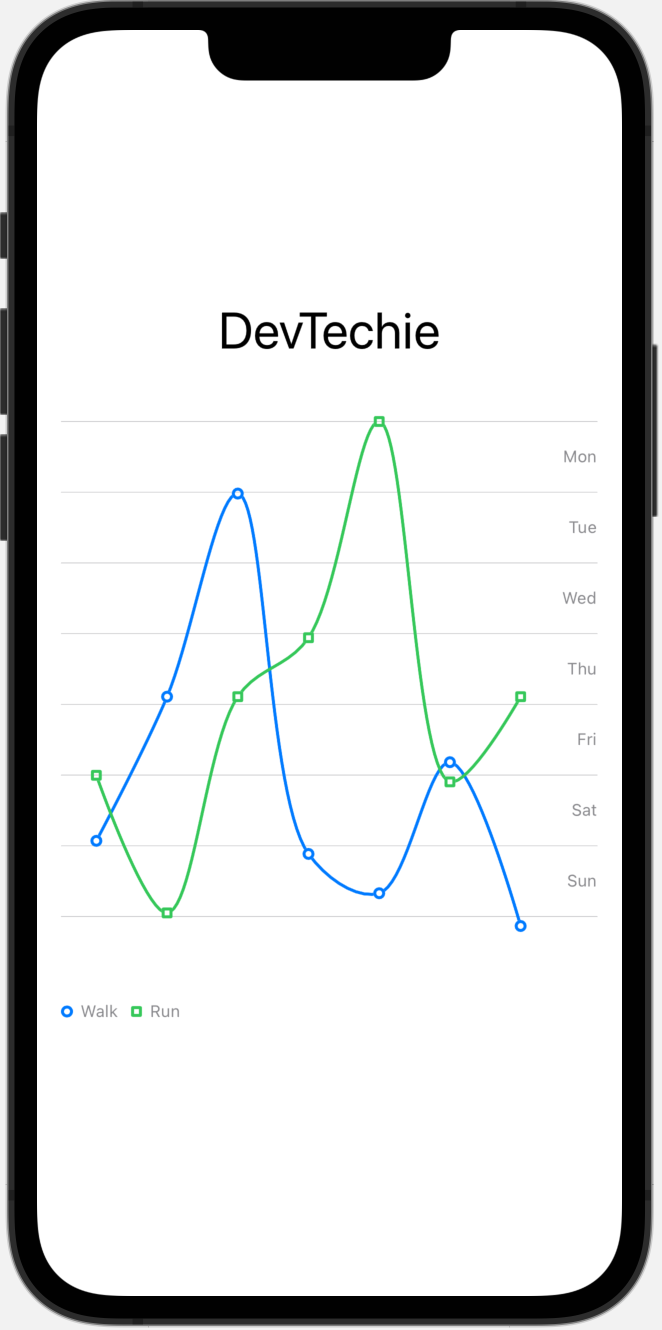
We can use StrokeStyle to style axis lines.
struct ChartXAxisConfiguration: View {
    let workouts = [
        (workoutType: "Walk", data: Workout.walkData),
        (workoutType: "Run", data: Workout.runData)
    ]

    var body: some View {
        VStack {
            Text("DevTechie")
                .font(.largeTitle)
            Chart {
                ForEach(workouts, id: \.workoutType) { series in
                    ForEach(series.data) { element in
                        LineMark(x: .value("Day", element.day), y: .value("Mins", element.minutes))
                            .interpolationMethod(.catmullRom)
                    }
                    .foregroundStyle(by: .value("WorkoutType", series.workoutType))
                    .symbol(by: .value("WorkoutType", series.workoutType))
                }
            }
            .chartXAxis(content: {
                AxisMarks(stroke: StrokeStyle(lineWidth: 2, dash: [2,3,4]))
            })
            .chartYAxis(.hidden)
            .frame(height: 400)
            .padding()
        }
    }
}
AxisGridLine
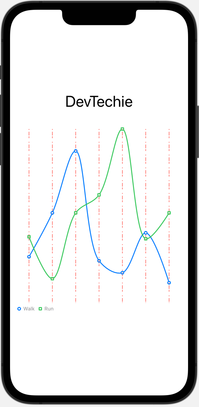
AxisGridLine is a line that a chart draws across its plot area to indicate a reference point along a particular axis. We can further customize axis grid lines by using AxisGridLine struct which is defined inside the AxisMark .
.chartXAxis(content: {
    AxisMarks {_ in
        AxisGridLine(
            centered: true,
            stroke: StrokeStyle(
                dash: [2, 4, 8]))
              .foregroundStyle(Color.red)
    }
})
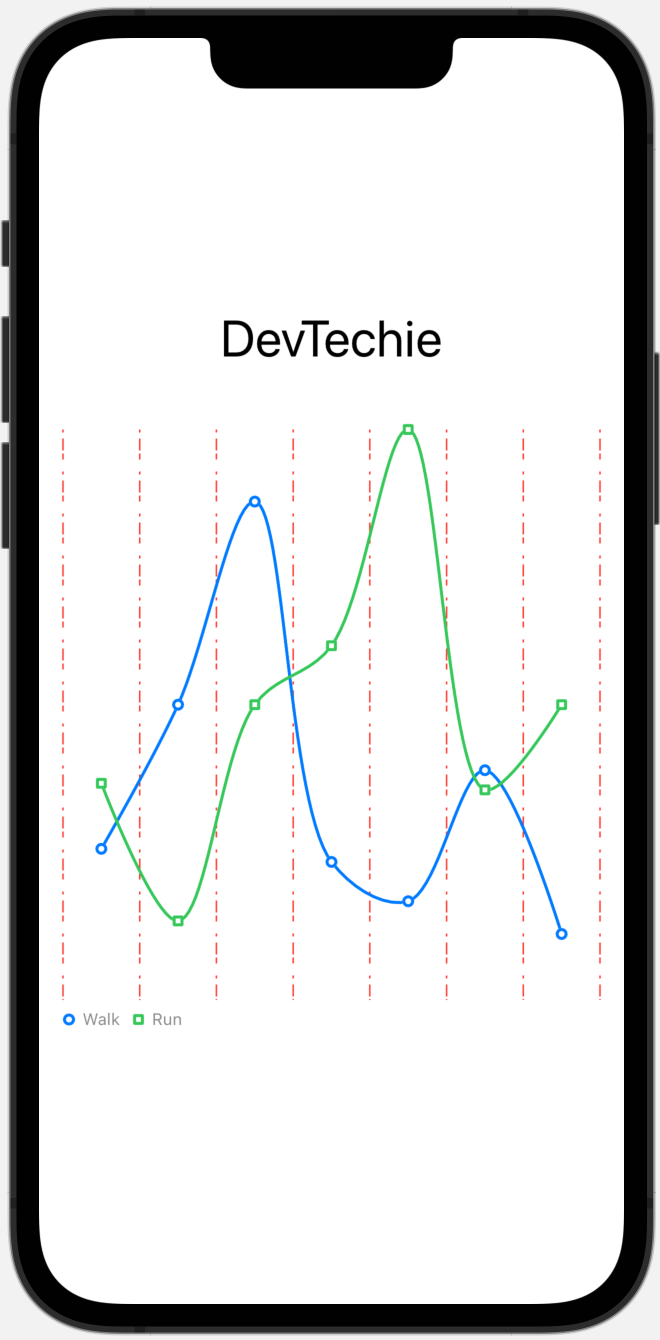
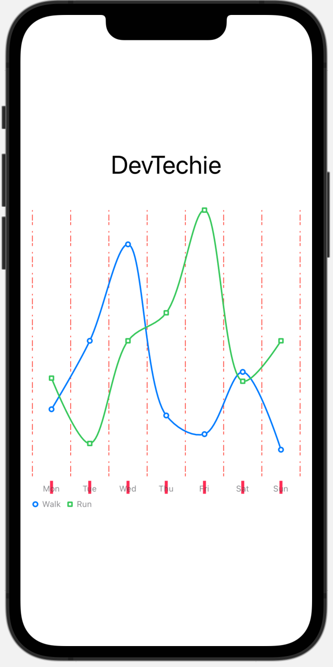
Centered parameter indicates whether to center the grid line between two axis values or not. Let’s set the value to false to see the difference.
.chartXAxis(content: {
    AxisMarks {_ in
        AxisGridLine(
            centered: false,
            stroke: StrokeStyle(
                dash: [2, 4, 8]))
              .foregroundStyle(Color.red)
    }
})
AxisValueLabel
AxisValueLabel is the label that describes the value for an axis mark. There are several options to configure axis value label.
centered determines whether to center the label between two axis values.
anchor sets the anchor point on the bounding box of the text element that attaches to the position.
multiLabelAlignment sets how labels along the axis are aligned with each other.
collisionResolution defines how labels that collide with others are resolved.
offsetsMarks determines whether to offset marks to accommodate for the space used by the label.
orientation sets the orientation of label.
horizontalSpacing defines the horizontal space of label.
verticalSpacing sets the vertical spacing of label.
Centered Label
AxisValueLabel(centered: false)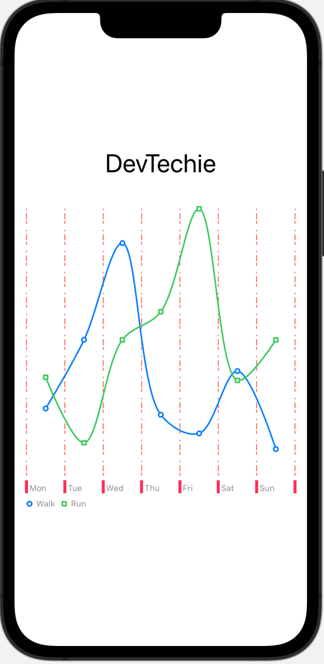
Default value for center is false.
AxisTick
AxisTick struct creates an axis tick with the given properties. It takes following parameters:
centered determines whether to center the grid line between two axis values.
length defines the length of tick.
stroke sets the style of stroke.
.chartXAxis(content: {
    AxisMarks {_ in
        AxisGridLine(
            centered: false,
            stroke: StrokeStyle(
                dash: [2, 4, 8]))
.foregroundStyle(Color.red)AxisTick(centered: true,
stroke: StrokeStyle(lineWidth: 4))
.foregroundStyle(Color.pink)AxisValueLabel()
}
})
Let’s set center to false, which is the default value for AxisTick.
AxisTick(centered: false,
         stroke: StrokeStyle(lineWidth: 4))
.foregroundStyle(Color.pink)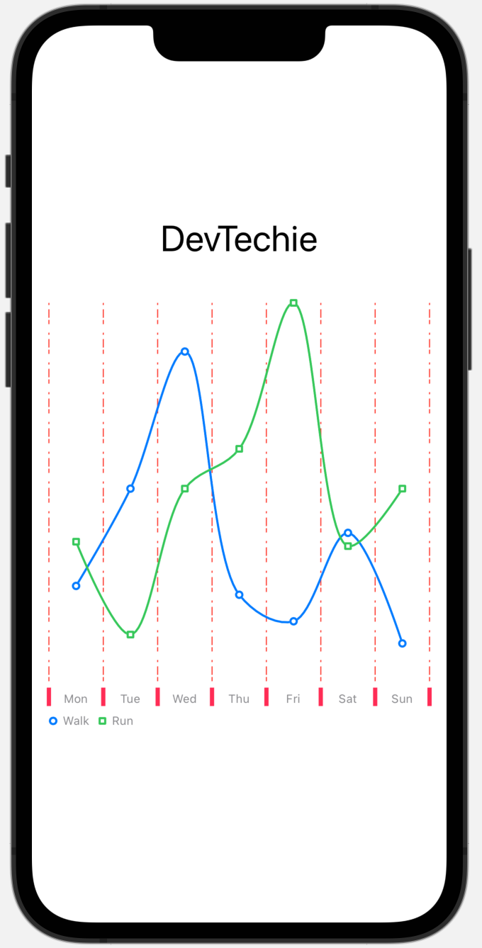
Label Customization
We can customize labels with the help of AxisValueLabel . Let’s add vertical spacing for AxisLabel:
AxisValueLabel(verticalSpacing: 20)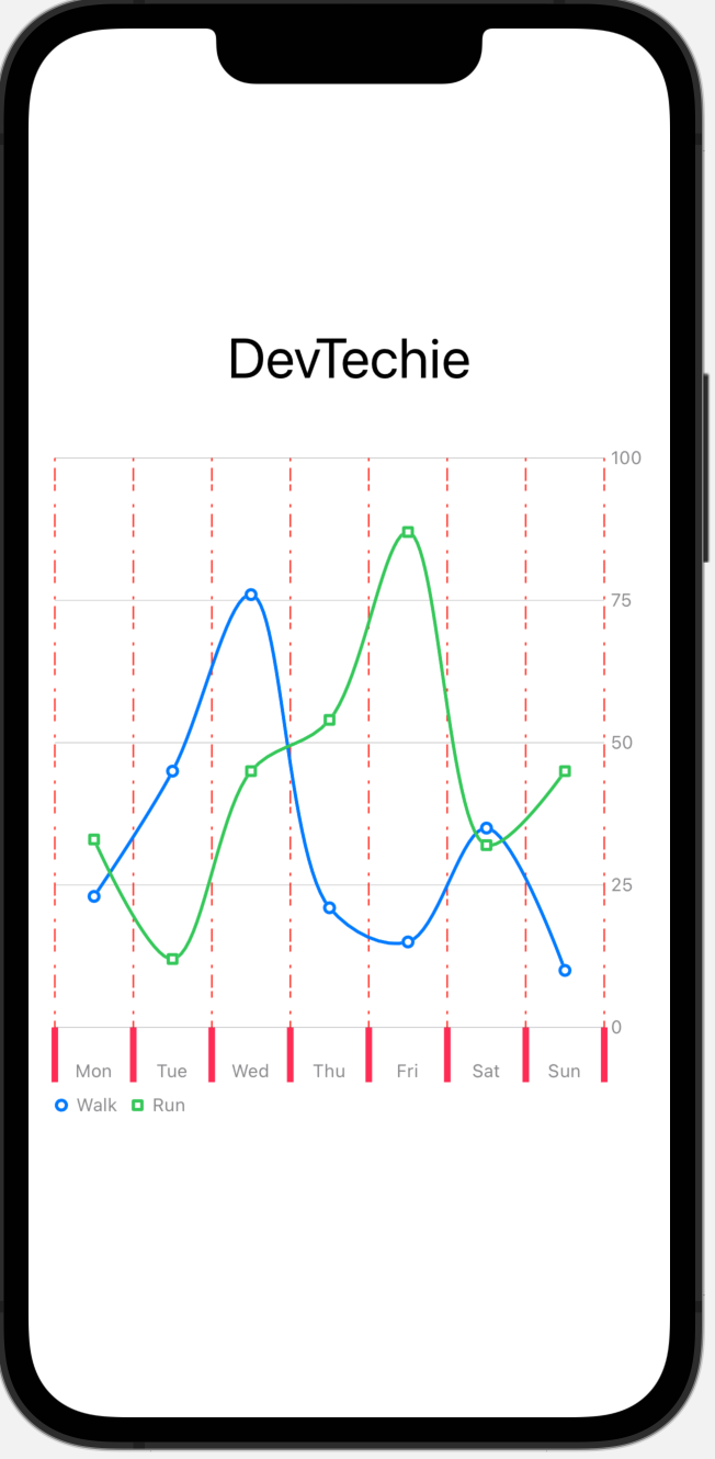
Label Customization
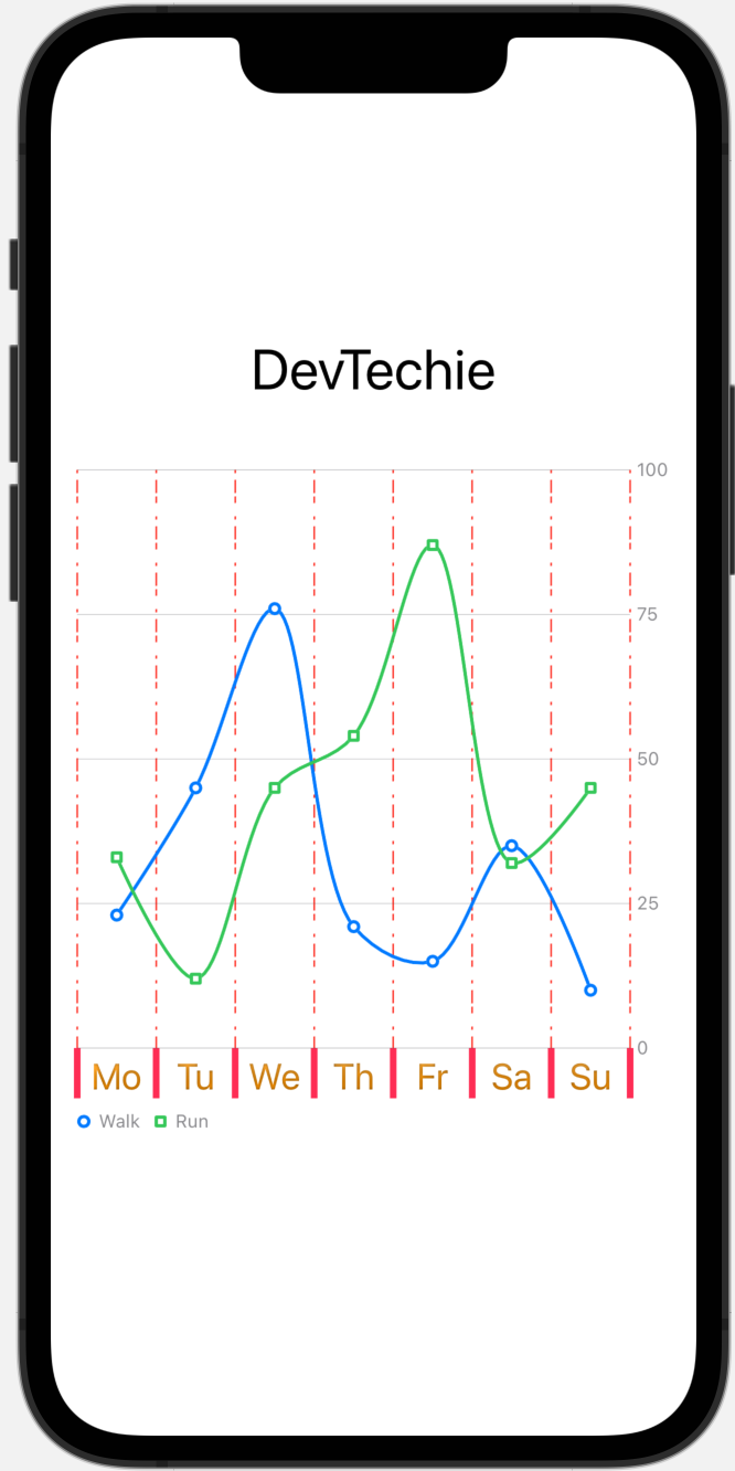
We can further customize label with our own values. AxisMark gives us value which can be used to gain access to the internal value of label.
Note: We will continue to use x-axis for our examples but same code can be used with y-axis
.chartXAxis(content: {
                AxisMarks { value in
                    AxisGridLine(
                        centered: false,
                        stroke: StrokeStyle(
                            dash: [2, 4, 8]))
.foregroundStyle(Color.red)AxisTick(centered: false,
stroke: StrokeStyle(lineWidth: 4))
.foregroundStyle(Color.pink)
AxisValueLabel {
if let month = value.as(String.self) {
Text(month.prefix(2))
.font(.title2)
.foregroundStyle(Color.orange.gradient.shadow(.inner(radius: 1)))
}
}}
})
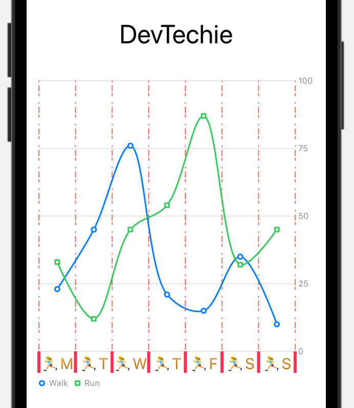
We can use emoji in the text as well, as shown below:
AxisValueLabel {
if let month = value.as(String.self) {
Text("🏃♀️" + month.prefix(1))
.font(.title3)
.foregroundStyle(Color.orange.gradient.shadow(.inner(radius: 1)))
}
}
With that we have reached the end of this article. Thank you once again for reading. Don’t forget to 👏 and follow 😍. Also subscribe our newsletter at https://www.devtechie.com


