
Native Accordions Are about to Land in Chrome
Write an accordion with the native HTML details element

Accordions are a pattern that is implemented by every big UI library (such as Material UI or Bootstrap). They are pretty standardized; if you use one of them, you should notice that they come with tab navigation and that you can open each individual item by pressing space. This contributes to the accessibility of the element. However, not every library meets these accessibility standards (Ant Design, for instance).
Finally, accordions make it to the native web, and we get rid of many obstacles we face today.
The details element
The HTML details element is the core of native accordions. Let’s take a look:
<details>
  <summary>Label</summary>
  <div>
    Text
  </div>
</details>
This will render an element that roughly looks like this:
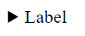
The element is closed by default (there’s an open attribute). In its closed state, it will only display the contents of the summary.
Now, if we put two of these elements next to each other, they will work independently. Meaning, I can open both at the same time:
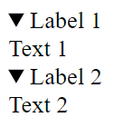
This behavior works across all modern web browsers.
Add the accordion behavior to the details element
But, of course, we are not there yet. The desired behavior would be to open these elements exclusively. Meaning only one of the items can be opened at the same time.
We can reach our goal by using the name attribute, very much like a group of radio buttons:
<details name="accordion-1">
  <summary>Label 1</summary>
  <div>
    Text 1
  </div>
</details>
<details name="accordion-1">
  <summary>Label 2</summary>
  <div>
    Text 2
  </div>
</details>
Now, these details elements are grouped, and we achieved the desired effect. But, unfortunately …
Anyways, if you are using the current version of Google Chrome, here’s a fiddle for you to play with:
How to style the HTML details element?
Of course, the details element looks nothing like anything you would want to put on your modern website. Luckily, it is possible to style newer elements, such as the details element.
In this case, the styling is very similar to list elements. If it is of any help to you, you can remember it like that: “Used like a radio, styled like a list.”
details > summary {
  list-style: none;
  cursor: pointer;
  background-color: yellow;
}

details {
  background-color: lightblue;
}
As you can see, you can get rid of the arrow next to the summary by using list-style: none; on the summary. Then, you can style the rest of the element to your liking.
Here’s a fiddle for you to play around with.
And there you have it, that’s an accessible native accordion element.
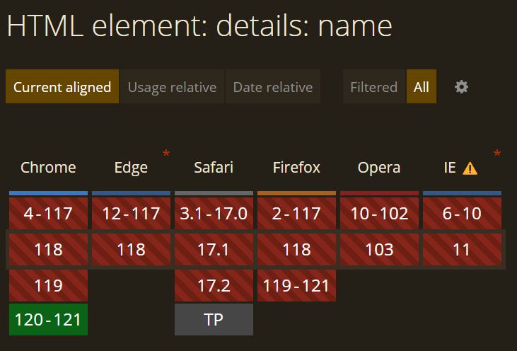
Of course, it’s currently not really usable due to the lack of browser support. As of now, it is only usable in Google Chrome version 120. I expect the feature to land in Safari 18, too.
That’s all, folks! Thank you for reading!
In Plain English
Thank you for being a part of our community! Before you go:
- Be sure to clap and follow the writer! 👏
- You can find even more content at PlainEnglish.io 🚀
- Sign up for our free weekly newsletter. 🗞️
- Follow us: Twitter(X), LinkedIn, YouTube, Discord.
- Check out our other platforms: Stackademic, CoFeed, Venture.


