
My Obsidian Setup (Part 16) — Charts
Ever wanted to include line charts, bar charts, doughnuts, pie, etc. in your notes? You may want to view a chart representation of your habits tracker or when you create notes. The Obsidian Charts plugin lets you include charts in your notes. You will also need Dataview to be able to query values. Let’s check how it’s done.

First, you need to install the Obsidian Charts Plugin.
Basic Usage
A code block of the type chart is used to generate a chart. The chart settings are set using YAML. The properties’ names are self-explanatory.
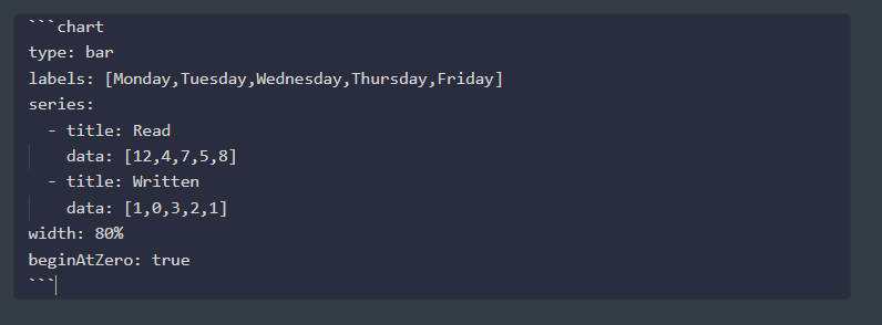
```chart
    type: ""
    labels: []
    series:
        - title: ""
        data: []
        - title: ""
        data: []
```
You can also use the graphical chart creator from the Command Palette, or even set a Hotkey to create simple charts. Just open the Command Palette and type chart.
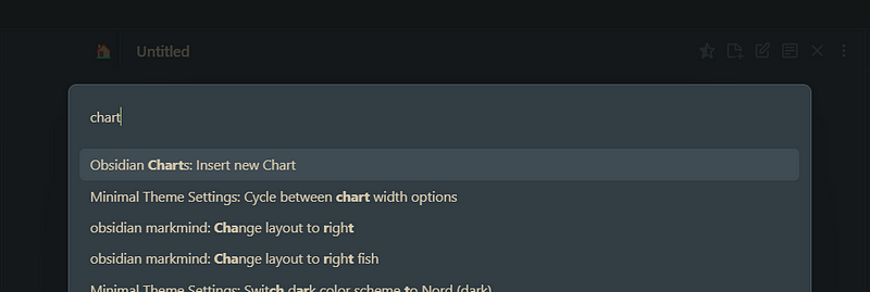
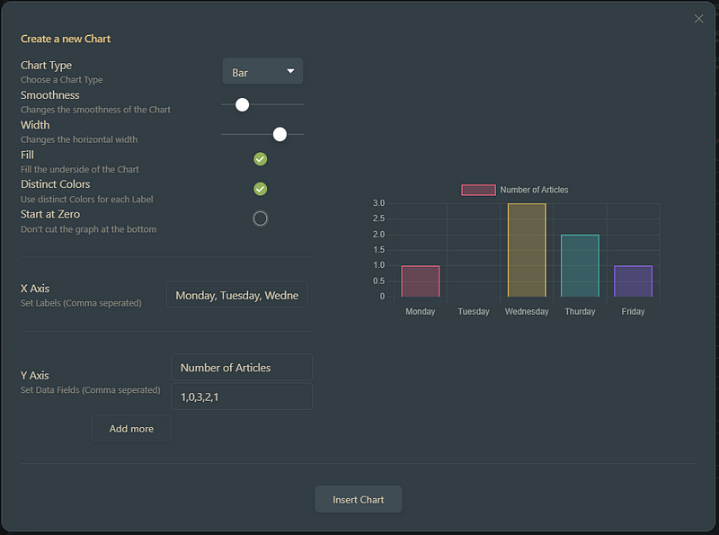
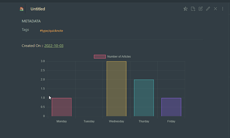
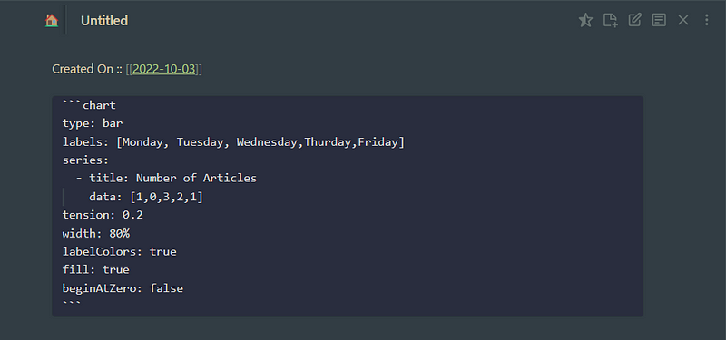
Chart Types
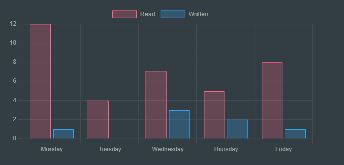
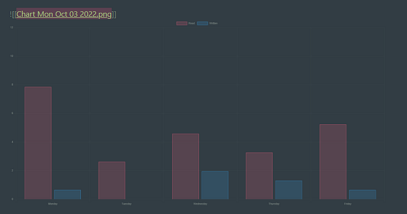
Bars
The bar chart was already shown above.
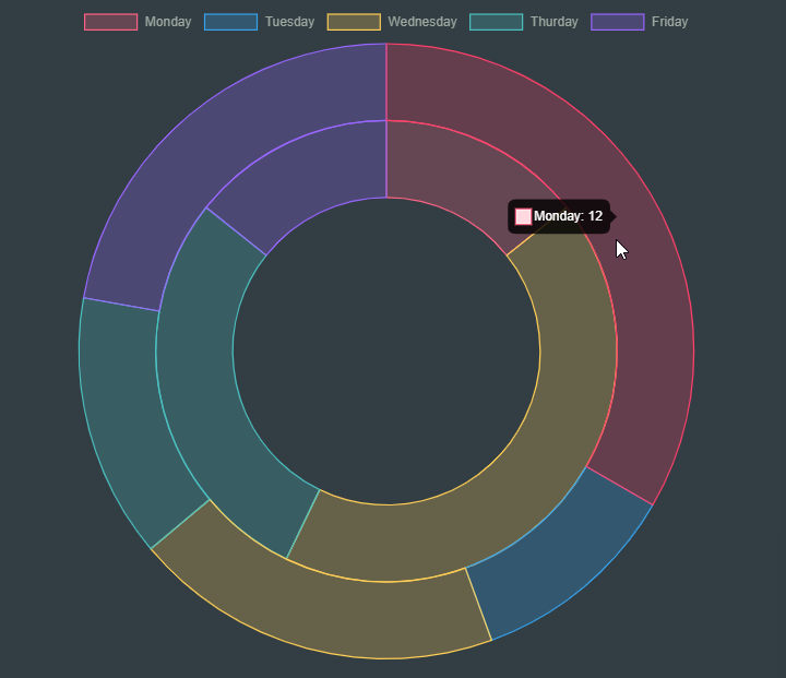
Pie
```chart
type: pie
labels: [Monday, Tuesday, Wednesday,Thurday,Friday]
series:
  - title: Read Articles
    data: [12,4,7,5,8]
  - title: Written Articles
    data: [1,0,3,2,1]
width: 80%
labelColors: true
```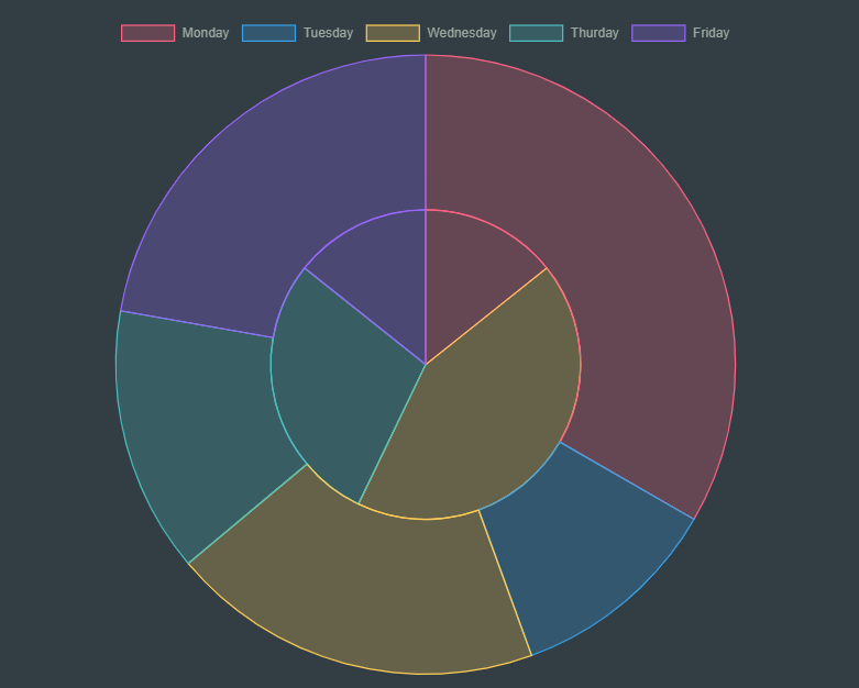
Doughnut
```chart
type: doughnut
labels: [Monday, Tuesday, Wednesday,Thurday,Friday]
series:
  - title: Read Articles
    data: [12,4,7,5,8]
  - title: Written Articles
    data: [1,0,3,2,1]
width: 80%
labelColors: true
```
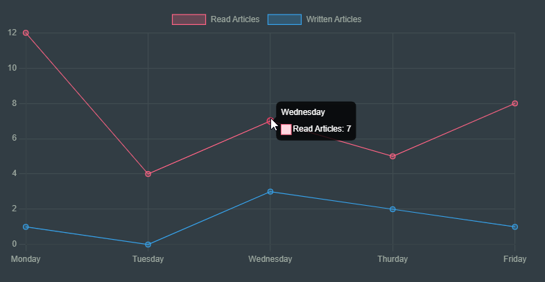
Line
```chart
type: line
labels: [Monday, Tuesday, Wednesday,Thurday,Friday]
series:
  - title: Read Articles
    data: [12,4,7,5,8]
  - title: Written Articles
    data: [1,0,3,2,1]
```
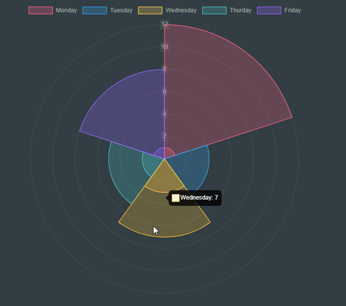
Polar Area
```chart
type: polarArea
labels: [Monday, Tuesday, Wednesday,Thurday,Friday]
series:
  - title: Read Articles
    data: [12,4,7,5,8]
  - title: Written Articles
    data: [1,0,3,2,1]
labelColors: true
width: 40%
```
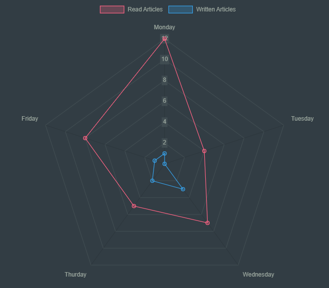
Radar
```chart
type: radar
labels: [Monday, Tuesday, Wednesday,Thurday,Friday]
series:
  - title: Read Articles
    data: [12,4,7,5,8]
  - title: Written Articles
    data: [1,0,3,2,1]
width: 80%
```
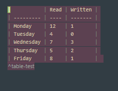
Create Chart From Table
We can create a chart from a table in the same or another note. Just add a Block ID (^name) to the table and the same id to your Chart codeblock.
```chart
type: line
id: table-test
width: 80%
```
| | Read | Written |
| --------- | ---- | ------- |
| Monday | 12 | 1 |
| Tuesday | 4 | 0 |
| Wednesday | 7 | 3 |
| Thursday | 5 | 2 |
| Friday | 8 | 1 |
^table-test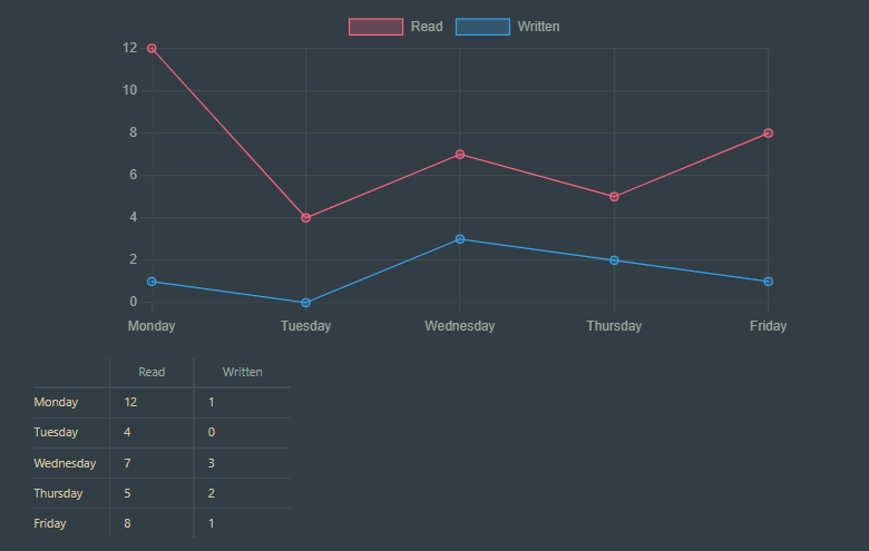
If you want to get the data from a table on a different note, also insert the note name in the file attribute.
For example, a table in a note with the name data-note.md :
```chart
type: line
id: table-test
file: data-note
width: 80%
```
Replace Table with Chart
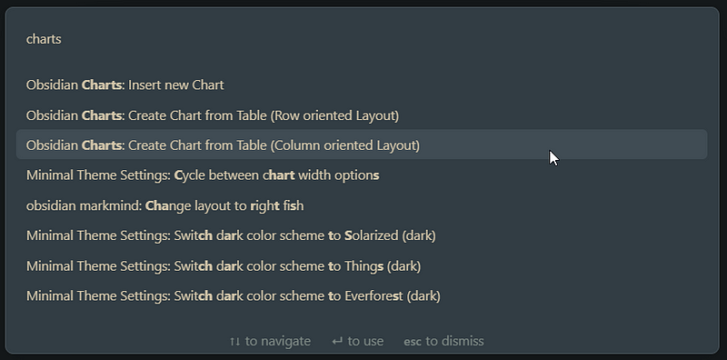
We can also transform a table into a chart. Just select the table markdown, access Command Palette, a select Obsidian Charts: Create Chart from Table:
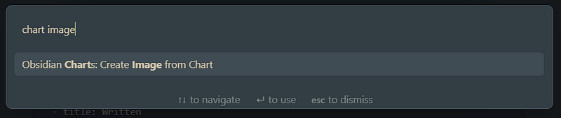
Convert Charts to Images
Converting a chart to an image may also be handy. Select the chart codeblock, access Command Palette and select Obsidian Charts: Create Image from Chart:
Full Settings
width— set the width of any Chartfill— is used in Line Charts to fill the Area under the TracesspanGaps— fill in missing Datapointstension— is used in Line Charts to set the tension of the Traces to the given pointsbeginAtZero— set the Chart to begin at 0legend—toggle the display of the legendlegendPosition— where the legend will be displayedindexAxis— sets bar or lines chart orientation horizontal or verticalstacked— sets bar and line graphs stackedTitle— usexTitle: “Title here” oryTitle: “Title here” to add a Title to the specified AxisReverse— reverse the axis it is applied to (xReverseoryReverse)MinandMax— min and max of the respecitve axis (xMax,yMinorrMaxfor radar and polar area)DisplayandTickDisplay— toggle the visibility of the axis (Display) or the ticks of the axis (TickDisplay)time— format as day, week, month, year, etctransparency— set transparency of the inner color of your chart’s elements
Advanced
If you want to do more advanced things, you can use the Dataview plugin.
You will also need to understand how DataviewJS works (check here).
If you want to use Charts with Dataview, check this example:
test:: First Test
mark:: 6
```dataviewjs
const data = dv.current()const chartData = {
type: 'bar',
data: {
labels: [data.test],
datasets: [{
label: 'Grades',
data: [data.mark],
backgroundColor: [
'rgba(255, 99, 132, 0.2)'
],
borderColor: [
'rgba(255, 99, 132, 1)'
],
borderWidth: 1
}]
}
}window.renderChart(chartData, this.container);
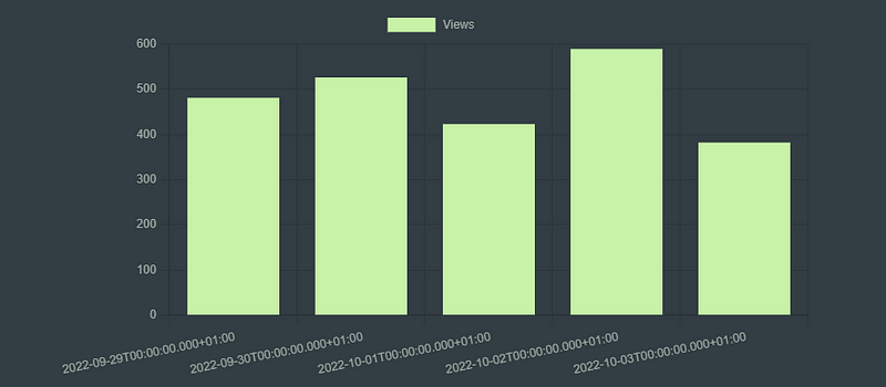
```Example: Chart For Your Medium Views
Let’s create a chart from a DataView query. Suppose we have a field on our daily notes called medium-viewswith data that we get from the stats page of Medium.
We could use the following code to generate the chart:
```dataviewjs
const rawData = await dv.query('TABLE file.name, full-date, Medium-Views FROM #daily-note WHERE Medium-Views SORT file.name');const rows = rawData.value.values;const chartData = {
type: 'bar',
data: {
labels: rows.map(x => x[2]),
datasets: [
{label: 'Views', data: rows.map(x => x[3]), backgroundColor: ['#C7F2A7']}
],
},
}window.renderChart(chartData, this.container);```
Now you are ready to create charts in your Obsidian Vault using Obsidian Charts. Please read the documentation if you need more info.
Stay tuned for more Obsidian articles. Meanwhile, check out the previous parts of the My Obsidian Setup series.


