
My First Week of the #30DayMapChallange
My personal take on the first week of the #30DayMapChallange, a daily social challenge aimed at designing thematic maps every day in November.
Since 2019, the Geographic Information System (GIS) and spatial analytics community have been quite busy each November — thanks to a fun challenge called the #30DayMapChallange. Each year, this challenge has a thematic schedule, proposing a topic that should be the primary directive for map visualisation to be posted on that particular day. While the issues certainly mean a constraint, they also help participants to find mutual interest, share data sources, and express individual styles visually and technologically.
Here, I would like to briefly overview my first week of this challenge, detailing and showing the different maps I created — usually in Python.
In this article, all images were created by the author.
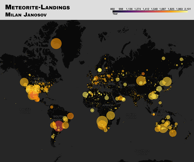
Day 1 — Points
The first day of this challange usually goes for the most simple geometry of them all — points. To create my POI map, I used NASA’s Open Data Portal’s Meteorite Landing data. This dataset contains about 40k observations, which, when placed on a map, show a remarkable correlation with population densities. So either meteorites target inhabited lands, or we have more data on meteorites where there are more people to find them, right?
To create this (interactive) map, I used Python, in particular, Folium.
On the visualization, I sized each dot marker, corresponding to one meteorite, based on its recorded mass in grams, which ranges from 0.01 g to 60,000 kg or 60 tons. By the way, this 60-ton giant Hoba and was found in 1920 in Grootfonteinn, Namibia. Then, I coloured each marker based on the time of its discovery. Fun fact: the first recorded meteorite, Nōgata (472g), was found in Fukuoka Prefecture, Japan, in 861, shortly after the impact. After this observation, there is nothing in the data for centuries in the database. Then, finally, Elbogen came in 1399 (107000.0), and then, Rivolta de Bassi (103.3g) in 1490 and Ensisheim (127000.0g) in 1491. Looking at later periods in the data set, it turns out that 35% of the meteorites were recorded after 2000 and 98% after 1899.
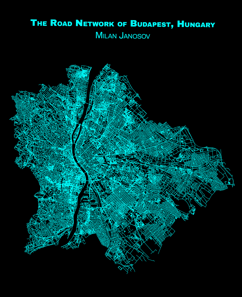
Day 2 — Lines
After Points, naturally, comes lines (or LineStrings, if I want to be specific). As a network scientist and a geospatial data scientist, my choice was obvious: visualise the road network of my home town, Budapest, using data collected from OpenStreetMap via the package OSMNx.
Fun fact about this network: it has 115,539 nodes and 316,096 edges, while the length of all road segments measures 1,879 km!
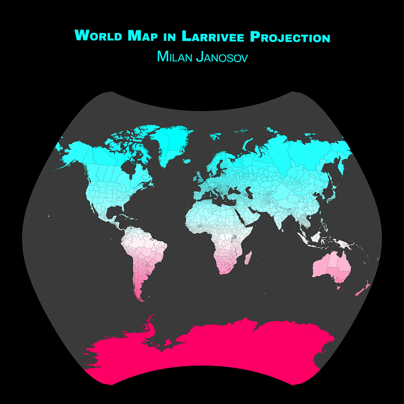
Day 3 — Polygons
First points, then lines — and now, polygons! On this map, I took every country of the world as a single polygon building on Natural Earth data. To add a nice gradient colouring, I coloured each country based on its distance from the equator. All computations were done in Python, and visuals were done using Matplotlib.
The map has a rather odd shape because I used the so-called Larrivee Projection, which was developed by Léo Larrivée in 1988 for the Canadian. You can learn more about different map projections here.
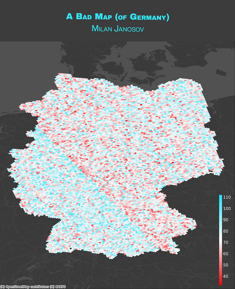
Day 4 — A bad map
The fourth day of the map challenge was unusual — while everybody was busy creating the best maps of their lives, we had to develop a bad one. However, the way it was terrible was open to interpretation.
To ensure mine was bad enough, I did some maths to arrive at a nonsense, absolutely bad map of Germany. First, I downloaded Germany’s admin boundaries from OpenStreetMap using the OSMNx package. Second, split it into hexagons using Uber’s H3 library, using hexagon level 6, resulting in 12122 hexagons. Third, for each hexagon, I computed its centroid’s long and lat coordinates (using epsg:4326), until 14 decimals. Then, I added each digit in both the long and lat coordinates, arriving at my ‘score’ that is used to colour each hexagon cell. Voile! Senseless!
Day 5 — Analog map
After four days of intense data wrangling, day 5 drove us out to the wilderness and made us build analogue maps. So, as we were still pretty close to Halloween, I decided to combine it with the map challenge and carve the map of Budapest on it.
The scary part is a bit hidden — I am using EPSG:23700, the local projection system of Hungary, which looks excellent with Budapest but is most likely terrible when used on the geometries of any other country. Try it if you dare!

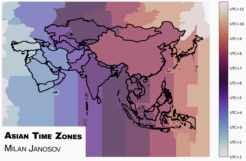
Day 6 — Asia
For day 6, I returned to the previously introduced Natural Earth database and downloaded their GIS file containing the global time zones. As day six was about Asia, I had to do some filtering to arrive at the 48 Asian countries, after which I arrived at the following map — using Python and Matplotlib.
Day 7 — Navigation
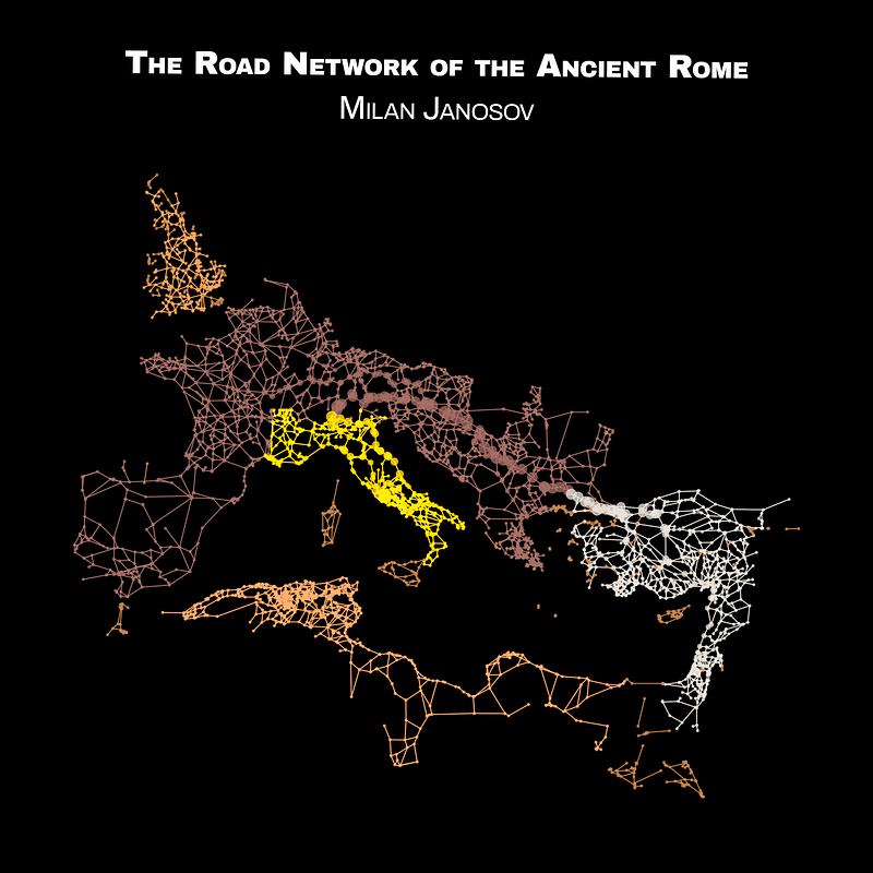
I recently came across an exciting dataset titled Roman Road Network (version 2008) on Harvard’s Dataverse: the historical road networks of the Roman Empire in a perfect GIS format. I turned it into a network analytics project published on Towards Data Science. As this project showed, indeed, all the roads led to Rome back in the day; I believe that this is a — relatively simple but still — navigational map, steering everyone to the centre who sets foot on any of these roads.
This was the summary of my first week doing the #30DayMapChallange — three more weeks to go, so get ready for many more maps to come! Now, also with video and code tutorials, on my Patreon channel as well.


