
Multi-Dimension Visualization in Python Part I
Data visualization helps us to explore and review data easily. It is much better than a table or a long long paper. Most of time the visualization work is limited to 2-D. In this article, I am going to introduce how to plot and explore multi-dimension data (1-D to 6-D).
Firstly import the libraries we need:
import pandas as pd
import matplotlib.pyplot as plt
from mpl_toolkits.mplot3d import Axes3D
import matplotlib as mpl
import numpy as np
import seaborn as sns
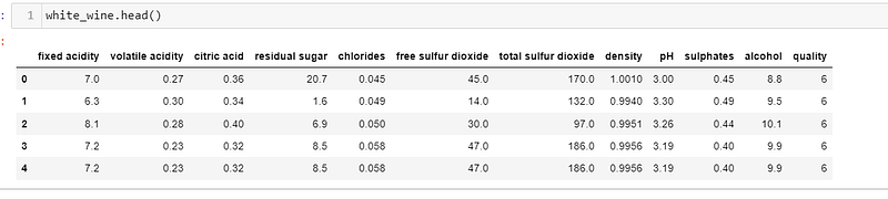
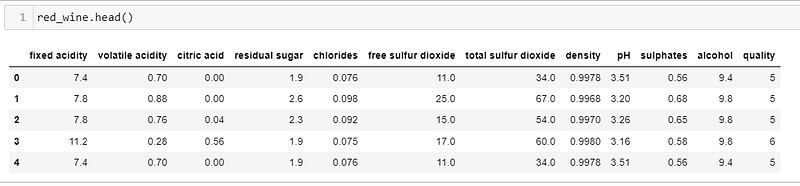
%matplotlib inlineHere we use winequanlity dataset as an example: https://archive.ics.uci.edu/ml/machine-learning-databases/wine-quality/
Before exploring the data, we do some manipulation:
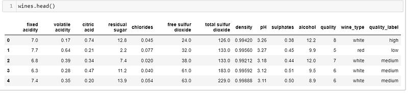
# store wine type as an attribute
red_wine['wine_type'] = 'red'
white_wine['wine_type'] = 'white'

# bucket wine quality scores into qualitative quality labels
red_wine['quality_label'] = red_wine['quality'].apply(lambda value: 'low'
                                                          if value <= 5 else 'medium'
                                                              if value <= 7 else 'high')
red_wine['quality_label'] = pd.Categorical(red_wine['quality_label'],
                                           categories=['low', 'medium', 'high'])
white_wine['quality_label'] = white_wine['quality'].apply(lambda value: 'low'
                                                              if value <= 5 else 'medium'
                                                                  if value <= 7 else 'high')
white_wine['quality_label'] = pd.Categorical(white_wine['quality_label'],
                                             categories=['low', 'medium', 'high'])

# union red and white wine datasets
wines = pd.concat([red_wine, white_wine])

# re-shuffle records just to randomize data points
wines = wines.sample(frac=1, random_state=42).reset_index(drop=True)
We concatenate both red and white wine to create a single wine dataset, and create a feature as “quality_label”.
- 1-D visualization
To display the distribution for all the attributes, Histogram is the best choice:
wines.hist(bins=15, color='steelblue', edgecolor='black', linewidth=1.0,
           xlabelsize=8, ylabelsize=8, grid=False)
plt.tight_layout(rect=(0, 0, 1.2, 1.2)) 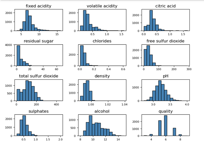
It is a good idea for exploring all the attributes. Further more, let’s see another option for a continuous attribute:
# Histogram
fig = plt.figure(figsize = (6,4))
title = fig.suptitle("Sulphates Content in Wine", fontsize=14)
fig.subplots_adjust(top=0.85, wspace=0.3)

ax = fig.add_subplot(1,1, 1)
ax.set_xlabel("Sulphates")
ax.set_ylabel("Frequency")
ax.text(1.2, 800, r'$\mu$='+str(round(wines['sulphates'].mean(),2)),
         fontsize=12)
freq, bins, patches = ax.hist(wines['sulphates'], color='steelblue', bins=15,
                                    edgecolor='black', linewidth=1)


# Density Plot
fig = plt.figure(figsize = (6, 4))
title = fig.suptitle("Sulphates Content in Wine", fontsize=14)
fig.subplots_adjust(top=0.85, wspace=0.3)

ax1 = fig.add_subplot(1,1, 1)
ax1.set_xlabel("Sulphates")
ax1.set_ylabel("Frequency")
sns.kdeplot(wines['sulphates'], ax=ax1, shade=True, color='steelblue')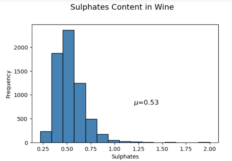
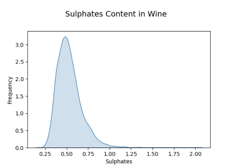
We can see that the distribution of sulphates is right skew.
For a discrete attribute, a Histogram usually is the best one. Sometimes we can use a pie chart:
fig = plt.figure(figsize = (6, 4))
title = fig.suptitle("Wine Quality Frequency", fontsize=14)
fig.subplots_adjust(top=0.85, wspace=0.3)

ax1 = fig.add_subplot(1,1, 1)
ax1.set_xlabel("Quality")
ax1.set_ylabel("Frequency")
ax1.pie(wines.groupby('quality').count()['quality_label'],labels=wines.groupby('quality').count().index)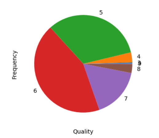
2. 2-D visualization
2-D visualization is the most commonly used method.
Usually we use heatmap to display the correlations between attributes:
# Correlation Matrix Heatmap
f, ax = plt.subplots(figsize=(10, 6))
corr = wines.corr()
hm = sns.heatmap(round(corr,2), annot=True, ax=ax, cmap="coolwarm",fmt='.2f',
                 linewidths=.05)
f.subplots_adjust(top=0.93)
t= f.suptitle('Wine Attributes Correlation Heatmap', fontsize=14)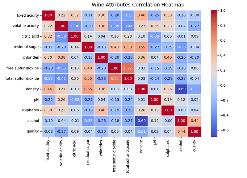
For the specific attributes, we can use pairplot to see their relationship:
specific_atts=['density','residual sugar','total sulfur dioxide','fixed acidity']

sns.pairplot(wines[specific_atts],diag_kind='kde')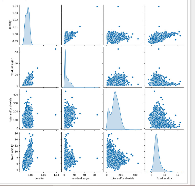
Or we can use parallel coordinates to display the relationship between categories:
specific_atts=specific_atts+['wine_type']

pd.plotting.parallel_coordinates(wines[specific_atts],'wine_type')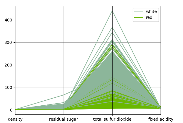
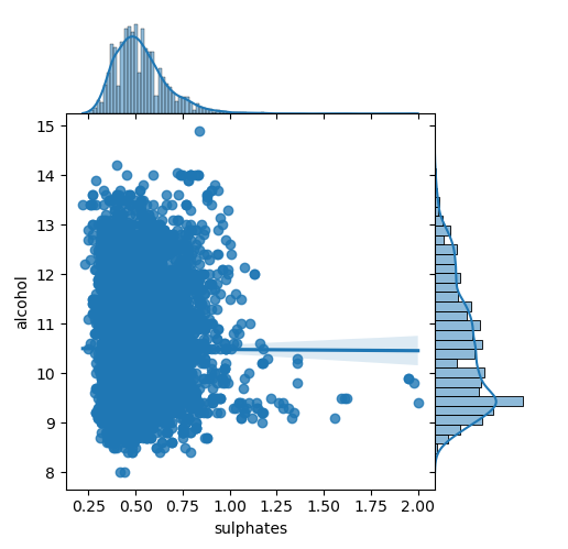
For 2 continuous attributes, scatter plot and joint plot are the best options to see the relationship and distributions.
# Scatter Plot
plt.scatter(wines['sulphates'], wines['alcohol'],
            alpha=0.4, edgecolors='w')

plt.xlabel('Sulphates')
plt.ylabel('Alcohol')
plt.title('Wine Sulphates - Alcohol Content',y=1.05)


# Joint Plot
jp = sns.jointplot(x='sulphates', y='alcohol', data=wines,
                   kind='reg', space=0, size=5, ratio=4)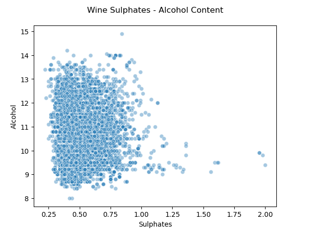
But for the 2 discrete attributes, we have to choose another type— bar chart:
# Multi-bar Plot
cp = sns.countplot(x="quality", hue="wine_type", data=wines,
                   palette={"red": "#FF9999", "white": "#FFE888"})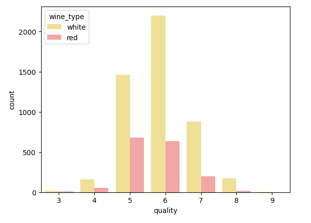
For the mixed attributes, multi-histograms are easy to use:
# Using multiple Histograms
g = sns.FacetGrid(wines, hue='wine_type', palette={"red": "r", "white": "y"},size=4)
g.map(sns.distplot, 'sulphates', kde=False, bins=15, ax=ax).add_legend(title='Wine Type')
g.fig.suptitle("Sulphates Content in Wine", fontsize=14)
g.set_axis_labels('Sulphates','Frequency')
g.fig.subplots_adjust(top=0.85, wspace=0.3)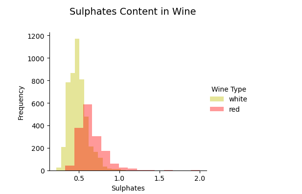
Further more, box plots and violin plots are used for see the outliners and kernels respectively:
# Box Plots
f, (ax) = plt.subplots(1, 1, figsize=(12, 4))
f.suptitle('Wine Quality - Alcohol Content', fontsize=14)

sns.boxplot(x="quality", y="alcohol", data=wines,  ax=ax)
ax.set_xlabel("Wine Quality",size = 12,alpha=0.8)
ax.set_ylabel("Wine Alcohol %",size = 12,alpha=0.8)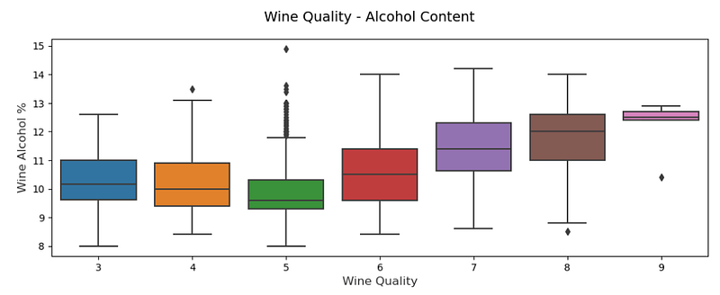
# Violin Plots
f, (ax) = plt.subplots(1, 1, figsize=(12, 4))
f.suptitle('Wine Quality - Sulphates Content', fontsize=14)

sns.violinplot(x="quality", y="sulphates", data=wines,  ax=ax)
ax.set_xlabel("Wine Quality",size = 12,alpha=0.8)
ax.set_ylabel("Wine Sulphates",size = 12,alpha=0.8)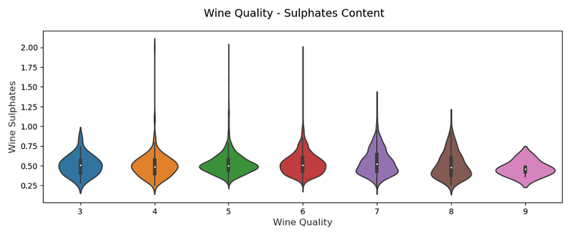
3. 3-D visualization
The 3rd dimension usually is the categorical attribute, displaying by different colors like “hue” parameter in Seaborn:
# Scatter Plot with Hue for visualizing data in 3-D
cols = ['density', 'residual sugar', 'total sulfur dioxide', 'fixed acidity', 'wine_type']
pp = sns.pairplot(wines[cols], hue='wine_type', size=1.8, aspect=1.8,
                  palette={"red": "#FF9999", "white": "#FFE888"},
                  plot_kws=dict(edgecolor="black", linewidth=0.5))
fig = pp.fig
fig.subplots_adjust(top=0.93, wspace=0.3)
t = fig.suptitle('Wine Attributes Pairwise Plots', fontsize=14)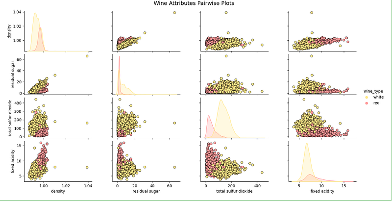
For 3 continuous attributes, we can use space’s 3-D scatter plot with x, y, z axis:
# Visualizing 3-D numeric data with Scatter Plots
# length, breadth and depth
fig = plt.figure(figsize=(8, 6))
ax = fig.add_subplot(111, projection='3d')

xs = wines['residual sugar']
ys = wines['fixed acidity']
zs = wines['alcohol']
ax.scatter(xs, ys, zs, s=50, alpha=0.6, edgecolors='w')

ax.set_xlabel('Residual Sugar')
ax.set_ylabel('Fixed Acidity')
ax.set_zlabel('Alcohol')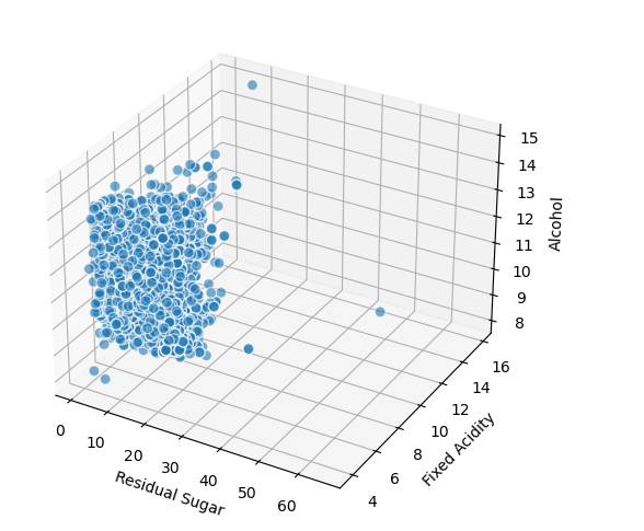
Sometimes the xyz style maybe not the best, we can use size as the 3rd dimension with a bubble chart:
# Visualizing 3-D numeric data with a bubble chart
# length, breadth and size
plt.scatter(wines['fixed acidity'], wines['alcohol'], s=wines['residual sugar']*25,
            alpha=0.4, edgecolors='w')

plt.xlabel('Fixed Acidity')
plt.ylabel('Alcohol')
plt.title('Wine Alcohol Content - Fixed Acidity - Residual Sugar',y=1.05)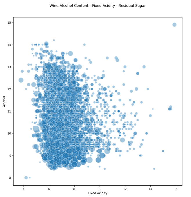
For 3 discrete attributes, subplots are the easiest way:
# Visualizing 3-D categorical data using bar plots
# leveraging the concepts of hue and facets
fc = sns.factorplot(x="quality", hue="wine_type", col="quality_label",
                    data=wines, kind="count",
                    palette={"red": "#FF9999", "white": "#FFE888"})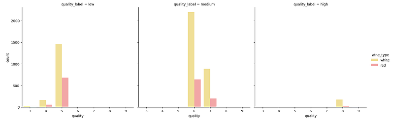
For mixed attributes, categorical colors will be the 3rd dimension:
# Visualizing 3-D mix data using scatter plots
# leveraging the concepts of hue for categorical dimension
jp = sns.pairplot(wines, x_vars=["sulphates"], y_vars=["alcohol"], size=4.5,
hue="wine_type", palette={"red": "#FF9999", "white": "#FFE888"},
plot_kws=dict(edgecolor="k", linewidth=0.5))
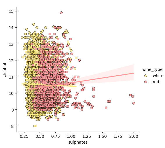
# we can also view relationships\correlations as needed
lp = sns.lmplot(x='sulphates', y='alcohol', hue='wine_type',
palette={"red": "#FF9999", "white": "#FFE888"},
data=wines, fit_reg=True, legend=True,
scatter_kws=dict(edgecolor="k", linewidth=0.5)) 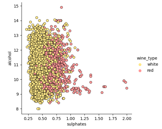
Instead, KDE can be used as well:
# Visualizing 3-D mix data using kernel density plots
# leveraging the concepts of hue for categorical dimension
ax = sns.kdeplot(white_wine['sulphates'], white_wine['alcohol'],
                  cmap="YlOrBr", shade=True, shade_lowest=False)
ax = sns.kdeplot(red_wine['sulphates'], red_wine['alcohol'],
                  cmap="Reds", shade=True, shade_lowest=False)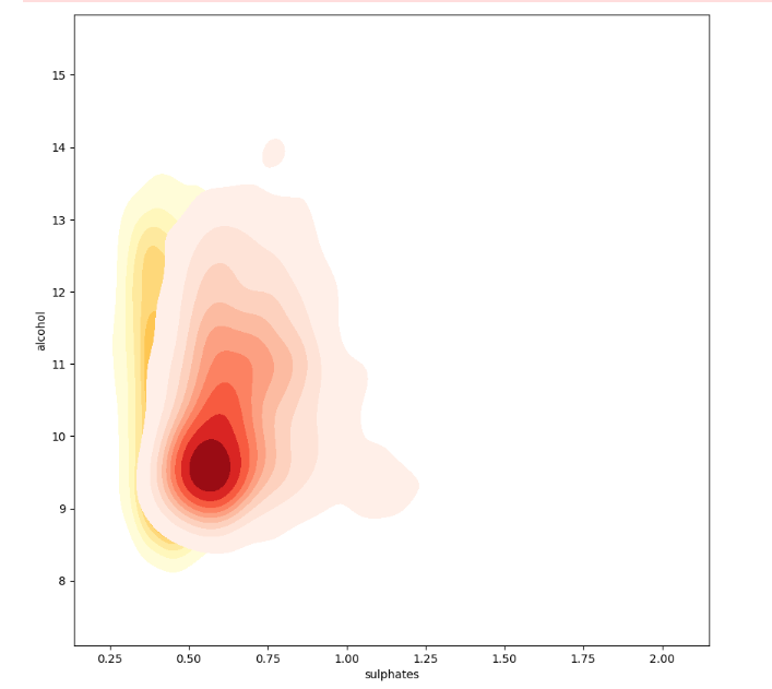
From the above, we can see red wines have more sulfate than white wines.
Also, box plots and violin plots sometimes are used in 3-D subplots:
# Visualizing 3-D mix data using violin plots
# leveraging the concepts of hue and axes for > 1 categorical dimensions
f, (ax1, ax2) = plt.subplots(1, 2, figsize=(14, 4))
f.suptitle('Wine Type - Quality - Acidity', fontsize=14)

sns.violinplot(x="quality", y="volatile acidity",
               data=wines, inner="quart", linewidth=1.3,ax=ax1)
ax1.set_xlabel("Wine Quality",size = 12,alpha=0.8)
ax1.set_ylabel("Wine Volatile Acidity",size = 12,alpha=0.8)

sns.violinplot(x="quality", y="volatile acidity", hue="wine_type",
               data=wines, split=True, inner="quart", linewidth=1.3,
               palette={"red": "#FF9999", "white": "white"}, ax=ax2)
ax2.set_xlabel("Wine Quality",size = 12,alpha=0.8)
ax2.set_ylabel("Wine Volatile Acidity",size = 12,alpha=0.8)
l = plt.legend(loc='upper right', title='Wine Type') 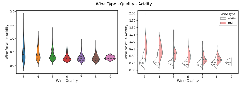
# Visualizing 3-D mix data using box plots
# leveraging the concepts of hue and axes for > 1 categorical dimensions
f, (ax1, ax2) = plt.subplots(1, 2, figsize=(14, 4))
f.suptitle('Wine Type - Quality - Alcohol Content', fontsize=14)

sns.boxplot(x="quality", y="alcohol", hue="wine_type",
               data=wines, palette={"red": "#FF9999", "white": "white"}, ax=ax1)
ax1.set_xlabel("Wine Quality",size = 12,alpha=0.8)
ax1.set_ylabel("Wine Alcohol %",size = 12,alpha=0.8)

sns.boxplot(x="quality_label", y="alcohol", hue="wine_type",
               data=wines, palette={"red": "#FF9999", "white": "white"}, ax=ax2)
ax2.set_xlabel("Wine Quality Class",size = 12,alpha=0.8)
ax2.set_ylabel("Wine Alcohol %",size = 12,alpha=0.8)
l = plt.legend(loc='best', title='Wine Type') 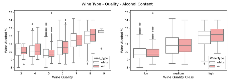
To be continued…
Thank you for reading.


