MOVIE POSTERS: HORROR
Throughout cinematic history, there has been an ongoing quest to find the best way to communicate on the poster both the genre and the essence of the story. Saul Bass, Drew Struzan or Neil Kellerhouse are some of the great designers who have designed posters for personalities such as Alfred Hitchcock, Steven Spielberg or David Fincher. To achieve this, different resources have been used through image, typography or color. As we know, the main function of a well-designed poster is to convey the message of the story in an image and convince the viewer to watch the film.
To create a powerful poster it is very important to look back and be inspired by those who achieved a major impact on the public
Next, we travel back in time to know the evolution of the posters of one of the most popular genres: horror.
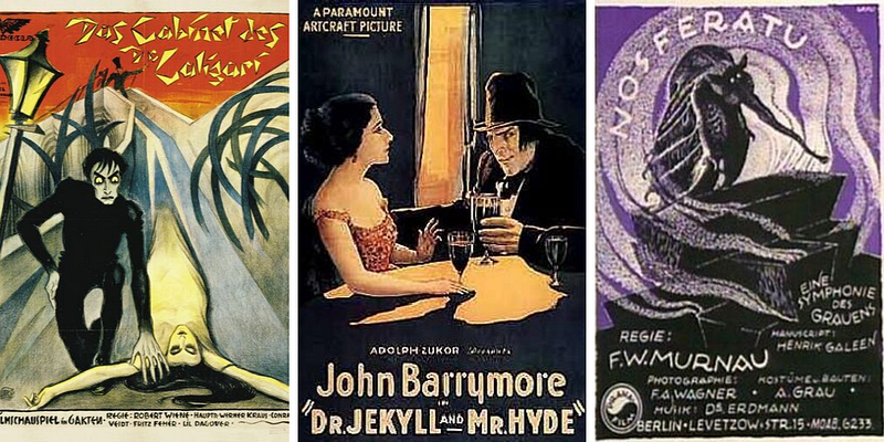
Early horror films, such as “The Cabinet of Dr. Caligari” (1919), “Dr. Jekyll and Mr. Hyde” (1920) or “Nosferatu” (1921), featured posters that reflected his expressionist air. In them predominated black and white, as well as shape and background. Since then the poster was conceived as a strong marketing tool. When “The Cabinet of Dr. Caligari” was to be released in Berlin, a series of enigmatic posters that read “Du musst Caligari werden” (“You must become Caligari”) began to appear all over the city. Later, some of these posters designed by Erich Ludwig Stahl and Otto Arpke (Stahl-Arpke, for friends) were exhibited in museums such as the MoMA.
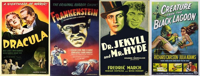
Later, Universal Pictures released its horror films based on classic monsters from literature. The color was introduced in the illustrations to highlight the monster figure. The typography became responsible for highlighting horror in its more traditional forms and characteristics: bloody, torn or electrifying lyrics.
A well-designed poster must convince the viewer to watch the film
Besides, its representation was made through three basic colors associated with fear, death, and monsters: red, yellow and green. This evolution can be seen by comparing the previous “Dr. Jekyll and Mr. Hyde” poster with that of the later version of Paramount film. It’s clear which one the monster stands out best, isn’t it?
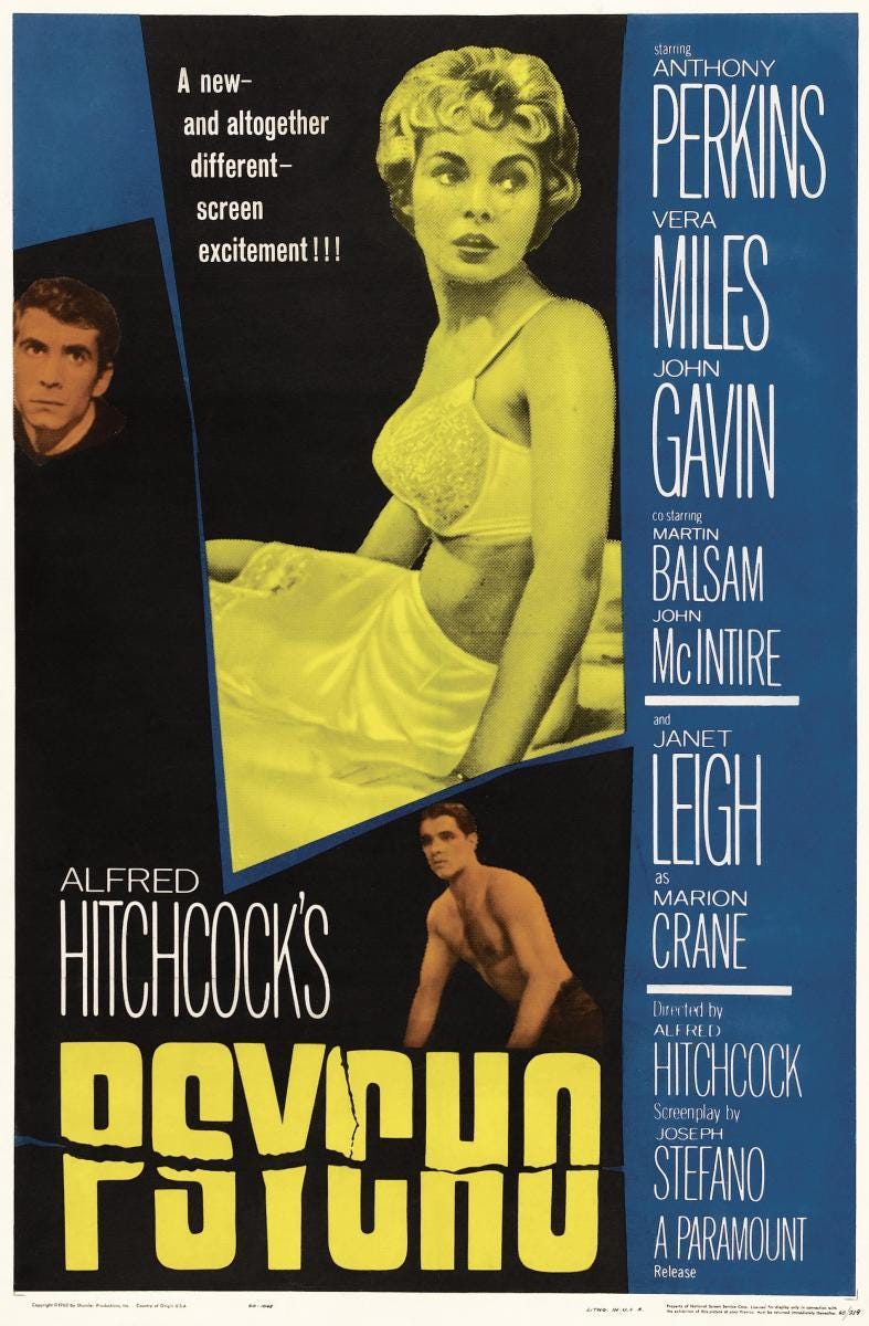
During the Golden Age of Hollywood, the so-called “star system” was the model of hiring actors in exclusivity devised by the big studios to ensure the success of their productions. This fact had its direct impact on the posters designed to highlight the characters starring the great stars of the moment.
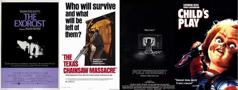
It was not until the seventies and eighties when it became to give more importance to the main topic or the scene most characteristic of the film. Illustration no longer prevailed but was combined or replaced by photography. This was a model especially repeated in films that were the origin of franchises and that based their first posters on iconic elements that jumped directly into the imaginary of popular culture. However, the posters always respected the shades of terror: darkness with black and warm colors (red, orange).
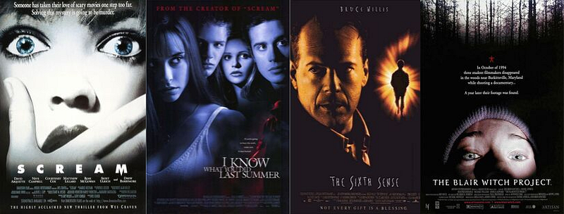
From the 1990s, those films of greater seriousness and dramatic coexisted with the rise of the teen slasher. The posters, in turn, showed a tendency to more restrained and elegant fonts and the maintenance of the red in their color palette reference to blood. Also, they began to be characterized by showing terrified faces.
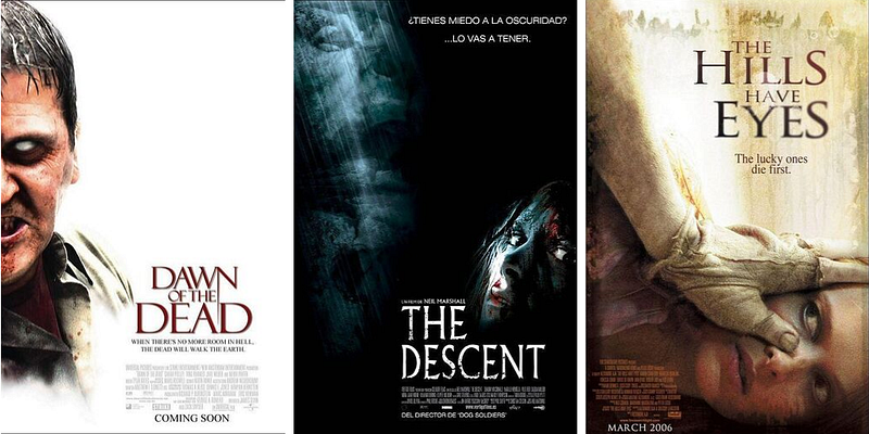
Already in the 200s, and using photography as basic support, the posters opted to include the most terrifying and shocking images of the films with the aim of surprising and capturing the viewer’s attention.
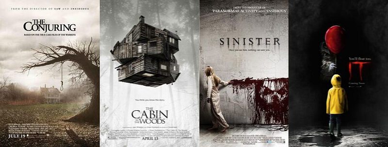
Many of these trends are still present in today’s posters. However, great advances in technology allow us to create more visual effects that highlight the terrifying of the genre. On the other hand, we can identify another trend that follows a more minimalist and stylized line.
Now, do you think any trend will be repeated soon? We are confident that to be innovative and create a powerful poster it is very important to look back and be inspired by those who at the time achieved a great impact on the public.
If you are working on a project of this kind and you need help to design the poster that your terrifying story deserves, do not hesitate to request Poster Design. Our service, made by professional designers, will allow you to transfer the main message of your story to an image, will increase the professionalism of your project and will make you stand out in the market.