
Medium: money
Oh How the Money Rolls in!
Tracking your Medium earnings

I was wading through some of the more interesting quarters of Medium yesterday when I discovered the notorious unclad model Jan Sebastian describing her accounting system.
It seems that she finds out her daily income — top marks for the step-by-step directions how to find that number on both desktop and mobile, Jan! — and writes it into a WordPad document. Talk about your bare bones accounting.
Her numbers are much bigger than mine, of course.
If it works for you, that’s fine
I read through the comments — if I get two people reading my stuff it’s a day for celebration but Jan has to fight ’em off with a stick — and some echoed what was in my mind: why not use a spreadsheet?
Excel was mentioned but what popped into my mind was the spreadsheet in Google Docs, a free service accessed online.
You have to create an account but it’s pretty painless if you already have a Google account of some kind - GMail, for example — and you then get access to an Office-type suite of programs. Google Sheets is their spreadsheet and it works the same as Excel or Numbers.
Of course, you can use whatever spreadsheet you feel comfortable with but I’ve chosen Sheets because it is a free service accessible to everyone.
Number One: make your sheet
The Sheets menu is at the top of the webpage, so make sure you use that instead of whatever browser menu you have. Clicking on “File/New”, for example, will have a different result in the browser menu, but for now, do that in the Sheets menu to make a new empty spreadsheet:
I’m not going to explain how to use a spreadsheet. As usual, there are more commands and options and menu items than any sane person could use in a lifetime of use, and we are just going to stick to basics. You want more information, dive into the Help menu.
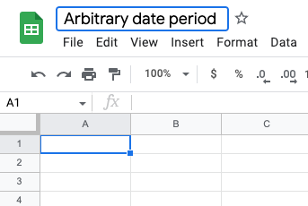
Number Two: give your sheet titles and headings
First off, change the name of the sheet from “Untitled spreadsheet” to something that makes sense to you. I’m just going to cover the month of October plus a few days either side:
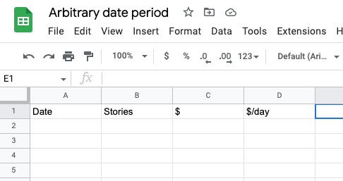
Next, fill in the column headings. You can make a complex sheet with all sorts of esoteric information but right now I’m only interested in the basics:
The date column will hold a list of consecutive dates. If you want to track your income for the year, you’ll want 365 rows, plus a total. If you want a month, then around 30 rows should do you.
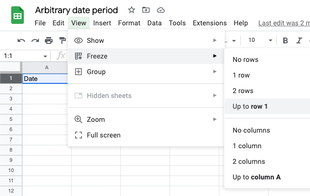
Next, we want to freeze the headings row, so that if you scroll down to row two thousand the headings won’t scroll up out of view. “View/Freeze/Up to row 1” is how you do this. You can also freeze a column, and if you build a super-detailed sheet with about a hundred columns tracking cumulative dollars per word count per article per day and so on, then you may want to freeze the date column so you know where you are in the sheet.
Populate the sheet
Now we begin to fill the thing in. First, and easiest is the list of consecutive dates.
You may want to select the entire first column — just click on the “A” above the “Date” heading — and change the date format into whatever suits you. I think it begins as Year/Month/Date but I find that involves too much mental juggling to work out what day that really is, and so I switch it around to what my poor tired brain wants. There’s an option for customised dates near the end of the “Format” menu.
The easiest way to fill the column is to enter your start date in cell A2, select the cell, position your mouse pointer over the bottom right corner and drag it down. As the pointer moves down, the dates will fill in automatically.
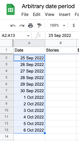
Pretty neat, huh? You can do that as many times as you want. The program has enough smarts to understand that you want every new line to be a new day in your Medium journey.
Next is to fill in the stories column. I’m not actually going to make much use of this data today but it can be leveraged to see the average earnings per story and pick up trends over time.
I tend to just look at my stats page and count up the stories per month. If I want my lifetime totals or the stories published in a year, I can do some more complicated ways to get cumulative totals but for now I’ll just stick to the stories in a month.
Now, the big thing about this number is that it’s not going to go down. If I publish a story on the first day of the month, the number of stories published will always be at least one. So, until I enter a different number when I publish another story or six, I can easily fill in the whole month by simply telling each cell to be the number in the row above.
I do this by selecting a cell, typing the “=” symbol and then selecting the row above. In the following example I have selected cell B3 and above (in orange) you can see “=B2”. So cell B3 will always copy whatever is in cell B2, at least until I change this by (say) entering a new number in cell B3.
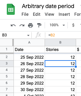
As with the date column, I can “pull down” on the selected cell to copy the same formula all the way down. Cell B4 will take the value of cell B3 above, cell B5 will take the value of cell B4 and so on.
This way, when I publish a new story and update my total for that day, the number will change in every cell for the rest of the month.
Do the same for the $ column. Whatever amount you have in that column for the first day of the month, every other day will be at least that amount.
For the “$/day” column, things get a bit trickier. I want to divide the $ amount by the number of days in the month so far. So for the first day of the month, I divide the money amount by 1, which gives me the total per day which is, surprise surprise, the same number.
On the second day, I want to divide the number by two, and so on all the way through the month. To get the number of the day in the current month, I need to use the “day” function. So, as you see below, for cell D2 I divide the money amount in cell C2 by the day of the month in the date column, cell A2. So:
cell D2 = cell C2 divided by day( cell A2 )
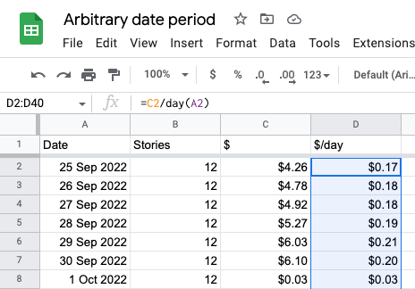
Again, select the first cell in that range and drag the bottom right corner all the way down until you get to the end of the month.
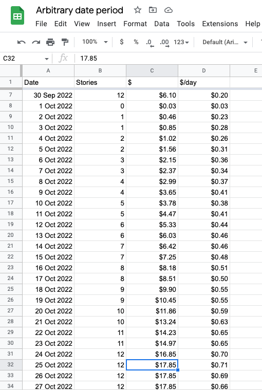
In the screenshot above I’ve populated the sheet, assuming that I publish one story per day and every day my earnings go up by 50c or so. As you can see, my numbers reset on the first of the month, and I’ve entered data until 25 October. For 26 and 27 October, the numbers stay the same except for the “$/day” column, where the daily number goes down because I’m dividing a fixed amount of money by an increasing number of days.
At this point, I’ve gone in a slightly different direction from Jan’s Wordpad scheme. For me, the earnings per day per month is more important than the actual money coming in per day.
If I wanted to show Jan’s figure of daily earnings I would add a new column and have each cell be the result of subtracting the total earning for the previous day from the total earning for the current day.
I’ll leave that as an exercise for the reader, or if you really want to be talked through it, let me know in the comments.
Making it visual
Numbers are all very well but there’s a reason I have an analogue watch face on my Apple Watch. I get more of an immediate visual feel for the graphic display, rather than having to munch numbers.
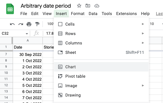
So, let’s add a chart to show what’s happening. Menu item “Insert/Chart”; how easy is that?
By default that gives us the entire sheet area, date progression left to right, and the three number series (Stories, $, and $/day) as lines showing points of vertical magnitude.
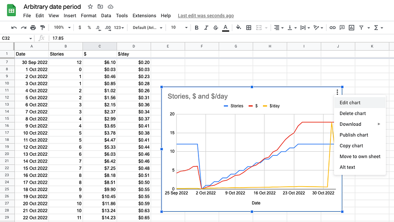
That’s all very well, but I want to limit the data area and only show $/day. I click on the three dots in the top right corner of the chart, and select “Edit chart” from the popup menu. Make a few adjustments, and voila!
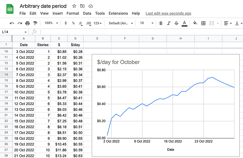
That’s what I want to see: a visual representation of how much I’m earning per day over the month of October. As time goes by I can add in other months and get fancy with cumulative data, 30-day rolling averages and so on.
For those of you with sharp eyes…
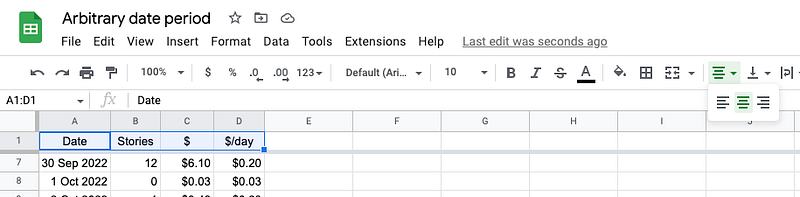
Yes, I tidied up the column widths and headings in between those last two screenshots.
First I adjusted the column widths by shrinking down each shaded cell along the top row (shown as A, B, C, D etc.) so as to minimise white space.
I then selected the four header cells and changed the text alignment in the toolbar (way over to the right of this image) to centred, rather than left or right.
And, of course, the world is your oyster from this point on. You can modify, add in data or analysis to your hearts content.
I’ve made the sheet sharable (read-only) at this link: https://docs.google.com/spreadsheets/d/15a06UF1q0uCacckkmDPFp2bWACAxeF61beTdd_yyKeg/edit?usp=sharing
You may look at it to see how it is put together, but not modify it.
My skills are limited
My spreadsheet skills are at the user level. I can do a few basic tasks, usually after puzzling through the help files and making a bunch of mistakes, but I know that there are experts out there with skills and abilities far beyond mine.
If anyone can put together a spreadsheet that has more bells and whistles than the simple model presented here, be my guest. Advertise your skills in the comments or better yet, write a story about it.
Britni


