
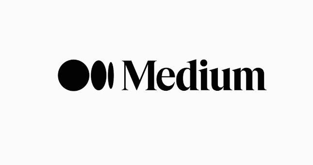
Medium’s New Logo (2020)— Unfinished Ellipses Logomark
Medium’s logo continues its brand transformation by replacing iconic M with an unfinished ellipses icon
Medium is in the middle of several major platform changes. Medium is moving away from its emphasis on curation toward “relational” distribution mechanisms. Publications are becoming colorful and customizable. Individual profiles are following suit.
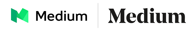
However, as you likely have notice, Medium has a new logo.
More precisely, it has a completely new icon and a slightly redesigned logomark (when put together making a new logo):
As Medium explained in it’s post announcing the change:
Medium started with a simple purpose: to deepen people’s understanding of the world, and spread ideas that matter. We did this by giving people a simple medium — a blank page — for their ideas to reach what is now a global community of over 170 million readers. Most importantly, as an open platform, anyone can have a voice on Medium, regardless of background, affiliation, or expertise, and share their thoughts directly, independently, and unfiltered. We’re proud to give these voices a home to grow, connect, and spark real, nuanced conversations — as well as the potential to instigate change.
While our mission remains the same, our publishing tools, reading platform, and content offering are ever-advancing to better serve this mission. As the world changes around us, we aim to create a more intentional and relational network of ideas exchange. Our updated brand identity is meant to provide a better expression of who we are, where we came from, and where we’re going.
Medium’s New Icon
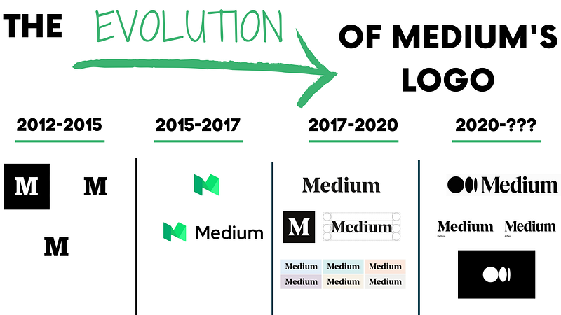
A Brief History of Medium’s Logo Progression
For context, here is a brief overview of the changes Medium had made to its logo, icon, and logomark over time.
2012–2015
Ever since Medium first launched in beta in 2012, they sported a logo that is a big, bold, black-and-white slab-serif M, from the font Stag.
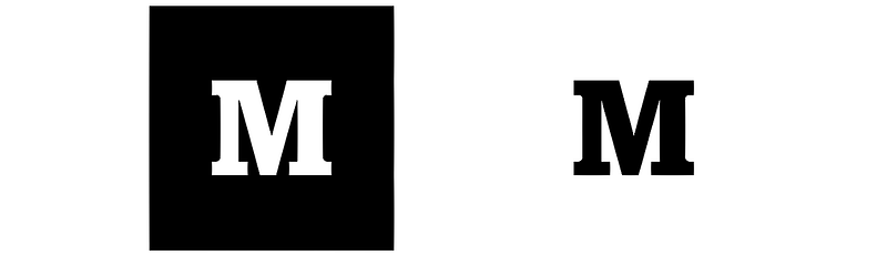
However, as Medium noted:
While simple, elegant, and strong, this Stag M proved rather inflexible as a logo. It served us well through our first few years, but as Medium has grown and evolved, the logo has begun to feel flat, impenetrable, blunt, and not to be toyed with. It is also not particularly distinctive, either. In short, our M no longer captured or conveyed what Medium has become.
So, we set out this summer with the goal of creating a logo that was a better reflection of who we are, and where we want to head from here.
After exploring about a million different ideas for a new icon, we arrived back at the capital M as a visual mark we wanted to hold onto. Next step: we started having some fun — figuring out how an M shape could bend and stretch to embody what Medium felt like to us.
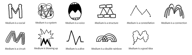
From there, we started getting more serious, working with type designer Rod Cavazos of the foundry PSY/OPS. With Rod, we pursued the concept that our logo could be made of a series of interconnected ideas or shapes that, when joined together, form a new thought. A logo that flows, unfurls, and builds like a great and memorable conversation.
2015–2017
This led to Medium’s second attempt at a logo.
At last, we were on to something! This simple geometric interpretation of the M felt fun — like a delightful game or a deeply satisfying puzzle. We couldn’t stop ourselves from playing with all the different treatments, mutations, and color combinations it was practically begging for.
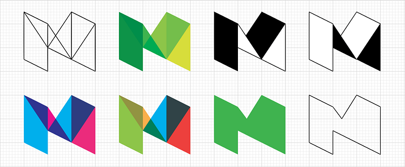
The result was a geometric green M and a slightly revamped font for the Medium wordmark:
2017–2020
This logotype is heavily influenced by Medium’s original slab-serif identity, which suggests that the last logo wasn’t performing as Medium had hoped.
Medium’s 2015–2017 logo was an oddly drawn, pseudo-isometric effort, combined with an inoffensive middle-of-the-road sans-serif; it always felt like an idea compromised by too much management.
The new logotype is far more bold, and achieves a certain editorial authority.
As one branding expert said:
The first success is that the logo now works in black and white (that’s logo design 101 passed). The second is that it honors the history of the brand — if a company this young can be said to have a history — without being a slave to it. The third is that the exaggerated contrast calls to mind the blackletter mastheads of credible publications like the New York Times, or the Washington Post, without actually embracing blackletter — it would be a foolhardy publication that adopted a blackletter masthead, with all its cultural connotations, in the current political climate.
The logotype is distinctly more modern than its predecessor, thanks to the sharp serifs and highly tapered shoulders. The only slight criticism might be levelled at the letter spacing: the uniform rhythm of the strokes and counters, coupled with the letter spacing, results in too little visual separation between the ‘i’, ‘u’, and ‘m’. It’s a minor gripe though, and this isn’t text that needs to be read in the conventional sense.
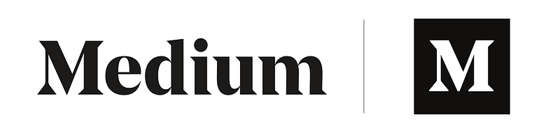
In addition to the logotype, Medium are using a monogram. This is the uppercase ‘M’ reversed on a black background. The monogram is intended for use where the logotype is too detailed — social media avatars spring to mind — and includes a couple of smart tweaks: the contrast is visibly reduced, and the serifs and apex are blunted; ensuring the shape does not feel weak, or blurred, at smaller sizes.
The logotype works well on the site, contrasting with the sans-serif used in the UI, clarifying the role of the UI labels far more effectively than the previous iteration. The monogram does a good job of taking a step back on individual post pages, letting the writer’s own personality dominate.
2020 — ???
Apparently, the fourth time is the charm.
Medium announced today that it had updated its brand identity, including a new wordmark and icon:
For the wordmark itself, not much has changed. We loved our old Medium logo. It felt accessible and gave a nod to our literary roots. Since we’re still the same brand, it didn’t feel appropriate to drastically change — but in the spirit of an ever-evolving Medium, we wanted to give it a polish.
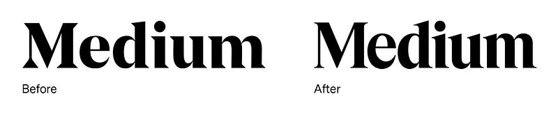
We built off the strengths of our existing wordmark and customized the letterforms to feel more inviting. The lines are smoother, the letters sit tighter for improved readability, and overall, it stands prouder. It’s fundamentally the same Medium wordmark, just with a makeover.
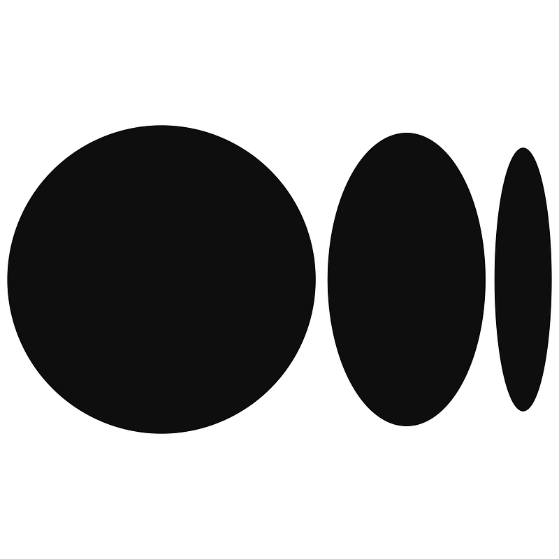
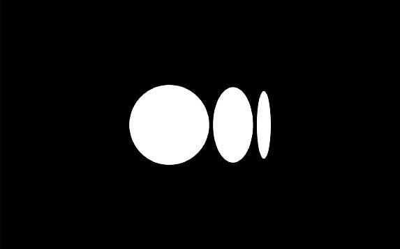
The more significant change was the addition of a new symbol:
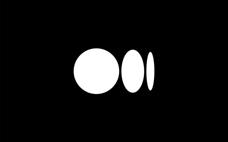
Why add a symbol?
A symbol gives us more creative flexibility, another tool in the toolbox
Medium is a platform for creators to express themselves, so our brand should never get in the way of yours. When you read on Medium, a symbol allows Medium the brand to take a backseat to let individual publications and writers shine
The symbol, like our illustration style, is inspired by language and typography. It is born from the ellipses: a punctuation mark that represents an unfinished or impending thought, an idea to come, what’s next. This is, again, what happens on Medium — there’s always a new idea, always more to the story.
Medium’s Newest Logo in Action
What do you think of Mediums new logo? Leave a response below.

Thanks for reading this article! Leave a comment below if you have any questions. Be sure to sign up for the Blogging Guide newsletter, to get the latest tips, tricks, and news about writing on Medium and to join our Facebook group, Medium Writing, to share your latest Medium posts and connect with other writers.
If you liked this article, here are some other articles you may enjoy:

Casey Botticello is an internet entrepreneur and the founder of Blogging Guide, an online community of writers with an award-winning newsletter. He is also the creator of the popular Medium Writing Course and the Substack Newsletter Course.
Casey previously worked at several tech startups, a lobbying & strategic communications firm, and has created several businesses of his own. He is a graduate of The University of Pennsylvania, where he received his B.A. in Urban Studies.
You can connect with him on LinkedIn, Twitter, Facebook, follow his Medium publications, Digital Marketing Lab and Medium Blogging Guide, or reach out to him directly on his personal website.


