
Maybe we don’t have to (re)brand everything
and end up being clones of each other.
In continuing this series of Creative Monologue, I’ll be talking about how we designers and businesses brand or rebrand ourselves, and the related pitfalls we should avoid.
“It is as if graphic designers all work from the same palette… they pick and choose from what is currently hip and readily acceptable to infuse the work of their clients with a dose of contemporary cool.”
— Rudy VanderLans for Emigre № 64 (2003)
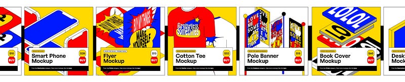
WHEN I FIRST STARTED doing freelance design, my thoughts were very much pigeon-holed into achieving results like those in Behance have showcased. Professional, eye-catching, systematic, consistent-to-the-tee sort of branding* was something that was glorified by that website to the core. Even pieces of printed paper need to have that right texture and colour (courtesy of mockup image sites) for an identity of a business to be “solidified.” Nothing was overlooked.
*The term branding used over here mainly refers to the visual outputs that a company/individual would publish. This ranges from their logos to social media posts, to business cards, to packaging prints, and so forth. I understand the technical term for branding encompasses too the company’s values, motto, and other things. But for the lack of a better word, I will refer to this slew of aforementioned items as ‘branding.’
I acquired that sort of mentality when working on doing up a brand design that my friends wanted. They are a duo that wants to offer people catered fitness programs. To give more context, they don’t run a gym. They don’t have an office. They are just two dudes fresh out of a fitness educational course wanting to make some money by teaching others some physical exercises.
During my consultation and feedback sessions with them, I was trying to pull out all the cards (or so I thought) that a design agency would by giving them visuals after visuals of corporate paraphernalia. Think stylised social media posts and posters of people in ideal exercise poses. They are being framed within selected shapes, colours, and patterns, just to reinforce the identity of their new upcoming fitness “brand.” This idea is pushed upon by all of us when we were comparing designs to well-established gym companies while working on their own Instagram profile.
Nearing the end of all this, I found myself feeling a bit heated up when they mentioned how they feel they are unable to carry along the branding guideline I’ve meticulously made for them. Mind you, I even put design templates for them to work on in Microsoft Powerpoint. (Don’t cringe!) But I digress.
I just wanted to do a good job, but also, I have been tone-deaf about this whole thing I caught myself in. They didn’t need such a defining brand identity if they are only doing this as a sideline. They have no intentions to turn this into a potential Fortune 500 company. So what was I thinking? It now dawned on me that I am a victim of a “(Re)branding Everything” mentality that’s so prevalent in current times.
The main attribute to this so-called design pandemonium could be the inevitable path of globalisation we have foraged. Cultural unification, the result of making more connections with the advent of technology, has made us choose just a limited range of ideal elements of brand design. The next best thing we’ve decided was to do cut-and-paste maneuvres until every company or business is slathered in a thick coating of Austurbane, Corporate Memphis, or Modern Brutalism (at least in this era which I’m writing in now).
Obviously, the implications of globalisation far extend beyond the realm of design and are a whole can of worms that I’m not going to pick about here. What I’d like to pick, however, are the troubles we’ve set ourselves on as a result of (re)branding everything the same way. Here are some reasons why there isn’t a need for that.
Not everyone is a corporate giant
It is all the rage right now for designers to self-brand. And while we are at it, we do them up like we are a multi-disciplinary firm consisting of a team of 10+ people.
While imitation (of big businesses) is a form of flattery of their good brand design assets, why are we allowing individualistic identities to blur with commercial giants? It only presents identity crises. That’s such a huge irony when self-branding is meant for designers to stand out amongst others.
It’s a dangerous path we’re treading on if the majority of us designers’ source of ideal design or inspiration comes from just commercial places. Firstly, it means all our creative rationale would inadvertently end up being homogenous because we are looking from the same origins. Secondly, we oversaturate the market with those works and impress new prospective designers that this is the best way to brand yourself. And lastly (but not least-ly?), we are giving clients a stereotype of what is deemed “peak” design; that nothing can match up to that as having marketable value. We are perpetrating a narrow-minded view of what creatives can be.
By providing that same kind of look to a small business, also presents it in a very strange position. Supposedly if the business is offering home-baked goods. By slapping it with a corporate identity, people may in turn view their goods as something more mass-produced rather than artisanal.
Maybe what small businesses and even small design studios need is not a full-fledged, commercially-constructed brand when they are just starting out. If you think about it, people value and recognise a bakery, barbershop, or flower boutique more from what they do and serve than how they brand themselves in the long run. Additionally, when it’s been granted that their business is doing well, nuances in how they naturally approach the way they handled the business become more evident. This can then give them enough merit and elements to work with for them to create proper and relevant branding. Sure, they can first have a logo, but newfound small businesses and designers shouldn’t be so overly concerned about it that they forget it’s just a small part of an equation at the end of the day.
To also bring up the fitness branding for my friends, they had a hard time maintaining the brand guidelines I gave them. The same thing can also happen to small-scale businesses. We have to bear in mind how many things people are juggling when it comes to running a business, and design consistency likely isn’t at their forefront when it comes to work priorities. If they don’t have a design department or someone in that sector working for them, the branding you develop for them mustn’t be that tough to maintain. Or rather, it’d not be wise to throw a branding guideline on a company if it just consists of two people who are coincidentally non-designers.
Self-initiated design introduces new ideas
As much as it is hot taboo for professionals to let non-designers reign and bask in potential mishaps, their perspective in design can present new ways to see solutions and creatives. Consider this: Locksmith stickers. Very unassuming in the Singapore vandalism landscape, but my constant notice of it has led me to eye on something peculiar, that is how repetitive they are.
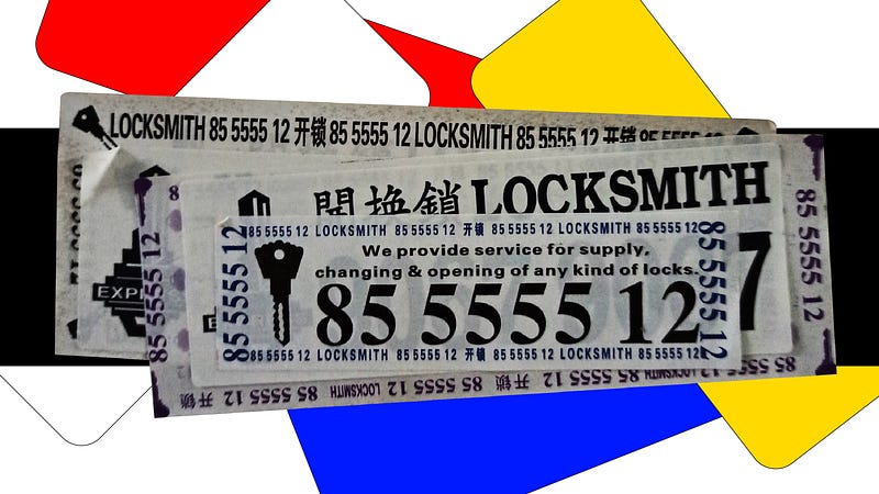
Whilst to grab attention, the rows of the same telephone numbers on a sticker can preserve its visibility even when competitors try to cover them with their own stickers. Total obscurity of their numbers seems to be impossible, should their label length and width are to be just slightly bigger than the ones overlapping them. Even if someone tries to tear it away, remnants of the sticker, perhaps at the corner, may still have their numbers preserved and viewable for people to key them into their phones. Somewhat devious yet ingenious, these locksmiths are perceivably budget-wise, but also wise enough to know their way around advertising and get the biggest real estate on their labels.
As such, maybe it is worth allowing small businesses to just try and attempt design on their own rather than seek the consultation of a designer to foresee everything beforehand. Premade design sites like Canva and Carrd are good ways for businesses to introduce themselves without needing to do too much work design-wise, and yet allow them just enough customisation to still look good enough for a head start. And fair enough, we can see this being the case for many Singapore home-based bakeries popping off with just this formula.
Here’s another thought. In a world where corporate identities run rampant, it is nice to sometimes see subversion going on with design. Everyone could use a giggle now and then when they see a tacky shop sign seemingly made with Powerpoint. Although it may not be the best first impression, the distinct appearance can be a great way for customers to pinpoint your identity easily. Also, it sometimes hits a wave of nostalgia to observe dollar-store vernacular at local places, doesn’t it?
We are turning ourselves into parodies
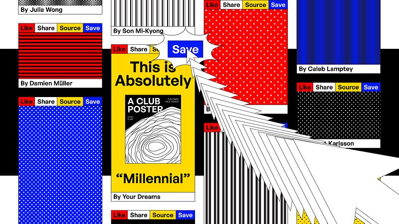
It was clearer to identify such a ‘(re)brand everything’ mentality when people were throwing shade on CIA’s rebrand back in January this year. Presenting themselves newly to attract a younger generation of prospective agents, many were quick to take a jab and comment their design similarities with music festival posters. Be it so, it was obvious the choice of visual elements included in this redesign was very much a smorgasbord of what is currently trending in the graphic design sphere. It was so violently trendy that it almost seems to be parodying a teen book adaptation movie of a spy agency, if I say so myself.
Could that have been the case? An intense study of a trend and a laser-sharp trajectory to nail that “millennial” look? For a company like this, maybe. If so, then we can see how things can potentially fail if our point of reference is so hard-hitting on just already well-established commercial design elements.
A Singapore-based survey done by design industry volunteers, collectively named Don’t Mind If, found out that the majority of those working in the creative sector found themselves having to work overtime fairly regularly. On top of that, more than half of those respondents felt that their overtime effort was left unacknowledged or recorded. While this may not be the same worldwide, it is evident within this report that the need to work for long hours with no incentives in view may be a reason for designers to hit a wall at a faster rate. And out of desperation, seek an easy way out by using design tropes to finish jobs within timelines. (Okay, I guess there are still caveats in the way they work that may not lead to this hypothetical narrative, but it’s nevertheless a possibility.)
As I have never worked in a design agency before, I am unable to say for myself if such workplaces are demanding and stressful enough to require quick and bad turnovers of cut-and-paste creatives. But as once a design student, my schoolmates and I felt that pressure when trying to pass over different projects to several design course modules at one go. If the design industry has that same form of mentality, a pressure-cooker environment that agencies have manufactured, it can result in brand clones, just because it’s easier and faster.
It’s an excuse for being a lousy business entity
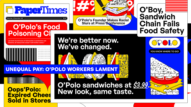
On the other end of the spectrum, we have big companies that wear typical corporate identities as a façade. McDonald’s has revamped their brand for who knows how many times to match with current times. Yet in the US, that new camouflaged facet of theirs is merely superficial when you follow their ice cream machine scandal or the many beef they’ve caused throughout their existence.
We should learn here not to consider a rebrand to simply sanitise one’s company from a problematic past, especially if they’ve recently faced public backlash. If a business’ funding is mainly used on preserving their outer image rather than to fix internal issues, that’s not a good sight. The amount of time to reconstruct those mottos and values is also down the drain.
Here’s what an unnecessary rebranding fund can be used on instead: to pay workers fairly, give them proper health coverage, uphold safe working conditions, and so forth. If you do good, maybe your old brand can stay. Or that can even give proper grounds to rebrand well.
If you are a new business that’s just strutting out for the first time, consider working on the quality of your products and services before branding, as I’ve mentioned earlier. You can save some embarrassment in the long run.
Conclusion
We are saturated in (same-y) brands and rebrands as if that makes or breaks a business. But identities are much more nuanced than that. And It’s up to us to discern if a (re)brand is truly necessary, or to focus on running one’s business steadily and ethically first. When a company is beautiful inside, there will be reasons and a great rationale to look just as pretty outside.
And also, maybe, don’t look at Behance too much for inspiration.


