
May I See the SwiftUI Menu, Please?
Implementing a menu navigation in SwiftUI
Introduction
One of the most common navigation patterns in mobile app development is menu navigation.
Although this pattern is widely used in many apps such as Amazon or Gmail, Apple has never provided a built-in way to implement this kind of navigation.
Back in the “old times”, when designing apps with UIKit, SWRevealViewController came in handy to implement this pattern. In this tutorial, we’ll see how to use SwiftUI to easily achieve the same effect.
Our Goal
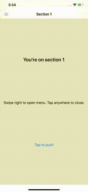
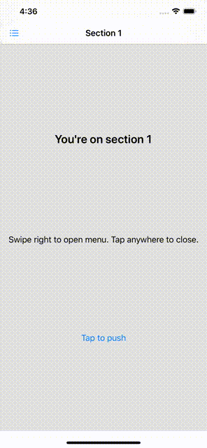
We aim to implement a reusable menu that will slide from left to right and show a list of clickable items. Each row on the list and the content displayed can be any View, which means the menu must support generic types.
You can find the final implementation in my repo. By the end of the tutorial, you should have something like this:
MenuView
When implementing custom views in SwiftUI, it might be tempting to write all the views in the same file.
Yet, this prevents the views from being reused and makes our code difficult to read. Remember the massive ViewController in UIKit? How about a massive View?
Create a new file and call it MenuView. Let’s define the struct as:
struct MenuView<Item, Row, Content>: View where Item: Identifiable & Equatable, Row: View, Content: View { // Content here}
MenuView defines three generic types: Item, Row, and Content. Let’s see what each of these are:
Itemis the data model that fills aRow.Rowis the view displayed for a specific item within the menu.Contentis the view displayed on screen for the selected index of the menu.
For those who are already familiar with SwiftUI, Item and Row might sound very similar to List.
List takes a collection of Identifiable items and a factory block to generate a View for each item. In our case, MenuView will take two factory blocks to build the rows of the list and the content of the selected row.
MenuView is just a built-in List stacked over a dynamic content page.
MenuView dependencies
To create a MenuView, we will need to pass the list of items that will fill the rows as well as two factory blocks to dynamically inject the views of both the row and the section.
For that, we can make use of the @ViewBuilder property wrapper. This will allow us to write code in a more “SwiftUI-y” way, that is, in a more descriptive way.
Take a look at the arguments:
indexSelectedrepresents the row that is selected at the moment.menuItemsholds the list of elements that will model each row of the list. Remember from the struct definition that they conform toIdentifiableandEquatable.menuItemRowis aViewBuilder. This factory method will help dynamically build each row of the list.menuItemContentis another factory method that will be used to create the content of the section selected.
At this point, we have everything we need to start implementing MenuView. Let’s get to work.
Implementation
As mentioned before, MenuView will contain two views:
revealList, the list of items.contentView, the view for the selected section or page.
Both of them will be stacked on top of each other. MenuView will then keep a state to know whether revealList is visible or not:
@State private var isMenuRevealed: Bool = trueExtend MenuView and declare revealList and contentView:
Notice that we use the factory blocks to build each row as well as the content for the selected row. Each row will change indexSelected when tapped as well as hide the menu.
We’ll use ZStack to stack revealList on top of contentView.
However, revealList will need an offset that will change depending on isMenuRevealed. If true, it’ll cover the whole screen. If false, it’ll slide off the screen.
Define a helper method to determine the revealList offset:
private func revealListOffset(_ proxy: GeometryProxy) -> CGPoint {
    CGPoint(x: self.isMenuRevealed ? -proxy.size.width : 0, y: 0)
}
Finally, define body as:
Revealing the menu
Currently, the menu defines a state isMenuRevealed to manage the offset of revealList. It is switched to false when any row is tapped, but how can we show the menu?
Also, we should consider that any other view might want to trigger the menu, as well, when some event occurs. For example, when a navbar button is tapped.
Let’s change the definition of isMenuRevealed. It’ll be a state no longer but a binding:
This means that isMenuRevealed is bidirectional, meaning it can be modified by the view it is contained in and also from some other view in its view hierarchy.
At this point, the menu can be toggled from another view that contains MenuView.
What if we add a “built-in” way to do the same by means of a gesture? Let’s add a drag gesture to reveal or hide the menu when the user swipes the content. First, create a state to hold the gesture offset value:
@State private var draggingOffset: CGFloat = 0Then, add DragGesture to ZStack:
And a TapGesture to close the menu if contentView is tapped:
self.contentView
    .onTapGesture (perform: {
        withAnimation {
            self.isMenuRevealed = true
        }
    })
Don’t forget to use withAnimation to animate the state changes.
Notice that we’ve set a threshold for draggingOffset that depends on isMenuRevealed. We don’t want to keep swiping right if the menu is open, do we?
Finally, modify the method revealListOffset so that it takes this offset into account:
let hiddenOffset = -proxy.size.width + draggingOffset
return CGPoint(x: self.isMenuRevealed ? hiddenOffset : hiddenOffset + proxy.width, y: 0)
Reveal ratio
So far, revealList takes up too much space (the whole screen, actually). When revealed, it is not obvious there’s something behind it:
It would be useful to define a reveal ratio so that we can choose the overlapping ratio. Let’s add a new variable revealRatio to our initializer:
Now, modify revealListOffset and create a new function called revealListSize:
Finally, go back to the body and use the newly created function. Replace proxy.size.width with self.revealListSize(proxy).width. Your view body should look like this now:
MenuView is now ready to go live. Shall we give it a try?
Use case
Let’s put this to work and see how easy it is to implement a menu. Create a new file and declare a MenuView inside its body:
Very simple, isn’t it? By modularizing our views we’ve managed to write neater code that we can now reuse.
Plus, it is easy to extend with new functionalities. What about selecting the reveal edge or choosing between different reveal modes?
Where to Go From Here
Check out my repo for the whole code.


