Material 3 bottom sheet — DragHandle Jetpack compose
Hello everyone, hope everybody is fine. In this blog, we are going to see about the latest Material 3 bottom sheet design with a drag handle in Jetpack compose. Let us start
Many Android developer knows about Material Design which is a design system for Android that mostly contains about different components, guidelines, specifications, accessibility, etc. The Material team released Material 3 which contains the latest design guidelines, components, etc using which we can develop better UI to make a better user experience for wide users. The Android team will create a component with guidelines and specs of material design in XML which as a developer we can use it. Now you all know Jetpack compose is a new UI toolkit for Android they will introduce the components which achieve all guidelines of material design and release so as a developer we can use it also which reduce our work. So I thought we will use the latest bottom sheet of material 3 and play with it.
I think many know how to create a bottom sheet using Jetpack Compose which is not new. Here I am going to explain the small issue I faced while creating a Material 3 bottom sheet. Okay, no more theory let us go inside the practical.
Dependency
implementation "androidx.compose.material3:material3:1.1.0"UI
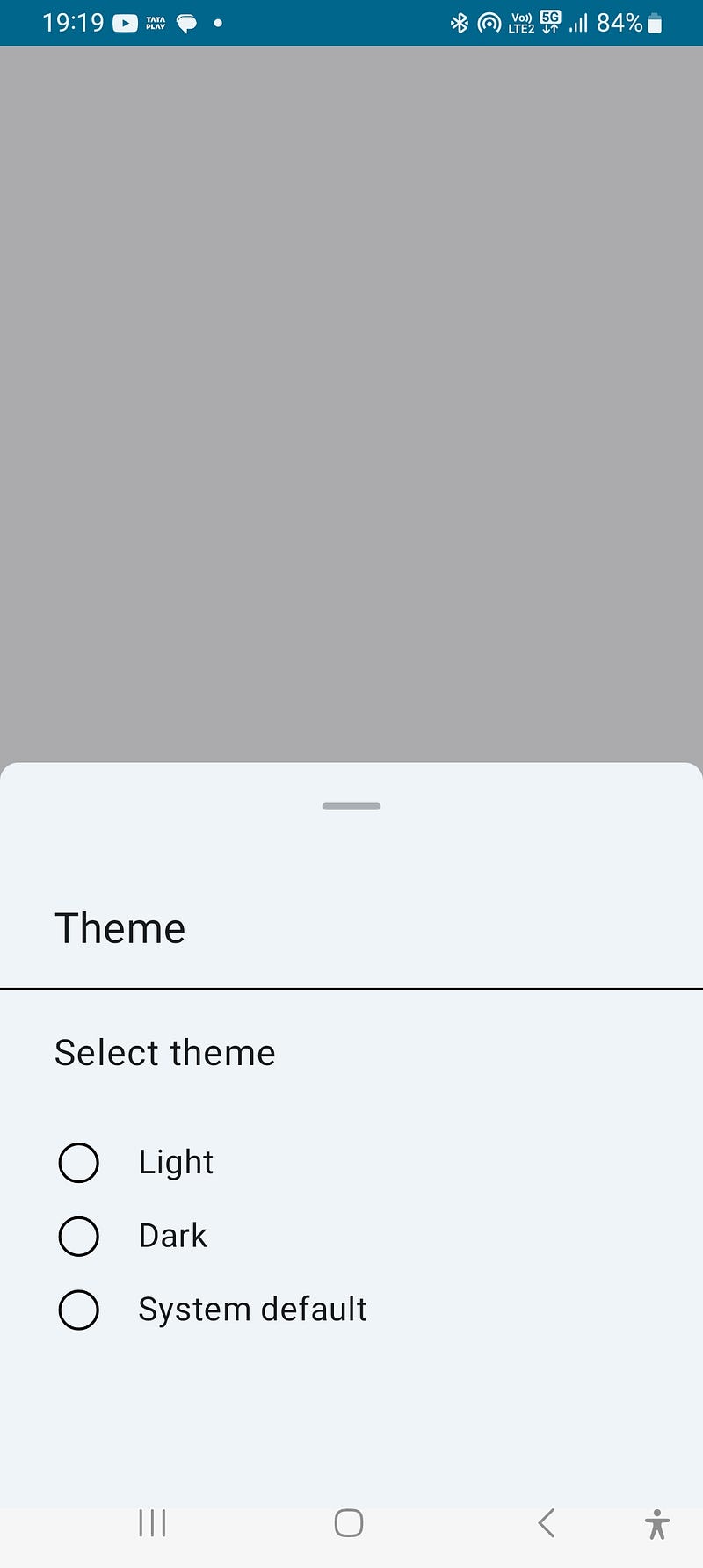
As this blog aims at the main issue we are not going to explain much about the UI of Bottomsheet. This bottom sheet is a theme selection bottom sheet nothing more. Here is the UI
Code
@OptIn(ExperimentalMaterial3Api::class)
@Composable
fun CustomBottomSheet() {

    ModalBottomSheet(modifier = Modifier, sheetState = rememberModalBottomSheetState(
        skipPartiallyExpanded = false), onDismissRequest = {
    }, shape = RoundedCornerShape(
        topStart = 10.dp,
        topEnd = 10.dp
    ),
    ) {
        CustomBottomSheetContainer()
    }
}
Here are going to use the ModalBottomSheet of Material 3.
Note: This API is experimental
ModalBottomSheet: This is a built-in Jetpack Compose component used to display a modal bottom sheet. It takes several parameters
sheetState: This parameter represents the state of the bottom sheet, and it is created usingrememberModalBottomSheetState. TheskipPartiallyExpandedproperty is set tofalse, which means the bottom sheet can partially expand instead of immediately closing when dragged upwards.onDismissRequest: This is a callback function that is triggered when the user tries to dismiss the bottom sheet. In our code, it is left empty.shape: This parameter is used to define the shape of the bottom sheet. In your code, it is set to aRoundedCornerShapewithtopStartandtopEndcorners having a radius of10.dp.
We have created the CustomBottomSheetContainer function which will be the content of the bottom sheet.
@Composable
fun CustomBottomSheetContainer() {
    Scaffold(topBar = {
        Column {
            Text(text = "Theme", modifier = Modifier.height(75.dp)
                    .padding(start = 29.dp, top = 26.dp),fontSize = 23.sp)
            Divider(color = Color.Black, thickness = 1.dp)
        }
    }) {
        Column(modifier = Modifier.padding(it)) {
            Text(text = "Select theme", modifier = Modifier
                    .padding(start = 29.dp, top = 20.dp, bottom = 10.dp)
                    .height(40.dp),fontSize = 20.sp)
            CustomItem("Light")
            CustomItem("Dark")
            CustomItem("System default")
        }
    }
}
Here we have created the bottom sheet content called CustomBottomSheetContainer
Here's a breakdown of the code:
Scaffold: This is a built-in Jetpack Compose component used to implement the basic structure of a screen. It provides a top app bar and other common UI elements. It takes the following parameters:
topBar: This parameter defines the content of the top app bar. It consists of aColumncomposable that contains aTextcomposable displaying the text "Theme" and aDividercomposable below it.
Column: This is a composable function used to vertically stack multiple elements.
1. Text: This is a composable function used to display text. The first one displays the text “Select theme” and applies padding and height using the Modifier parameter.
2. Second one is CustomRadioButtonItem which is the item that will be displayed on the bottom sheet.
Overall, the CustomBottomSheetContainer the composable function sets up a basic layout using Jetpack Compose Scaffold and Column components. It displays a top app bar with the "Theme" text and a divider. Below the top app bar, it displays the "Select theme" text and presumably renders multiple radio button items using the CustomRadioButtonItem composable function.
@Composable
fun CustomItem(text: String) {
    Row(modifier = Modifier.height(40.dp), verticalAlignment = Alignment.CenterVertically) {
        Image(
            painter = painterResource(id = R.drawable.frame_1),
            modifier = Modifier.padding(start = 31.dp, top = 9.dp), contentDescription = ""
        )
        Text(
            text = text, modifier = Modifier
                .height(40.dp)
                .padding(start = 20.dp, top = 11.dp),
            fontSize = 18.sp
        )
    }
}
Here we have created the item for the bottom sheet
Overall, the CustomItem composable function creates a row with an image and text, representing a single image item. The image is displayed at the beginning of the row, and the text is displayed next to it, both with specified padding and height. The actual image resource used (R.drawable.frame_1) is not included in the code snippet you provided.
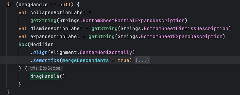
Now comes the issue as you can see in the image of the Bottom sheet UI you can see the cement color line. In the new design of the bottom sheet by default, they added a drag handle UI which is used for dragging. For me the UI is without a drag handle so analyzed the code of ModalBottomSheet how they have drawn and found that it uses dragHandle attribute which accepts null. DragHandle will be drawn if it is not null. You may ask if it accepts null means it should be drawn by default right? Here is the hack, by default dragHandle is not null the android team sets composable content for dragHandle by default. So to avoid this when you use modalBottomSheet of Material 3 please consider of passing null to dragHandle attribute. If you pass your custom dragHandle UI compose function as it accepts composable.
Here is the ModalBottomSheet code
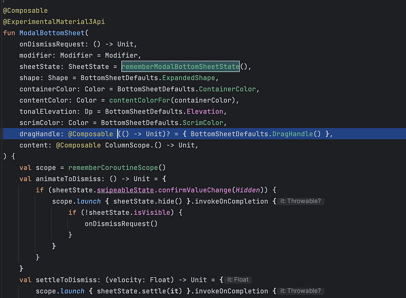
In the image, you can see the dragHandle attribute which accepts null, and by default, it uses a default compose function
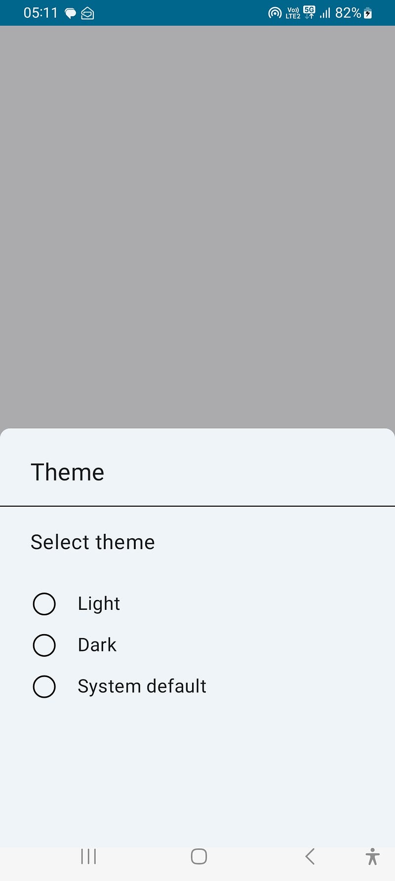
Without dragHandle
@OptIn(ExperimentalMaterial3Api::class)
@Composable
fun CustomBottomSheet() {

    ModalBottomSheet(modifier = Modifier, sheetState = rememberModalBottomSheetState(
        skipPartiallyExpanded = false), onDismissRequest = {
    }, shape = RoundedCornerShape(
        topStart = 10.dp,
        topEnd = 10.dp
    ), dragHandle = null,
    ) {
        CustomBottomSheetContainer()
    }
}
If you do not want the dragHandle to pass null to attribute which won't draw the dragHandle
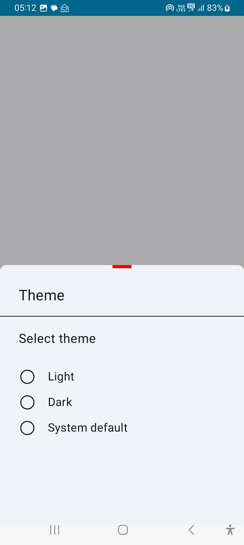
Custom DragHandle
@OptIn(ExperimentalMaterial3Api::class)
@Composable
fun CustomBottomSheet() {

    ModalBottomSheet(
        modifier = Modifier,
        sheetState = rememberModalBottomSheetState(
            skipPartiallyExpanded = false
        ),
        onDismissRequest = {
        },
        shape = RoundedCornerShape(
            topStart = 10.dp,
            topEnd = 10.dp
        ),
        dragHandle = { Spacer(modifier = Modifier.width(30.dp).height(5.dp).background(Color.Red)) },
    ) {
        CustomBottomSheetContainer()
    }
}
Here I added The Spacer composable which will create a 30dp wide and 5dp high empty space with a red background color, that act as a divider
As you can see in the UI, it drew the spacer at the center horizontally but I didn't give any alignment. After analyzing the code of dragHandle by default it aligns the dragHandle content to center. Here is the screenshot
Conclusion
The many bottom sheet design won't contains dragHandle. I faced the issue and surfed the internet on how to disable it but no luck. So I read the bottom sheet compose code and found this. So I thought this will be very helpful for developers who faced issues like me.
Thank you for reading. Comment below if you have any suggestions, doubts, etc


