
Mastering the Day Trading Using Neural Network & Deep Learning
In today’s fast-paced financial markets, day trading has emerged as a popular and lucrative strategy for those seeking short-term gains. With the rapid advancements in technology and the growing influence of artificial intelligence, traders are now leveraging the power of neural networks and deep learning to optimize their trading decisions. In this article, we introduce “Mastering the Day Trading Using Neural Network & Deep Learning,” a comprehensive guide that explores the fusion of sophisticated trading techniques and cutting-edge machine learning algorithms. We will delve into the intricacies of day trading, discuss the benefits of incorporating neural networks and deep learning, and provide practical insights to help you stay ahead of the curve in this competitive trading landscape. Join us as we unravel the secrets of mastering day trading with the assistance of advanced AI technologies.
Let’s begin,
Importing Libraries
import os
import pandas as pd
import matplotlib.pyplot as plt
import matplotlib.patches as patches
import seaborn as sns
import warnings
import numpy as np
from numpy import array
from importlib import reload # to reload modules if we made changes to them without restarting kernel
from sklearn.naive_bayes import GaussianNB
from xgboost import XGBClassifier # for features importancewarnings.filterwarnings('ignore')
plt.rcParams['figure.dpi'] = 227 # native screen dpi for my computerSeveral Python libraries are imported and plotting configurations are set up in this code snippet.
It allows the code to manipulate files and directories by interacting with the operating system portablely.
Data structures are provided by the pandas library for efficiently storing and manipulating large datasets. Often used for cleaning, preprocessing, and analyzing tabular data, it is a popular tool for working with tabular data.
There are several types of visualizations that can be created with matplotlib, including line plots, scatter plots, and histograms. A rectangle, an ellipse, or a polygon can be created using the patches submodule.
With the seaborn library, you can create visually appealing and informative visualizations on top of matplotlib.
Warnings are suppressed by the warnings module during execution.
Numpy provides functions for manipulating arrays and matrices and is used in scientific computing. A lot of data manipulation is done with it using pandas.
Without restarting the kernel, the importlib module allows you to reload previously imported modules.
In the sklearn library, you can implement various algorithms for classification, regression, and clustering. A simple and commonly used algorithm for classification is imported in this code snippet, GaussianNB.
A popular tool for gradient boosting is the xgboost library, which contains the XGBClassifier class. In the case of classification tasks, the XGBClassifier implements gradient boosting specifically.
Last but not least, plt.rcParams determines the resolution of plots that will be generated by matplotlib.
# ARIMA, SARIMA
import statsmodels.api as sm
from statsmodels.tsa.arima_model import ARIMA
from statsmodels.tsa.statespace.sarimax import SARIMAX
from statsmodels.graphics.tsaplots import plot_pacf, plot_acf
from sklearn.metrics import mean_squared_error, confusion_matrix, f1_score, accuracy_score
from pandas.plotting import autocorrelation_plot
Statsmodels is a library that provides tools for statistical modeling and analysis, and this code snippet imports several classes and functions from it.
There are many functions and classes in the sm module that enable various types of statistical analysis in statsmodels.
Time series data can be fitted with ARIMA models using the Autoregressive Integrated Moving Average class. Based on a time series’ past behavior, ARIMA is a popular method for time series forecasting.
Data series are fitted with SARIMAX models using Seasonal Autoregressive Integrated Moving Averages. The SARIMA model takes into account seasonal variations in data as an extension of the ARIMA model.
A time series’ partial autocorrelation function (PACF) and autocorrelation function (ACF) can be plotted using plot_pacf and plot_acf functions. An ARIMA or SARIMA model can be derived from these plots by determining the order in which the AR and MA terms appear.
There are several metrics for evaluating the performance of machine learning models in the sklearn.metrics module, including mean_squared_error, confusion_matrix, and f1_score. These functions are imported from the sklearn.metrics module. Models such as ARIMA and SARIMA can also be evaluated using these metrics.
Various plotting tools from pandas are provided by the pandas.plotting module, including the autocorrelation_plot function. A time series’ autocorrelation function can help identify any autocorrelation in the data using this function.
# Tensorflow 2.0 includes Keras
import tensorflow.keras as keras
from tensorflow.python.keras.optimizer_v2 import rmsprop
from functools import partial
from tensorflow.keras import optimizers
from tensorflow.keras.models import Sequential, Model
from tensorflow.keras.layers import Input, Flatten, TimeDistributed, LSTM, Dense, Bidirectional, Dropout, ConvLSTM2D, Conv1D, GlobalMaxPooling1D, MaxPooling1D, Convolution1D, BatchNormalization, LeakyReLU
# Hyper Parameters Tuning with Bayesian Optimization (> pip install bayesian-optimization)
from bayes_opt import BayesianOptimization
from tensorflow.keras.utils import plot_modelTensorFlow 2.0’s Keras API is implemented in the tensorflow.keras module, which this code snippet imports.
Deep learning models are built and trained with the Keras module.
A neural network’s parameters are optimized during training using tensorflow.python.keras.optimizer_v2’s rmsprop optimizer.
Partial functions are imported from functools and used to create new functions that are partial applications of other functions. Pre-specifying some of a function’s arguments is useful for defining the function.
Deep learning models can be trained using various optimization algorithms provided in the optimizers module.
A Sequential class adds layers onto each other in a linear stack.
It allows layers to be connected in a variety of ways with a more complex neural network architecture defined by the Model class.
An input layer for a neural network is defined by the Input class.
Multidimensional inputs are flattened into 1D vectors using the Flatten layer.
An input sequence is applied a layer at each time step using the TimeDistributed layer.
Long Short-Term Memory (LSTM) cells are added to a neural network using the LSTM layer. In order to model sequences, LSTMs are commonly used as recurrent neural networks (RNNs).
Neural networks are enhanced with the Dense layer.
Bidirectional RNNs process input sequences in both forward and backward directions using the bidirectional layer.
During training, neurons are randomly dropped out of the Dropout layer to prevent overfitting.
LSTM convolutions can be added to neural networks using the ConvLSTM2D layer. Videos are typically analyzed with convolutional LSTMs.
1D convolutional neural networks (CNNs) use the Conv1D layer, GlobalMaxPooling1D layer, MaxPooling1D layer, and Convolution1D layer. Sequence modeling typically uses these layers.
A neural network’s activations are normalized using the BatchNormalization layer.
When the input value is negative, the LeakyReLU activation function allows a small negative slope.
Using Bayesian optimization, the BayesianOptimization class optimizes hyperparameters using the bayesian-optimization package. Using this method, you can determine the optimal hyperparameters for a neural network.
A neural network’s architecture can be visualized using the plot_model function.
Loading Data
Reading stocks’ data and keeping it in dictionary stocks. `Date` feature becomes index
files = os.listdir('data/stocks')
stocks = {}
for file in files:
    # Include only csv files
    if file.split('.')[1] == 'csv':
        name = file.split('.')[0]
        stocks[name] = pd.read_csv('data/stocks/'+file, index_col='Date')
        stocks[name].index = pd.to_datetime(stocks[name].index)
Data is read from multiple CSV files in a directory called ‘data/stocks’. It first lists all files in the directory and stores them in the files variable using the os.listdir() function. Stock data for each symbol is then stored in a dictionary stocks.
Using a for loop, the code iterates over each file in the list. Each file is checked by splitting the filename on the period (‘.’) and checking if the second part of the result is ‘csv’. In a CSV file, the code takes the first part of the resulting list and extracts the stock symbols from the filename. To make the DataFrame indexable, the index_col parameter is set to ‘Date’ in the pd.read_csv() function.
The resulting DataFrame is then converted to a DateTimeIndex using pd.to_datetime(), and the resulting DataFrame is stored in the stocks dictionary under the corresponding stock symbol key. When the loop is done, the stocks dictionary has a DataFrame for each stock symbol, with the date index and columns representing the open, high, low, close, and volume. This code snippet is commonly used in financial analysis and machine learning applications to create a dataset of stock price data for various symbols, which can be used to train and test predictive models.
Baseline Model
Baseline model would serve as a benchmark for comparing to more complex models.
def baseline_model(stock):
    '''
    \n\n
    Input: Series or Array
    Returns: Accuracy Score
    Function generates random numbers [0,1] and compares them with true values
    \n\n
    '''
    baseline_predictions = np.random.randint(0, 2, len(stock))
    accuracy = accuracy_score(functions.binary(stock), baseline_predictions)
    return accuracy
Using this code, you can create a Python function baseline_model(stock) that returns an accuracy score based on a series or array of data. With NumPy np.random.randint(), the function generates a series of random binary predictions with the same length as the input stock data. The function then converts the input data into binary form by using the helper function functions.binary(stock), which represents a positive value as 1 and a negative value as 0. The accuracy of the random binary predictions is computed using this binary representation.
By comparing the random binary predictions to the true binary representation of the input data, the function calculates the accuracy of the random binary predictions. Using some input features, this function serves as a simple baseline model for binary classification tasks. In order to evaluate the performance of more complex machine learning models, we can use the accuracy of this baseline model as a reference point.
Accuracy
baseline_accuracy = baseline_model(stocks['tsla'].Return)
print('Baseline model accuracy: {:.1f}%'.format(baseline_accuracy * 100))
Using the baseline_model() function and the ‘Return’ column of the TSLA stock data, which represents daily returns, this code snippet calculates the accuracy of the baseline model for the TSLA stock. With the print() function, the resulting accuracy is displayed on the console in a formatted string as a percentage with a decimal point using the baseline_accuracy variable.
You can use this code to quickly evaluate the performance of the baseline model on a particular stock or dataset. It may be necessary to refine the baseline model or to add feature engineering to improve performance if the accuracy of the baseline model is low. Alternatively, if the baseline model is highly accurate, it may indicate that the task is relatively simple and a comparison with other baseline models is needed to determine the best approach.
Accuracy Distribution
base_preds = []
for i in range(1000):
    base_preds.append(baseline_model(stocks['tsla'].Return))

plt.figure(figsize=(16,6))
plt.style.use('seaborn-whitegrid')
plt.hist(base_preds, bins=50, facecolor='#4ac2fb')
plt.title('Baseline Model Accuracy', fontSize=15)
plt.axvline(np.array(base_preds).mean(), c='k', ls='--', lw=2)
plt.show()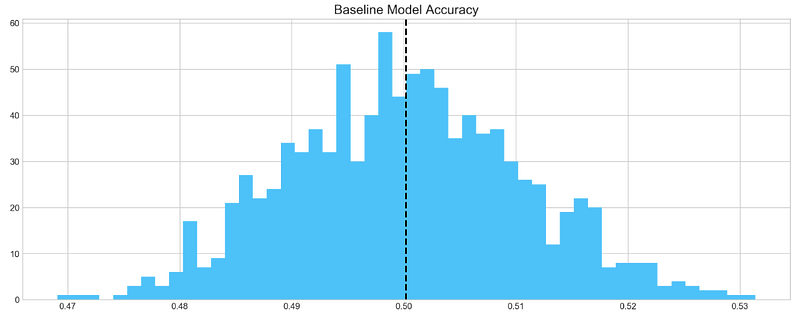
Based on 1000 random samples of TSLA stock return data, this code snippet creates a histogram of the accuracy scores generated by the baseline model. In order to store the accuracy scores, the code first creates an empty list called base_preds. As a result, the baseline_model() function is called 1000 times on the ‘Return’ column of the TSLA stock data, appending the accuracy score to the base_preds list each time.
In the next step, the code creates a blue histogram of the base_preds data using plt.hist() from the matplotlib library. In this case, “Baseline Model Accuracy” is set as the title of the histogram by using plt.title(). Using plt.axvline(), the code adds a vertical line to the histogram to indicate the baseline model’s mean accuracy score. It is displayed as a black dashed line with a thickness of 2 using np.array(base_preds).mean().
Lastly, the histogram is displayed using plt.show(). This code can be used to visualize how well the baseline model performs on average based on the distribution of its accuracy scores. The baseline model may be a good starting point if the distribution is centered around a high accuracy score. To achieve better performance, more sophisticated models or feature engineering may be required if the distribution is widely spread or centered around a low accuracy score.
Baseline model on average has 50% accuracy. We take this number as a guideline for our more complex models
ARIMA
AutoRegressive Integrated Moving Average (ARIMA) is a model that captures a suite of different standard temporal structures in time series data.
- p: The number of lag observations included in the model, also called the lag order.
- d: The number of times that the raw observations are differenced, also called the degree of differencing.
- q: The size of the moving average window, also called the order of moving average.
We will split train and test data to evaluate performance of ARIMA model.
print('Tesla historical data contains {} entries'.format(stocks['tsla'].shape[0]))
stocks['tsla'][['Return']].head()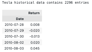
By accessing the ‘shape[0]’ attribute of the ‘tsla’ DataFrame and formatting the result with a string literal and the print() function, this code snippet prints the number of entries in the historical TSLA stock data. Using the double bracket notation ([[‘Return’]]), it accesses the first five rows of the ‘Return’ column in the ‘tsla’ DataFrame and calls the .head() function.
In order to ensure that the TSLA stock data has been read in correctly and that the desired columns are present, this code can be used. To get an idea of the data structure and values, use .head() to display the first few rows of the DataFrame using the .shape attribute.
Autocorrelation
Let’s take a look at the `Autocorrelation Function` below. The graph shows how time series **data points** correlate between each other. We should ignore first value in the graph that shows perfect correlation (value = 1), because it tells how **data point** is correlated to itself. What’s important in this graph is how **first** data point is correlated to **second**, **third** and so on. We can see that it’s so weak, it’s close to zero. What does it mean to our analysis? It means that ARIMA is pretty much useless here, because it uses previous data points to predict following.
plt.rcParams['figure.figsize'] = (16, 3)
plot_acf(stocks['tsla'].Return, lags=range(300))
plt.show()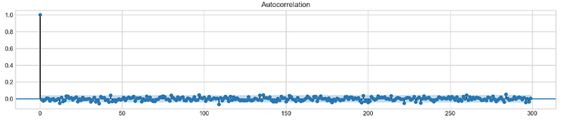
By using the plt.rcParams[‘figure.figsize’] parameter, Matplotlib plots will have a figure size of 16 inches by 3 inches. A plot_acf() function from the statsmodels.graphics.tsaplots module is then used to estimate the autocorrelation for TSLA stock ‘Return’ column. Autocorrelation is shown with lags set to a range(300) for a maximum of 300 lags. Plotting the autocorrelation is completed by calling plt.show().
The autocorrelation plot is commonly used to visualize the correlation between a series and its lags in time series analysis. It is possible to detect seasonal patterns or dependencies in the TSLA stock returns using the autocorrelation plot. An autoregressive (AR) or seasonal autoregressive (SAR) model may be appropriate if the data show significant autocorrelations at certain lags.
To make a conclusion we’re going to try different orders and see how well they perform on a given data.
# ARIMA orders
orders = [(0,0,0),(1,0,0),(0,1,0),(0,0,1),(1,1,0)]
# Splitting into train and test sets
train = list(stocks['tsla']['Return'][1000:1900].values)
test = list(stocks['tsla']['Return'][1900:2300].values)all_predictions = {}for order in orders:
try:
# History will contain original train set,
# but with each iteration we will add one datapoint
# from the test set as we continue prediction
history = train.copy()
order_predictions = []
for i in range(len(test)):
model = ARIMA(history, order=order) # defining ARIMA model
model_fit = model.fit(disp=0) # fitting model
y_hat = model_fit.forecast() # predicting 'return'
order_predictions.append(y_hat[0][0]) # first element ([0][0]) is a prediction
history.append(test[i]) # simply adding following day 'return' value to the model
print('Prediction: {} of {}'.format(i+1,len(test)), end='\r')
accuracy = accuracy_score(
functions.binary(test),
functions.binary(order_predictions)
)
print(' ', end='\r')
print('{} - {:.1f}% accuracy'.format(order, round(accuracy, 3)*100), end='\n')
all_predictions[order] = order_predictions
except:
print(order, '<== Wrong Order', end='\n')
pass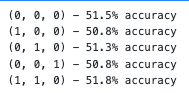
The following code snippet defines a list of orders that will be tested against the ARIMA model. A tuple of three integers is used for the orders: p for the autoregressive model (AR), d for the differencing model, and q for the moving average model.
Data in the TSLA stock ‘Return’ column is then split into training and testing sets. Data from the first 900 days are defined as the training set, while data from the next 400 days are defined as the testing set.
A dictionary all_predictions is created to store predictions for each ARIMA order next.
Based on the ARIMA model, the code predicts the next day’s return for each order in the orders list. In order to predict the next day’s return, the model is fitted with the training data up until the current time step.
Order_predictions are then updated with the predicted return, and the training set is updated with the value for the following day.
A model’s accuracy is calculated using the accuracy_score() function in the sklearn.metrics module after all predictions have been made. Calculating accuracy requires converting the true and predicted returns into binary form using the functions.binary() helper function.
The predicted returns are stored in the all_predictions dictionary under the order key along with the accuracy score and order.
Testing different ARIMA orders on the testing set can be done using this code. In order to make predictions on new data, the accuracy scores can be used to select the best ARIMA model order. The ARIMA model may not be suitable for modeling the data if accuracy scores are consistently low, and other models should be considered instead.
Review Predictions
# Big Plot
fig = plt.figure(figsize=(16,4))
plt.plot(test, label='Test', color='#4ac2fb')
plt.plot(all_predictions[(0,1,0)], label='Predictions', color='#ff4e97')
plt.legend(frameon=True, loc=1, ncol=1, fontsize=10, borderpad=.6)
plt.title('Arima Predictions', fontSize=15)
plt.xlabel('Days', fontSize=13)
plt.ylabel('Returns', fontSize=13)
# Arrow
plt.annotate('',
xy=(15, 0.05),
xytext=(150, .2),
fontsize=10,
arrowprops={'width':0.4,'headwidth':7,'color':'#333333'}
)
# Patch
ax = fig.add_subplot(1, 1, 1)
rect = patches.Rectangle((0,-.05), 30, .1, ls='--', lw=2, facecolor='y', edgecolor='k', alpha=.5)
ax.add_patch(rect)# Small Plot
plt.axes([.25, 1, .2, .5])
plt.plot(test[:30], color='#4ac2fb')
plt.plot(all_predictions[(0,1,0)][:30], color='#ff4e97')
plt.tick_params(axis='both', labelbottom=False, labelleft=False)
plt.title('Lag')
plt.show()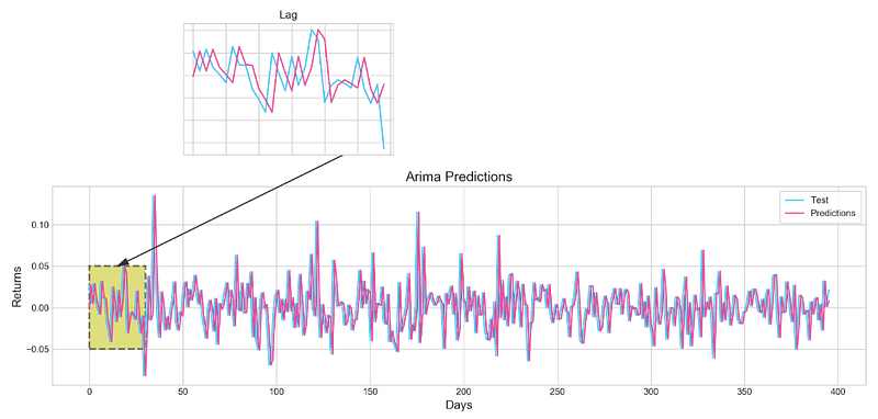
As well as a large plot showing the actual and predicted returns for the TSLA stock, this code snippet also displays a smaller plot showing the first 30 days of the testing set. The first step is to create a 16-inch x 4-inch figure using fig = plt.figure(figsize=(16,4)). After that, plt.plot(test, label=’Test’, color=’#4ac2fb’) plots the actual returns, while plt.plot(all_predictions[(0,1,0)], label=’Predictions’, color=’#ff4e97') plots the predicted returns for the ARIMA model.
By using plt.legend(), the labeled and colored lines are displayed with a legend. In this example, plt.title() is used to set the title, and plt.xlabel() and plt.ylabel() are used to set the axes and labels. The plot is highlighted with an arrow using plt.annotate(), and the plot’s section is indicated with a yellow patch using patches.Rectangle().
Plot.axes() is used to create a smaller plot at [.25, 1, .2, .5] with the location and size specified. Plat.plot() is used to plot the first 30 days of the testing set and outcomes, and plt.tick_params() is used to remove the labels on the x- and y-axes. Lastly, plt.show() is used to display the plots. Visualize the ARIMA model’s predictions and compare them to the actual returns of TSLA stock using this code. An overview is provided by the large plot, whereas a closer look is provided by the smaller plot. You can use the arrow and patch to highlight specific features of the plot, including a turning point or a key section.
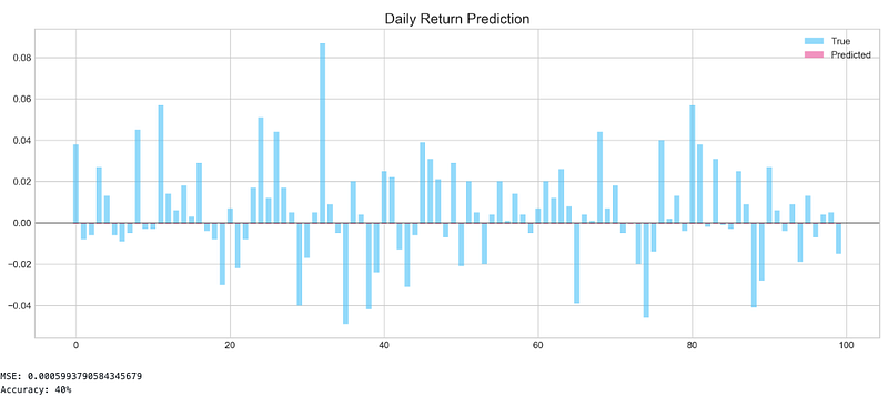
Histogram
plt.figure(figsize=(16,5))
plt.hist(stocks['tsla'][1900:2300].reset_index().Return, bins=20, label='True', facecolor='#4ac2fb')
plt.hist(all_predictions[(0,1,0)], bins=20, label='Predicted', facecolor='#ff4e97', alpha=.7)
plt.axvline(0, c='k', ls='--')
plt.title('ARIMA True vs Predicted Values Distribution', fontSize=15)
plt.legend(frameon=True, loc=1, ncol=1, fontsize=10, borderpad=.6)
plt.show()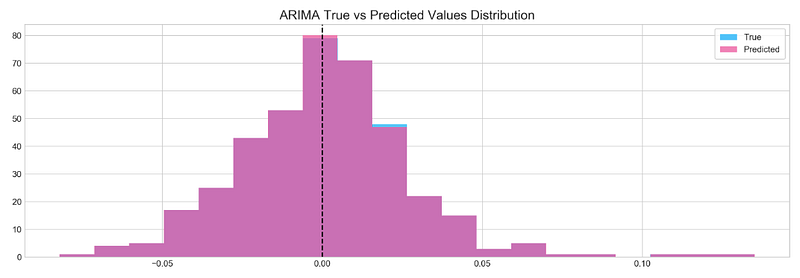
Using the same ARIMA model with order (0,1,0), it generates a histogram of the true and predicted returns for the TSLA stock over the testing period. With plt.figure(figsize=(16,5)), the figure size is set to 16, and the histogram is sliced from 1900 to 2300 based on the ‘Return’ column of the ‘tsla’ DataFrame. Bins is used to divide the histogram into 20 bins, and the histogram is given a label and a color.
In the all_predictions dictionary, the predictions from the ARIMA model with order (0,1,0) are used to create the histogram of predicted returns. There are also 20 bins in the histogram, which are labeled and given a color. The bars are semi-transparent by setting the alpha value to .7. Plt.axvline() is used to draw a vertical line at zero, and plt.title() and plt.legend() are used to add titles and legends. For the TSLA stock during the testing period, this code can be used to compare the true and predicted returns. The ARIMA model may be capturing the data patterns accurately if the distributions are similar. It may mean that the model is not appropriate for modeling the data if the distributions are significantly different.
Sentiment Analysis
tesla_headlines = pd.read_csv('data/tesla_headlines.csv', index_col='Date')A DataFrame named tesla_headlines is created using a CSV file named tesla_headlines.csv, with the Date column set as the index column. Using the pandas module, the pd.read_csv() function reads in the CSV file. In the current working directory, the data directory is assumed to be. Using ‘Date’ as the index column, the index_col parameter specifies that the Date column should be used as an index. By reading in news headlines about the TSLA stock, this code can analyze the relationship between news and stock returns.
tesla = stocks['tsla'].join(tesla_headlines.groupby('Date').mean().Sentiment)This code snippet joins the TSLA stock returns data from the stocks dictionary with news sentiment data from the tesla_headlines DataFrame. Tesla is the new variable created from the resulting DataFrame. TESLA_headlines.groupby(‘Date’) groups the news sentiment data by date, and .mean() calculates the average sentiment score for each date. As a result, the DataFrame has the date as the index column, and a single column named ‘Sentiment’ contains the mean sentiment score for each date.
The stock returns data and news sentiment data are then combined using the join() method. Based on the index values of the two DataFrames, the join() method matches the rows of the two DataFrames. Using the same index as the stock returns data, the resulting DataFrame contains all columns from the stock returns data as well as the ‘Sentiment’ column from the news sentiment data. Tesla is the name of the new variable created from the resulting DataFrame.
For the TSLA stock, you can analyze the relationship between news sentiment and stock returns using this code. Stock returns data can be used as a response variable in a regression analysis, with the ‘Sentiment’ column used as a predictor variable. In this way, we can determine whether news sentiment is significantly correlated with stock returns, and to what extent it can be used to predict future stock returns.
tesla.fillna(0, inplace=True)Tesla DataFrame’s missing values in this code snippet are replaced with 0. In the fillna() method, missing values are substituted in-place, modifying the original DataFrame and not returning a new one. Using the fillna() method, you substitute the missing value with a single argument. In this case, 0 is set as the value. Missing values in Tesla DataFrames can be handled with this code before further analysis or modeling. Missing values can be replaced with 0 to prevent errors caused by missing data in analysis or modeling.
It is important to note, however, that replacing missing values with 0 may not always be the best strategy, as this can introduce bias or distort the distribution of the data. In addition to imputation, interpolation, or deletion, other strategies for handling missing values include imputation with the mean or median. Depending on the nature of the missing values and the analysis or modeling requirements, the best strategy will be determined.
plt.style.use('seaborn-whitegrid')
plt.figure(figsize=(16,6))
plt.plot(tesla.loc['2019-01-10':'2019-09-05'].Sentiment.shift(1), c='#3588cf', label='News Sentiment')
plt.plot(tesla.loc['2019-01-10':'2019-09-05'].Return, c='#ff4e97', label='Return')
plt.legend(frameon=True, fancybox=True, framealpha=.9, loc=1)
plt.title('Tesla News Sentiment and Daily Return', fontSize=15)
plt.show()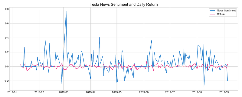
For the period January 10, 2019 to September 5, 2019, this code snippet plots the daily TSLA stock returns and news sentiment score. In the first step, the plt.style.use() function is used to set the plot style to seaborn-whitegrid, which is a matplotlib style that provides a white grid on a light gray background. The next step is to create a 16 by 6 inch figure using the plt.figure() function. To set the size of a figure, use the figsize parameter. A graph is then drawn using plt.plot() by plotting two lines together. To illustrate the relationship between the news sentiment score on one day and the stock returns on the next day, the first line represents the news sentiment score which is shifted by one day using .shift(1).
In the second line, you can see the daily stock returns. Using the c parameter, we set the colors of the two lines to ‘#3588cf’ and ‘#ff4e97’, respectively. PLT.legend() is used to add the legend to the graph, with the frameon, fancybox, and framealpha parameters set to True, True, and .9, respectively, to add a frame, make the legend box fancy, and set the frame’s opacity to .9. loc is used to add the legend at 1 in the graph. PLT.title() is used to set the title of the graph, and PLT.show() is used to display the graph.
It is possible to visualize the relationship between daily TSLA stock returns and news sentiment using this code. By plotting the data, patterns, trends, and outliers can be identified, and it can be determined whether news sentiment is correlated with stock returns. Stock returns can be influenced by other factors as well, so correlation does not necessarily imply causation.
Feature Selection With XGBoost
XGBoost will be used here to extract important features that will be used for neural networks. This might help to improve model accuracy and boost training. Traning will be performed on scaled `Tesla` dataset.
scaled_tsla = functions.scale(stocks['tsla'], scale=(0,1))The scale() function in the functions module is used to scale the TSLA stock prices and returns in the stocks DataFrame. Scaling to a range between 0 and 1 requires the scale parameter to be set to (0,1). In scale(), the minimum value is turned into 0 and the maximum value is turned into 1, and all other values are scaled proportionally between 0 and 1. It helps to compare variables that have different units or scales by normalizing their values to a common range. DataFrame scaled_tsla is created to store the rescaled data. To compare the values of the two variables and to visualize the data more clearly, this code can normalize the TSLA stock prices and returns to a common range. It is also important to keep in mind that scaling the data may affect how the data is interpreted and how any modeling or analysis results are presented.
X = scaled_tsla[:-1]
y = stocks['tsla'].Return.shift(-1)[:-1]
This code snippet specifies the input features X and the target variable Y for a supervised learning problem. Scaled TSLA stock prices and returns are used as input features X, excluding the last row of the scaled_tsla DataFrame. This row is excluded because it does not have a corresponding target value. Stocks[‘tsla’].Return.shift(-1)[:-1] is used to calculate the target variable y, which represents daily returns for TSLA shifted by one day. Input features are shifted to align the target variable with the input features so that each row corresponds to the target value of the next day. A regression or classification algorithm can use the resulting X and Y arrays as input and output, respectively. Based on the input features X, the model would aim to predict the target variable y.
# Initializing and fitting a model
xgb = XGBClassifier()
xgb.fit(X[1500:], y[1500:])
In this code snippet, the gradient boosting algorithm is implemented using the XGBoost library to create an instance of the XGBClassifier class. XGBClassifier predicts binary or multiclass outcomes based on a classification model. To train the model using input features X and target variables Y, we call the fit() method on the xgb object. We exclude the first 1500 rows of training data by specifying X[1500:] and Y[1500:].
First 1500 rows are likely used as a warm-up period to initialize the model and avoid any biases or inaccuracies at the start of the data set. In addition to predicting y for new input features, the model can be used to evaluate the accuracy of the predictions using various metrics, or to identify the most important input features.
important_features = pd.DataFrame({
                                    'Feature': X.columns,
                                    'Importance': xgb.feature_importances_}) \
.sort_values('Importance', ascending=True)plt.figure(figsize=(16,8))
plt.style.use('seaborn-whitegrid')
plt.barh(important_features.Feature, important_features.Importance, color="#4ac2fb")
plt.title('XGboost - Feature Importance - Tesla', fontSize=15)
plt.xlabel('Importance', fontSize=13)
plt.show()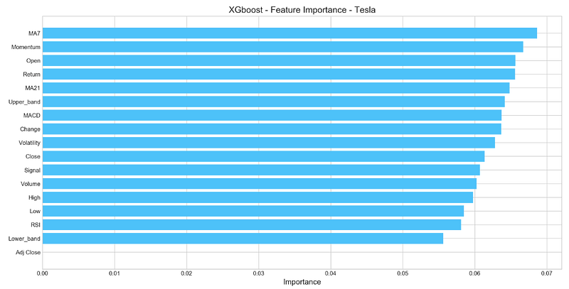
Using the feature_importances_ attribute of the trained XGBClassifier model, this code snippet computes the importance of each input feature. The importance values for each input feature are then stored in a DataFrame named important_features. In the important_features DataFrame, importance values are sorted in ascending order using .sort_values(‘Importance’, ascending=True).
The features can then be visualized in decreasing importance order. With plt.barh(), an x-axis displays the importance values and the y-axis displays the feature names. Plot.style.use(‘seaborn-whitegrid’) styles the plot, and plt.title() titles it “XGboost — Feature Importance — Tesla.” Using plt.show(), we can see the plot. Plotting each input feature’s importance in the model can be useful for determining which features should be included in the model or interpreting its results.
Deep Neural Network
n_steps = 21
scaled_tsla = functions.scale(stocks['tsla'], scale=(0,1))
X_train, \
y_train, \
X_test, \
y_test = functions.split_sequences(
scaled_tsla.to_numpy()[:-1],
stocks['tsla'].Return.shift(-1).to_numpy()[:-1],
n_steps,
split=True,
ratio=0.8
)An algorithm for sequence prediction is implemented using the sliding window approach in this code snippet. With the functions.scale() function, the TSLA stock prices and returns are scaled to be between 0 and 1. Since the last row does not have a corresponding target value, it is excluded using scaled_tsla.to_numpy()[:-1].
A sliding window of length n_steps is then created from the input sequence using the split_sequences() function. Scaled_tsla.to_numpy() is specified as the input sequence, and stocks[‘tsla’].Return.shift(-1).to_numpy() is specified as the target variable. By specifying split=True and ratio=0.8, the split_sequences() function divides the input sequence and target variable into training and testing sets.
We return X_train, Y_train, X_test, and Y_test as the results. (n_samples, n_steps, n_features) are three-dimensional arrays of shape (n_samples, n_steps, n_features), where n_samples is the number of samples, n_steps is the number of time steps in each window, and n_features is the number of input features. Since the input sequence consists of scaled TSLA stock prices and returns, n_features is 2. Where n_samples is a number of samples, y_train and y_test are two-dimensional arrays.
LSTM Network
keras.backend.clear_session()n_steps = X_train.shape[1]
n_features = X_train.shape[2]model = Sequential()
model.add(LSTM(100, activation='relu', return_sequences=True, input_shape=(n_steps, n_features)))
model.add(LSTM(50, activation='relu', return_sequences=False))
model.add(Dense(10))
model.add(Dense(1))
model.compile(optimizer='adam', loss='mse', metrics=['mae'])Here is a code snippet using the Keras API with TensorFlow as the backend for a neural network that predicts sequences. To reset Keras session and remove existing models and layers, keras.backend.clear_session() is called first. With X_train.shape[1] and X_train.shape[2], n_steps and n_features are set to n time steps and n input features, respectively. Creating an empty neural network model is done using the Sequential() function. The model is expanded by adding layers with model.add().
In the first layer, there is an LSTM with 100 units and a ReLU activation function. Input_shape = (n_steps, n_features) takes a three-dimensional input of shape. This layer should output a sequence if return_sequences=True is set. LSTMs as well as ReLU activation functions make up the second layer. Due to the default return_sequences setting of False, this layer produces a single vector of length 50. An additional Dense() layer with a single output unit for the predicted return value is added after a Dense() layer with 10 units is added.
Model learning is configured by calling the compile() method. To measure the difference between the predicted and true return values, the mean squared error (MSE) loss function is used, and to evaluate the model’s performance during training, the mean absolute error (MAE) metric is used. The model consists of two LSTM layers followed by two fully connected Dense() layers. Each sequence of input samples, steps, and features is input into the program and outputs a single scalar value.
model.fit(X_train, y_train, epochs=100, verbose=0, validation_data=[X_test, y_test], use_multiprocessing=True)plt.figure(figsize=(16,4))
plt.plot(model.history.history['loss'], label='Loss')
plt.plot(model.history.history['val_loss'], label='Val Loss')
plt.legend(loc=1)
plt.title('LSTM - Training Process')
plt.show()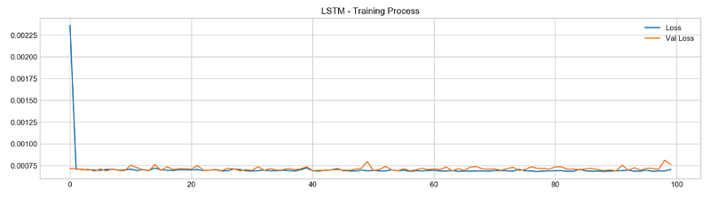
With the help of the fit() method in Keras, this code snippet trains an LSTM neural network model. The fit() method takes two arguments, X_train and y_train, as input and output data. Here, 100 epochs (i.e., iterations over the entire training set) are specified by the epochs parameter. By setting the verbose argument to 0 and the validation_data argument to [X_test, y_test], progress bars will not display during training. As a final step, the use_multiprocessing argument is set to True during training to use multiple CPU cores simultaneously.
The history attribute of the trained model is used to plot the training and validation loss over epochs. For each epoch in training and validation, the history attribute contains training and validation loss values, as well as any other metrics monitored (e.g., accuracy). A plot is drawn using plt.plot() only for the loss and validation loss values. A plot of the epoch-by-epoch loss shows how the model learns to make better predictions over time, indicating that it is improving.
pred, y_true, y_pred = functions.evaluation(
X_test, y_test, model, random=False, n_preds=50,
show_graph=True)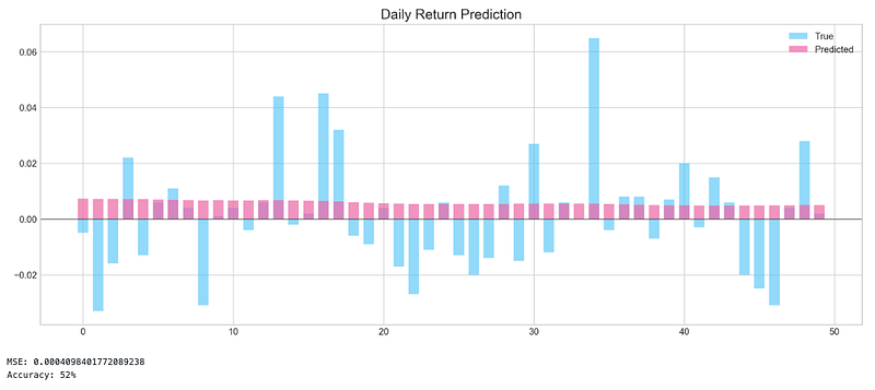
To evaluate the performance of the LSTM model trained in the previous code snippet, this code snippet calls the evaluation() function from the functions module. A test dataset containing input features and target values is passed as arguments to the evaluation() function: X_test and y_test. An LSTM model that has been trained. random: a boolean argument indicating whether to generate random predictions (for the baseline model comparison).
This option is disabled by setting random=False. Predictions will be made based on the value of n_preds, an integer value. Whether to display a graph of predicted and true values is indicated by show_graph, a boolean argument. In this case, show_graph=True is set in the code to display the graph. Pred, y_true, and y_pred are assigned the output of the evaluation() function. A predicted value is called pred. A true target value is called y_true, and a predicted value is called y_pred. Using the show_graph=True option, this code snippet also shows a graph of predicted and true values.
Bayesian Optimizer
def create_model(d1, d2, filters, pool, kernel):
keras.backend.clear_session()
d1 = int(d1)
d2 = int(d2)
filters = int(filters)
kernel = int(kernel)
pool = int(pool)
n_steps = X_train.shape[1]
n_features = X_train.shape[2]
model = Sequential()
model.add(Conv1D(filters=filters, kernel_size=kernel, activation='relu', input_shape=(n_steps, n_features)))
model.add(MaxPooling1D(pool_size=pool))
model.add(Flatten())
model.add(Dense(d1, activation='relu'))
model.add(Dense(d2, activation='relu'))
model.add(Dense(1))
model.compile(optimizer='adam', loss='mse', metrics=['mse'])
model.fit(X_train, y_train, epochs=4, verbose=0, validation_data=[X_test, y_test], use_multiprocessing=True)
score = model.evaluate(X_test, y_test, verbose=0)
return score[1]The code defines a function create_model() that takes five input parameters: d1, d2, filters, pool, and kernel. Convolutional neural networks (CNNs) are created based on these parameters. The first step is to call keras.backend.clear_session() to reset the Keras session and remove any existing models and layers. Using int(), the input parameters are converted to integers. By using X_train.shape[1] and X_train.shape[2], n_steps and n_features are set to the number of time steps and input features in X_train. To create an empty neural network model, Sequential() is called. Model.add() adds layers to the model.
A Conv1D layer with filters, kernel, and relu activation function takes a three-dimensional input of shape (n_steps, n_features). In this layer, the return_sequences=True argument indicates that the output should be a sequence. Secondly, there is a MaxPooling1D layer with the size of the pool pool. In the next step, a Flatten() layer is added to the model, followed by two Dense() layers with d1 and d2 units and a ReLU activation function. As a final step, a Dense() layer is added with a single output unit for the predicted return value. A model’s learning process is configured using the compile() method.
The Adam optimizer is used, the mean squared error (MSE) loss function is used to determine the difference between the predicted and true return values, and the mean squared error (MSE) metric is used to evaluate the performance of the model. In order to train the model on the training data, the fit() method is called. Four epochs are used. The model is evaluated using the evaluate() method on the test data, and the mean squared error is calculated.
def bayesian_optimization(): pbounds = {
'filters': (1, 10),
'd1': (160, 250),
'd2': (10, 40),
'kernel': (2,10),
'pool': (2, 10)
} optimizer = BayesianOptimization(
f = create_model,
pbounds = pbounds,
random_state = 1,
verbose = 2
)
optimizer.maximize(init_points=5, n_iter=5)
print(optimizer.max)Using this function, you can tune the hyperparameters of a convolutional neural network model to predict time series with a Bayesian approach. It creates a dictionary of hyperparameters with their corresponding search bounds called pbounds. There are several hyperparameters to consider, including the number of filters in the convolutional layer, the number of units in the first dense layer, the number of units in the second dense layer, the kernel size, and the pool size.
This function then initializes a BayesianOptimization object with the create_model function as the objective function. Pbounds is passed a dictionary. For reproducibility, the random_state parameter sets the random seed, and the verbose parameter controls the optimization process’ verbosity. On the optimizer object, which runs the Bayesian optimization process, maximize() is called. Init_points specifies the number of random initializations to be performed before optimization begins; n_iter specifies the number of optimization iterations. According to the optimizer object’s max attribute, the function prints the hyperparameters that resulted in the best model performance.
n_steps = 21
scaled_tsla = functions.scale(stocks['tsla'], scale=(0,1))
X_train, \
y_train, \
X_test, \
y_test = functions.split_sequences(
scaled_tsla.to_numpy()[:-1],
stocks['tsla'].Return.shift(-1).to_numpy()[:-1],
n_steps,
split=True,
ratio=0.8
)The code defines 21 steps for the sequence and scales the ‘tsla’ column of a DataFrame called ‘stocks’ using the ‘scale’ function from the module ‘functions’. Using ‘split_sequences’, it divides the scaled data into training and testing sets.
Four arguments are required for the ‘split_sequences’ function:
Scaled data except for the last element, which is sliced using ‘to_numpy()[:-1]’. As the function aims to predict the next value in the sequence, there is no value after the last element to predict.
With ‘.Return.shift(-1)’, the daily return of ‘tsla’ is shifted by one position, which is also sliced up to the second-to-last element using ‘to_numpy()[:-1]’. The model’s target variable is this.
Each input sequence has a certain number of steps.
According to the ‘split’ argument, the data will be split into training and testing sets based on the ‘ratio’ argument, which is set to 0.8, meaning that 80% of the data will be used for training, and 20% for testing.
Four values are returned by the function:
X_train, which contains the input sequences for training.
y_train, which contains the target values for training.
X_test, which contains the input sequences for testing.
y_test, which contains the target values for testing.
n_steps = X_train.shape[1]
n_features = X_train.shape[2]
keras.backend.clear_session()
model = Sequential()
model.add(Conv1D(filters=9, kernel_size=5, activation='relu', input_shape=(n_steps, n_features)))
model.add(MaxPooling1D(pool_size=9))
model.add(Flatten())
model.add(Dense(250, activation='relu'))
model.add(Dense(10, activation='relu'))
model.add(Dense(1))
model.compile(optimizer='adam', loss='mse', metrics=['mse'])
By using the ‘shape’ attribute of the numpy array, the code initializes the number of time steps in the input sequences for the model to the number of columns in the training set (X_train). In the same way, the number of features in the input sequences is the same as the number of features in the training set. By using the ‘Sequential’ class from the Keras library, the next few lines of code set up the neural network model. Multiple layers are present in the model.
In the first layer, there are nine filters, a kernel size of 5, and a ReLU activation function. ‘input_shape’ specifies the shape of the input data, which in our case is (n_steps, n_features). In the second layer, a MaxPooling1D layer with a pool size of 9 performs downsampling by taking the maximum value within a window of size 9. In the third layer, the output of the previous layer is flattened into a 1D array. There are 250 neurons in the fourth layer and 10 neurons in the fifth layer, both using the ReLU activation function.
The final layer is a Dense layer with a single neuron and no activation function, which outputs the predicted value. MSE is used as the loss function in the Adam optimizer. During training, MSE is also used as a metric to evaluate the model’s performance.
model.fit(X_train, y_train, epochs=100, verbose=0, validation_data=[X_test, y_test], use_multiprocessing=True)plt.figure(figsize=(16,4))
plt.plot(model.history.history['loss'], label='Loss')
plt.plot(model.history.history['val_loss'], label='Val Loss')
plt.legend(loc=1)
plt.show()# Evaluation
pred, y_true, y_pred = functions.evaluation(
X_test, y_test, model, random=True, n_preds=100,
show_graph=True)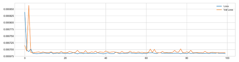
Using the training data (X_train and y_train) for 100 epochs, the model is trained using the ‘fit’ method. When the ‘verbose’ argument is set to 0, no output will be displayed during training. The ‘validation_data’ argument provides the testing data (X_test and y_test) for evaluating the model’s performance after each epoch. For faster training, the ‘use_multiprocessing’ argument is set to ‘True’. The code creates a 16x4 figure using Matplotlib’s ‘plt.figure’ function after training. Using Matplotlib’s plot function, it plots the training loss and validation loss for each epoch.
To add a legend to the plot, use the ‘legend’ function, and to display the plot, use the ‘show’ function. The code then evaluates the model using the ‘evaluation’ function from the ‘functions’ module. To generate predictions and compare them with actual target values, the ‘evaluation’ function takes the testing data (X_test and y_test), the trained model, and some additional arguments such as ‘random’ and ‘n_preds’. If ‘show_graph’ is set to ‘True’, a graph comparing actual and predicted values will be displayed. This function returns three values: ‘pred’, which is an array of actual and predicted values, ‘y_true’, which is an array of actual target values, and ‘y_pred’, which is an array of predicted values.
Finding Similar Patterns
Hypothesis behind this idea is simple: can patterns (sequences) found train set be used to predict patterns in test set? Pattern is a sequence of daily stock returns presented as binary values (0 — if return is negative, 1 — if return is positive). Example of sequence: [0, 1, 1, 0, 1, 0, 0, 1, 0]. The process can be broken down into several steps:
1. Split data into train and test sets
2. Pick first pattern (with length of 9 days) from test set and collect similar patterns in train set
3. Compare 10th day of train patterns with 10th day of test pattern, save result
4. Repeat process for the rest of the patterns in test set
plt.figure(figsize=(16,5))
plt.style.use('seaborn-whitegrid')
plt.plot(stocks['tsla'][2000:2100].Return, label='Stock', c='#4ac2fb')
plt.plot(stocks['tsla'][2001:2010].Return, lw=3, label='Pattern (9 days)', c='#ff4e97')
plt.legend(frameon=True, fancybox=True, framealpha=.9, loc=1)
plt.title('Patterns in Testing Set', fontSize=15)
plt.ylabel('Return')
plt.show()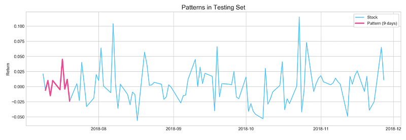
The code creates a 16x5 figure using the ‘plt.figure’ function from the Matplotlib library. Matplotlib’s ‘style.use’ function sets the plot’s style to ‘seaborn-whitegrid’. Using the Matplotlib ‘plot’ function with the color ‘#4ac2fb’, the code plots the daily returns of the ‘tsla’ stock for 100 days (from the 2000th to the 2100th). Using a thicker line (lw=3) and the color ‘#ff4e97’, it also plots the daily returns for the previous 9 days (from the 2001st to the 2010th day).
In the testing set, the model will attempt to predict this pattern. By using the ‘legend’ function, a legend is added to the plot with the labels ‘Stock’ and ‘Pattern (9 days). For styling the legend box, use the ‘frameon’, ‘fancybox’, and ‘framealpha’ arguments. To position the legend at the upper right corner of the plot, the ‘loc’ argument is set to 1. Using the ‘title’ function, the title of the plot is set to ‘Patterns in Testing Set’ and the font size to 15. The ‘ylabel’ function sets the y-axis label to ‘Return’. The plot is displayed by calling the ‘show’ function.
Similar Patterns to The Example
start = 1
window = 9
a = []
sample = binary_test[start:start+window]
for i in range(len(binary_train)-window):
if accuracy_score(binary_train[i:i+window], sample) == 1.0: a.append(i)plt.figure(figsize=(16,5))
plt.plot(stocks['tsla'][2000+start:start+2010].Return.values, label='TRUE', ls='--', lw=3, c='k')
[plt.plot(stocks['tsla'].Return[i:i+10].values, label=i) for i in a]
plt.axhline(0, c='k')
plt.title('Matched Patterns', fontSize=15)
plt.xlabel('Day', fontSize=13)
plt.ylabel('Return', fontSize=13)
plt.legend()
plt.show()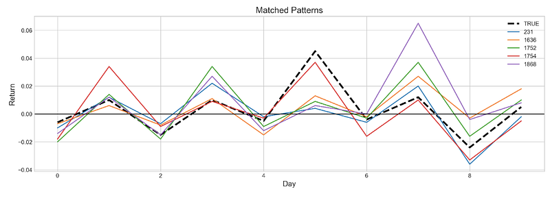
In the first step, the code sets the starting index of the testing set to 1 and the window size to 9. In order to store the indices of matching patterns, it creates an empty list called ‘a’. A sample of binary values with a length of ‘window’ is then selected from the testing set. To find patterns that match the selected sample, it loops through the binary values in the training set using the ‘accuracy_score’ function. A matching pattern’s index is appended to the ‘a’ list if it is found.
Using Matplotlib’s ‘plt.figure’ function, the code creates a 16x5 figure. Using a dashed line (ls=’ — ‘) with a width of 3 (lw=3) and the color black (c=’k’), it plots the daily returns of the ‘Tsla’ stock from the testing set. Using a loop and different colors, the code plots the daily returns of the ‘tsla’ stock from the training set for each matching pattern index in the ‘a’ list. Matplotlib’s ‘axhline’ function adds a horizontal line at y=0. Using the ‘title’ function, the code sets the title of the plot to ‘Matched Patterns’ and the font size to 15.
Labels for the x-axis and y-axis are set using the ‘xlabel’ and ‘ylabel’ functions. A legend can be added to a plot using the ‘legend’ function. Lastly, the plot is displayed using the ‘show’ function.
Q Learning
profit, trades = functions.macd_trading(stocks['tsla'].loc['2018':'2018'])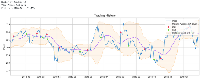
Using the Moving Average Convergence Divergence (MACD) indicator on the ‘Tsla’ stock data from 2018, the code calls the ‘macd_trading’ function from the ‘functions’ module. Using the ‘tsla’ stock data for 2018, the function returns two values: ‘profit’ which is the total profit made during the trading simulation, and ‘trades’ which is a DataFrame containing information about each trade. Based on the crossover of two exponential moving averages (EMAs) with different periods, the ‘macd_trading’ function generates buy and sell signals. Based on these signals, the function simulates trades and calculates profits. ‘trades’ DataFrame contains information about each trade, including the date, type of trade (buy or sell), price, quantity, and profit.
plotting.macd(stocks['tsla'].loc['2018':'2018'])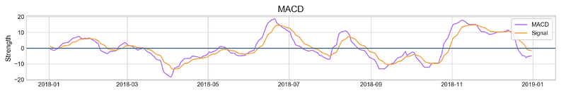
A plot of the Moving Average Convergence Divergence (MACD) indicator for the ‘tsla’ stock data from 2018 is generated by calling the ‘macd’ function in the ‘plotting’ module. As input, the function plots the MACD indicator, which is calculated as the difference between two exponential moving averages (EMA) with different periods. The MACD line (which is the EMA of the MACD line) is plotted as a solid line, while the signal line is dashed. A bar chart shows the MACD histogram (which represents the difference between the MACD line and the signal line). There are also horizontal lines at y=0 to indicate the crossover points between the MACD and signal lines. A crossing of the MACD line above the signal line is considered a bullish signal, indicating that it may be a good time to buy. In contrast, when the MACD line crosses below the signal line, it is considered a bearish signal, indicating that it may be a good time to sell. Based on the MACD indicator, traders can identify potential entry and exit points for trades using the ‘macd’ function.


