
📈 Mastering RRGs: Your Trading Game-Changer 🚀
Unlocking the Power of Visualization in Trading Strategy
In the world of trading and investing, understanding the dynamics of different securities is crucial. One tool that has emerged as a unique and powerful aid in this process is the Relative Rotation Graph (RRG). This innovative visualization tool allows traders to analyze the relative strength trends of several securities against a common benchmark and against each other, all on one graph. This article delves into the intricacies of RRGs and how they can enhance your trading strategy.
Agenda
- 📜 Concept of RRG
- 🛠️ How to Use RRGs
- ⏰ Which Timeframe to Use
- 🆓 Where to Use the RRG for Free
The Concept of RRGs
Relative Rotation Graphs, commonly referred to as RRGs, are a visualization tool that plots the relative strength and momentum of different securities. The concept of RRGs was developed to provide a clear, visual way to understand complex financial data. By plotting relative performance on one graph, they allow for a more intuitive understanding of the relative strength trends of several securities.
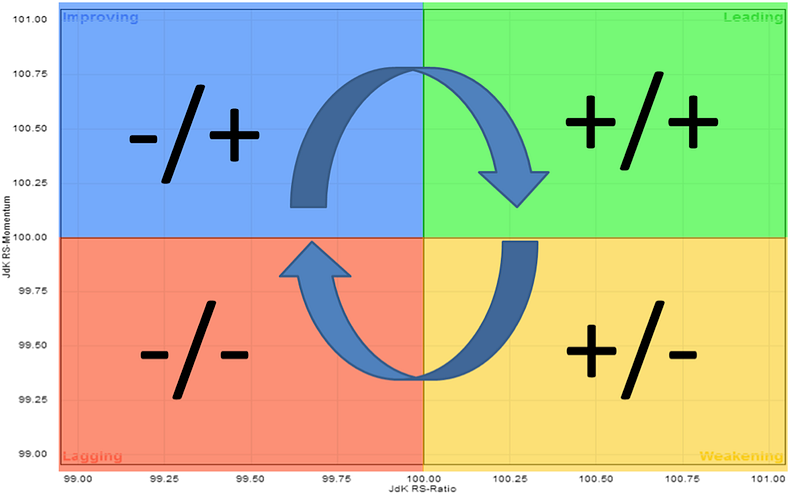
The real power of RRGs lies in their ability to depict true rotation, a concept often discussed in the context of sector and asset class rotation but difficult to visualize on linear charts. RRGs use four quadrants to define the four phases of a relative trend. These quadrants allow for the visualization of true rotations as securities move from one quadrant to another over time. This movement provides valuable insights into the relative performance and trend shifts of the securities being analyzed.
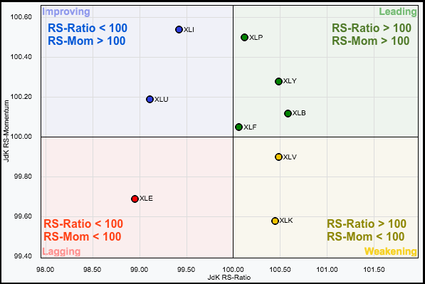
Understanding RS-Ratio and RS-Momentum Indicators
The RS-Ratio and RS-Momentum are two key indicators used in RRGs. The RS-Ratio measures the relative strength of a security against a benchmark over a certain period. A high RS-Ratio indicates that a security is outperforming the benchmark, while a low RS-Ratio indicates underperformance.
On the other hand, the RS-Momentum measures the momentum of the RS-Ratio. A rising RS-Momentum indicates improving relative strength, while a falling RS-Momentum indicates deteriorating relative strength. Together, these two indicators provide a comprehensive view of a security’s relative performance and momentum.
The Difference Between Daily and Weekly RRGs
RRGs can be plotted on both daily and weekly timeframes. The choice of timeframe depends on the trader’s strategy and investment horizon. Daily RRGs provide a short-term view of the relative performance and are suitable for short-term traders. On the other hand, weekly RRGs provide a longer-term view and are suitable for long-term investors.
Enhancing Trading Strategies with RRGs
Understanding the relative strength of different securities can provide valuable insights into potential investment opportunities. RRGs provide a visual way to analyze these trends, making it easier to identify patterns and shifts in performance. This can be particularly useful for traders and investors looking to understand the dynamics of different sectors or asset classes.
For instance, a security moving from the lagging quadrant (indicating underperformance) to the improving quadrant could signal a potential opportunity. Similarly, a security moving from the leading quadrant (indicating outperformance) to the weakening quadrant could suggest that it might be time to consider exiting that position.
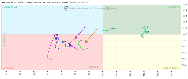
The chart provided serves as an illustrative example, clearly demonstrating that the financial sector is on the cusp of entering the ‘Improving’ quadrant. This transition suggests a potential upswing in relative strength, indicating promising prospects for this sector.
Get Access for free to RRG chart
There are several online platforms where you can use RRGs for free. Two of the most popular are StockCharts.com and the official RRG website. StockCharts.com offers a free version of RRGs, allowing you to plot RRGs for any group of securities and customize the benchmark and timeframe. Similarly, the official RRG website provides a platform for users to explore and utilize this powerful tool, offering a range of customization options to suit your specific trading strategy.
Conclusion
In conclusion, Relative Rotation Graphs (RRGs) offer a unique and powerful way to visualize and analyze the relative strength trends of different securities. They provide a new perspective on the dynamics of different sectors or asset classes, making it easier to spot patterns and potential opportunities. Whether you’re a seasoned trader or just starting out, understanding and using RRGs can be a valuable addition to your trading strategy. However, like any tool, they should be used as part of a comprehensive trading strategy and not in isolation.
If you found this breakdown helpful and want to stay updated on the latest in the trading world, make sure to follow me for more insightful content 📚🔍.
Appreciate your support and looking forward to sharing more with you! 👍💫


