
Mastering Next.js 13 and Recharts: Unleashing the Power of Data Visualization

Get ready to unleash the potential of data visualization with Next.js 13 and Recharts! In this article, I’ll guide you through the process of creating captivating and meaningful visualizations. Whether you’re a novice or an experienced developer, join us as we explore the dynamic fusion of Next.js 13 and the versatile Recharts library to transform your data into visuals.
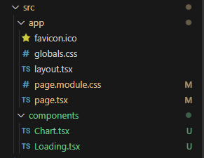
When you finish this article the folder structure should look like this.
To begin, I’ll walk you through the process of installing the Recharts library in your Next.js project. With just a few simple steps, you’ll be armed with the tools needed to bring your data to life.
npm install recharts
Once you’ve set up the necessary dependencies, I’ll dive into the implementation of the Loading Component. This component will serve as a placeholder while we eagerly await our data to be displayed. Don’t worry; I’ve got you covered with the code snippet and instructions.
const Loading: React.FC = ({}) => {
  return <h3>Loading...</h3>;
};

export default Loading;
Now, it’s time to introduce the star of the show — the Chart component. With the help of React and Recharts, I’ll guide you through the creation of visually stunning data visualizations. Brace yourself as we explore the code and explain each essential element, from defining the data structure to rendering the BarChart component.
// Import necessary dependencies from React and Recharts libraries
import { useEffect, useState } from "react";
import {
  BarChart,
  Bar,
  XAxis,
  YAxis,
  CartesianGrid,
  Tooltip,
  Legend,
} from "recharts";
import Loading from "./Loading";

// Define the type for a single data point
type DataPoint = {
  name: string;
  value: number;
};

// Define the type for the props of the Chart component
type ChartProps = {
  data: DataPoint[];
};

// Define the Chart component as a functional component
const Chart: React.FC<ChartProps> = ({ data }) => {
  // Declare a state variable to keep track of whether the code is running on the client side
  const [isClient, setIsClient] = useState<boolean>(false);

  // Use the useEffect hook to set the isClient state to true when the component mounts
  useEffect(() => {
    setIsClient(true);
  }, []);

  // Render the chart component conditionally based on the isClient state
  return (
    <>
      {isClient ? (
        // If the code is running on the client side, render the BarChart component from Recharts
        <BarChart width={500} height={300} data={data}>
          <CartesianGrid strokeDasharray="3 3" />
          <XAxis dataKey="name" />
          <YAxis />
          <Tooltip />
          <Legend />
          <Bar dataKey="value" fill="#8884d8" />
        </BarChart>
      ) : (
        // If the code is running on the server side, render a Loading component
        <Loading />
      )}
    </>
  );
};

export default Chart;
Next, I’ll guide you through the seamless integration of the Chart component into your page.tsx file, allowing your data to shine on a stunning web page. I’ve also added some basic styling to enhance the visual appeal. Witness the magic as your data takes center stage and feel free to unleash your creativity by customizing the styling to match your unique vision.
import styles from "./page.module.css";
import Chart from "@/components/Chart";

const data = [
  { name: "Data Point 1", value: 10 },
  { name: "Data Point 2", value: 20 },
  { name: "Data Point 3", value: 30 },
  { name: "Data Point 4", value: 40 },
];

export default function Home() {
  return (
    <main className={styles.main}>
      <div>
        <h1 className={styles.title}>Data Visualization</h1>
        <Chart data={data} />
      </div>
    </main>
  );
}
.main {
display: flex;
flex-direction: column;
justify-content: space-between;
align-items: center;
justify-content: center;
padding: 6rem;
min-height: 100vh;
}
.title {
text-align: center;
margin-bottom: 2.5rem;
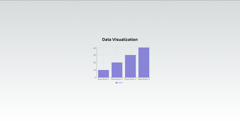
}In this moment your web page should look like this.
I would love to hear your thoughts and opinions on the content, so please feel free to leave a comment and let me know what you think. Additionally, if you have any suggestions or ways in which I can improve my writing, I would greatly appreciate your feedback. Thank you for taking the time to read my article and I hope to hear from you soon!


