
Master Data Visualization with ggplot2: Pie Charts, Spider Plots, and Bar Plots
Your go-to guide on creating pie charts, spider plots, and circular bar plots in R
In the third part of the data visualization series with ggplot2, we will focus on circular plots. The list of the tutorials are as follows:
- Scatter and box plots
- Histograms, Bar, and Density plots
- Circular plots (pie charts, spider plots, and bar plots)
- theme(): create your own theme() for increased workflow
So, under circular visualizations, we will be covering on how to create the following charts:
- Pie charts
- Spider charts
- Circular bar plots
Further, we will discuss the pros and cons of using these types of visualizations.
With great power comes great responsibility, use pie and spider charts wisely.
Data and packages
For creating visuals for circular plots, we will be using the breakfast cereal dataset from Kaggle. The dataset has 77 unique cereal types with 16 fields.
We will be creating two new variables: manufact (contains the count of different cereal manufacturers) and cereal_Bran_low (filtered nutrition data for selected Bran cereal brand with calorie value between 80 and 120).
In the third part of the series, as usual, we will be using ggplot2 and tidyverse which are the basic packages widely used. Apart from them, for plotting spider or radar plot, ggradar package will be used.
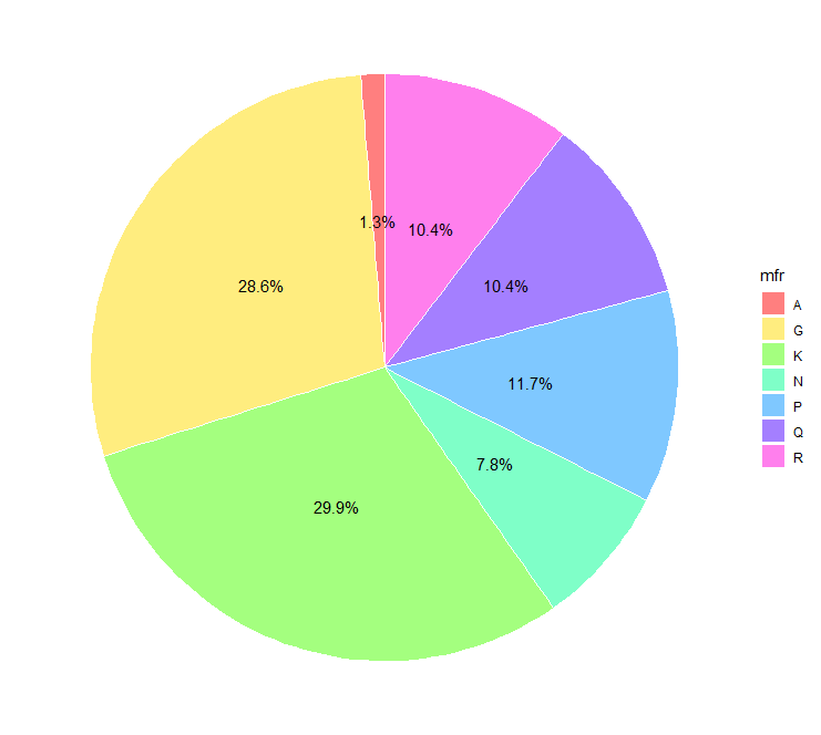
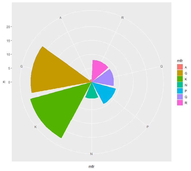
Pie charts
For creating Pie charts, we will be using the manufact variable. There is no defined function for creating Pie chart in ggplot2 package, although the base plotting in R has pie() function. In order for us to plot Pie charts using ggplot2, we will use geom_bar() and coord_polar() functions to create segments of a circle. coord_polar() function converts the cartesian coordinates to the polar coordinate system, this way it is easy to create circular plots. The x argument for the ggplot() aesthetics is assigned as x=“ ” and the theta argument is assigned y value in the coord_polar() function.
To convert a bar chart to a pie chart, set stat=“identity” in geom_bar() and fix width=1 .
Pros: useful when comparing few data points.
Cons: difficult to interpret for large datasets, hard to depict trends overtime
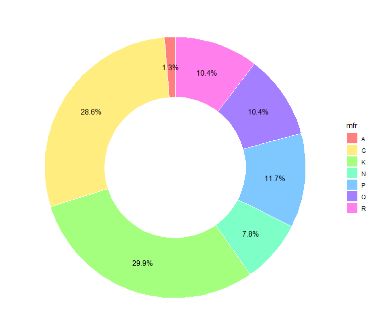
The modification of the pie chart leads to the donut chart. The size and the thickness of the donut can be manipulated by controling the x argument of the aesthetics of ggplot(). Make sure the value of the x argument lies between the xlim range.
Bullseye chart
For creating a circular bar plot, set argument stat=“identity” in geom_bar() function. Make sure to arrange the bars in increasing order of length when going radially outwards. For converting the bar chart to circular orientation set argument theta=“y” in the coord_polar() function. If the color bars complete one complete round then the chart will resemble a bullseye, hence the name.
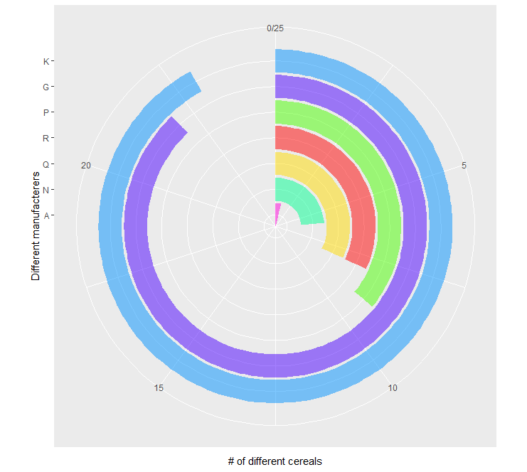
Coxcomb chart
Simply changing a single argument in the bullseye chart will lead to coxcomb chart. Instead of assigning theta=“y” if its changed to theta=“x” in the coord_polar() function, we get coxcomb chart.
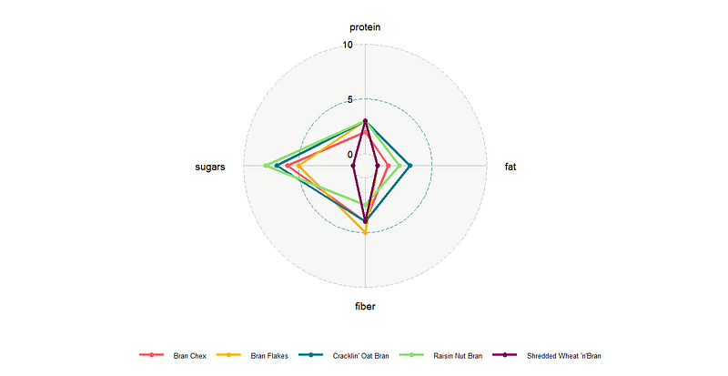
Spider charts
Currently, there is no function in ggplot2 package to create spider or radar charts. ggradar package is compatible witth ggplot2 package to that can be used to create spider charts. In ggradar() function, as in ggplot() function, the aesthetics can be defined. Few important arguments required are:
values.radar: prints the minimum, mid, and maximum values of the circular grid lines.
grid.min: minimum value of the grid
grid.mid: middle value of the grid
grid.max: maximum value of the grid
Pros: easy to understand if all the variables have the same scales.
Cons: difficult to compare when the scales have different units, hard to interpret circular plots.
The complete code for plotting all the charts.
Conclusion
So in this tutorial, we saw how to create pie charts, spider plots, coxcomb charts, and bullseye charts. Identified how the pie chart can easily be converted to other chart types except for the spider plot by changing a couple of arguments either in the aesthetics of ggplot() function or in geom_bar() function. We further discussed the pros and cons of using circular chart types (especially pie charts and spider plots, bein the popular ones) and saw that in general these charts are discouraged and their alternatives are used which are easy to understand and interpret.
Further readings from this series or on visualizations using ggplot2 package.
References
- https://www.kaggle.com/crawford/80-cereals
- https://blog.scottlogic.com/2011/09/23/a-critique-of-radar-charts.html#chart2
- https://www.data-to-viz.com/caveat/spider.html
The link to the complete code is here.
You can connect with me on LinkedIn and Twitter to follow my data science and data visualization journey.


