
Marketing Dashboards: A Complete Guide to the Right Tools, Metrics, and Questions to Ask
How to create stellar reporting systems

It’s important to estimate the efficiency of marketing. Marketing is always a cost item, so it’s necessary to understand if it’s worth spending money on. To prove that it is, you can use various types of reports depending on the special aspects of your business. To understand what kind of reports you need, answer the following questions:
- Who’s the decision-maker and what decisions will be made on the basis of this report?
- What questions would you like to answer with this report?
- What metrics, dimensions, and segments are needed to create a meaningful report?
- Is this report periodical or a one-time thing?
- Do you need to update the report manually and will you use filters on it?
- What services do you use to build reports? Google Sheets, Excel, Google Analytics, or something else?
Marketing specialists need to regularly provide reports on the performance of their sales plans and the efficiency of their advertising campaigns. These reports must be informative and clear. The situation gets more complicated as data is often stored in different systems — Excel, Google Sheets, Google Analytics, CRM, and call tracking systems. You’ll probably spend a lot of time combining all of this data.
Let’s say we have data we need for reporting. We’ll choose metrics and parameters that will provide us with valuable insights.
Choosing Metrics and Parameters to Display in Your Reports
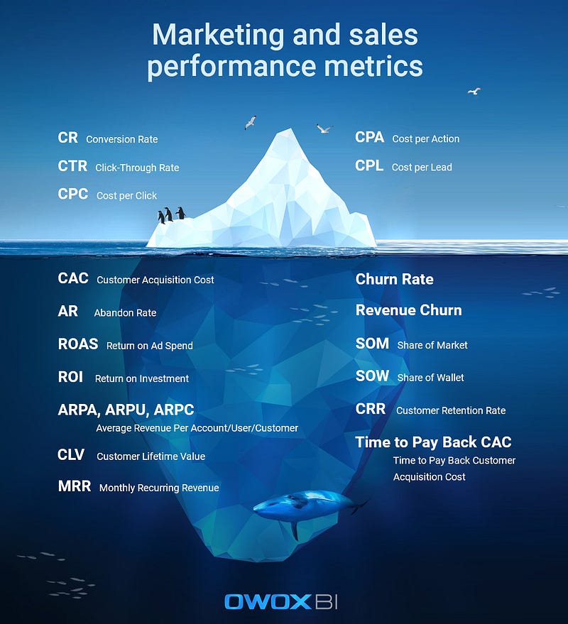
To refresh your memory, take a look at this infographic of essential performance metrics:
For more of a refresher, here are some interesting links for you:
- Still confused about the difference between metrics and KPIs? Check out 18 Digital Marketing Metrics and KPIs You Should Know
- Want to learn more about metrics and parameters in Google Analytics? Check out Main Metrics and Dimensions Without Which Your Business May Fall Apart
Once you’ve agreed on the list of metrics and the frequency with which you’ll track them, it’s time to choose a way to clearly present your data.
The Best Ways to Visualize Data
Why is data visualization necessary? We can answer with a simple analogy: imagine how much easier it would be to read instructions for medication if there was at least one illustration, or if the most important information was visualized.
In the case of marketing analytics, standard Excel tables with data are our medication instructions. It’s possible to visualize them with the help of the services described below.
We’re used to seeing data presented visually in certain ways, beginning with well-known and simple line charts, pie charts, and histograms and ending with stream graphs and sunburst charts. There are more than 60 common types of charts and graphs and this number continues to grow.
Here are some of the most actively used visualizations:
- Line chart. The most popular chart to represent the overall picture, show trends, and display data for a certain period.
- Bar chart. Used for comparing categories; unlike histograms, bar charts compare discrete variables.
- Histogram. Sister of the bar chart that shows data for a continuous interval or period.
- Pie chart. The most common way to demonstrate ratios or percentages.
- Bubble chart. Shows the correlation between circles and compares their volume.
- Geo chart. Displays the development of geographical areas, making it convenient for international companies.
- Stream graph. Displays changes in categories over time and is easy to use with large volumes of data for a certain time interval.
- Sunburst chart. A multilevel chart for demonstrating communications and hierarchy in a system.
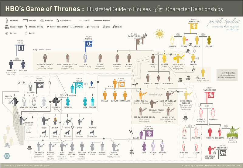
Among all the popular ways of presenting data, infographics are worth mentioning. Infographics provide information in a balanced and consistent way. They’re easy to read because they’re structured, colorful, and stylish. Besides, infographics are perfectly suited for promoting on social networks. Boring instructions or complex dependencies are much easier to perceive in infographics. An infographic helps to tell a story and helps people understand complicated relationships — as complicated as those in Game of Thrones, for instance:
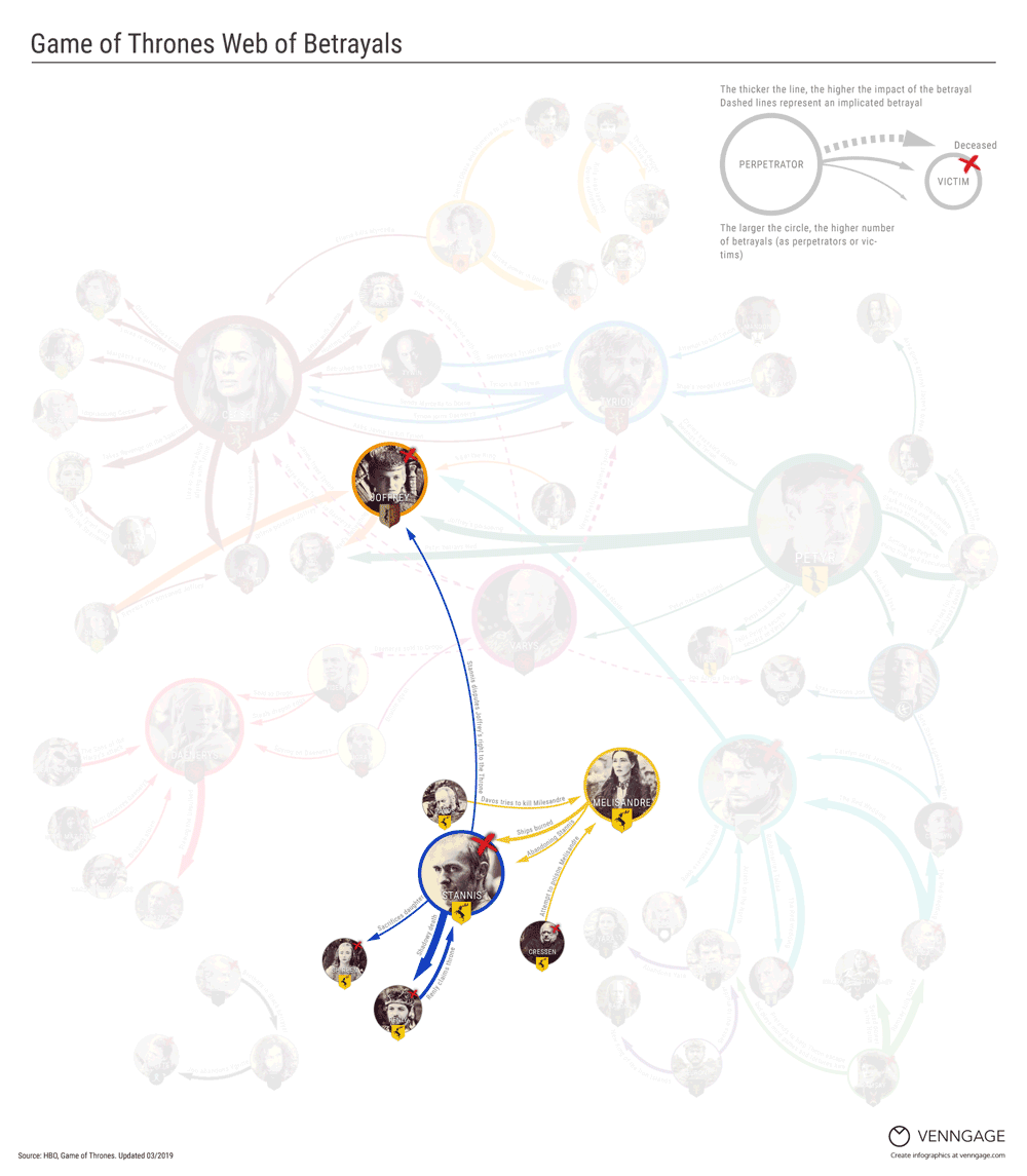
Not so long ago, infographics evolved into an interactive form. Continuing with Game of Thrones, this interactive infographic shows us, in detail, all the betrayals of characters:
Interactive storytelling, for example, is used by the Tableau Desktop service for creating presentations and reports.
Creating effective visuals is quite a difficult task, and if you’re a beginner, we recommend starting with basic rules and tricks that you can apply without the help of developers.
Dashboards: The Best Way of Presenting Data
A dashboard presents all relevant data on one screen. It also visualizes the results of calculations in the form of vivid graphs, charts, and tables. This way of presenting data helps viewers perceive information more easily and considerably simplifies decision-making.
Dashboards unite complex reports and their advantages are indisputable. They’re a safe way to clearly present key parameters and metrics that can’t be presented in a single report.
Advantages of dashboards:
- Not necessary to combine data manually.
- All KPIs are visible on one screen
- Changes in data can be monitored in real-time.
Dashboards allow people to more easily understand large data sets and estimate the current situation at a glance. In other words, dashboards reveal secrets in your data.
One more advantage of dashboards is the simplicity of control over reporting. When working with any data visualization service, you need to perform three steps:
- Connect data sources.
- Choose the period for analysis.
- Build a report on the basis of this data.
Criteria for a Good Dashboard
Characteristics of a good dashboard include:
- Well-planned data visualization. You can quickly and easily see where ROI sinks or what ad platform isn’t working.
- The right context. At first sight, it’s clear what charts are about and what data is presented in diagrams.
- The opportunity to select dates. You can easily change the reporting period for advertising campaigns.
- Interactive widgets. Data can be filtered according to selected parameters (country, city, device, campaign, etc.)
- The ability to compare data. You can compare selected data with the same data for the previous period to estimate the efficiency of advertising campaigns.
- The ability to monitor changes. You can monitor changes with a chosen frequency. For example, measure traffic once a day, once a week, or in real-time.
A good dashboard provides useful information for decision-making and insights. A bad one doesn’t give a definite answer to your questions.
To make a good dashboard, understand its purpose, how it can help you, and what challenges it will help you solve in the future.
Mistakes When Creating Dashboards
- Too many details and elements distract users and turn the dashboard into a carnival.
- Metrics, axes, and charts are named oddly.
- Data isn’t visualized using appropriate charts/graphs. For example, a pie chart is chosen to demonstrate decay over time.
- The report title doesn’t make the purpose of the dashboard clear, leading to confusion.
If you want to learn more about data visualization, we recommend the blog by Stephen Few, an American expert in data visualization and the author of “Information Dashboard Design” and “The Data Loom.”
But enough theory! Let’s look closer at the services that help you test everything you’ve learned about data visualization.
Dashboard Creation Services
Google Analytics
The most popular web analytics service from Google uses widgets for dashboard customization. In general, there are three options for creating a Google Analytics dashboard:
- Create a dashboard without widgets, starting with a blank slate.
- Create a dashboard with a set of default widgets (an initial set of reports).
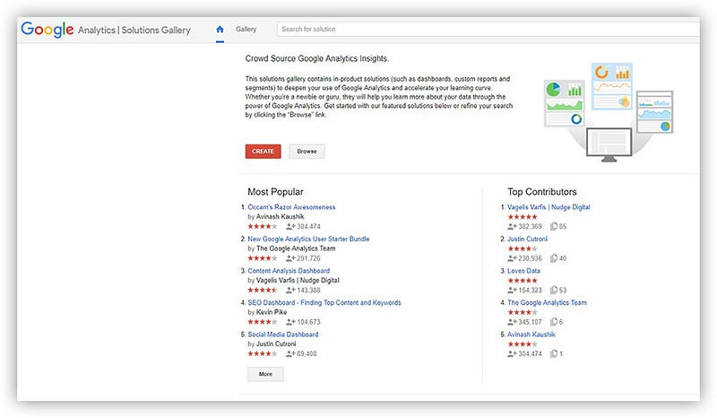
- Import a dashboard from the Google Analytics Solutions gallery.
The standard Google Analytics dashboard can be altered to achieve a dashboard that displays all the information you need.
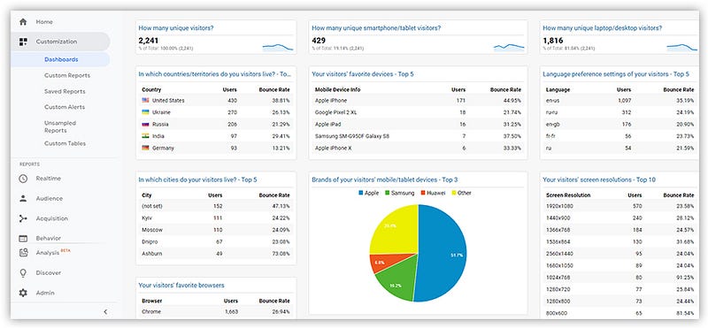
For example, here’s a dashboard about website visitors (from Dashboard Junkie). You can see the country and the city in which your clients are in, their browsers, their screen resolutions, etc.
The Google Analytics Solutions gallery gives you access to all of the most popular dashboards. Besides just browsing for the right dashboard, you can search by categories with recommended dashboards, reports, and segments.
Advantages of Google Analytics
- It’s free.
- It has a solutions and templates gallery.
- You can adjust and compare segments in reports.
Disadvantages of Google Analytics
- It works only with information from Google Analytics.
- It automatically only loads data from Google Ads.
- Session information processing can be delayed by up to 48 hours.
Google Data Studio
This popular service from Google creates reports and dashboards and perfectly visualizes data from different sources. At the moment, it supports 18 Google connectors and 138 partner connectors. Moreover, there are 12 connectors with open-source code available.
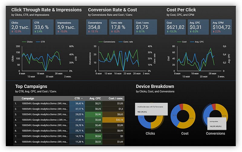
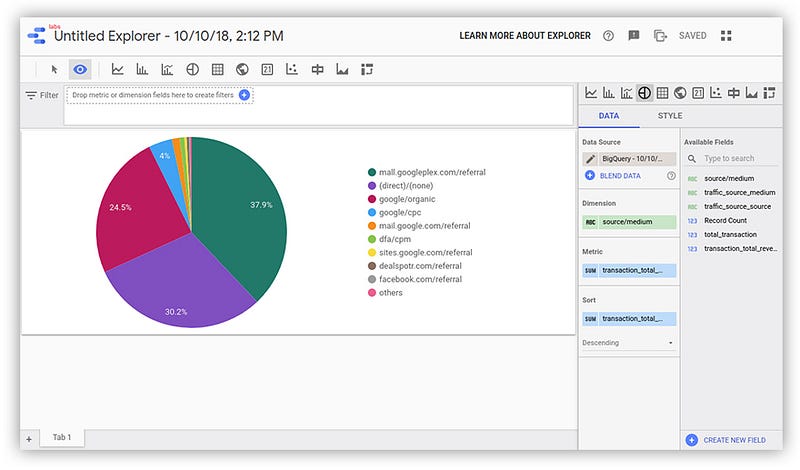
Here’s an example of a Google Data Studio dashboard:
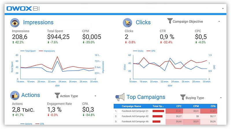
You can find an example of a Facebook Ads Insights dashboard made with the help of OWOX BI and Google Data Studio in the Google gallery:
Data Studio advantages
- Regularly updated.
- Free.
- Integrated with all Google products.
- Convenient for visualizing reports from Google BigQuery.
- Possible to use data from different sources in one dashboard.
Disadvantages
- No additional data aligning — data has to be prepared before loading.
- Impossible to define in advance how exactly a dashboard will look on a mobile device.
Note: To receive quality data and reports while working with Google Data Studio, we recommend collecting raw data in Google BigQuery and building dashboards from it.
OWOX BI Smart Data
The next product on our list is OWOX BI Smart Data. It allows you to quickly receive and visualize answers to management and marketing questions without involving analysts.
For our readers, we’ve prepared a template of the Marketing Attribution Dashboard in Google Data Studio. This dashboard collects the most popular metrics and parameters for reporting and analysis of the current processes.
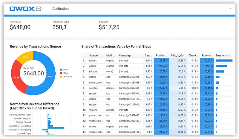
On this dashboard, there’s a separate page that demonstrates how various sources influence the user’s decision to make a purchase.
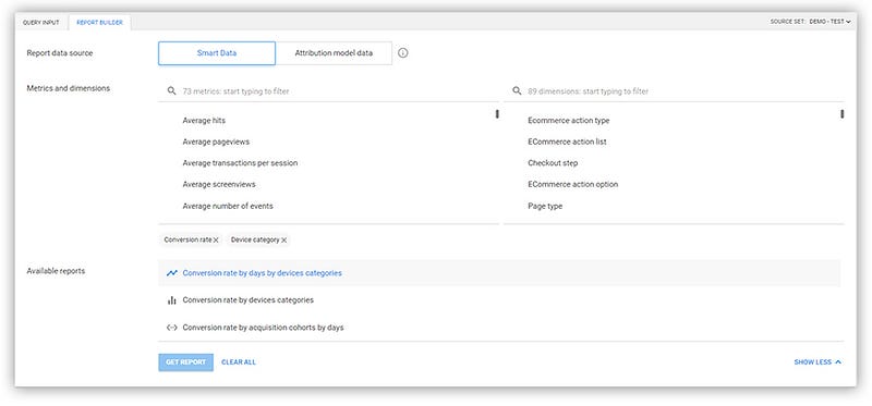
OWOX BI Smart Data provides three ways to obtain reports.
- Report builder. To get reports using the report builder, you need to choose the data source, the reporting period, and the necessary metrics and parameters from the list. After that, the report builder will show what reports are available.
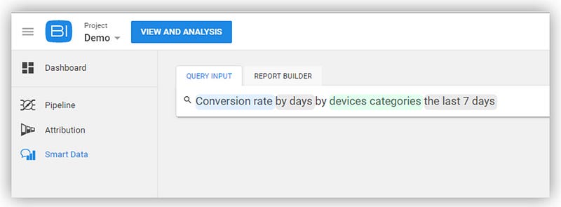
- Enter a query manually. Using this method, begin to type a keyword, for example, “conversion,” and OWOX BI Smart Data will prompt you with available reports.
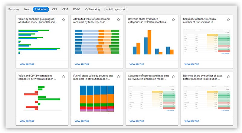
- Choose a report among the templates on the OWOX BI Smart Data home page.
If you want to visualize a report from Smart Data in Google Data Studio, just export it and open it in Data Studio.
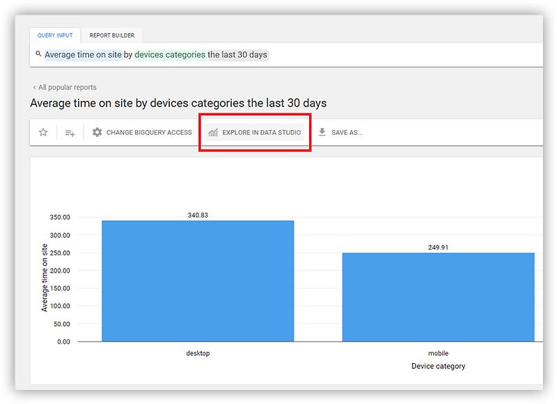
OWOX BI generates a link with report data and sends it to Data Studio. After that, the data will be available in Data Studio Explorer, where it can be visualized and used for building a Data Studio report:
Advantages of OWOX BI Smart Data
- Works with different data sources.
- No special technical training needed.
- Provides data segments from different sources.
- Automatically checks the quality of data.
Disadvantages
- Limited opportunities for visualization.
- Works with a finite set of queries and combinations.
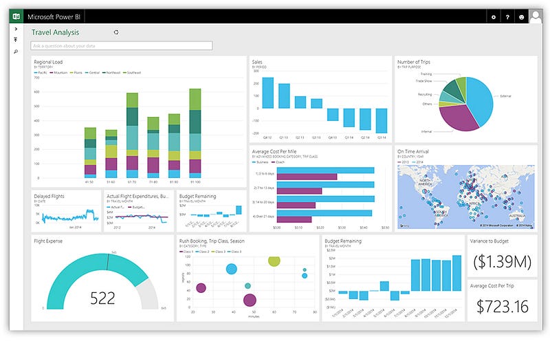
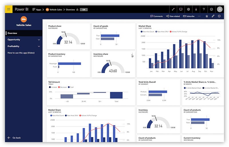
Microsoft Power BI
This is one of the oldest data visualization services. In addition to the desktop version, there’s a mobile version that’s convenient for data validation on the go. Power BI allows you to create and share dashboards and its interface is clear.
It’s worth mentioning that there’s a free version of Power BI, so you can get acquainted with it and form your own opinion of its functionality.
Advantages of Power BI
- It can combine data from various sources.
- It can preview dashboards and customize the display for tablets and phones.
- It is integrated with Microsoft products.
Disadvantages
- Not enough tools for cleaning and processing data.
- Importing and processing large volumes of data takes a long time.
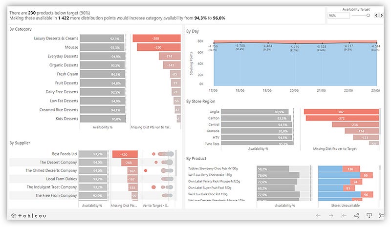
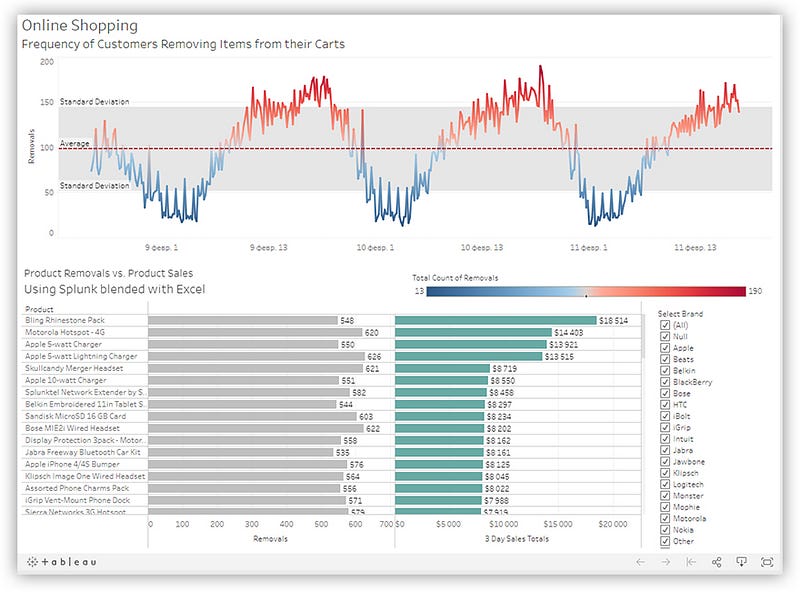
Tableau
Tableau can also work with multiple data sources.
Tableau allows you to create interactive dashboards and is easy to use, which is why this service enjoys such popularity.
The Tableau community, with its forum of active users and a library with training resources, is one more confirmation that Tableau is one of the most popular business intelligence services.
More advantages of Tableau
- Easy integration with Big Data platforms.
- Supports mobile platforms.
- Gets regular updates and comes with many additional materials (courses, videos, instructions).
Disadvantages
- Low level of data protection.
- Data has to be prepared before loading.
- Exporting data takes a lot of time.
Key Takeaways
Keep in mind that the choice of a suitable service for visualization depends on the volume of data that a company handles. For small businesses, the capabilities of Google Analytics, Google Data Studio, and OWOX BI Smart Data will be enough. For a more difficult dashboard, it’s worth thinking about systems with greater functionality, such as Google Data Studio, Tableau, and Power BI.


