
Mapping with Python’s GeoPandas
In this article, I’ll discuss how to leverage the power of data visualization with maps, and I’ll explore the different ways of plotting them using Matplotlib and GeoPandas.
Cartography is one of our first tries at representing data about the earth in a graphical form.
I like to picture it as:
One day, we were tired of getting lost in the desert and decided to sculpt a piece of clay so we would remember in which direction is the river, the city, or the temple… Now, we carry a piece of metal in our pockets that communicates with other big chunks of metal we threw in space to spin around our planet taking pictures of it, so we can get perfectly scaled proportions, and use state-of-the-art algorithms to calculate what is the fastest way to get to the nearest Mcdonalds.

There’s a wide array of ways you can visualize data with maps, from simple and meaningful visualizations to more artistic and impactful ones, it all depends on which data you’re trying to communicate, and where you want to draw attention.
I’ll use Jupyter Notebook to run my code, Pandas, and GeoPandas for data wrangling, NumPy for math, and Matplotlib for the visualizations.
import pandas as pd
import geopandas as gpd
import numpy as np
import matplotlib.pyplot as plt
Geopandas comes with some default datasets we can use to play around with, let’s start by reading one of them.
world = gpd.read_file(gpd.datasets.get_path('naturalearth_lowres'))print(type(world))
world.head()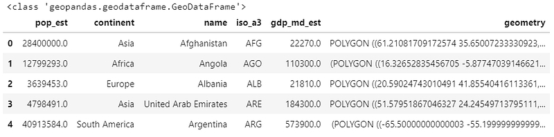
That is very similar to a Pandas data frame, but this time in a GeoDataFrame object. They’re almost identical frameworks, with GeoPandas optimized for handling geometrical data such as polygons, lines, and points. It can also read some different file formats, such as shapely files.
Just like the regular Pandas, it’s perfectly integrated with Matplotlib, so with just a .plot(), we can already see our shapes.
world.plot()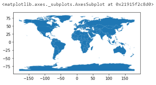
Great, and by using a Dataframe to handle our data, we can easily filter out rows we don’t want to display, and we can even select a column to be encoded.
world = world[world.name != "Antarctica"]world.plot(column='pop_est')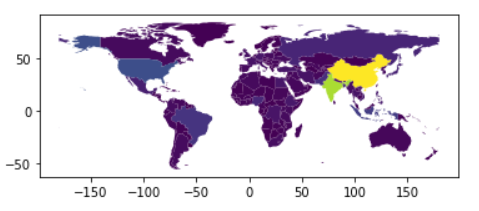
By default, it’ll handle polygons by encoding colors to the selected variable, so a color map.
In this case, it’s using different colors and the gradients between those colors to display the countries population.
That’s pretty easy, and it should be easy to add our data to it, too, right?
Narrator — It wasn’t…
Okay, this may require some data cleaning, but the amount of work will depend on the dataset you’re using.
Let’s check it.
I’ll be using the world development indicators dataset. https://www.kaggle.com/worldbank/world-development-indicators
df = pd.read_csv('data/Indicators.csv')
df.head()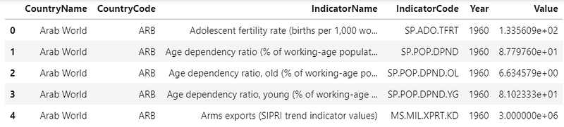
This dataset has lots of different indicators from 1960 to 2015. So let’s select just one of them.
Maps are usually already packed with lots of variables. In a world map, we have latitude, longitude, and markings to separate land from water. So we have to be careful not to diverge our audience’s attention, and too many variables to look for can be very distracting.
for i in df['IndicatorName'].unique(): print(i)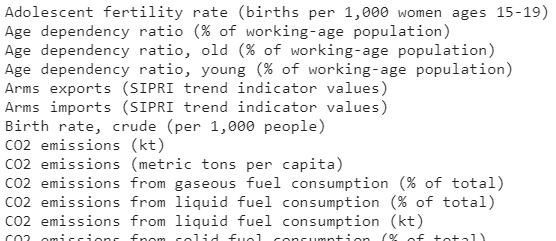
You can use a for loop to go through the unique indicators and select your own. I want to see what’s going on with the threatened species of birds.
bird_df = df[(df['IndicatorName'] == 'Bird species, threatened') &
(df['Year'] == 2015)].copy()bird_df.head()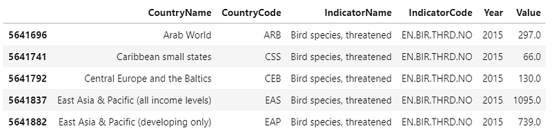
Now we have to see which variables our datasets share in common. Our bird_df has a CountryName and CountryCode, and those are supposed to be the same values we have on our world map as ‘name’ and ‘iso_a3’. Let’s check this out.
countries_b = bird_df.CountryCode.unique()
countries_w = world.iso_a3.unique()
for iso in countries_w:
if iso not in countries_b:
print(world[world['iso_a3'] == iso][['name',
'iso_a3']].values)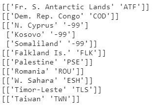
Interesting. So these codes are in our world map but are not in our bird_df.
Since we don’t have a too-long list, we can check the values to make sure they’re missing.
idx = bird_df.CountryName.str.contains('Congo')
bird_df[idx]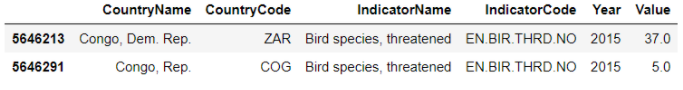
idx = world.name.str.contains('Congo')
world[idx]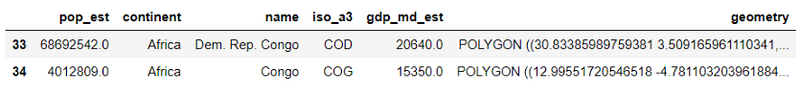
— uh, we have some mismatched values in our CountryCodes. We can fix this!
new_code = {'CountryCode': {'ZAR': 'COD', 'ROM': 'ROU', 'TMP': 'TLS'}}# replace
bird_df.replace(new_code, inplace=True)
# check for congo
idx = bird_df.CountryName.str.contains('Congo')
bird_df[idx]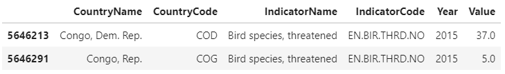
We can use a dictionary with the column name, the values to be replaced, and the new values, and then pass this dictionary to Pandas .replace() function.
# rename code column and drop rows with empty cells
bird_df.rename({'CountryCode':'iso_a3'}, axis=1, inplace=True)
bird_df = bird_df[['iso_a3', 'Value']].dropna()
# merge dataframes and filter columns
world_values = world.merge(bird_df, how='inner', on='iso_a3', copy=True)
world_values = world_values[['iso_a3', 'geometry', 'Value']]Pandas .merge() performs the equivalent of a SQL join; we just need to make sure the columns we’re using to join our datasets have the same name, then we select the type of join we’re performing, tell pandas to make a copy of the result, and save it to a variable.
In this case, I’m using an inner join on our iso_a3.
SQL equivalent:
SELECT * FROM world
INNER JOIN bird_df ON world.iso_a3 = bird_df.iso_a3;
Cool, we added our data to the world GeoDataFrame, Now we can plot it!
world_values.plot(column='Value')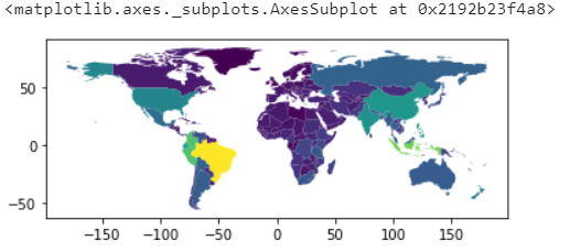
Okay, that wasn’t so hard. Next — Fixing the aesthetics.
We can start by defining a figure to have more control over our plot and its size.
Since we performed an inner join, we lost the polygons for the countries without values in our bird_df, so let’s plot our original map, and then on top of that, our new chart.
fig, ax = plt.subplots(1, figsize=(16,8))world.plot(ax=ax)
world_values.plot(column='Value', ax=ax)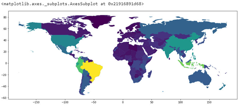
Okay, those colors are not intuitive at all. We can add a color bar to identify them, but still, this is not the best choice of colors to display our data.
This choice of colors might’ve worked if we had intervals to identify.
For our data, it’s better to use a single color, varying in intensity to display different values.
We can also change the color of our background map, so our viewers know we don’t have data there.
fig, ax = plt.subplots(1, figsize=(16,8))world.plot(ax=ax, color='grey')
world_values.plot(column='Value', ax=ax, cmap='Greens')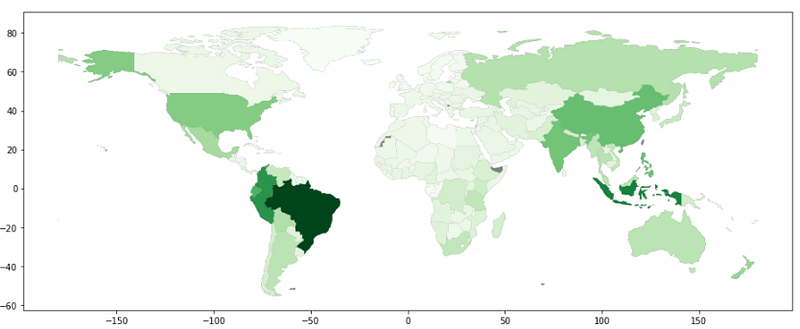
That’s way better. We used the cmap parameter to select one of the default options of colormaps. Let’s also change the ‘facecolor’ of our figure, add some black lines to mark the borders between the countries with the ‘edgecolor’ parameter and remove the axis around our map.
fig, ax = plt.subplots(1, figsize=(16,8), facecolor='lightblue')world.plot(ax=ax, color='darkgrey')
world_values.plot(column='Value', ax=ax, cmap='Greens', edgecolors='black')ax.axis('off')
plt.show()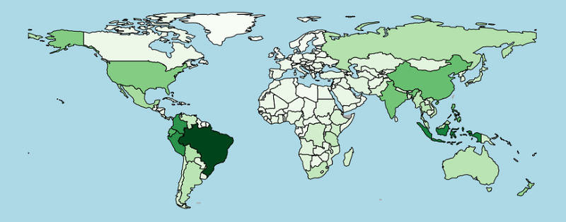
We barely need more information than that. Just by adding a title, our viewers would be able to figure out the rest.
But we don’t want our audience speculating about the data; we can display a scale for those colors to facilitate the interpretation.
from mpl_toolkits.axes_grid1 import make_axes_locatablefig, ax = plt.subplots(1, figsize=(16,8), facecolor='lightblue')world.plot(ax=ax, color='darkgrey')
world_values.plot(column='Value', ax=ax, cmap='Greens', edgecolors='black')# set an axis for the color bar
divider = make_axes_locatable(ax)
cax = divider.append_axes("right", size="3%", pad=0.05)# color bar
vmax = world_values.Value.max()
mappable = plt.cm.ScalarMappable(cmap='Greens', norm=plt.Normalize(vmin=0, vmax=vmax))
cbar = fig.colorbar(mappable, cax=cax)ax.axis('off')
plt.show()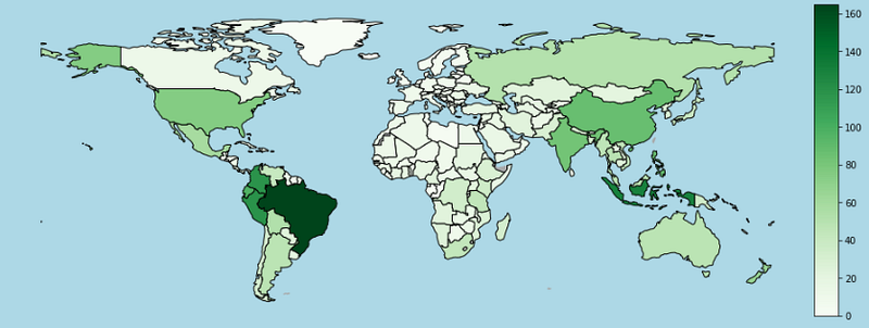
Great, that’s way easier to understand.
We used Matplotlib toolkits to locate our axis, created a division to the right of it with 3% the size of our main chart, and added a little padding between them.
After building the space for our color bar, we need to create a Mappable Object. The Mappable will distribute our color map into a normalized range (0 to 1), so to build one, we need a color map (cmap), and a normalizing object that we can get with .normalize(min, max).
After that, the only thing left to do is pass the mappable and the new axis to our .colorbar() function. Matplotlib takes care of the rest.
Note that our Colorbar is just like any other chart, so we can access and change it’s properties like we do with other Matplotlib plots.
fig, ax = plt.subplots(1, figsize=(16,8), facecolor='lightblue')world.plot(ax=ax, color='darkgrey')
world_values.plot(column='Value', ax=ax, cmap='Greens', edgecolors='black')# set an axis for the color bar
divider = make_axes_locatable(ax)
cax = divider.append_axes("right", size="3%", pad=0.05)# color bar
vmax = world_values.Value.max()
mappable = plt.cm.ScalarMappable(cmap='Greens', norm=plt.Normalize(vmin=0, vmax=vmax))
cbar = fig.colorbar(mappable, cax=cax)cbar.set_ticks(np.arange(0, vmax, 40))
cbar.ax.tick_params(labelsize=18)ax.axis('off')
plt.show()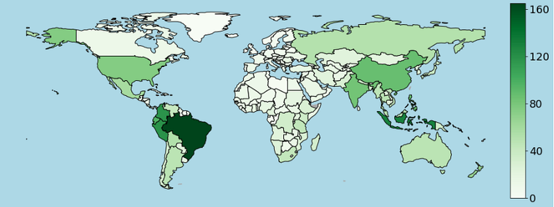
We don’t necessarily need to place the Colorbar to the right of our map, but it’s important to remember that if you place it at the top or the bottom, you need to change the orientation of them in the Colorbar as well.
fig, ax = plt.subplots(1, figsize=(16,8), facecolor='lightblue')world.plot(ax=ax, color='darkgrey',
alpha=0.8, hatch= "///")world_values.plot(column='Value', ax=ax, cmap='Greens',
edgecolors='black')# set an axis for the color bar
divider = make_axes_locatable(ax)
cax = divider.append_axes("bottom", size="5%", pad=0.05)# color bar
vmax = world_values.Value.max()
mappable = plt.cm.ScalarMappable(cmap='Greens', norm=plt.Normalize(vmin=0, vmax=vmax))
cbar = fig.colorbar(mappable, cax=cax, orientation="horizontal")
cbar.ax.tick_params(labelsize=20)ax.axis('off')
plt.title('# of Threatened\nBird Species', loc='left', fontsize=26)plt.show()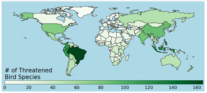
And that’s our chart! We learned how to use the GeoPandas default world map to visualize our data in a simple, yet effective visualization.
But, what about custom maps?
Maybe you don’t like the proportions of this map, perhaps you would instead use an Asia centric map, or you’re mapping a custom region like a city or even a building.

The internet is full of geospatial datasets. In the next example, I’ll use Vancouver’s open data to explore more about plotting custom maps.
bnd_gdf = gpd.read_file('data/boundary/local-area-boundary.shp')
ps_gdf = gpd.read_file('data/public-streets/public-streets.shp')
rent_gdf = gpd.read_file('data/rental-issues/rental-standards-current-issues.shp')
I’ve downloaded three files, all of them formatted as shapely files, with different types of data on them — Let’s see how this looks like when plotted.
bnd_gdf.plot()
ps_gdf.plot()
rent_gdf.plot()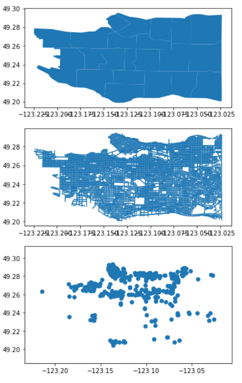
The boundaries dataset has polygons on it, defining the edges of the city and its neighbourhoods. We’ve already seen this type of data.
The public streets dataset has lines in it and the rental standards dataset points.
We already know how to deal with maps, so let’s put all those plots in the same figure, adjust the alpha of the streets, change some colors, and see what happens.
fig, ax = plt.subplots(1, figsize=(16,8))bnd_gdf.plot(ax = ax, color='black')
ps_gdf.plot(ax = ax, color='white', alpha=0.4)
rent_gdf.plot(ax = ax, color='red', markersize=rent_gdf['totaloutsta']*5)plt.title('Vancouver - BC\nRental Standards - Current Issues',
loc='left', fontsize=20)ax.axis('off')
plt.show()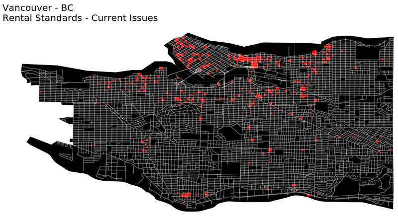
Awesome, I’ve also added the markersize parameter to encode the number of issues in the rental standards dataset to the sizes of the dots.
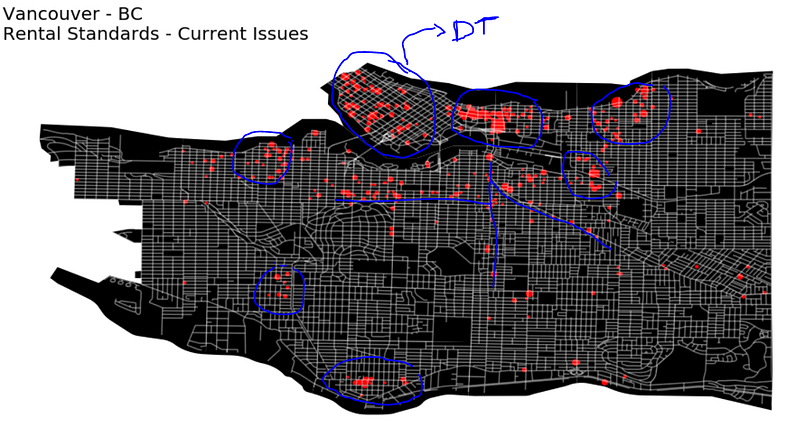
Pointing the locations of the issues in a map brings up lots of insights, we can see concentrations around downtown, East Van, and other commercial areas. There also seems to be some concentrations around the main streets.
But there’s one problem with displaying points on a map. They may end up too close to each other and overlap with other dots — All that to say, this plot can show some concentrations, but it’s not genuinely displaying the density of the issues.
Something like a choropleth or a heatmap would be more beneficial in this situation, so let’s see how we can transform this data to build a Hexbin map.
x, y = [], []for point in rent_gdf.geometry.values:
if str(type(point)) != "<class 'NoneType'>":
x.append(point.coords.xy[0][0])
y.append(point.coords.xy[1][0])We can start by getting x and y from our points, and then we just need to use Matplotlib’s .hexbin(x, y) to get our map.
fig, ax = plt.subplots(1, figsize=(32,16))#streets
ps_gdf.plot(ax = ax, color='black', alpha=0.2)#hexbins
ex = [plt.xlim()[0], plt.xlim()[1],
      plt.ylim()[0], plt.ylim()[1]]
ax.hexbin(x, y, cmap='Reds', extent=ex)#boundaries
bnd_gdf.plot(ax = ax, alpha=0.2, facecolor="none", edgecolor='black')ax.axis('off')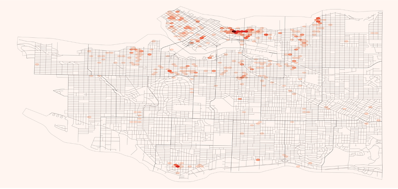
Before plotting the hexbin, I’m saving the x and y limits of the public streets map, this is so we can extend the planned area of the hexbin plot and cover the whole figure, it’s also going to have other applications later on.
Matplotlib build the color map using the count of values by default, but we don’t want to look for the count of records with issues, we want to see the quantities we have registered.
fig, ax = plt.subplots(1, figsize=(32,16))ps_gdf.plot(ax = ax, color='black', alpha=0.2)ex = [plt.xlim()[0], plt.xlim()[1],
plt.ylim()[0], plt.ylim()[1]]ax.hexbin(x, y, C=rent_gdf['totaloutsta'], reduce_C_function = np.sum,
cmap='Reds', extent=ex)bnd_gdf.plot(ax = ax, alpha=0.2,
facecolor="none", edgecolor='black')ax.axis('off')
ax.patch.set_facecolor('0.5')
plt.xlim()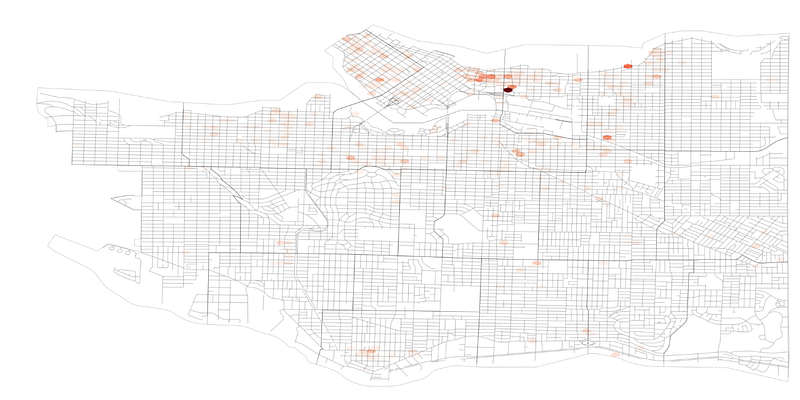
Sweet, so we can use ‘C’ to define the values for our color map, and we can use ‘C_reduce_function’ to identify how it’s going to do so. By default, ‘C’ will calculate the mean for the area, but we’re using the sum.
Now, let’s be artistic! I’ll use matplotlib.colors to build a linear colormap. I’ll start with black for empty areas and minimum numbers.
I’m trying to emphasize the extremely high values, and not distract our viewers with areas containing just a couple of issues.
After black, I’ll use yellow →yellow-orange →orange →orange-red →red.
I’m trying to use warm colors going from one primary to another (yellow to red), using two tertiary colors(yellow-orange, and orange-red), and a secondary (orange) to transition between them.
import matplotlib.colors as colorscolors_list = ["black", "yellow", "#FFAE32", "orange", "orangered", "Red"]
cmap = colors.LinearSegmentedColormap.from_list("", colors_list)fig, ax = plt.subplots(1, figsize=(32,32), facecolor='black')ps_gdf.plot(ax = ax, color='white', alpha=0.5)ex = [plt.xlim()[0], plt.xlim()[1],
plt.ylim()[0], plt.ylim()[1]]hb = ax.hexbin(x, y, C=rent_gdf['totaloutsta'], reduce_C_function = np.sum,
cmap=cmap, vmin=0, extent=ex,
edgecolor='0.1', gridsize=80)ax.axis('off')
#ax.patch.set_facecolor('black')
plt.savefig('pic.png', facecolor='black')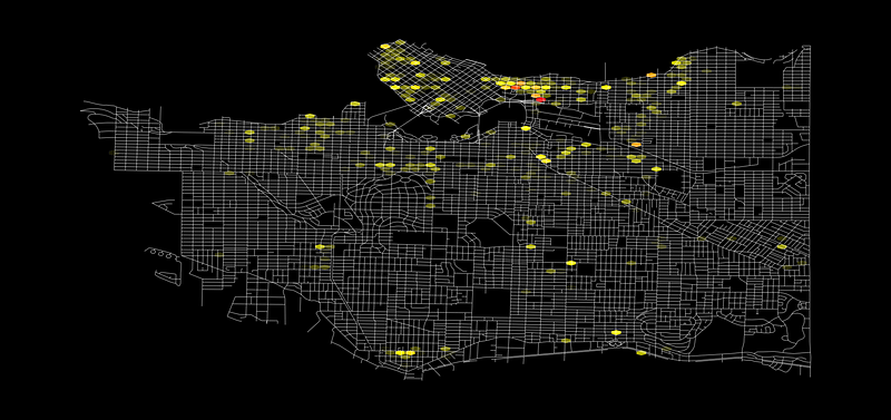
We’re improving! Let’s keep going and finish this up.
Note that I’ve also added a ‘gridsize’ parameter to the hexbin, this parameter accepts two values, one for the number of bins in the x-axis and one for the y-axis. If we pass only one value to this setting, it’ll calculate the second one automatically to as close as it can from a regular hexagon.
Now we can use Geopy to calculate the distance between two geographic coordinates. *Here we’ll use those limits we saved earlier.
import geopy.distance as distance
import mathcoords_1 = (ex[2], ex[0])
coords_2 = (ex[2], ex[1])
d2 = distance.geodesic(coords_1, coords_2).m/80
print(d2)a = d2/ math.sqrt(3)
A = 3/2 * math.sqrt(3) * pow(a,2)
print('~','%1.f'%A, 'm²')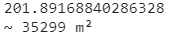
Cool.
We’ll use the limits we saved to get the total distance of our x-axis in meters.
I’m using a geodesic method to figure this out.
Then we divide the result by 80, which is the number of bins in a row, and we’ll have the short diagonal(d2) of each hexagon.
d2 = SquareRoot(3) * a a = d2/ SquareRoot(3) AREA = (3/2) * SquareRoot(3) * a²
— ‘a’ is the size of the side
Awesome! Note that the ~35,000 m² is a squared value, which means the conversion to km² is not 1,000. To get the km², we would need to divide our value by 1mi.
*My last tip — The hexbin plot will return a PolyCollection; if you save it to a variable, you can pass it to the fig.colorbar() instead of making a custom mappable object.
Let’s finish this!
# Color map
colors_list = ["black", "yellow", "#FFAE32", "orange", "orangered", "Red"]cmap = colors.LinearSegmentedColormap.from_list("", colors_list)# Figure n title
fig, ax = plt.subplots(1, figsize=(32,32), facecolor='black')
plt.title('Vancouver - BC\nRental standards current issues'.upper(),
color='white', fontsize=32, loc='left')# Plot streets
ps_gdf.plot(ax = ax, color='white', alpha=0.5)# Plot hex bins
ex = [plt.xlim()[0], plt.xlim()[1],
      plt.ylim()[0], plt.ylim()[1]]
hb = ax.hexbin(x, y, C=rent_gdf['totaloutsta'], reduce_C_function = np.sum,
cmap=cmap, vmin=0, edgecolor='0.1', gridsize=80)# Color bar axis
divider = make_axes_locatable(ax)
cax = divider.append_axes("bottom", size="5%", pad=0.05)# Plot color bar
cbar = fig.colorbar(hb, cax=cax, orientation="horizontal")
cbar.ax.tick_params(labelsize=32, color='white', labelcolor='white')# Scale
coords_1 = (ex[2], ex[0])
coords_2 = (ex[2], ex[1])
d2 = distance.geodesic(coords_1, coords_2).m/80
a = d2/ math.sqrt(3)
A = 3/2 * math.sqrt(3) * pow(a,2)scale_txt = 'Hexbin Area: ~'+ '%1.f'%A +'m²\nNumber of issues in the area:'
plt.text(0, 70, scale_txt, color='white', fontsize=32)# remove axis and save
ax.axis('off')
plt.savefig('pic.png', facecolor='black')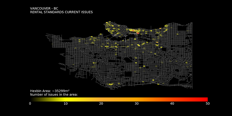
It took a lot, but it’s ready.
Now we have a better visualization of the density of unresolved issues, on the other hand, the spaces with a low number of problems are not so evident, in the end, it’ll always depend on what we want to highlight.
Thanks for reading my article!
A note In Plain English
Did you know that we have four publications and a YouTube channel? You can find all of this from our homepage at plainenglish.io — show some love by giving our publications a follow and subscribing to our YouTube channel!
Resources: Vancouver Open Data; GeoPandas; Matplotlib Hexbin; GeoPy;
Going Further: Fundamentals of color theory — Kris Decker; Cartopy; Geoplot;


