Local climate analytics: Health Facility Rain Exposure in Vietnam
Processing geospatial satellite imagery data on a cloud-based Jupyter Notebook Python Environment to measure rain exposure of key public infrastructure facilities
This work has been done entirely using publicly available data, and was co-authored with Anh Tuấn Phan, Parvathy Krishnan, and Hieu Danh Luu. All errors and omissions are those of the author(s).
“Water, water everywhere and not a drop to drink”
Samuel Taylor Coleridge’s poem, The Rime of the Ancient Mariner

Geospatial data layers that can provide better insights into local weather and climate change risks are proliferating in this age of big data. But for end-users working for governments across the world, and the more tech-savvy data scientists that seek to support them, tapping into these resources in a flexible and effective manner to address front-line issues can be challenging.
How can such big data mapping insights be achieved to provide local insights in practical terms? We demonstrate how cloud-based Jupyter Notebook Python Environments (cJPNE) can be used to assess the possible vulnerability of access to stroke care in Vietnam. This serves as a broader example to probe how public infrastructure assets and investments could be analyzed for better applied local risk and resilience analytics.
The location of infrastructures such as health facilities and road networks linkages are vital to a population’s access to public services. Beyond analyzing this access under normal environmental conditions, the persistent threat of extreme weather — and the further risks associated with climate change — can raise additional concerns in terms of vital physical services access such as health care points.
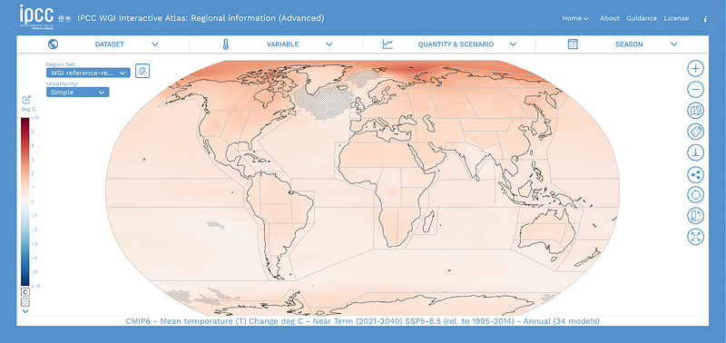
A new generation of hazard layers serves to provide a growing rich sense of possible exposures. Good examples include the Think Hazard site established by the World Bank’s Global Facility for Disaster Reduction and Recovery (GFDRR). The recent 2021 Sixth Assessment Report of the United Nations Intergovernmental Panel on Climate Change (IPCC) sheds light on the prospective different ranges of possible extreme weather changes across the globe. The IPCC also provides for an Interactive Atlas providing scenario layers across a range of dimensions.
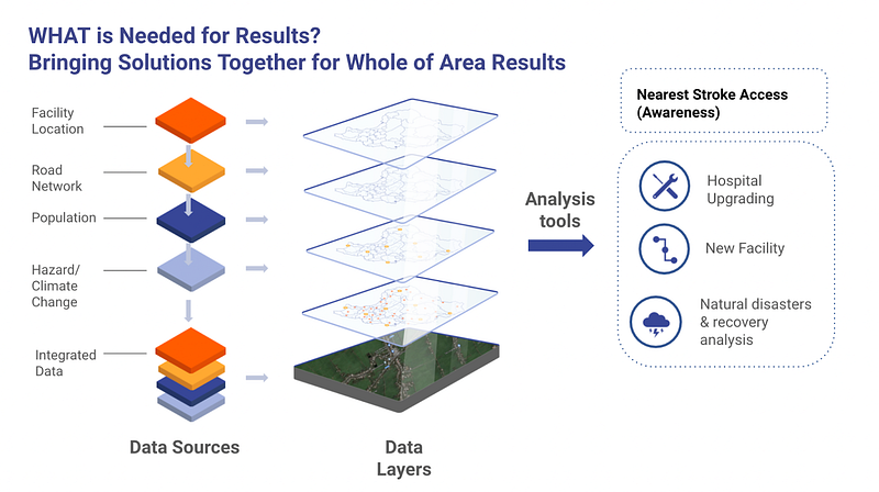
With a growing number of geospatial disaster risk and climate change layers now available to users for viewing, how can these be linked back to an exploration of more specific public infrastructure asset and investment services exposure? Intuitively, this task would involve overlaying the respective infrastructure, population, and risk layers to understand where exposure might be the greatest (see Figure 2).
Cloud-based Jupyter Python Notebooks can be used to apply geospatial risk analysis to public infrastructure access over space and time
Cloud-based JPNEs (“cJNPEs) provide a powerful platform technology to integrate and analyze key data to deliver descriptive (what is) and prescriptive (what could be) insights. In a previous Medium Towards Data Science contribution, we showed how two population distribution layers with high levels of geospatial granularity can be deployed in a cloud-based JPNE environment. Integral to using cloud-based JPNEs well is to establish clear and replicable data pipelines and to identify fit for purpose open-source Python libraries that are able to deliver on a particular question of interest. In this example, we investigate the basic exposure of stroke facilities in Vietnam to potential extreme precipitation layers.
Investors in the stock market will frequently hear the term: “the past is no guide to the future.” In the age of climate change, this would certainly be true for rainfall patterns. A range of available geospatial layers falls into the spectrum of descriptive (what has been) and predictive (what could be in the future). Weather forecasting is an example of prediction, but a reporting of yesterday’s measured rainfall in any given location is descriptive. At the same time, various scientific initiatives are leveraging big data and machine learning models to generate geospatial risk layers at a global level.
To illustrate working with these types of geospatial layers for screening public infrastructure assets or investments, we first explore the apparent exposure of an estimated 106 stroke facilities in Vietnam to historical precipitation and possible flood risk. This blog looks back in terms of the Climate Hazards Group Infrared Precipitation with Stations (CHIRPS) for rainfall. The next installment compares this to projected Fathom-Global 2.0 Flood Data (see Luu-Danh et. al 2021a, b), which is a forward-looking risk layer.
Making applied sense of the wealth of new environmental exposure layers means having domain specialists and data scientists address basic data access and analysis first
A starting point to exploring geospatial data layers in cloud-based JPNEs is being able to articulate what they measure, as well as the temporal and geospatial granularity of the data. In short, at what frequency and locational detail are the data available, and with how much delay? For predictive data, temporal dimensions are typically expressed in terms of some forecast period. For descriptive historical data, the question is how far does the data go back in a consistent series, and at what reporting frequency. Viewed from the perspective of a cloud-based JPNE, a further question is whether data access (and updates) can be already automated (through APIs), or if they require manual intermediate stages of downloading data and shifting it across. The more automated the process can be set up, the more replicable of course the exercise will be.
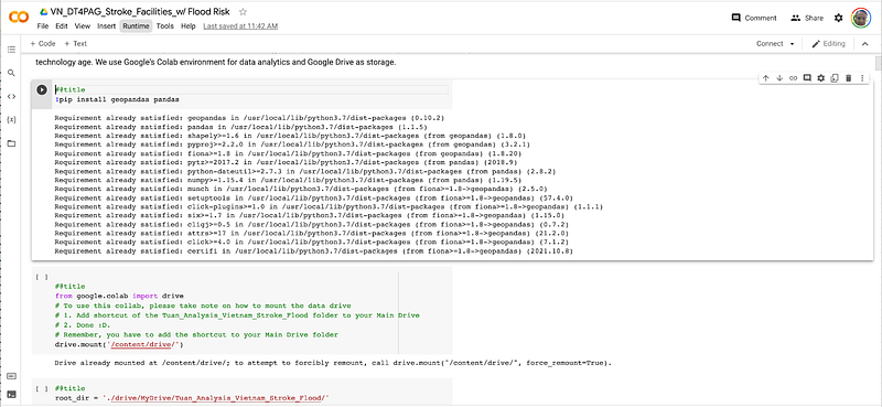
In conducting this work, users should understand (i) what measure — historical or predictive — were each of the illustrative layers capturing, (ii) how could these layers be intersected in a meaningful way with the location of existing public health infrastructure settings, and (iii) and a where next on options the refine the analysis and data to benefit local policymakers. Figure 3 shows a JPNE user-interface view for this analysis set up on Google Colab. All code can be run-line, and relevant data is also stored and accessed via the cloud.
From the perspective of a cloud-based JPNE deployment, geospatial data access pipelines can run a spectrum from manual to machine-to-machine automated. A manual process for example would require the users to manually download the data from a web link (or from an e-mail or USB stick!), and then deploy this according to a cJNPE for access (e.g., per mounting in a Google Drive folder). An automated process would allow for the data to be automatically called from the “source of truth” repository. While the former approach may work on an ad hoc basis (or for a dataset that is not updated), it is both cumbersome and weak data management practice. Mechanisms such as APIs also would allow the eJPNE to check what is the latest available data (e.g., rainfall data) and update series in terms of dashboards or visualizations accordingly. An API would ideally also pull the associated metadata associated with any data feed (e.g., latest data version and access date).
Getting to work with CHIRPS Historical Satellite Precipitation can start with different access points
Our cJPNE processing of CHIRPS illustrates the possible value of satellite data readings. The data was originally developed in part of support efforts at better international famine prediction. The dataset provides near-real-time precipitation data across the world in a quasi-global format. It is provided under multiple timeframes for the users to choose from. CHIRPS ver 2.0 has its data dated from 01-Jan-1981 to near-real-time. It has daily, 5-day, 10-day, monthly, 2-month, 3-month, quarterly, and annual data on all of its stations around the world. The datasets provided to the public cover the entire world in quasi-global format (50S−50N). CHIRPS 2.0 also has more detailed data on several stations: Africa, East Africa, Mexico, Cameroon — Caribbean, and Indonesia. The data is available in Tag Image File Format (TIFF/TIF) format, a commonly used format for raster data. For Vietnam, the data is extracted from the global dataset with each grid cell being about 5 kilometers in diameter.
The latest CHIRPS data can be accessed from different sources. This includes a University of California at Santa Barbara (UCSB) research group’s website, which we used, as well as platforms such as Google Earth Engine. The latter resource provides for near real-time updates on any changes made on the dataset with easy API requests but requires a Java connection. The raw data can be manipulated in different ways to yield a definition of interest. Above all, some initial descriptive-analytic cJPNE visualizations of the data serve to provide comfort to both the end-users and data scientists that data access has been achieved and to provide a reality check for initial results.
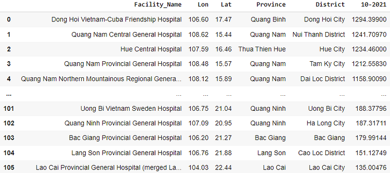
For the initial data access and wrangling exercise, we sought to understand which of our 106 stroke facilities was exposed to the highest monthly rainfall level in a recent month. To illustrate the use of this geospatial layer, we first extracted all the 11,204 latest monthly values within Vietnam’s boundaries for Oct 2021 at the time of writing (covering the country’s area of over 330 thousand km2).
The footprint of facilities can be larger, but data is available on a point basis. Therefore we matched these facility points to the precipitation grids. We created a grid of these values and intersected each of the values for each facility in that grid. After gathering the list of matched pairs, one can use different aggregation functions (summation, maximization, etc.) to find the value for the matching pair.
We converted the data in JNPE using the raster2xyz library for analysis with pandas and geopandas. In this example we look at total rainfall in October 2021 and narrow the data to just the surrounding area of the stroke facilities:
We rank the facilities descendingly based on the rainfall data for the month of October 2021. Dong Hoi Vietnam-Cuba Friendship hospital takes the top spot with over 1,294 mm of precipitation. This appears reasonable since the Central Coast region is currently understood to be in its rainy/stormy season. Later positions further confirm this phenomenon as all the top five facilities are in this region with all of them having over 1,150 mm in the month of October (see Table 1).
On the other hand, the last five positions are from the Northern region. Lao Cai comes at the bottom of the list with only 135 mm in October. The winter of 2021 came early, affecting the overall weather in the mountains North with dry and cold winds.
We can visualize these data using geopandas’s plot function. Figure 4 presents our rainfall data for October 2021, based on the total level of rainfall by 11,204 grid cells. The vertical axis presents the latitude and horizontal longitude, as would be provided for example by a GPS reading for a smartphone.
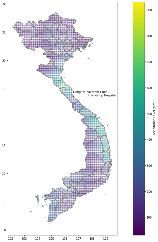
Based on the map visualization presented in Figure 4, we can further confirm the ranking results from Table 1 and its narrative: The Coastal Central region generally has more rainfall compared to the rest of the country in early Winter.
Next, we were interested in understanding if this high level of rain was concentrated in a few days, or if it just represented consistent rain. To do this, we extracted the daily data for Dong Hoi Vietnam — Cuba Friendship Hospital and plotted its daily values against the country’s median daily precipitation.
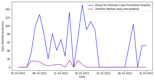
We can see the daily trend of precipitation in and around Dong Hoi Vietnam — Cuba Friendship Hospital confirms its monthly reading. Its daily precipitation levels are much higher than the rest of the country.
The CJPNE set-up also examines the longer-term weather exposure context for this location or any other location in Vietnam. For example, this could be used when considering a new facility investment. To put this in national and historic terms, we then asked what was the highest monthly precipitation ever recorded according to CHIRPS from Jan 1981 to Oct 2021. This was 1,914.2 mm in Oct 2020 in Loc Dien, Phu Loc, Hue (16°12'00.0"N 107°42'00.0"E), and the highest daily precipitation level is 691.974 mm on the 13th December 2016 in Ha Trung Marsh, Phu Vang District, Hue (16°30'00.0"N 107°42'00.0"E).
We collected Vietnam’s maximum rainfall values from all daily rainfall files available, from 01–01–1981 to 31–10–2021, from CHIRPS’s p05 directory. For each data file, we took all data points within Vietnam’s border, and then recorded the maximum value across all regions in Vietnam. The data collection process lasted from 31 Nov 2021 to 05 Dec 2021. We used matplotlib’s errorbar chart to visualize the wide distribution of maximum daily precipitation level in Vietnam to understand the historical occurrences of extreme levels of rain and how they correlated.
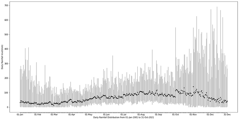
As seen in the chart, the rainfall values have extreme right tails across the entire yearly calendar. These outliers are usually the results of La Nina’s effect on the Central Coastal region of Vietnam. The mean values usually rise as we progress from spring towards summer and peak at the end of September, the stormy season in Vietnam. These values slowly decrease as winter approaches, signaling the usual dry and cold winter in the North and Central regions and the dry season in the South.
With the hint from the national level, we proceeded similarly with the area around Dong Hoi Vietnam — Cuba Friendship Hospital to see if La Nina is the driving force behind the high level of rainfall in October. All daily precipitation data in the month of October from 1981 to 2021 are collected on 6th December 2021 from UCSB’s CHIRPS v2.0 dataset.
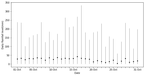
As we look closer to our rainiest stroke facility in Oct 2021, Dong Hoi Vietnam-Cuba Friendship Hospital, we can see similar patterns as we saw above at the national level. For most years, there is not much rain. Usually, the daily rain levels are close to 0 in the month of October with small rains here and there across the month. However, the rainfall daily data has extreme right tails sporadically in some years.

By looking at the monthly scale, one can see how La Nina creates extreme levels of rain throughout the historical view. High levels of rainfall coincide with La Nina occurrence: 1983 (1,085.16 mm), 1988 (1,273.45 mm), 1989 (998.72 mm), 1999 (906.69 mm), 2007 (1,208.37 mm), 2008 (1,182.09 mm), 2010 (1,364.92 mm), 2016 (1,264.72 mm), 2020 (1,522.44 mm), and 2021 (1,484.43 mm). Thus, the occurrence in October 2021 as we have seen in Figure 6 is not particularly an outlier, but rather an effect associated with a wider scale phenomenon.
High rainfall levels may suggest a high chance of pluvial flood in this season for the facility. However, the actual impact will depend on the topography of the location and the type of infrastructure (e.g., draining, protective walls, etc.) that are in place. We turn to this question in a subsequent blog drawing on the Fathom data.
Where Next?
We have shown how a cloud-based JPNE platform can be used to assess the extreme precipitation to stroke facility locations in Vietnam. While we have selected stroke facilities, this approach can of course be used for any other type of infrastructure. The key point is that a cJPNE platform can be used to frame relevant questions and answer them by progressively and iteratively analyzing available data.
The work of course can be continually improved. First, the analysis must confirm that the locational data concerning the health facilities is both comprehensive and correct. Second, the issue may be less direct exposure of the facility points themselves, but rather the exposure and disruption of roads that lead to them. Finally, the exposure layers can be subject to a significant degree of uncertainty, both looking back and forward (i.e., local signal to noise). Ground-truthing and reality checks for any actionable insights need to be part and parcel of this type of applied work!
No analysis and visualization will ever be perfect, but a cloud-based JPNE provides a good basis for benchmarking some of these risks, for example by running the same graphs with different comparable data layers. If the results in terms of health facility access (i.e, the use-case year) remain stable, this may lead to different conclusions than if they were radically different.
The reality of a planet dealing with climate change is a growing risk of extremes and uncertainty. Platform tools like cJPNE’s provide for a practical basis of linking context layers to the reality of the ground of local public services infrastructure access issues. They help structure local users to tap into a growing amount of big data environmental layers, including as spotlighted by the IPCC. Once this exploratory analysis has been completed, more polished dashboards and visualizations for end-users can be produced as interactive websites. But moving to website development before moving through cloud-based JPNE analysis with the real-world day is likely to inflate time delays and costs to decision-support value.
We are building up a growing track record of experiences with the deployment of cloud-based JPNE processes, including in the World Bank’s Big Data Observatory (BDO) for COVID-19 and Beyond and Vietnam Disruptive Technologies for Public Asset Governance (DT4PAG) programs. Through an ongoing series of Medium blog contributions (eg. Visualising Global Population Datasets with Python), we will continue to share our experiences, particularly in how they can help advance data-driven insights towards the achievement of SDGs and nudge progress towards applied technology learning by doing and skills building with a focus on the public sector.
Let us know your experiences with fostering people and process journeys towards better data-driven decision making, especially to contribute to public policy descriptive and prescriptive insights for developing countries.