
Linear Models For Stock Price Prediction
This comprehensive article provides an in-depth exploration of predicting stock prices using Linear Models in Python. Utilizing various Python libraries and modules such as pandas, numpy, datetime, seaborn, matplotlib, sklearn, and tensorflow, the article provides a detailed guide on preparing the environment for data analysis and machine learning.
The process is broken down into distinct steps: setting up the code, preparing and analyzing the data, forecasting using machine learning, and visualizing the results. This includes steps for calculating the dot product, importing necessary Python libraries for data analysis and visualization, creating and using functions for time series prediction models, preprocessing stock market data, and visualizing different segments of stock market data.
The article further guides you through the process of normalizing data for machine learning, training a simple linear forecasting model, and analyzing the loss of the model against different learning rates. Additionally, the article demonstrates how to use Keras to set up and train a simple machine learning model for time series forecasting.
Moreover, you’ll also learn to generate a forecast of future values using the trained model, reverse the normalization process applied to forecasts, and visualize forecasted values from the linear model in comparison to the actual values. Overall, this comprehensive guide walks you through each step involved in predicting stock prices using Linear Models in Python.
from formulas import *
import pandas as pd
import numpy as np
import datetime as dt
import seaborn as sns
import matplotlib.pyplot as plt
%matplotlib inline

from sklearn.preprocessing import MinMaxScaler

import tensorflow as tf

keras = tf.keras
For data processing, analysis, visualization, and machine learning, this code imports several Python libraries and packages. In plain English, it imports a custom module named formulas. There may be functions or variables defined by the user in this module. The pandas library is imported, which is commonly used to manipulate and analyze data. The program imports the numpy library, which provides support for large, multidimensional arrays and matrices as well as a number of high-level mathematical functions.
The module imports the datetime module, which provides classes for handling dates and times. For data visualization, it imports seaborn and matplotlib libraries. Based on matplotlib, Seaborn provides a high-level interface for drawing statistical graphics. By using the %matplotlib inline command, plots created with matplotlib can be displayed directly in Jupyter Notebooks. The MinMaxScaler is imported from sklearn.preprocessing.
In the data preparation step before training a machine learning model, this tool is used to normalize data. Tensorflow is a powerful library for numerical computation, which is particularly well-suited to large-scale Machine Learning and is highly optimized for performance on both CPUs and GPUs. Tensorflow.keras is aliased as keras. On top of TensorFlow, Keras provides a high-level API for neural networks. By importing necessary modules and libraries, this code prepares the environment for data analysis and machine learning.
Setup
# Example of dot product of two sequences of length 1
np.dot(2,1) + 5
The code calculates the dot product of two single-element sequences and adds five. The two sequences are just single numbers: 2 and 1. In this case, the dot product is the multiplication of both numbers, which equals 2 (since 2 times 1 equals 2). As a result of calculating this dot product, the code adds 5 to the result, so the final output of this code is 7. This code multiplies two numbers together, then adds five.
import numpy as np
import pandas as pd
import matplotlib.pyplot as plt
import tensorflow as tf
from sklearn.preprocessing import MinMaxScaler
import seaborn as sns

keras = tf.keras

# set style of charts
sns.set(style="darkgrid")
plt.rcParams['figure.figsize'] = [10, 10]
Data analysis and visualization are performed by this block of code, which imports a number of Python libraries. In addition to numpy and pandas for data manipulation, matplotlib and seaborn for data visualization, and tensorflow for machine learning, they also include MinMaxScaler from Sklearn for preprocessing data. As a shortcut for tensorflow.keras, it sets the alias keras. It’s easier to refer to the Keras API, which is a Python-based, high-level API for neural networks that runs on top of TensorFlow.
The code customizes the appearance of plots generated later. In this case, sns.set(style=”darkgrid”) applies a style with a dark background and grid lines to the plots. Matplotlib sets the default size for its plots. In plt.rcParams[‘figure.figsize’] = [10, 10], the default figure size is set to 10 inches by 10 inches. Any plot created will be of this size unless otherwise specified.
def plot_series(time, series, format="-", start=0, end=None, label=None):
    plt.plot(time[start:end], series[start:end], format, label=label)
    plt.xlabel("Time")
    plt.ylabel("Value")
    if label:
        plt.legend(fontsize=14)
    plt.grid(True)

def model_forecast(model, series, window_size):
    ds = tf.data.Dataset.from_tensor_slices(series)
    ds = ds.window(window_size, shift=1, drop_remainder=True)
    ds = ds.flat_map(lambda w: w.batch(window_size))
    ds = ds.batch(32).prefetch(1)
    forecast = model.predict(ds)
    return forecast

def window_dataset(series, window_size, batch_size=128,
                   shuffle_buffer=1000):
    dataset = tf.data.Dataset.from_tensor_slices(series)
    dataset = dataset.window(window_size + 1, shift=1, drop_remainder=True)
    dataset = dataset.flat_map(lambda window: window.batch(window_size + 1))
    dataset = dataset.shuffle(shuffle_buffer)
    dataset = dataset.map(lambda window: (window[:-1], window[-1]))
    dataset = dataset.batch(batch_size).prefetch(1)
    return dataset
In order to train and evaluate time series prediction models, these three functions work together. Using plot_series, data is visualized as a line graph with ‘time’ on the x-axis and ‘value’ on the y-axis. For better readability, the graph may include labels and a grid. Based on the parameters ‘start’ and ‘end’, it can plot a part or the whole series.
Using a given prediction model, this function generates forecasts for a given time series. Firstly, it converts the time series into a TensorFlow dataset and then divides it into windows (subsequences). Next, it uses the model to predict values for each window. These predictions are returned by the function.
To train a prediction model, window_dataset processes a given time series. One additional data point is added to each window of a specified size. Window data is divided into two parts: the first part contains all data points except the last (used as input for the model), and the second part contains the last (used as the target).
For efficient training, these windows are shuffled and batched into specified batch sizes. This prepared dataset is returned by the function. A trained model is used to make predictions, prepare data for time series prediction, and visualize the results.
Forecasting With Machine Learning
# Read in data
spy = pd.read_csv('SPY.csv')

# Convert series into datetime type
spy['Date'] = pd.to_datetime(spy['Date'])

# Save target series
series = spy['Close']

# Create train data set
train_split_date = '2014-12-31'
train_split_index = np.where(spy.Date == train_split_date)[0][0]
x_train = spy.loc[spy['Date'] <= train_split_date]['Close']

# Create test data set
test_split_date = '2019-01-02'
test_split_index = np.where(spy.Date == test_split_date)[0][0]
x_test = spy.loc[spy['Date'] >= test_split_date]['Close']

# Create valid data set
valid_split_index = (train_split_index.max(),test_split_index.min())
x_valid = spy.loc[(spy['Date'] < test_split_date) & (spy['Date'] > train_split_date)]['Close']
In this code snippet, stock market data is preprocessed, perhaps for analysis or machine learning purposes. It begins by reading data from a CSV file named ‘SPY.csv’, which seems to be historical stock price data for SPY (S&P 500 ETF). A pandas DataFrame, which is similar to a table in Python, is used to load the data. Afterwards, it converts the ‘Date’ column in the DataFrame from text to a Python-compatible datetime format.
Later, date-based operations could be performed on the data. We extract and save the ‘Close’ column, which represents the closing price of the SPY on each trading day. The subsequent analysis or model will likely focus on this data. Based on certain dates, the data is then divided into training, validation, and testing datasets. All closing prices up to December 31, 2014 are included in the training data.
All closing prices from January 2, 2019, and forward are included in the testing data. The validation data consists of the closing prices between the training and testing periods. Several datasets may be used to develop and validate a predictive model: training data for building the model, validation data for tuning it, and testing data for evaluating its performance.
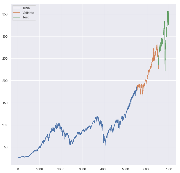
# Plot all lines on one chart to see where one segment starts and another ends
plt.plot(x_train, label = 'Train')
plt.plot(x_valid, label = 'Validate')
plt.plot(x_test, label = 'Test')
plt.legend()
print(x_train.index.max(),x_valid.index.min(),x_valid.index.max(),x_test.index.min(),x_test.index.max())
In this code, we are visualizing the different segments of stock market data — training, validation, and testing — on a single chart and displaying their ranges. ‘Train’, ‘Validate’, and ‘Test’ data are plotted on the same line chart in the first part of the code. Over time, each line represents the closing prices in the respective dataset. Thus, one can see where one dataset ends and the next one begins chronologically between these three datasets. It then adds a legend to the chart that provides labels for the different lines, so you can know which line corresponds to which dataset.
Finally, it prints out the maximum index (date) of the training data, the minimum and maximum index of the validation data, and the minimum and maximum index of the testing data. As a result, one can understand the chronological boundaries of the training, validation, and testing periods by examining these date ranges.
# Reshape values
x_train_values = x_train.values.reshape(-1, 1)
x_valid_values = x_valid.values.reshape(-1, 1)
x_test_values = x_test.values.reshape(-1, 1)

#  Create Scaler Object
x_train_scaler = MinMaxScaler(feature_range=(0, 1))

# Fit x_train values
normalized_x_train = x_train_scaler.fit_transform(x_train_values)

# Fit x_valid values
normalized_x_valid = x_train_scaler.transform(x_valid_values)

# Fit x_test values
normalized_x_test = x_train_scaler.transform(x_test_values)

# All values normalized to training data
spy_normalized_to_traindata = x_train_scaler.transform(series.values.reshape(-1, 1))

# Example of how to iverse
# inversed = scaler.inverse_transform(normalized_x_train).flatten()
As part of the preparation and normalization of data for machine learning, this code starts by reshaping the ‘Train’, ‘Validate’, and ‘Test’ data. As a result of the reshape operation, the data is transformed into the format required by the next step, which in this case is a two-dimensional array with one column and as many rows as needed. To scale the data, it creates an object (MinMaxScaler). This scaling aims to normalize the data to a specific range, in this case between 0 and 1. In machine learning, normalizing or scaling data can help algorithms converge faster and perform better.
Afterwards, the scaler is “fitted” to the training data. Calculate the minimum and maximum values of the training data so that the scaler knows how to scale this data. Fitted scalers transform (scale) the training data, and the scaled data is stored in normalized_x_train. Both validation and test datasets are then transformed using the same scaler. In order to ensure that all data is scaled consistently, it is important to use the same scaler.
Furthermore, it scales the entire series of stock closing prices (presumably the ‘Close’ price for all dates in the dataset) according to the same scaler. Furthermore, it provides a commented-out example of reversing the scaling process on the normalized training data, which can be useful for interpreting or comparing predicted values.
Linear Model
# Clears any background saved info useful in notebooks
keras.backend.clear_session()

# Make reproducible
tf.random.set_seed(42)
np.random.seed(42)

# set window size
window_size = 20

# define training data (20 day windows shifted by 1 every time)
train_set = window_dataset(normalized_x_train.flatten(), window_size)

# Build Linear Model of a single dense layer
model = keras.models.Sequential([
  keras.layers.Dense(1, input_shape=[window_size])
])

# Find optimal learning rate
lr_schedule = keras.callbacks.LearningRateScheduler(
    lambda epoch: 1e-6 * 10**(epoch / 30))
optimizer = keras.optimizers.Nadam(lr=1e-6)
model.compile(loss=keras.losses.Huber(),
              optimizer=optimizer,
              metrics=["mae"])

# Fit the model
history = model.fit(train_set, epochs=100, callbacks=[lr_schedule])
Using a machine learning library called Keras, this code sets up and trains a simple linear forecasting model. Keras clears any stored information from previous models in the first line. To avoid potential conflicts with older models, this step is useful when using Jupyter notebooks. A seed is then set for TensorFlow and Numpy’s random number generators. Any process that uses random numbers is guaranteed to produce the same result each time the code is run by setting a seed.
The window size is set to 20. For time series forecasting, a window size of 20 means that the model uses the past 20 time steps to predict the future. It prepares training data into appropriate sequences of 20-day windows according to the previously defined window size. A simple linear model with one dense layer is then defined. With one input layer, this is a very basic neural network model.
The learning rate schedule is defined. It will adjust the learning rate of the model’s optimizer during training, starting at 1e-6 and gradually increasing it. To train the model, Nadam, a stochastic gradient descent optimizer, will be used. Compilation includes a loss function (Huber loss), an optimizer, and a metric for evaluation (mean absolute error).
Finally, the model is trained on the training data for a total of 100 epochs according to the learning rate schedule. The training process is saved in the ‘history’ variable, which can later be plotted and analyzed.
plt.semilogx(history.history["lr"], history.history["loss"])
plt.axis([1e-6, 1, 0, .01])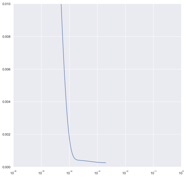
In this code, a plot is created that shows how the loss of a machine learning model changes with different learning rates. It uses a semilogx plot, which has a logarithmic axis on the x-axis and a linear axis on the y-axis. The learning rate schedule can help visualize changes over a wide range of values, such as learning rates that vary exponentially.
Training rates are represented on the x-axis, while loss values are represented on the y-axis. Understanding how the model’s loss changes as the learning rate increases can help in choosing the optimal learning rate. With the ‘axis’ command, you can specify the range of values to display on the x-axis (from 1e-6 to 1) and the y-axis (from 0 to 0.01).
The plot will show how the loss changes from 1e-6 to 1 and within a loss range of 0 to 0.01. Overall, this plot can provide insights into the relationship between learning rate and loss, which can help select an appropriate learning rate.
# Useful to clear everything when rerunning cells
keras.backend.clear_session()

# Make this reproducible
tf.random.set_seed(42)
np.random.seed(42)

# Create train and validate windows
window_size = 20
train_set = window_dataset(normalized_x_train.flatten(), window_size)
valid_set = window_dataset(normalized_x_valid.flatten(), window_size)

# 1 layer producing linear output for 1 output from each window of 20 days
model = keras.models.Sequential([
  keras.layers.Dense(1, input_shape=[window_size]) # o
])

# Huber works well with "mae"
optimizer = keras.optimizers.Nadam(lr=1e-3)
model.compile(loss=keras.losses.Huber(),
              optimizer=optimizer,
              metrics=["mae"])

# create save points for best model
model_checkpoint = keras.callbacks.ModelCheckpoint(
    "my_checkpoint", save_best_only=True)

# Set up early stop
early_stopping = keras.callbacks.EarlyStopping(patience=10)

# fit model to data
model.fit(train_set, epochs=500,
          validation_data=valid_set,
          callbacks=[early_stopping, model_checkpoint])
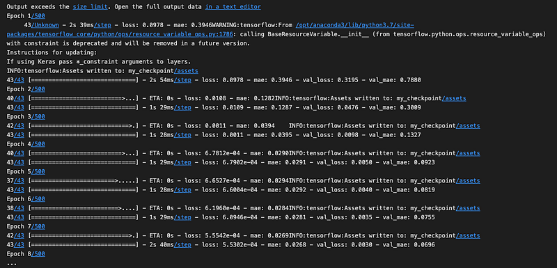
Utilizing the Keras library, this code sets up and trains a simple machine learning model for time series forecasting. The training process uses a linear model, validation data, model checkpoints, and early stopping. The first part of the code clears any stored information Keras might have from previous models. To ensure reproducibility, it sets seeds for TensorFlow and numpy’s random number generators. In the model, it specifies the size of the window for the data.
When making predictions, the model will consider 20 days of data at a time. Through the use of the previously defined and normalized training and validation datasets, it prepares the training and validation data into appropriate sequences or “windows” of 20-day periods. The model consists of a simple linear model with a single Dense layer. A specific loss function (Huber loss), an optimizer (Nadam) with set learning rate, and a metric for evaluation (mean absolute error) are included in the model.
The model is saved at its best performing point during training using a checkpointing system. The new model will replace the old one if the model improves during training (meaning that the validation loss decreases). In this way, even if the model’s performance deteriorates over time, we have a saved version of it at its best. After a certain number of epochs, it stops the training process if the model hasn’t improved.
By preventing unnecessary training, time and computational resources can be saved. The model is trained for up to 500 epochs on the training data. During training, the model’s performance is evaluated using the validation data, and both checkpointing and early stopping mechanisms are used. The training process optimizes the model’s performance and prevents overfitting.
lin_forecast = model_forecast(model, spy_normalized_to_traindata.flatten()[x_test.index.min() - window_size:-1], window_size)[:, 0]Using the trained model, this code generates a forecast of future values. Using normalized stock market data, the forecast is calculated over the test set’s time period. In plain English, it uses the model_forecast function to generate forecasts based on a provided model. Forecasts are made using the previously trained model. Input data for the forecast are normalized stock market data (spy_normalized_to_traindata), from the start of the test set (x_test.index.min()) minus the window size, up to the last data point (-1).
In this way, the forecast starts at the beginning of the test set, but includes sufficient preceding data for the first prediction window. For the forecast, the same window size is used as for training. Our forecast function returns an array, and we select all rows in the first column ([:, 0]). Based on the trained model, the line of code forecasts the stock market data in the range of the test set, and the forecasted values are stored in lin_forecast.
# Undo the scaling
lin_forecast = x_train_scaler.inverse_transform(lin_forecast.reshape(-1,1)).flatten()
lin_forecast.shape
There are two things this code does: It reverses the normalization process that was previously applied to forecasts. Data was scaled down to a range between 0 and 1 when training the model. The data is now being restored to its original scale.
By doing so, the forecasted values will be directly comparable to the actual stock prices in the original data. A shape check is then performed on the un-normalized forecasted data.
An array’s shape tells you how many dimensions it has and how many elements it contains. It can be useful to ensure that the data is in the correct format and that the un-normalization process went smoothly. This code converts forecasted values back to their original scale and then checks their shape.
# Plot results
plt.title('Linear Forecast')
plt.ylabel('Dollars $')
plt.xlabel('Timestep in Days')
plot_series(x_test.index, x_test)
plot_series(x_test.index, lin_forecast)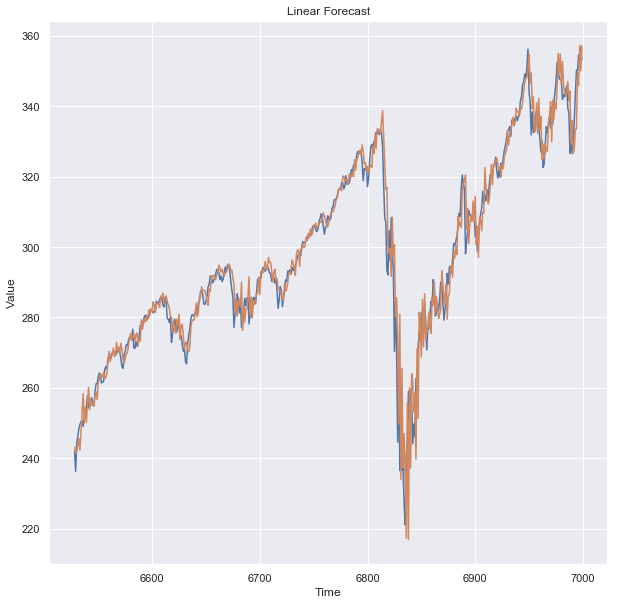
Using this code, the forecasted values from the linear model are visualized and compared to the actual values from the test data. In plain English, it first sets the plot’s title as ‘Linear Forecast’. The y-axis label is then set to ‘Dollars $’. Dollar values are plotted here, indicating that they represent amounts.
The x-axis is labeled ‘Timestep in Days’. A specific day is represented by each point on the x-axis. Plotting the actual values from the test data is done using a function called plot_series. For the plot, the x-coordinates represent the index values from the test data. On those days, the y-coordinates represent the closing stock prices.
The forecasted values are plotted using the same plot_series function. Test data are the x-coordinates, and forecasted stock prices are the y-coordinates. With this code, you can visually compare forecasted stock prices (from the linear model) with actual stock prices. You can use this to determine how well the model is doing.
Linear Model Result
keras.metrics.mean_absolute_error(x_test, lin_forecast).numpy()
A numpy array is created by converting the mean absolute error (MAE) between the actual test values and the forecasted values from the linear model. It calculates the Mean Absolute Error in plain English. Forecast accuracy is measured using this metric.
The method compares each forecasted value with the corresponding actual value, finds the absolute difference between each pair, and averages these absolute differences. Two sets of data are used for this MAE calculation: the actual values from the test set (x_test) and the forecasted values (lin_forecast).
This MAE value is then converted to a numpy array format, which might be more compatible with future functions. The code compares the forecasts of the linear model with the actual values and provides the average error in a numerical form.


