
Let me know what to say to the emergency number

We were in holidays in the Swiss alps. I was wandering around in the reception of our hotel while I waited for my wife to come down. So I watched the board where all touristic and key information are displayed. Yes, I was a bit bored. But then I saw something interesting.
A little poster said:
In case of emergency call the number 144. You are at the following adress…
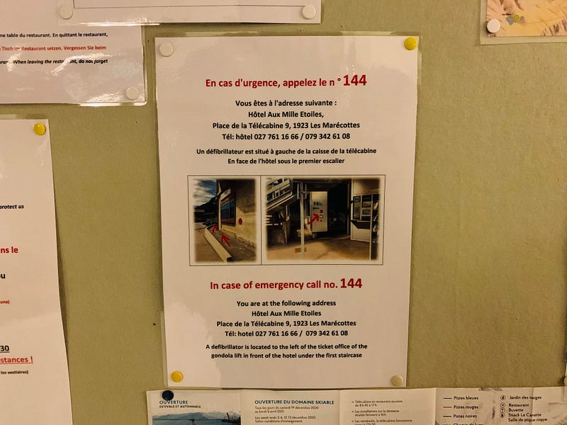
The poster also showed where you can find the defibrilator and made it clear with a few photos and arrows.
Why this is smart service design
I’m on holidays, if something bad happens I’m not in my usual environnement. If I’m a foreigner, I might not know what the emergency phone number is in Switzerland, so that already is pretty smart.
But the thing that I found particularly smart is to mention the key information I should give to the emergency service. In this case, the adress.
This is something that you can also do when you show an error message that lets people know they should contact the support. You can add a little note that says:
There was an error. Please share this error message to our support team to help them understand what happened… —
This article has been adapted in a more comprehensible English by the lovely Joanna Bienz. As Joanna is also an expert on Customer Experience and UX she shares additional comments to go further:
Joanna’s comment
I think that the great impact of the example was the hotel giving you the address, rather than you giving the address to the emergency service — a better example might be like during ordering takeout online for the platform to remind you to tell the restaurant if you have allergies :)