
Learn The Basics of Data Visualization in 1 Day With Free Guided Projects
Data Viz is everywhere nowadays.

Data visualization, once a relatively obscure field, has now risen to become an important part of business intelligence and data journalism. All those pretty dashboards you see? Data visualization in action. Infographics? Charts? Data visualization.
I would recommend searching for open positions where data visualization skill is required and look at the salaries. It’s not a bad skill to have!
Coursera
Coursera is an amazing platform famous for its University-style courses. But did you know that they offer short guided projects as well? While it takes around a month to complete their typical course and it can take up to a year to complete a track on a particular topic, a guided project can be completed in a few hours.

Guided Projects
For everyone who is not ready to commit (and how many of us started the online course and dropped it after a few days? Yeah, right.), Coursera offers a different format — a guided project. It takes around 2 hours to complete one project and it’s a great way to improve an existing skill or start learning something new entirely. When do you want to learn something new fast where do you go? Right, YouTube or Skillshare because their short lessons are perfect for beginners. Now, you can also go to Coursera and find similar content there.
Not long ago, I was preparing for a Tableau Certification and found these bite-sized projects extremely useful. Each project can serve both as an introduction to the topic as well as a good exercise to practice your skills or even an addition to your growing portfolio.
We all know that you are busy but maybe you can find 2 hours to learn an extremely popular and in-demand skill such as data visualization?
Getting Started with Power BI Desktop
Data visualization is huge right now and while Python is not going anywhere, a lot of companies prefer to use PowerBI or Tableau to visualize their data.
COVID19 Data Analysis Using Python
Ready-to-use platforms are great but analyzing your data with Python gives you unlimited possibilities and flexibility. If you’ve been looking at data analysis with Python for a while but had no idea where to start - start here!
Getting Started with R
R is a programming language and free software environment that can be used for data analysis. While it might seem that 2 hours are not enough, this project manages to cover all the basics of the R programming language that you need to get started.
Introduction to Python
A lot was already said about Python so we all know that it’s a beginner-friendly, multi-purpose language that can be used almost everywhere. If you’ve never worked with Python but extremely curious to see what’s the fuss about — this course is perfect for you.
Spreadsheets for Beginners using Google Sheets
I wouldn't call Excel a professional data visualization tool but people do use spreadsheets to create basic charts, reports, and to visualize their data.
Python for Data Analysis: Pandas & NumPy
Python is amazing also because it has so many ready-to-use libraries to offer. NumPy and Pandas are two of the most widely used python libraries in data science.
Creating an Interactive KPI Management Dashboard in Tableau
If Apple ever decides to realize a data viz platform, it will look a lot like Tableau. Personally, I love Tableau for its clean interface, attractive graphics, and ease of use. Every time I open Tableau Public, it never ceases to amaze me what people can do with this seemingly simple platform.
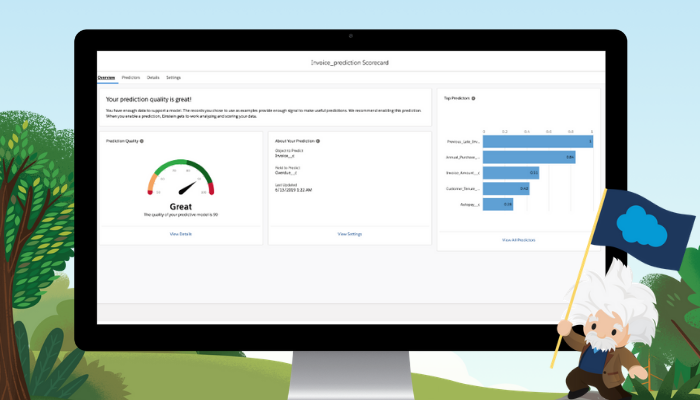
If you have a Salesforce account, Tableau 2021 also offers an amazing feature called Einstein Predictions, a machine learning model that can analyze your data and give you some accurate predictions. This feature alone deserves a separate blog post…
If you want to see Tableau in action, I recently used it to create a super simple visualization of my Medium stats. It took me less than an hour and it was a fun project to work on!