avatarVikalp Kaushik

Summary

The article outlines the process and guidelines for designing custom icons for UI, emphasizing the importance of adhering to Material Design principles, including stroke, padding, live area, and size specifications.

Abstract

The author discusses the approach to creating custom icons for user interfaces, particularly when unique or brand-specific icons are required. The article delves into the foundational aspects of icon design, such as understanding the stroke, padding, and live area. It recommends a standard icon size of 24 x 24 px with a 1px grid, as per Material Design guidelines, and provides specific measurements for the live area, padding, and stroke to ensure consistency. Additionally, the article highlights the significance of using grids and keylines for precision in icon design and suggests resources like a YouTube tutorial and a Figma community file for further assistance. The author encourages readers to engage with the content by commenting and subscribing for future updates.

Opinions

  • The author prefers using free icon packs but acknowledges the need for custom icon design to align with a client's brand personality.
  • Adherence to the Material Design System is advocated for consistency and quality in icon design.
  • The article suggests that designing icons within the recommended live area is generally best, although there can be exceptions.
  • A specific icon design template is recommended, including a 24 x 24 px size with a 20 x 20 px live area, 2px padding, and a 2px stroke for uniformity across icons.
  • The author endorses following basic grids and keylines to achieve better icon design and recommends a YouTube video for those seeking a visual guide.
  • For designers using Figma, the author recommends a community file by Ragnar Freyr that provides keyline versions for both 24x24 and 16x16 px icons.
  • The author is open to feedback and intends to update the article with more information, indicating a commitment to continuous learning and sharing within the design community.

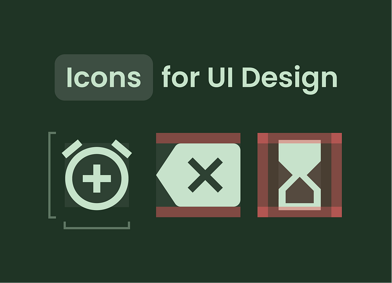
Learn How I Design Icons for UI

Learn what rules and sizes I follow for Designing Icons.

When I am creating UI design I mostly prefer borrowing icons from different websites or free Icon packs. Still, sometimes a client wants something unique or icons that match the brand personality.

That is when I design a custom icon while following the basics of icon designing. I follow the Material Design System while designing my icons.

Let’s see some of the basics You need to know to get started designing your custom icons for a better personality of your designs.

#1 Basics of Icon Designing

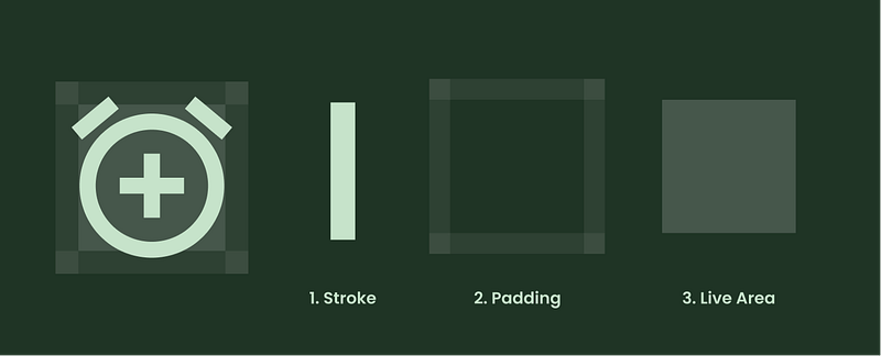
There is 3 most basic term you must know when you start designing your icons for UI, and those are Stroke, Padding, and Live Area, let me explain them.

  1. Stroke: The size of the line or icon, we can adjust the stroke according to the company’s or client’s branding need.
  2. Padding: This is the space around the icon that helps in defining the territory of the icon and some spacing also.
  3. Live Area: Live area is the area where you will be drawing your icon, sometimes there is an exception that icons can cross the live area but it’ll be better to design your icons in the live area.

#2 Sizes for Icon Designing

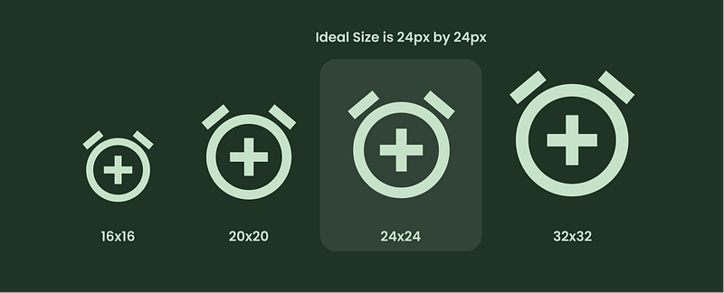
You can create various Icon sizes but the best recommendation for icon design by material design guidelines is a 24 x 24 px icon. with 1px grid.

https://material.io/design/iconography/system-icons.html#grid-and-keyline-shapes

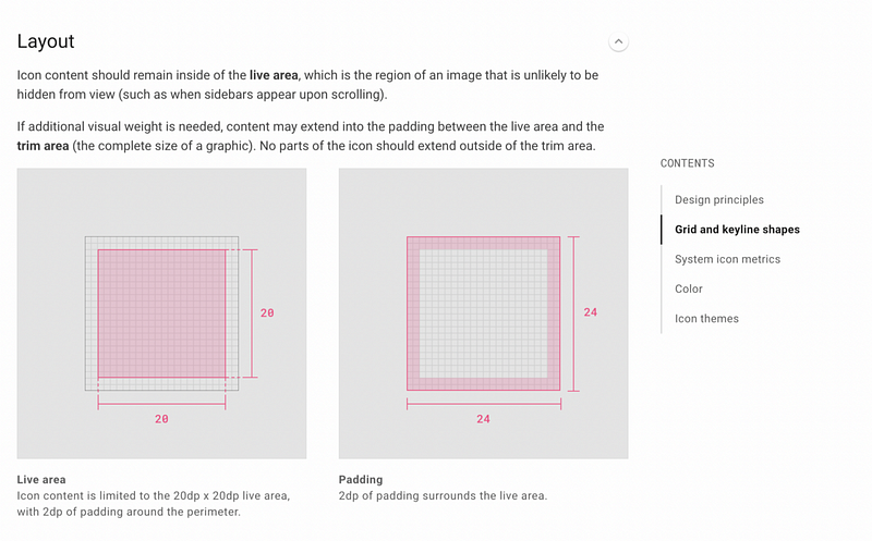
When designing the 24x24 px icon the live area should be 20x20px, and…

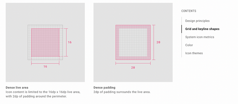
with the padding of 2px and…

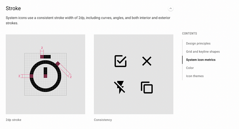
with the stroke of 2px for consistency in all the icons.

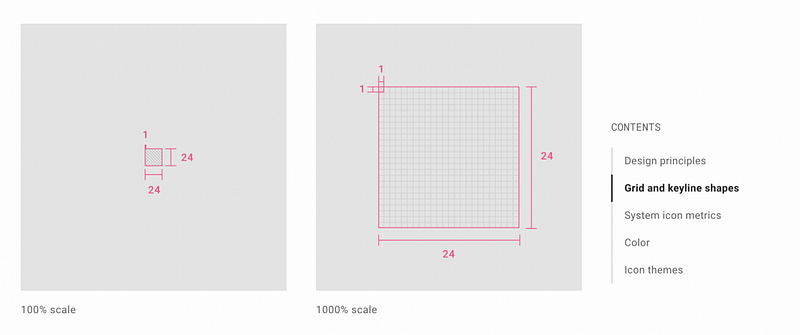
#3 Grid, Keylines, and Basic Shapes

Following the basic grids and keylines help you design better icons also, by staying in the lines you can design a much more perfect icon, and for this, I have a video to recommend because he teaches much better.

If you want a Figma keyline version then grab the file from the Figma community by Ragnar Freyr for both 24x24 and 16x16 px.

So that’s it for now if you have any doubt then comment below.

I’ll edit this and write more in the future, thanks for reading don’t forget to clap.

Subscribe here, to get new articles right in your inbox!

Design
UI
UX
UI Design
UX Design
Recommended from ReadMedium