
K-means Clustering and Visualization with a Real-world Dataset
Use an easy to understand real-world dataset to demonstrate how to implement K-means clustering with Scikit-learn library and visualize the results using pandas, Matplotlib and seaborn
K-means clustering is a popular unsupervised machine learning algorithm used for clustering data points into groups or clusters based on their similarities. The algorithm aims to partition a dataset into k clusters, where k is a predetermined number of clusters.
The k-means algorithm works by iteratively assigning each data point to the nearest centroid or center of a cluster, based on a distance metric (usually Euclidean distance). The centroid of each cluster is then updated as the mean of all the data points assigned to that cluster. This process continues until the centroids converge, i.e., until the assignment of data points to clusters does not change.
K-means clustering is widely used in various applications such as image segmentation, customer segmentation, and anomaly detection. However, it is sensitive to the initial selection of centroids, and the resulting clusters can vary based on the initial random assignment of centroids. Therefore, it is common to run the algorithm multiple times with different random initializations to improve the chances of finding the best clustering.
Scikit-learn is a popular Python library for machine learning, which includes an implementation of the k-means clustering algorithm. In this article, we will demonstrate how to implement a K-means clustering using scikit learn with an easy understanding real-world example.
Table of Contents
· 1. K-mean Clustering Method in Scikit Learn ∘ 1.1 KMeans method ∘ 1.2 Cluster quality metrics · 2. Read Dataset ∘ 2.1 Set the environment variable ∘ 2.2 Import required libraries ∘ 2.3 Read the dataset ∘ (1) Method 1 ∘ (2) Method 2 · 3. Explore the data · 4. Encode the categorical variable · 5. Two Dimensional K-Means Clustering ∘ 5.1 Select variables ∘ 5.2 Create a scatter plot ∘ 5.3 KMean clustering ∘ 5.4 Predict the labels of the clusters ∘ 5.5 Center points of the clusters ∘ 5.6 Visualize clustering results ∘ 5.7 Add cluster labels to DataFrame ∘ 5.8 Application of clustering model ∘ (1) Obtain the cluster label ∘ (2) Predict cluster label ∘ (3) Filter a certain cluster through its label ∘ (4) Extract a customer’s information by his ID · 6. Multi-Dimensional k-Means Clustering ∘ 6.1 Select features ∘ 6.2 The Optimal Number of Clusters ∘ (1) Elbow Curve Method ∘ (2) Silhouette Analysis ∘ 6.3 Implement KMean clustering ∘ 6.4 Display the results ∘ (1) Scatter matrix plot ∘ (2) Parallel coordinates plot ∘ (4) Heatmap ∘ (5) Average result table and plot · Summary
1. K-mean Clustering Method in Scikit Learn
1.1 KMeans method
Scikit learn provides an easy method to implement K-means clustering, and the expression is as follows:
KMeans(n_clusters=8, *, init='k-means++', n_init=10, max_iter=300, tol=0.0001, precompute_distances='auto', verbose=0, random_state=None, copy_x=True, n_jobs='deprecated', algorithm='auto')
Here’s a brief explanation of the main parameters:
- n_clusters: The number of clusters to form.
- init: The initialization method for the centroids. Possible options are ‘k-means++’ (default), ‘random’, or an ndarray of shape (n_clusters, n_features) to specify the initial centroids.
- n_init: The number of times the K-means algorithm will be run with different centroid seeds. The final results will be the best output of n_init consecutive runs in terms of inertia.
- max_iter: The maximum number of iterations for each run of the K-means algorithm.
- tol: The relative tolerance with respect to inertia to declare convergence. precompute_distances: Whether to precompute distances (faster but requires more memory) or to calculate distances on the fly (slower but less memory-intensive).
- random_state: The seed used by the random number generator.
- n_jobs: The number of CPUs to use for parallel computation. Use -1 to use all available CPUs.
- algorithm: The algorithm used to compute the K-means. Possible options are ‘auto’, ‘full’, or ‘elkan’.
There are also several other parameters you can specify to further customize the KMeans object. Once you have created the KMeans object with the desired parameters, you can fit it to your data using the fit method and use the predict method to assign new data points to their closest clusters based on the learned centroids.
1.2 Cluster quality metrics
Visual inspection of the clusters can be a useful method to evaluate clustering, especially when the number of clusters is small. It can provide insights into the quality of the clustering and identify any issues or anomalies.
Besides, Scikit-learn provides several cluster quality metrics that can be used to evaluate the performance of K-means clustering. Here are some commonly used metrics:
- Silhouette Score: Computes the mean silhouette coefficient of all samples. This metric measures the similarity of a sample to its own cluster compared to other clusters. It ranges from -1 to 1, where higher values indicate better clustering.
- Inertia: Measures the sum of squared distances of all samples to their closest cluster center. This metric is used to evaluate how well the clusters are separated from each other. Lower values indicate better clustering results.
- Calinski-Harabasz Index: Computes the ratio of the between-cluster variance to the within-cluster variance. This metric measures how well the clusters are separated from each other. Higher values indicate better clustering results.
- Davies-Bouldin Index: Computes the average similarity between each cluster and its most similar cluster. This metric measures how well the clusters are separated from each other. Lower values indicate better clustering results.
It is important to note that no single method can determine the best clustering for all datasets, and a combination of methods may be necessary to obtain a comprehensive evaluation.
2. Read Dataset
2.1 Set the environment variable
You probably meet the following userwarning message when implementation of KMean clustering in Section 5 and Section 6.

To avoid this userwarning message, the easiest way is to set the environment variable by adding the following command before importing all required packages. If you are interested in studying where and how the userwarning message generates, you maybe comment # the following code first and run all the rest codes.
import os
os.environ["OMP_NUM_THREADS"] = '1'
2.2 Import required libraries
import pandas as pd
import seaborn as sns
import matplotlib.pyplot as plt
from sklearn import preprocessing
from sklearn.cluster import KMeans
2.3 Read the dataset
(1) Method 1
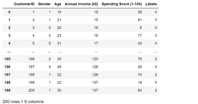
We use a very popular and easy to understand dataset on Mall Customers with different names online. You can download from many places, such as Mall_Customers.csv from this link in Kaggle, or customers.csvfrom this link in GitHub. Then you put it into a folder, say the data folder in your current working directory. I downloaded the one with name 'customers.csv' from GitHub, so we can read it in the following way.
data = pd.read_csv('./data/customers.csv')
data.head()
(2) Method 2
If you do not want a copy in your local computer, you can read it directly from the GitHub.
url = 'https://raw.githubusercontent.com/jeffprosise/Applied-Machine-Learning/main/Chapter%201/Data/customers.csv'

data = pd.read_csv(url)
data.head()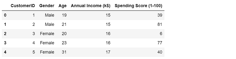
3. Explore the data
data.info()
It renders the following result:
<class 'pandas.core.frame.DataFrame'>
RangeIndex: 200 entries, 0 to 199
Data columns (total 5 columns):
 #   Column                  Non-Null Count  Dtype
---  ------                  --------------  -----
 0   CustomerID              200 non-null    int64
 1   Gender                  200 non-null    object
 2   Age                     200 non-null    int64
 3   Annual Income (k$)      200 non-null    int64
 4   Spending Score (1-100)  200 non-null    int64
dtypes: int64(4), object(1)
memory usage: 7.9+ KB
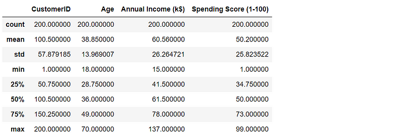
data.describe()The result goes as follows:
4. Encode the categorical variable
We encode the categorical variable ‘Gender’, where “Male” and “Female” in are encoded with value 1 and 0, respectively. There are several methods to encode the categorical or string variables, which have been discussed in this previous article. You can easily use these methods, but we will use another method LabelEncoder() in Scikit learn.
data_encode = data.copy()

le = preprocessing.LabelEncoder()
data_encode['Gender'] = le.fit_transform(data_encode['Gender'])
data_encode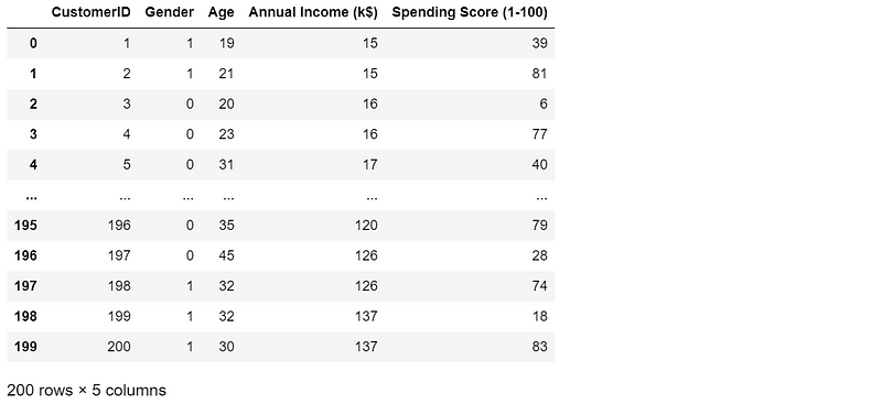
5. Two Dimensional K-Means Clustering
5.1 Select variables
First, we just consider a simple 2 dimension case on the customers in terms of ‘Annual Income (k$)’ and ‘Spending Score (1–100)’. We make a copy of the DataFrame to keep the original DataFrame unchanged.
df = data_encode.copy()
x = df['Annual Income (k$)']
y = df['Spending Score (1-100)']
5.2 Create a scatter plot
Let’s create a scatter plot to visualize data roughly. We use ‘ggplot’ style for all the plots in this article. You can use any style that you like.
# set the plotting style to 'ggplot'
plt.style.use('ggplot')

plt.scatter(x, y, s=35, alpha=0.9)
plt.xlabel('Annual Income (k$)')
plt.ylabel('Spending Score')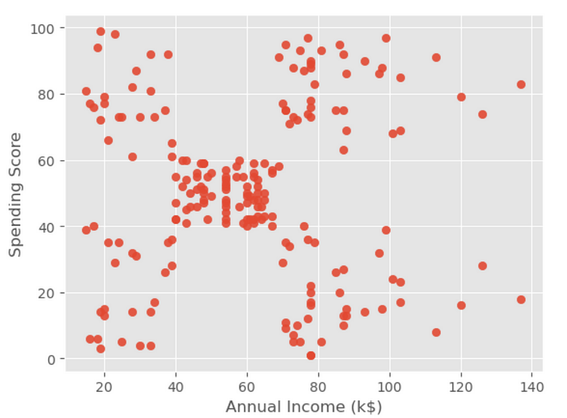
The above visualization result displays that the data points fall into roughly five clusters.
5.3 KMean clustering
The easy way to create the input X by the column names, and then convert it as a NumPy array using ‘.values’ to avoid an UserWarning in the Section 5.8.
X = df[['Annual Income (k$)','Spending Score (1-100)']].values

kmeans = KMeans(n_clusters=5, init='k-means++', n_init='auto', random_state=0).fit(X)
5.4 Predict the labels of the clusters
To predict the labels of K-means clustering in scikit-learn, you can use the predict method of the KMeans object.
cluster_labels = kmeans.predict(X)
print(cluster_labels)
It produces the following result.
[4 3 4 3 4 3 4 3 4 3 4 3 4 3 4 3 4 3 4 3 4 3 4 3 4 3 4 3 4 3 4 3 4 3 4 3 4
 3 4 3 4 3 4 1 4 3 1 1 1 1 1 1 1 1 1 1 1 1 1 1 1 1 1 1 1 1 1 1 1 1 1 1 1 1
 1 1 1 1 1 1 1 1 1 1 1 1 1 1 1 1 1 1 1 1 1 1 1 1 1 1 1 1 1 1 1 1 1 1 1 1 1
 1 1 1 1 1 1 1 1 1 1 1 1 2 0 2 1 2 0 2 0 2 1 2 0 2 0 2 0 2 0 2 1 2 0 2 0 2
 0 2 0 2 0 2 0 2 0 2 0 2 0 2 0 2 0 2 0 2 0 2 0 2 0 2 0 2 0 2 0 2 0 2 0 2 0
 2 0 2 0 2 0 2 0 2 0 2 0 2 0 2]
Or use labels_method.
cluster_labels = kmeans.labels_
print(cluster_labels)
We can get the same result.
5.5 Center points of the clusters
To obtain the center points of the clusters, we can use the cluster_centers_ method of the KMeans object.
centers = kmeans.cluster_centers_
print(centers)
The results are:
[[88.2        17.11428571]
 [55.2962963  49.51851852]
 [86.53846154 82.12820513]
 [25.72727273 79.36363636]
 [26.30434783 20.91304348]]
5.6 Visualize clustering results
For a two dimensional clustering, it is easy to visualize the results with a scatter plot.
plt.scatter(x, y, c=cluster_labels, s=35, alpha=0.9, cmap='jet')
plt.xlabel('Annual Income (k$)')
plt.ylabel('Spending Score')
plt.scatter(centers[:, 0], centers[:, 1], c='red', s=70)
5.7 Add cluster labels to DataFrame
We can add the cluster labels to the DataFrame, which will be very convenient for us to inquire the customers’ information.
df[‘Labels’] = cluster_labels
df
5.8 Application of clustering model
(1) Obtain the cluster label
We can input one or more pairs of existing values of annual income and spending scores, and then obtain the belonged cluster(s).
kmeans.predict([[120,79]])[0]We get the cluster label:
2(2) Predict cluster label
For new dataset, We can easily predict the cluster label(s).
kmeans.predict([[150,30]])[0]The cluster number is:
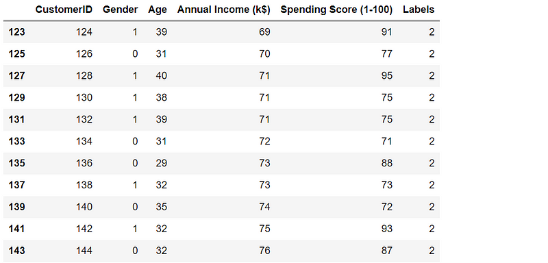
0(3) Filter a certain cluster through its label
df[df['Labels']==2]Part of the result screenshot goes as follows:
(4) Extract a customer’s information by his ID
df[df['CustomerID']==125].valuesIt renders as:
array([[125, 0, 23, 70, 29, 0]], dtype=int64)
6. Multi-Dimensional k-Means Clustering
In this example, we segment the customers using all the variables except for the ‘CustomerID’ column.
6.1 Select features
df = data_encode.copy()
X = df.drop(['CustomerID'],axis=1).values
X
Part of the result is like:

6.2 The Optimal Number of Clusters
If the data has more than three dimensions, it is difficult for us to use plotting method to find the optimal cluster number. Here, let’s use some methods introduced in Section 1.2.
(1) Elbow Curve Method
The elbow method is a heuristic method used to determine the optimal number of clusters in K-means clustering. The basic idea behind the elbow method is to plot the sum of squared distances between the data points and their assigned cluster centroids, as a function of the number of clusters, K.
The idea of the elbow method is to identify this “elbow point” on the plot, which corresponds to the optimal number of clusters. This point is usually determined by visually inspecting the plot and selecting the value of K where the rate of decrease in the sum of squared distances starts to level off. It is easily obtained from KMeans.inertia_ method in Scikit-learn.
inertias = []
for i in range(1, 10):
    kmeans = KMeans(n_clusters=i,init='k-means++', max_iter = 300, n_init='auto', random_state=0)
    kmeans.fit(X)
    inertias.append(kmeans.inertia_)

plt.plot(range(1, 10), inertias)
plt.xlabel('Number of clusters')
plt.ylabel('Inertia')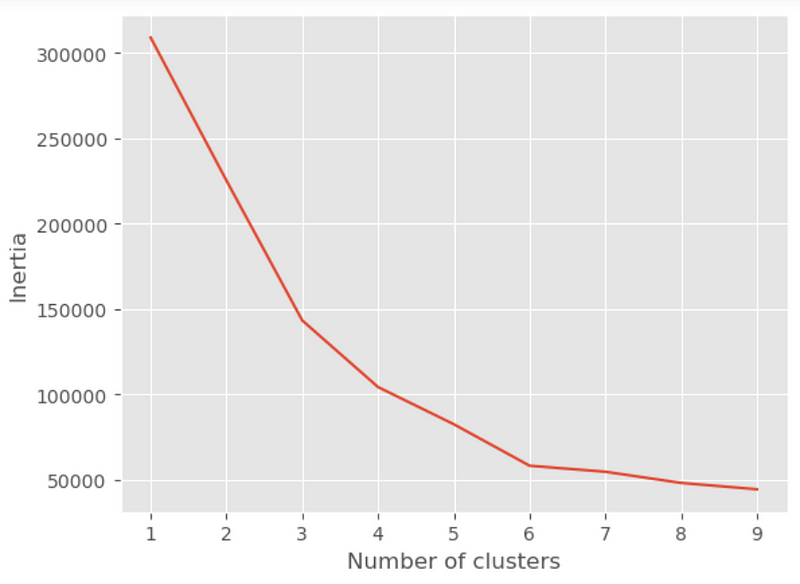
The resulting plot will have the number of clusters on the x-axis and the sum of squared distances on the y-axis. The “elbow point” corresponds to the value of K where the rate of decrease in the sum of squared distances starts to level off. In this example, the elbow point appears to be at K=6, suggesting that 6 clusters might be the optimal choice for this dataset. However, the optimal number of clusters ultimately depends on the specific dataset and problem at hand, so the elbow method should be used as a heuristic rather than a definitive solution.
(2) Silhouette Analysis
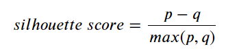
where:
- p: is the mean distance to the points in the nearest cluster that the data point is not a part of
- q: is the mean intra cluster distance to all the points in its own cluster.
The value of the silhouette score range lies between -1 to 1, where a higher value indicates better clustering results. A value of 0 indicates that the sample is on or very close to the decision boundary between two neighboring clusters.
from sklearn.metrics import silhoDuette_score

# Silhouette score analysis to find the ideal number of clusters for K-means clustering

score=[]

range_n_clusters = range(2, 10)

for num_clusters in range_n_clusters:

    # intialise kmeans
    kmeans = KMeans(n_clusters=num_clusters, init='k-means++', random_state=0, max_iter = 300, n_init='auto')
    kmeans.fit(X)

    cluster_labels = kmeans.labels_

    # silhouette score
    silhouette_avg = silhouette_score(X, cluster_labels)
    score.append(silhouette_avg)

    print("For n_clusters={0}, the silhouette score is {1}".format(num_clusters, silhouette_avg))
The results are as follows:
For n_clusters=2, the silhouette score is 0.32323687252392846
For n_clusters=3, the silhouette score is 0.383798873822341
For n_clusters=4, the silhouette score is 0.4052954330641215
For n_clusters=5, the silhouette score is 0.37688936241822546
For n_clusters=6, the silhouette score is 0.4506609653808789
For n_clusters=7, the silhouette score is 0.403956517241377
For n_clusters=8, the silhouette score is 0.37726715689435
For n_clusters=9, the silhouette score is 0.3787881296338692
We can also plot the silhouette score and easily observe its maximum value.
plt.plot(range_n_clusters,score,'r*-')
plt.xlabel('Number of clusters')
plt.ylabel('silhouette Scores')
The above result reveal that silhouette score reaches its maximum of 0.4506609653808789 when the cluster number is 6, and this result is identical with that by elbow method.
6.3 Implement KMean clustering
Based on the above result, we specify n_cluster=6 to class the customers into 6 clusters.
kmeans = KMeans(n_clusters=6, init='k-means++', random_state=0, max_iter = 300, n_init='auto')
kmeans.fit(X)
df['Cluster'] = kmeans.predict(X)
df.head()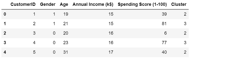
6.4 Display the results
Visualizing multidimensional clustering results can be challenging since we cannot directly visualize more than three dimensions in a 2D or 3D plot. However, there are some techniques that can help us to visualize the clusters and understand the relationships between the features. Here are some common approaches:
- Scatter matrix plot: A scatter plot matrix is a matrix of scatter plots that shows the relationships between all pairs of features in the dataset. This can help us to identify which features are most strongly related to each other and which features may be useful for distinguishing between clusters. We can use different colors or markers for different clusters.
- Parallel coordinates plot: A parallel coordinates plot is a plot that shows each data point as a line that connects the values of each feature. This can help us to visualize the relationships between multiple features at once and to identify patterns or trends across the features. We can use different colors or line styles for different clusters.
- Heatmap: A heatmap is a color-coded matrix that shows the values of each feature for each data point. This can help us to identify which features are most important for distinguishing between clusters and to identify patterns or trends in the data. We can use different colors or color scales for different clusters.
(1) Scatter matrix plot
We use pairplot() of seaborn library to create the scatter matrix plot. We exclude the 'CustomerID' columns.
results = df.drop(['CustomerID'], axis=1)

sns.pairplot(results, hue="Cluster",palette="rainbow")
The above plot allows us to visualize the relationships between all pairs of features in the dataset and how they relate to the clustering results.
(2) Parallel coordinates plot
Pandas provides an easy method to create parallel coordinate plots, which can be used to visualize multiple dimensional data.
plt.figure(figsize=(15,8))
pd.plotting.parallel_coordinates(results,'Cluster',alpha=0.90)

plt.xticks(rotation=45)
plt.show()
This plot can easily interpret the results in terms of variables or clusters. Just take two examples, from the results of the Age, we can see that the customers are comparatively older in the cluster 5 than the rest clusters. In terms of the clusters, cluster 0 has the lowest spending score.
(4) Heatmap
To create a heatmap to show the relations between each cluster and each variable, we need to shape the data using pandas melt as follows.
results_melt = pd.melt(results, id_vars=['Cluster'],
                  value_vars=['Gender', 'Age', 'Annual Income (k$)', 'Spending Score (1-100)'],
                  var_name='Variables',
                  value_name='Values')
results_melt.head()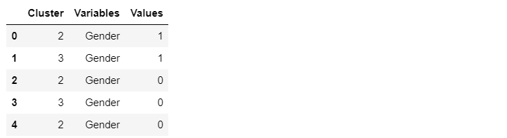
Then we pivot the results DataFrame, and then use seaborn to create the heatmap.
We can easily use heatmap method provided in seaborn data visualization library to create the heatmap.
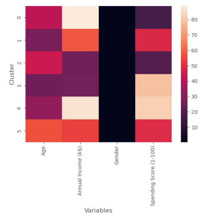
The above heatmap cannot display the gender well due to its smaller values, thus it is good to display the cell values with text using annot=True.
sns.heatmap(results_pivot,annot=True)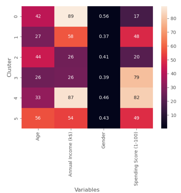
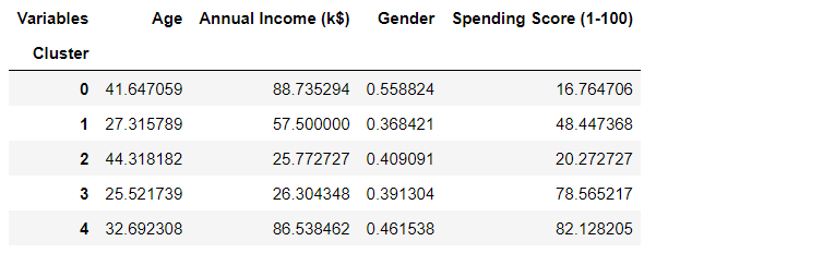
(5) Average result table and plot
The total numbers of males and females, and average values of the rest variable would be very helpful to give an insight on the cluster results.
col_names = ['Cluster', 'Average Age', 'Average Income','Average Spending Index', 'Number of Females',
'Number of Males']

mean_results = pd.DataFrame(columns=col_names)

for i, center in enumerate(kmeans.cluster_centers_):
    # Averages/mean of age, income and spending score
    mean_age = center[1]
    mean_income = center[2]
    mean_spend = center[3]

    # numbers of females and males
    clusters_df = df[df['Cluster'] == i]
    n_females = clusters_df[clusters_df['Gender'] == 0].shape[0]
    n_males = clusters_df[clusters_df['Gender'] == 1].shape[0]

    mean_results.loc[i] = ([i, mean_age, mean_income, mean_spend, n_females, n_males])

mean_results.head()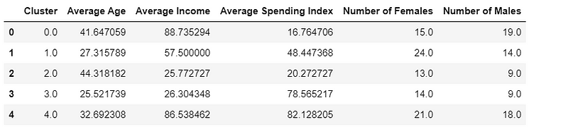
It is also helpful to create a parallel coordinate plot and visualize the above result table.
pd.plotting.parallel_coordinates(mean_results,'Cluster',sort_labels=True)
plt.xticks(rotation=45)
plt.show()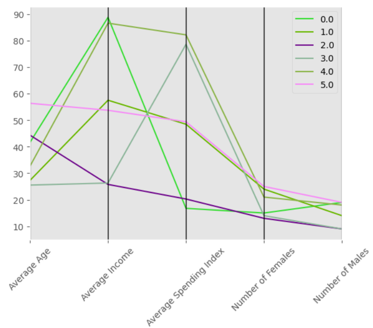
Summary
This article demonstrates how to implement K-means clustering using scikit-learn library and visualize the results using pandas, Matplotlib and seaborn. It covers the following main topics: (1) essential concepts on K-means clustering and its applications; two dimensional clustering example; (4) a multidimensional clustering example; and (5) how to display and visualize multidimensional clustering results.
A Jupyter notebook HTML version was published at https://blog.deepsim.xyz on March 25, 2023.


