
Jerry Jenkins Has the Perfect Website
Learn from it to optimize your own for lead generation
After utilizing many marketing workshops, guides, books, and consultants with limited success, I saw JerryJenkins.com today and everything clicked. There are so many sites and designers on the web that follow a typical web-design/technology paradigm. However, they don’t always maximize the human behavior and psychological factors that can deliver the best results.
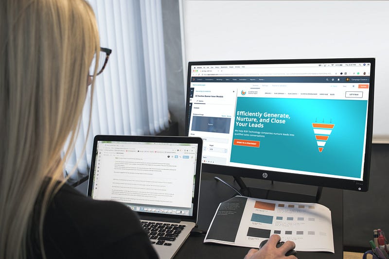
As a business owner, if I were hiring a marketing specialist right now, the interview would consist mostly of asking the candidate to tell me about the JerryJenkins website(last visited March 28, 2020).
I am not a customer or affiliate of Jerry Jenkins, nor have I read any of his books. I’m sure they are great. Stock photos are used here under license. Other copyrighted images, trademarks, and text belong to their owners and are included here for education and commentary under fair use.
1. Above the Fold
In the old days, newspapers would be folded and placed in metal boxes with a glass window. People could look through the window and see the part of the newspaper above the fold. If a passerby peeking in the window liked what they saw, they could put a quarter in the box and take one out.
In order to get people to put in those quarters, the front page had to be pleasing to look at, give people an idea of what was below the fold, and make them want to read further.
Let’s walk through Jerry Jenkins’ site above the fold as it looks today. It’s a clean design with a lot of white-space. Take a look at it and see what grabs your attention.
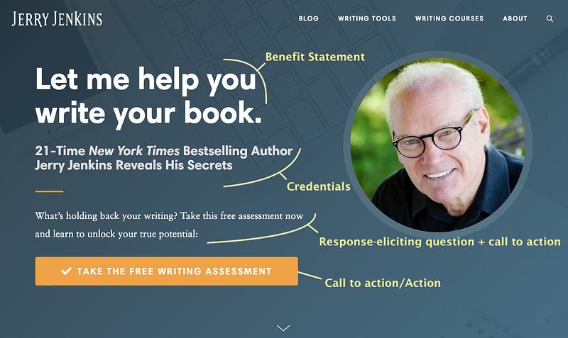
The first thing we see is a benefit statement, “let me help you write your book.” written in large, friendly letters. That does two things. The obvious one is that it immediately tells you what Jerry Jenkins and his site are all about.

Less obvious is that it encourages everyone who is not interested in writing a book to leave. Just like if I were to see a door with, “let me wax your armpits” on it, I would nope right outta there.
That’s important because you don’t want people visiting your site who only want to see pictures of your cats. Have another site for that. Your marketing websites have one job — to work for you to help convert leads.
Westerners tend to move their eyes left-to-right and top-to-bottom when scanning a page, so your eyes are next drawn to the biggish headshot. Is that the face of someone you want to help you write a book? Thank goodness someone advised him to shave off his beard.

Note: that doesn’t necessarily mean you should shave yours off.
If you find Mr. Jenkins’ face revolting and it completely turns you off, that doesn’t matter. For every visitor that his face turns away, it will sell to someone else. For many, it won’t make a difference at all. Don’t be afraid to turn some people off if it will turn others on.
From the headshot, our scanning flows to, “21-Time New York Times Bestselling Author Jerry Jenkins Reveals His Secrets.” Those credentials give Mr. Jenkins authority. So now, at a glance, we have an offer and two reasons to accept it: a friendly, smiling face and impressive credentials.
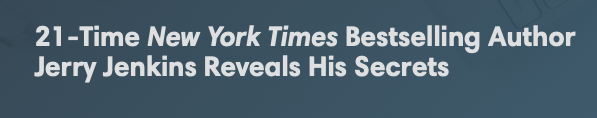
Your credentials might not be as impressive, but that doesn’t mean they won’t work. “Award-winning gardener,” “university grad,” and “retired pilot” could all be effective if they add authority to your offer and photo.
You can also borrow someone else’s authority by asking permission from a mentor or another author to use a comment they made about your work.
Next, we are primed for action. Notice we are not jumping straight to a sale. It says, “what’s holding back your writing?” not, “buy my super-duper writing course!” The page is getting you to think past the sale of something smaller and much safer: “take the free writing assessment.” This provides a gentle glide-path that pre-conditions you to consider taking a course later.
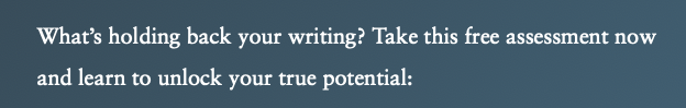
Think of it like feeding ducks. You throw some food so that it lands near the duck. Then you throw a little closer to you each time until you have it eating out of your hand.
Finally, we’re ready for the call to action. “Take the free writing assessment” is the first call to action on the page, and it is right there above the fold in the perfect spot to make visitors want to click it. No need to scroll further.

I haven’t clicked it yet, but I’m guessing that to see the results of the assessment you will have to provide an email address which will subscribe you to a drip campaign.
Too many websites, including mine, get the section above the fold wrong. They have big scrolling pictures or giant slogans that look nice but don’t accomplish anything. Worse, they can be a cluttered mess.
The second you open Jerry Jenkins’ site, there is a good chance you will do something useful for him (hopefully, for you too).
Now that you understand what the area above the fold is supposed to do, as an exercise take a look at some random sample designs and see which ones you think will work the best.
There is also a little arrow at the bottom of the section to tell the visitor there is more to see. I’m sure that was added because some people left not realizing that they could scroll down.
2. Drip Campaign
I was right! Not to be a spoil-sport, but to get your writing assessment results you do have to provide your email address. However, I was surprised and impressed by how the results are delivered. I won’t spoil that gem.
* SPAM WARNING * A drip campaign is not spam if you have the receivers’ permission to send emails, or you have established a relationship with the receivers. The relationship is established on JerryJenkins.com when the recipient takes the writing assessment or downloads a free resource (see below). Never add someone to your drip campaign out of the blue. That’s how you get banned.

Marketing is a system, not a task. That means you need policies and procedures that you or your marketing specialist regularly follow. You keep turning cranks to keep things flowing and expect results to happen. If you don’t get the results you want after a specific amount of time, then you make changes, but mostly it’s just cranking.
A drip campaign is part of that process by pre-conditioning potential customers to buy something. It also functions as a reminder system. A lot of people aren’t ready to make a purchase right now, but a little reminder a few months later when they are ready can generate sales that would otherwise have been lost.
Drip campaigns work by sending useful or interesting information in a newsletter format with a purchase link at the end. If you have a gardening book, your campaign might be seasonal reminders that potential readers would find helpful. You simply end every newsletter with “for more useful tips, buy my book here.”
If you are in the process of writing a novel, then you might send monthly progress reports or have character-naming contests. You could also ask for help choosing a cover on 99Designs. In that case, you won’t have a “buy now!” button, but you would have a list of email addresses to which you could send an announcement when the book is published.
Moreover, if you have an email list of people already interested in your book, that would be useful information to provide potential agents or publishers.
3. Free Resources
The next section on the site is “free resources.” One way to drive traffic to your site, and thus into your drip campaign, is by creating ad campaigns in search or social media. “Are you having trouble deciding whether to use a shovel or a spade? Download this free resource for the answers you seek.”
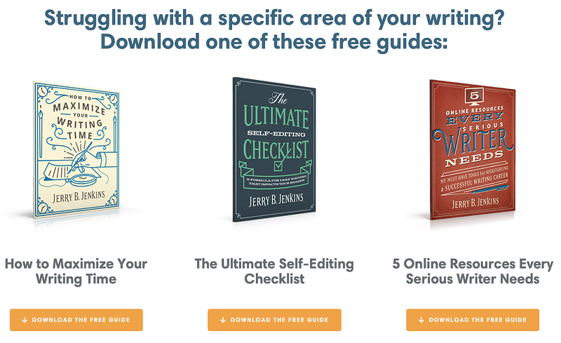
Yes, the free resources you write will be interesting and useful to some people. No one knows everything, so there are lots of people out there with questions to which you have answers. You might also consider writing short stories as a free resource.
Like the writing assessment, in order to download the free resource, you will have to provide your email address.
The important thing to remember is that you are selling something of value, a free resource or writing assessment, in exchange for an email address. Dripping without permission is spam and will get you banned.
4. About Jerry
If you are a 21-time bestselling New York Times author, you want to make sure that people know it so they buy your product or service.
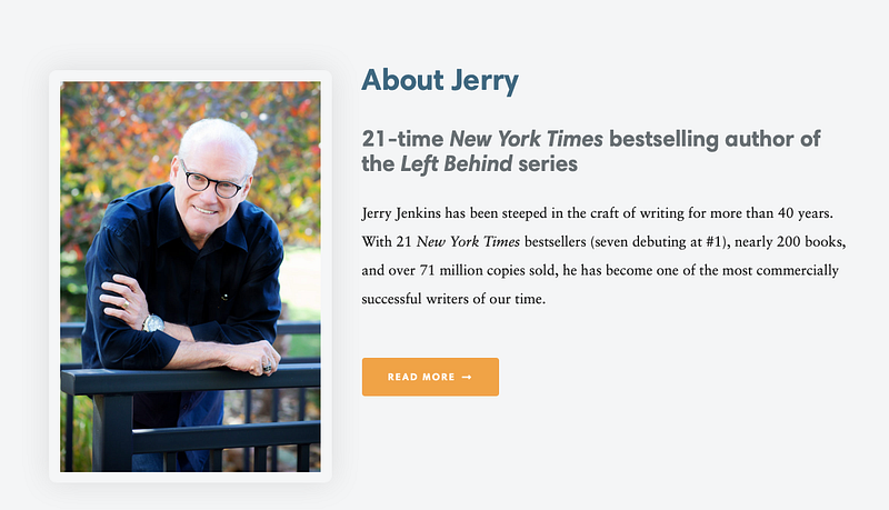
However, you may not have such amazing credentials. Instead, you should talk about people you have studied under, relay how much time and effort you spend researching, or focus on being relatable in your “about me” section.
Personally, when I looked at the page, I didn’t pay a lot of attention to the “About Jerry” section. I already knew he was a “21-time New York Times bestselling author” and wasn’t all that interested in more details.
Some people want to see it. Some don’t. Your mileage will vary.
5. First Testimonial
Testimonials give credibility to things you want to say about yourself. “I am a great guy and you should buy my stuff!” sounds quite a bit different to your brain than, “with Jerry Jenkins’ information, I landed four contract offers!” Others praising you is almost always better than self-praise.
Your visitors won’t notice, but their brains will.
My one complaint about this testimonial is that it is written with a passive voice. That takes some of the power out of it.
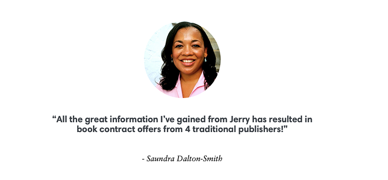
Many websites have scrolling or long lists of testimonials. Mr. Jenkins opted for only a couple. More may be better, but one or two will do. Remember, each of these things is an upgrade that will help you catch more visitors, not something that will destroy you if you don’t have it.
A teacher, mentor, or beta reader could be a good source of a testimonial if you haven’t published yet. Be creative with those upgrades.
6. Blog Posts
Blog posts are great for SEO, keeping people on your site, and giving you a reputation as an expert. Keeping up with a blog takes discipline though.
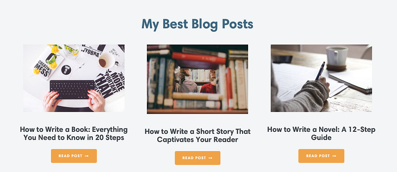
On this site, the blogs look interesting and instructional. Someone thinking about buying one of his courses would appreciate the ability to review them. Each one also has multiple calls to action to get visitors into the drip campaign.
7. Second Testimonial
The second testimonial is a lot like the first. I’m not sure it adds anything.
8. Social Media Links
I’m not an award-winning social media expert, but people click those to find out more about you and engage with you. I have looked at Mr. Jenkins’ Twitter feed. He doesn’t do a lot of engagement there, but perhaps he does on Facebook.

More engagement in social media can bring incremental traffic improvements. If you need it, make a habit of three to four social media engagements per day.
What Not to Do!
As instructive as JerryJenkins.com is, there are a few things that went wrong — or at least you should not do yourself.
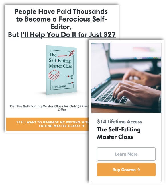
- If you do the work of taking the writing assessment you “win” a one-time offer to take buy “The Self-Editing Master Class” for $27 instead of the listed price of $14. That’s 92% more for folks who took the assessment. Be sure to regression test everything on your site that asks for payment. (I am sure it is a mistake and have notified the author of the issue via Twitter.)
- As of today, the “click below to learn more” buttons for some courses link to a login page instead of a page with more information. That sort of thing shouldn’t happen with an important link. Make sure you test every big orange button on your site.
- I’ve received a couple of drip campaign emails from the website. The first was a note of encouragement with no call to action. That was nice. The second had a call to action to like a drip campaign landing page on Facebook. That’s fine, but for heaven’s sake add a URL parameter and code the pages so you aren’t bombarding existing members with popups and irrelevant calls to action. Those get old very quickly.
- Having multiple calls to action to get people into your drip campaign is good. However, in the blog posts, I found them to be over-used to the point of being off-putting.
In our fighter game analogy, these sorts of issues can cause damage. You can lose a credibility gun if you offer two different prices for the same product. Moreover, people aren’t going to want to click your email links if you are hitting them with more of the same popups.
These are all issues that I found just trying out site features to write about. Your testing should be more exhaustive, but it shouldn’t take more than a couple of hours on a site with this level of complexity.
Finally, I like the idea of having a “like” call to action in the email. That’s great if your goal is to build up traffic and increase the size of the mailing list. At some point, though, you want people to buy something, so make sure you have a call to action for that somewhere.
Conclusion
How much your marketing team can or will tell you about JerryJenkins.com will tell you a lot about how ready it is to support you. I hit well over 1,000 words just explaining what the little “above the fold” section was doing.
If you are your own marketing team, this walk-through at least gives you an idea about what is involved in creating an effective web page beyond the web design terms you are used to hearing.
The bottom line is, expect the people selling you a marketing website to explain these types of things to you rather than dazzle you with numbers.


