
iOS Like Modal View Dialog Animation In Jetpack Compose
Implementing dialog animations in Android has never been easier

As a mobile developer, you often have the requirement to emulate the system behavior of another OS. Even if we don't implement a cross-platform app, designers sometimes don’t consider system-specific behavior and develop their designs according to one or the other system.
Sometimes you don’t come around to adapting to these requirements. An example is a requirement to implement a screen that uses the animation of an iOS modality view, which is a part of Apple’s human guidelines while functioning as a full-screen dialog.
While this can be easily done in iOS, at least from my experience, in Android it’s quite a hustle.
I will therefore share with you how I achieved this task by implementing a Jetpack Compose Dialog that will imitate the slide in animation while remaining the functionalities of the composable.
Update 07.03.2023
Thanks to viktor de pasquale for mentioning in the comments a way for overcoming the problem with the magic animation time number. I updated the article accordingly thanks to his suggestion.
- Removed now obsolete Box layout around
AnimatedBottomSheetTransition - Replaced arbitrary delay for overcoming the Dialog first compositions delay with a Mutex implementation
1. Why don’t you just use the ModalBottomSheet?
While the ModalBottomSheetLayout is a great component when it comes to showing additional content to the user without blocking the flow of your app, at least in Jetpack Compose it has some trade-offs if you try to accomplish a full-screen with it.
While it’s no problem to let it fit the whole screen, trying to block the user interaction like a drag to close which is part of the initial functionality of the component, is currently not possible.
At the time of writing, there seems to be a bug with the disabling of gestures at the BottomSheetScaffold when you have a scrollable container inside it, like this issue for example shows.
A second reason why the component was not an option to fulfill the requirements is that we had to call it from multiple places in the app while it had to lay on top of the whole content. Since the design also included a bottom bar, we had to render it also above that component.
That means that we’d need to use the BottomSheetScaffold and implement a complex architecture that allows us to replace the content of the bottom sheet at the top level of the composable hierarchy while allowing us to hide and close it from every point inside the app.
While this might be a use-case of the Event Bus pattern which I already talked about in one of my previous articles, my criticism about this principle comes into play again.
If you have only two screens that might work fine but imagine you have twenty or more different screens that can be possibly called from everywhere.
This will quickly lead to a huge mess which on the other hand will in the end lead to an unforeseeable maintenance effort and additional costs when you later want to expand your app.
2. Using a Dialog
The Dialog composable partially fits our requirements out of the box. It can be spread out to full-screen size and contain scrollable composables without interfering with blocking user gestures.
We can call it from anywhere inside our app and it will lay over the whole app content because it will be placed at the top of our composable hierarchy tree.
Additionally, it automatically provides us with the modal behavior of a dimmed background
The only thing that this component doesn’t offer is the required Modal View like bottom to top slide-in animation that is contained by default in the ModalBottomSheetLayout.
So let’s see how we can achieve that by using a Jetpack Compose Dialog.
2.1 The Animation
As the first step, we will define the bottom sheet animation.
As you can see we use AnimatedVisibility composable with slideInVertically set as the enter- and slideOutVertically as exit animation. Both of the animations use the full height of the screen as offset at the y-axis.
Using this approach the slide-in animation starts from the very bottom and ends at the top of the full-screen. The slide-out animation respectively starts at the top and goes back down to the very bottom of the screen.
Each of the animations happens in a time span of 500 milliseconds.
As I initially explained we will use a Dialog to implement our composable. Therefore as the next step, we will define a new composable ModalTransitionDialog that will contain a Dialog.
As you can see we declare the composable with three parameters. The first is a callback we will later use to dismiss the dialog, the second one can be used to determine if the dialog should allow closing via back press and the third one is the actual content that takes place inside the Dialog.
If you ask yourself what’s the ModalTransitionDialogHelper about, don’t worry, we will come to it in a second.
Because the dialog needs a few milliseconds to inflate, we need to delay the start of our animation. By binding the start of the animation to a boolean variable animateContentBackTrigger, and setting it to true after a short delay, we can bridge that time and afterward safely start our animation.
We do this by making use of the so-called Mutex. If you are familiar with the synchronized function, you might already get a clue what this could be about.
A Mutex can hold either the state Locked or Unlocked. If it’s locked, all coroutines will be suspended until it gets into the Unlocked state.
As you can see in the code snippet above because we wrap the animateContentBackTrigger.value = true in our Mutex with the locked state, the launched coroutine can’t proceed. In a later section, we will see when we unlock it again to resume the coroutine and update the animation trigger.
This is only relevant for the initial animation because the Dialog has not been laid out yet. In the exit animation, the layout has already been composed and therefore took all the required space to execute the exit animation.
This being said, you might already discovered the onCloseSharedFlow MutableSharedFlow variable. That Flow gets collected inside the LaunchedEffect and as soon as that happens invokes the startDismissWithExitAnimation with the animateContentBackTrigger and the onDismissRequest callback as parameters as you can see in the following code snippet:
The animation trigger value gets set back to false which triggers our previously defined exit animation. We then delay the coroutine exactly 500ms which corresponds to the time of the animation and then call the onDismissRequest() which on the other hand will cause the actual disposal of the Dialog, as we will later see in a usage example.
Using this approach, we can close the Dialog with our defined animation.
But how is the Dialog wired up with the animation and how is the content laid out you might ask. Take a look at the following snippet:
We declare the Dialog just like we’d normally do but set the onDismissRequest not to the callback directly but again connect it with the startDismissWithExitAnimation function.
If we now for example click the navigation back button, this callback would trigger and we’d also trigger the slide-out animation before the actual disposal.
The SideEffect is now responsible for unlocking the Mutex we declared in section 2.1. The invocation of the SideEffect occurs after a successful composition. We can therefore ensure that the composable is fully built up and ready to execute the enter animation.
As you might have already noticed, we use the animateContentBackTrigger as the visible parameter for our AnimatedModalBottomSheetTransition. Switching between true and false therefore triggers the previously defined slide-in and slide-out animation respectively.
The content is then passed to it with a new instance of a ModalTransitionDialogHelper that receives our defined coroutineScope and also the onCloseSharedFlow as parameters.
Now let’s finally reveal the secret of what this class is all about this helper class.
The class just provides one single function triggerAnimatedClose() that will emit a new value to the onCloseFlow which is then collected by the ModalTransitionDialog and therefore automatically emits the animated closing.
But how to use it in practice?
3. Usage example
Now that we had deep dive into the implementation of the ModalTransitionDialog, let’s take a look at an example of how we can use it in practice.
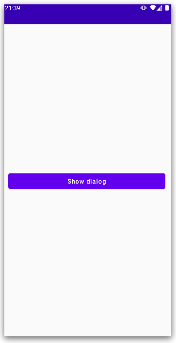
Take a look at the following example screen:
Let’s focus on the interesting part, the SampleModalTransitionDialog. As you can see, this composable as a whole is only visible if the showModalTransitionDialog variable is set to true.
Because inside the SampleModalTransitionDialog we declare our ModalTransitionDialog, the previously discussed process for starting the Dialog animation kicks in as soon as it gets shown.
Now you can see the modalTransitionDialogHelper variable is actually in the scope of that composable function and can be used to trigger the disposable animation via the previously presented triggerAnimatedClose() function.
The result of this example can be seen in the .gif below.
4. Summary
The overall ModalTransitionDialog composable can be found in the following code snippet:
5. Conclusion
In this article, we had a deep dive into how we can achieve an animated transition with a Dialog in Android’s Jetpack Compose.
The framework provides us with several great opportunities to facilitate the development of Android apps with modern design. But this is no more than the beginning. As you could already see from the article, animations have never been as easy to implement as they are today.
Using my presented approach it is very easy to build dialogs that can be interoperably be used and provide automated logic for triggering start and exit animations for your Jetpack Compose apps.
The only trade-off with this approach is that we still need to handle first the animation trigger and second the actual disposable of the dialog.
But in my opinion, this is bearable because of the easy-to-use helper class for triggering the whole close process, that gets passed into the content scope.
I hope you had some takeaways, clap if you liked my article, make sure to subscribe to get notified via e-mail, and follow for more!


