
Interactive Choropleth Maps in Python Using Altair, Plotly, and Folium
A Step by step guide to creating interactive map visuals in Python using opensource libraries - Altair, Plotly, and Folium
Are you looking for a simple Python library with which to create a choropleth map for your next web app or blog? Or maybe you’ve spent hours online looking for tutorials on how to get started? While there are a lot of popular libraries that can get you started with the simple implementation of static choropleth maps(such as Matplotlib, Seaborn, and so on), if interactivity is what you are looking for then this is the article for you! While there are libraries like d3.js which can build custom maps, there are few simpler tools that you can explore. This blog explores three easy-to-implement yet powerful opensource Python libraries!
Overwhelmed and lost in Documentation?
A few months back, I wanted to create an interactive map for an interesting web app that we were developing. I spent hours online looking for the perfect library to get started with but found it very difficult to run through the documentations as there was no proper step by step guide for implementation and customization of the visuals as required. I wished that I had a guide that compared the features and proper implementation along with the details about customization. This article is an attempt to create such a guide.
The following write-up compares and contrasts the implementation of an interactive choropleth map along with the details and possible customizations to get the final output as required, using three of the popular map libraries available for Python:
- Altair —Simple and fast implementation with a readily available set of features and pre-defined functionalities.
- Plotly — Variety of available implementations including Mapbox, Custom configurations, and styling.
- Folium — Leaflet implementation with complete customization and interactivity including tool-tips, pop-ups, and a lot more features.
Prerequisites
Choropleth maps require two kinds of data in the background, one is the geospatial data — geographical boundaries to populate the tiles (generally Shapefiles or Geo JSONs), and two data points against each tile in order to color code the map based on what that data represents.
The Geo Pandas library is useful for retrieving the data in the required format. This example uses a GeoJSON file of Indian states to populate the data on top of a map of India. You can get started with any publicly available shapefile/GeoJSON.
Altair Implementation
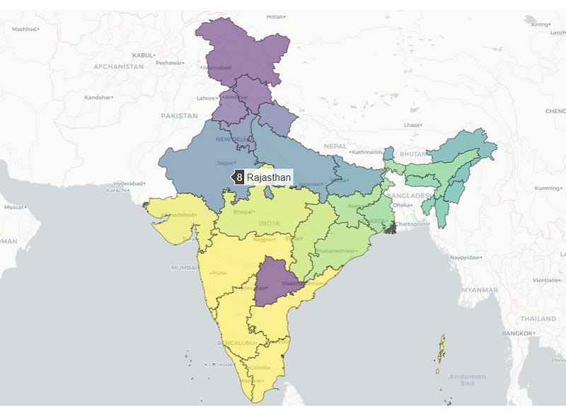
Altair is a visualization library for Python based on Vega. It contains a simple implementation of choropleth maps with minimal code and a good amount of interactivity (including selections, tool-tips, and more).
Another good thing about this library is that it’s compatible with fastpages. You can create simple blogs in minutes by converting a Jupyter notebook with a minimal amount of code. You can check out the GitHub readme for the implementation.
Code snippet:
# Importing required Libraries
import geopandas as gpd
import json
import altair as alt
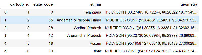
import pandas as pdReading the Shapefile as a GeoPandas frame:
gdf = gpd.read_file('states_india.shp')The data frame looks like this:
Creating a base layer and choropleth layers:
# Creating configs for color,selection,hoveringmulti = alt.selection_multi(fields=['count','state'], bind='legend')
color = alt.condition(multi,
alt.Color('count', type='ordinal',
scale=alt.Scale(scheme='yellowgreenblue')),
alt.value('lightgray'))hover = alt.selection(type='single', on='mouseover', nearest=True,
fields=['x', 'y'])#Creating an altair map layerchoro = alt.Chart(gdf).mark_geoshape(
stroke='black'
).encode(
color=color,
tooltip=['state','count']
).add_selection(
multi
).properties(
width=650,
height=800
)# Legendc1 = alt.layer(choro).configure_legend(
orient = 'bottom-right',
direction = 'horizontal',
padding = 10,
rowPadding = 15
)#Adding Labelslabels = alt.Chart(gdf).mark_text().encode(
longitude='x',
latitude='y',
text='count',
size=alt.value(8),
opacity=alt.value(0.6)
)c2 = alt.Chart(gdf).mark_geoshape(
stroke='black'
).encode(
color=color,
tooltip=['state','count']
).add_selection(
hover
).project(
scale=100,
)(c1+labels).configure_view(strokeWidth=0)The above code should render an interactive choropleth map with hover tooltip display functionality and highlight on select(Click).
Pros:
- Simple and fast to implement. Includes a pre-defined set of features for quick usage
- Compatibility with fastpages
Cons:
- Fewer customization options and limited interactivity
- No options to use external stylized tiles such as OSM, Mapbox, etc.
- Limited documentation to use all the features that the API offers.
Plotly Implementation
Plotly’s Python graphing library makes interactive, publication-quality maps with a lot of interactivity and configurable features.
The availability of custom base map configurations from Mapbox, OSM, and other styling options along with simple implementation using Plotly express and extensive documentation makes it one of the preferable options when it comes to creating interactive maps.
Code snippet:
# Importing required libraries

from plotly.graph_objs import Scatter, Figure, Layout
import plotly
import plotly.graph_objs as go
import json
import numpy as np
import geopandas as gpd
Importing the Shapefile:
gdf = gpd.read_file('states_india.shp')
with open('states_india_1.json') as response:
    india = json.load(response)
Creating a base figure and adding tiles:
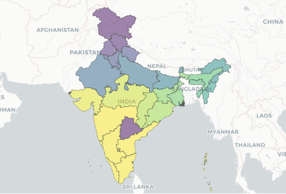
fig = go.Figure(go.Choroplethmapbox(geojson=india, locations=gdf['st_nm'], z=gdf['state_code'],featureidkey="properties.st_nm",colorscale="Viridis", zmin=0, zmax=25,marker_opacity=0.5, marker_line_width=1))fig.update_layout(mapbox_style="carto-positron",
mapbox_zoom=3.5,mapbox_center = {"lat":23.537876 , "lon": 78.292142} ) fig.update_layout(margin={"r":0,"t":0,"l":0,"b":0})fig.show()The above code should render an interactive choropleth map with hover tooltip display and zoom functionality. This Plotly implementation comes with a lot of other features that can be explored here.
Pros:
- Very simple implementation with Plotly express and graph libraries. Extensive documentation is available.
- A lot of customization and configurable styling options.
- Compatible with Dash and other options to embed the snippet on external web apps.
Cons:
- No option to add popups and other interactive elements other than pre-defined options.
- Might require token access to work with few external styles. Limited options to control the zoom limits and related interactivity.
Folium Implementation
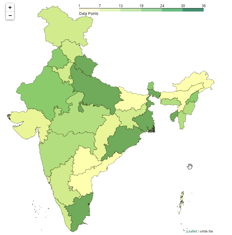
Folium combines the ease of use of the Python ecosystem and the mapping strengths of the leaflet.js library. It enables us to render highly customizable, responsive, and interactive choropleth maps as well as passing rich vector/raster/HTML visualizations as markers on the map.
The library has a number of built-in tilesets from OpenStreetMap, Mapbox, and Stamen, and supports custom tilesets with Mapbox or Cloudmade API keys. It supports both Image, Video, GeoJSON, and TopoJSON overlays.
Code snippet:
# Importing required Libraries
import geopandas as gpd
import pandas as pd
import folium
import branca
import requests
import json
from folium.features import GeoJson, GeoJsonTooltip, GeoJsonPopupImporting the Shapefile:
gdf = gpd.read_file('states_india.shp')
with open('states_india_1.json') as response:
    india = json.load(response)
#Creating a custom tile (optional)import branca# Create a white image of 4 pixels, and embed it in a url.
white_tile = branca.utilities.image_to_url([[1, 1], [1, 1]])Adding the base layers and choropleth layers:
#Base layerf = folium.Figure(width=680, height=750)
m = folium.Map([23.53, 78.3], maxZoom=6,minZoom=4.8,zoom_control=True,zoom_start=5,
scrollWheelZoom=True,maxBounds=[[40, 68],[6, 97]],tiles=white_tile,attr='white tile',
dragging=True).add_to(f)#Add layers for Popup and Tooltipspopup = GeoJsonPopup(
fields=['st_nm','cartodb_id'],
aliases=['State',"Data points"],
localize=True,
labels=True,
style="background-color: yellow;",
)tooltip = GeoJsonTooltip(
fields=['st_nm','cartodb_id'],
aliases=['State',"Data points"],
localize=True,
sticky=False,
labels=True,
style="""
background-color: #F0EFEF;
border: 1px solid black;
border-radius: 3px;
box-shadow: 3px;
""",
max_width=800,
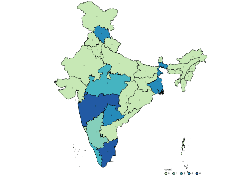
)# Add choropleth layerg = folium.Choropleth(
geo_data=india,
data=gdf,
columns=['st_nm', 'cartodb_id'],
key_on='properties.st_nm',
fill_color='YlGn',
fill_opacity=0.7,
line_opacity=0.4,
legend_name='Data Points',
highlight=True,
).add_to(m)folium.GeoJson(
india,
style_function=lambda feature: {
'fillColor': '#ffff00',
'color': 'black',
'weight': 0.2,
'dashArray': '5, 5'
},
tooltip=tooltip,
popup=popup).add_to(g)fThe above code should render an interactive choropleth map with hover tooltip display, click to zoom functionality, and custom popup display on click.
Pros:
- The number of customization and configurable styling options along with unique interactive features like custom popups, click to zoom, and custom tiling, and backgrounds.
- Option to pass vector/raster/HTML visualizations as markers on the map.
- Option to render the map as HTML and other options to embed the snippet on external web apps.
- Decent amount of documentation available to explore all the available features.
Cons:
- The slight learning curve to be able to leverage the features available. Also has some dependencies on few libraries that come with Folium.
Conclusion
When it comes to interactivity with maps, these three tools enable us to implement tailor-made maps in our websites without much hassle. This tutorial tries to provide a guide for implementing a simple choropleth map with required interactivity, taking a simple use-case. However, there are a lot of other features that can be explored by going through the documentation of the respective libraries. I hope that this blog provides you with a basic understanding of the implementations that are possible.
Please feel free to share your feedback so that this article can be updated and improved. You can reach out to me here for queries if you have any.
If you’re interested, check out this article for advanced visualizations using python & PowerBI:
About the Author
Srihari Pramod
Data Analytics & Decision Science professional working on AI products and architectural technologies .Hyderabad,India.
LinkedIn : https://www.linkedin.com/in/sriharipramod/


