
Interactive basketball data visualizations with Plotly
Analyze sports data with hexbin shot charts and bubble charts with Plotly and Plotly Express (source code & my own data for all 30 teams included in my GitLab repo)
This post is mostly about visualisation. It is only going to include very cursory basketball info — basically, if you know what it is, you’re going to be fine.
I have been tinkering with basketball data analysis & visualisation recently, using matplotlib for plotting. It is powerful, but Plotly is my usual visualisation package of choice.
In my opinion, Plotly achieves the right balance of power and customisability, written in sensible, intuitive syntax with great documentation and development rate.
So I recently migrated my basketball visualisation scripts to Plotly, with great results. In this article, I would like to share some of that, including examples using both Plotly and Plotly Express.
I included the code for this in my GitLab repo here (basketball_plots directory), so please feel free to download it and play with it / improve upon it.
Before we get started
Data
As this article is mainly about visualization, I will include my pre-processed data outputs in my repo for all 30 teams & league average.
Packages
I assume you’re familiar with python. Even if you’re relatively new, this tutorial shouldn’t be too tricky, though.
You’ll need plotly. Install it (in your virtual environment) with a simple pip install plotly.
Bubble charts in a blink — with Plotly Express
Professional basketball players in the NBA take shots from right at the rim, to past the three-point line, which is about 24 feet away from it. I wanted to understand how the distance affects accuracy of shots, and how often players shoot from each distance, and see if there is a pattern.
This is a relatively straightforward exercise, so let’s use Plotly Express. Plotly Express is a fairly new package, and is all about producing charts more quickly and efficiently, so you can focus on the data exploration. (You can read more about it here)
I have a database of all shot locations for an entire season (2018–2019 season) of shots, which is about 220,000 shots. The database includes locations of each shot, and whether it was successful (made) or not.
Using this data, I produced a summary (league_shots_by_dist.csv), which includes shots grouped by distance in 1-foot bins (up to 32 feet), and columns for shots_made, shots_counts, shots_acc and avg_dist.
So let’s explore this data — simply load the data with:
import pandas as pd
grouped_shots_df = pd.read_csv('srcdata/league_shots_by_dist.csv')
And then after importing the package, running just the two lines of code below will magically open an interactive scatter chart on your browser.
import plotly.express as px
fig = px.scatter(grouped_shots_df, x="avg_dist", y="shots_accuracy")
fig.show()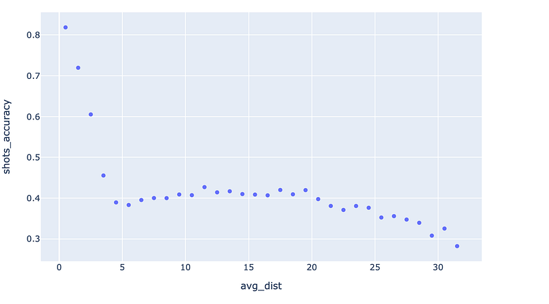
To see how often players shoot from each distance, let’s add the frequency data: simply pass shots_counts value to the ‘size' parameter, and specify a maximum bubble size.
fig = px.scatter(grouped_shots_df, x="avg_dist", y="shots_accuracy", size="shots_counts", size_max=25)
fig.show()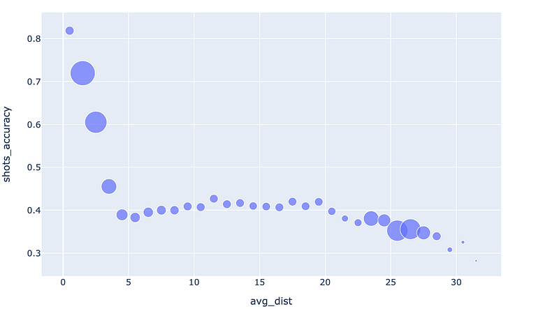
That’s intersting. The frequency (bubble size) decreases, and then picks back up again. Why is that? Well, we know that as we get farther, some of these are two point shots, some are three pointers, and some are a mix of the two. So let’s try colouring the variables by the shot type.
fig = px.scatter(grouped_shots_df, x="avg_dist", y="shots_accuracy", size="shots_counts", color='shot_type', size_max=25)
fig.show()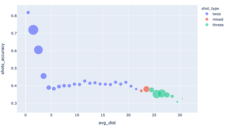
Ah, there it is. It looks like the shot frequency increases as players try to take advantage of the three point line.
Edit: here’s a live demo
Try moving your mouse over each point — you will be pleasantly rewarded with a text tooltip! You didn’t even have to set anything up.
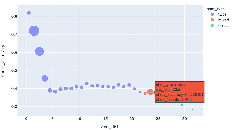
Moving your cursor and looking at the individual points, the data tells us that shot accuracy doesn’t change greatly past 5 to 10 feet from the basket. By shooting threes, the players are trading off about a 15% decrease in shot accuracy for a 50% more reward of a three pointer. It makes sense that three pointers are more popular than these ‘mid-range’ two pointers.
That’s not exactly a groundbreaking conclusion, but it’s still neat to be able to see it for ourselves.
But more importantly, wasn’t that insanely simple? We created the last chart with just two lines of code!
As long as you have a ‘tidy’ dateframe that has been pre-processed, Plotly Express allows fast visualisations like this, which you can work from. It’s a fantastic tool for data exploration.
Hexbin plots, with Plotly
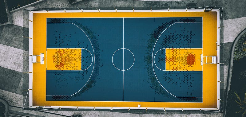
Let’s move onto another chart, called hexbin charts. I’ve discussed it elsewhere, but hexbin charts allow area-based visualisation of data, by dividing an entire area into hexagon-sized grids and displaying data by their colour (and also sometimes size) like so.
While Plotly does not natively provide functions to compile hexbin data from coordinate-based data points, it does not matter for us because a) matplotlib does (read about the ed by matplotlib here
Okay, so let’s move straight onto visualisation of the hexbin data:
Our first shot chart
I have saved the data in a dictionary format. Simply load the data with:
import pickle
with open('srcdata/league_hexbin_stats.pickle', 'rb') as f:
    league_hexbin_stats = pickle.load(f)
The dictionary contains these keys (see for yourself with print(league_hexbin_stats.keys()):
['xlocs', 'ylocs', 'shots_by_hex', 'freq_by_hex', 'accs_by_hex', 'shot_ev_by_hex', 'gridsize', 'n_shots']The important ones are: x & y location data xlocs, ylocs, frequency data freq_by_hex and accuracy data accs_by_hex. Each of these include data from each hexagon, except for accuracy data, which I have averaged into “zones” to smooth out local variations. You’ll know what I mean when you see the plots.
Note: The X/Y data are as captured originally, according to the standard coordinate system. I base everything else from it. Basically, the centre of the rim is at (0, 0) and 1 in X & Y coordinates appears to be 1/10th of a foot.
Let’s plot those. This time we will use plotly.graph_objects, for the extra flexibility it gives us. It leads to writing slightly longer code, but don’t worry — it’s still not very long, and it will be totally worth it.
Let’s go through this. The first few lines are obvious — I am just giving a few values new names, so that I can reuse the plotting code more easily. go.Figure() creates and returns a new figure, which we assign to fig.
Then we add a new scatter plot, with markers mode (i.e. no lines), and we specify parameters for those markers, including passing arrays/lists to be our sizes and colours.
The sizeref parameter gives a reference size to scale the rest of the sizes — I basically just play with this to get the right size, and sizemode refers to how the sizing works — whether the size should vary by area, or diameter.
The convention is that ‘area’ should be used, as changing the diameter according to the variable would change the area by the square of that value, and would exaggerate the differences.
We also specify the marker symbol as a hexagon (it is a hexbin plot, after all), and add a line on the outside of the hexagon for visual impact.
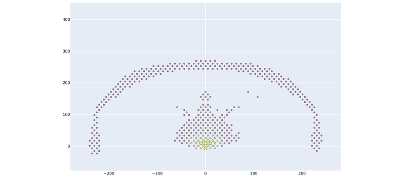
Looks… almost like a shot chart (or a message from our alien overlords), although obviously problematic. Where is the court, and why is the ratio funny? It’s impossible to know what the colours mean. The mouseover tooltips just show me the X-Y coordinates, which is not very helpful.
Let’s get to fixing those:
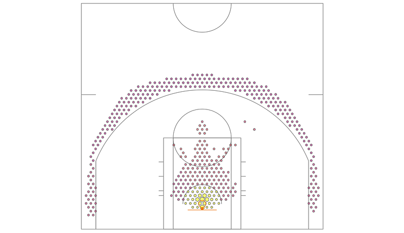
Draw me a picture
Luckily, Plotly provides a set of handy commands to draw whatever you want. By using the method fig.update_figure, and passing a list to the shapes parameter, it’s pretty easy to draw whatever you would like.
I based the court dimensions on this handy wikipedia figure, and the court was created with a mix of rectangles, circles and lines. I won’t go through the mundane details, but here are a couple of things you might find interesting:
- One thing that I had trouble figuring out was drawing SVG arcs, but this post on the plotly forum helped me out. It turns out plotly.js does not natively support arcs!
- Plotly allows me to fix the x & y ratio — I have disabled zoom here, but if it wasn’t, you can fix the y-axis to the x-axis using:
yaxis=dict(scaleanchor=”x”, scaleratio=1).
Running the same command as above, but simply inserting draw_plotly_court(fig) between fig = go.Figure(), and fig.add_trace(..., we get:
Putting a finger on the scale
Although much improved, we can’t make much of the data. The colour scale , and the size scale are both not great.
To remedy these, we’ll:
- ‘Clip’ the frequency values — by manually limiting values to my
max_freqvalue, with a list comprehension. - Introduce a different colour scale. I wanted to use a ‘sequential’ scale, as this shows changing positive values. This page shows all of the standard palettes that comes with Plotly. I chose ‘
YlOrRd’.

- Specify a max/min value for the colours, and
- Add a legend on the plot. I chose to specify just the top/bottom tick values, and add the characters
+and-to indicate that they are clipped.
Running the below code, you should be able to generate this chart.
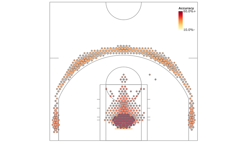
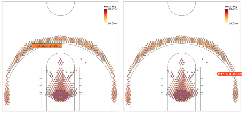
Tooltips
If you move your mouse over the chart, you’ll tooltips even in areas where the frequency value in my hexbin data is zero (see bottom right image). Also, the tooltip data isn’t currently very useful — it’s just X&Y coordinates. What can we do?
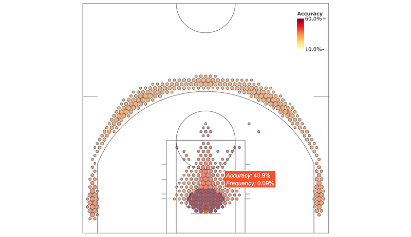
First of all, let’s just not have values at all where the frequencies are zero.
I wrote a simple function filt_hexbins to filter the hexbin data, so that if the frequency data is zero, it just deletes those values from all arrays of the same length.
And for the tooltip, we simply pass a text list to the parameter text. Also change the hoverinfo parameter value to text, and you’re good to go! The text string can include basic HTML like <i>, <b> or <br> tags, so try them out also.
Putting it together, we get this code, and this chart, with the improved, informative, tooltip. This means that you can move your mouse over any value (or scatter plot) and get any number of different information back out! Nifty.
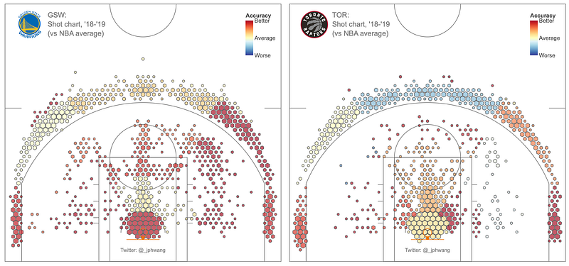
Comparing datasets + adding bitmaps to the figure
For completeness, let’s look at one last example where we will compare data of a team against the league average data. This example will also allow us to look at diverging colour scales as well, which are very handy.
We’ll also add a bitmap of a team logo to the figure to complete the look.
Load the data, just as we have done previously, but this time loading the file for the Hoston Rockets.
teamname = 'HOU'
with open('srcdata/hou_hexbin_stats.pickle', 'rb') as f:
    team_hexbin_stats = pickle.load(f)
For this plot, we’re going to keep the original team data for everything except the shot accuracy. We will convert the shot accuracy data to be relative, meaning we’ll compare it against the league average.
To do this, we use:
from copy import deepcopy
rel_hexbin_stats = deepcopy(team_hexbin_stats)
base_hexbin_stats = deepcopy(league_hexbin_stats)
rel_hexbin_stats['accs_by_hex'] = rel_hexbin_stats['accs_by_hex'] - base_hexbin_stats['accs_by_hex']
You might be wondering why I’m using deepcopy. The reason is that due to the way python works, if I had simply copied team_hexbin_stats to rel_hexbin_stats, any modifications to the values in rel_hexbin_stats would have also applied to the original dictionary also (read more here).
I could have just modified team_hexbin_stats, since we will not be using it again in this tutorial, but it’s just bad practice and can lead to confusion.
Using the modified rel_hexbin_stats, we can go on with rest of the processing — you know the drill by now. The only changes are to the colourmap, to a diverging map of RdYlBu_r (reversed as I want red to be ‘good), and change the scale to be from -10% to 10% as we show relative percentages.

Lastly, let’s add the team logo. Basketball-reference has a handy, standardised URI structure for the team logos, so I simply refer to those with the ‘teamname’ variable. And then, it’s a simple matter of adding the images you desire with the .add_layout_image method, specifying its size, placement and layer order.
The entire code for this version looks like this:
And look at these shot charts — glorious! I can’t embed an interactive version here, but I’m pretty happy with how they turned out.
(Edit: here’s a live demo (for TOR) — also for GSW, HOU, SAS and NYK)
As you can see, it’s really quite straightforward to plot spatial data using Plotly. What’s more, between Plotly Express and Plotly, you have a range of options that are sure to meet your requirements, whether they be quick & dirty data exploration, or in-depth, customised visualisations for your client.
Try it out for yourself, I’ve plotted the Finals’ teams, but you can have a look at your own teams in the repo. I include data for all the teams in it. I think you’ll be impressed by how easy Plotly makes visualisation, while being incredibly powerful and flexible.
That’s all from me — I hope you found it useful, and hit me up if you have any questions or comments!
I’m not sure what the best way to structure python files for a tutorial like this is, but I’ve just written everything in one file, so you can just comment / uncomment as you’d like and follow along.
If you liked this, say 👋 / follow on twitter, or follow for updates. I also wrote last week about producing interactive maps with Plotly.


