Insights from reviewing my readers’ one hundred and thirty-eight UX portfolios
Insights, takeaways and a resource of why some portfolios are objectively better than others.
Last month, I asked my readers to submit their portfolio for a screening done by me. I’ve gotten a whooping amount of portfolios, so it took a lot more time than expected.
Out of the 138 portfolios submitted, 125 was screened. If you’re part of the 13 that I didn’t review, it’s because you’re a UX writer, UX engineer or a UX consultancy business. I do not have the expertise to review portfolios for writers and engineers, and reviewing UX businesses is something I would not do for free (sorry).
If you’re a designer but I didn’t review your work, it’s because you didn’t follow my submission guidelines, so I couldn’t open your files. This is critical if you’re job hunting, so you better fix that.
The general statistics
Out of one hundred and twenty-five portfolios, I’ve said yes to fifty-six. That’s a 44.8% passing rate, and it is way higher than the usual ~10% when I do screening for actual job positions.
So we have a great sample of what works and what doesn’t. This article will dive into the common issues I see, how to fix those, and a special feature of amazing portfolios I am very impressed by.
It is important to note that I have some portfolios from people who aren’t actually junior. So this is a great reference for mid to senior level professionals as well.
Disclaimer: In any hiring role, resumes will be screened first before portfolios, and usually a maximum of 30 portfolios a week will be added into the candidate screening pipeline. This initiative is not simulating real portfolio screening processes in hiring practices, it is merely borrowing the same principles so I can conduct this experiment efficiently and give you the insights to why certain portfolios are better than others.
The first common pitfalls of portfolios I said ‘No’ to: Only UI work was shown
There are many talented UI designers that submitted their portfolios to me, and I genuinely like their work. However, I am screening for overall UX capabilities, so if I don’t see the artefacts like personas, userflows, research or anything that reflects that you are competent in that area, I’ll give your portfolio an ‘L’.
An oxymoron to the first common pitfall: Works with bad UI
Some portfolios have a decent amount of very well-done research, good interaction design on their wireframes but ultimately the final UI was severely lacking.
This is aimed at people who are not from a design background: you need to work double on your UI skills if you want to be hired. Don’t sabotage your chances because visual design is something that is easily fixable.
If you can’t create nice UI quick enough, use existing design systems in the Figma community to jazz up your work.
Next common pitfall: Shallow UX work
As mentioned in my article about portfolios, cookie-cutter projects showing the same process of design sprints are not enticing to me. Everyone is using the same process of “understand, define, ideate, prototype and conclusion”.
So again, what makes you so special that I’ll hire you to do those?
What hiring managers want to see is critical thinking and relevant application of the skills you have learned. In real life work scenarios, you don’t get to go through all 5 steps of the process all the time. So if you had to pick only 2 or 3 of those processes for a project, which one would you go for and why?
Annoying pet peeve #1: Slow scrolling animations
I like to spend no more than 2 minutes on a portfolio screening, and when I come across a website portfolio that has scrolling animations that fade the content in slowly, that slows me down and makes me spend more time on that portfolio.
It’s really irritating for me. Unless your work is good enough to be worth the wait or you’re trying to make an experiential portfolio, which is usually not the case, don’t do this.
A lot of the portfolios have this interaction unintentionally because they follow certain templates from the website creators they use. So please check your templates. Make sure it’s readable and accessible by removing the scroll animations.
I usually would say no to such web portfolios by default because it shows me a lack of understanding of interaction design and an oversight to accessibility. Don’t sabotage yourself like this.
Annoying pet peeve #2: Bad navigation
I generally hate portfolios that I have to go back and forth to navigate. When a hiring manager or recruiter is screening dozens of portfolios, we want to be enabled to do it fast.
A lot of portfolios require clicking and discovery of content, which is fine (but I have to say, this interaction is not ideal). The biggest pitfall comes when I’m within a content space and have no way to navigate to a next project quickly.
When I’m looking for a next project, it means I’m looking for more reasons to pass your portfolio. I want to give you a chance. So when I am blocked from doing that easily, with dozens of other portfolios to screen, I will drop off, and your chance is gone.
So please make sure your portfolios are easy to navigate. I have solutions for this, but I don’t really want to spoon-feed you answers. So happy figuring it out by yourselves!
The principles to good portfolios
I love to bitch about problems I find, but my main objective of writing and being a voice here is to educate. So there’s no better way to balance out learning after noting common mistakes with the best practices model UX-ers have done.
Without further ado, let’s dive into it.
Clear platform focus or expertise
The portfolios I’ve greenlit have clearly shown the platforms the designer is comfortable working in. Web-apps, desktop applications and mobile apps are the most common platforms on designers’ portfolios today. However, I’ve also seen some portfolios focusing on AR/VR and alternative mediums.
Which platform to focus on depends on the industry and company that you want to work in, so do your research about the products that your targeted industry builds, and make sure that your portfolio reflects the platforms your potential hiring manager wants to look at.
Interesting projects and case studies
After more than 100 portfolios at one go, the ones that truly stand out are the ones with projects that tackle interesting problems.
We’ve heard these sentiments from some hiring managers on LinkedIn: “We don’t need another food delivery app to save the world.”. And they are right, we don’t.
Case studies like that were given to you during your UX program because they are exercises for UX students to learn the trade, but they are not usually part of an exceptional portfolio because the problems are too simple and barely proves the performance of the designer outside the classroom.
Try to tackle problems that aren’t part of your program’s curriculum. In design school, we were urged to redesign the UX of our favourite brands, or to seek out side projects where we can apply our skillsets real-time.
Another smart way to get interesting problem statements is to create one from scratch. You can use Designercize for randomly generated goodies or your own brain if you want to test your creativity.
Overall portfolio reflects craftsmanship
Crasftmanship is defined as “the quality of design and work shown in something made”. In your portfolio, this means that both your work and your presentation should be of a decent quality.
It is very vague what decent means, because standards differ from one hiring manager to another, and there are no actual hard guidelines to determine whether a portfolio is good or bad because it is ultimately a visual representation of your work.
The strategy I follow is to take a look at the portfolios I am impressed by and use them as my benchmark and reference. Take note of what is alluring about others’ portfolio and try to figure out if that quality is something you’ll want in your own portfolio.
In my article about designing better portfolios, I mentioned Bestfolios as a reference point for web-based portfolios, but it is not enough to just look at references and make changes from a visual point of view.
The step-by-step to good portfolios
Break down the work and dive deep into the intention, style and attitude of the designer. When done well, you’ll realise for many outstanding portfolios, the personality of the designer will really shine through and is what ultimately sells their expertise.
1. Choose a focus
As mentioned in one of the above traits of good portfolios, having a focus shows expertise and intention in your work, and overall will look a lot more professional.
When you are given two menus from two different restaurants, which one sounds better to you? A restaurant that has a menu of over 100+ items, or the one that has 30+ items?
Having a focus or a niche tells me that you are confident, know what you are doing, and have a direction in your design career. Even if you don’t, that’s not the point. The point is how it looks to the hiring manager, and focused portfolios always look better.
2. Simplify your projects
There is no literal need for you to explain every excruciating detail about your project because chances are, a hiring manager is not going to read it. If I read every single detail in all of your portfolios, this article wouldn’t be out even after Christmas.
Summarise your projects like you’re summarising the bio section in your resume. Keep it short, keep it enticing, and most of all, keep it simple.
My portfolio has almost no details about my process and how I design, and I got interviews all the same. Simplicity is the key.
3. Tell me about your process, not your efforts
A wall of text justifying the effort someone puts in their projects is one of the most off-putting things I could come across.
“I spent 100 hours validating this problem statement, worked overtime, worked against the stakeholders and ultimately delivered a solution I can be proud of because I advocate for the user and spent weekends on this.”
Please don’t do this. I felt a need to write this step out because I’ve come across this many times during the screening.
We know transitioning into UX design is a difficult journey for many, but telling us how much effort you put in for your work simply isn’t sexy, and can come off as egotistical.
The summary of your work should focus on the work, not your efforts. Write about the feature you designed, about the personas, or about the context in which you were designing in. Those are details we want to know, and we honestly don’t care about the hours you’ve put into the project.
4. Have a voice
People write in many different ways. Those who have been following my Medium for a while would know I love writing in a direct, sassy, and provocative manner. It sets the tone and basically lets people rain judgement about the person you may be.
Having a tone of voice in your work will help bring out your personality before you even meet your hiring manager. We get excited when someone expresses themselves well. If you don’t know which writing style to go for, start reading more and notice how different writers form their sentences and make a point.
Write in a way that makes it interesting for a hiring manager to read. It’s not a must-have, but it is certainly a nice bonus!
5. Make it presentable (the last step always!)
Making your portfolio presentable should always be the last thing you do. Just like how UI is usually the final step in a basic UX process, you could consider presentation at the start, but you don’t act on it until you’re at the end.
Once you have all the content down for your portfolio, explore different ways to present it. All the visual references from your favourite portfolios will come in pretty handy right about now.
✨ Portfolio Spotlight ✨
Here you will find the portfolios I absolutely love and personally learned a lot from. I am still analysing all 56 greenlit portfolios down to every single detail, so this list might grow in the coming days.
Akhila Kosaraju
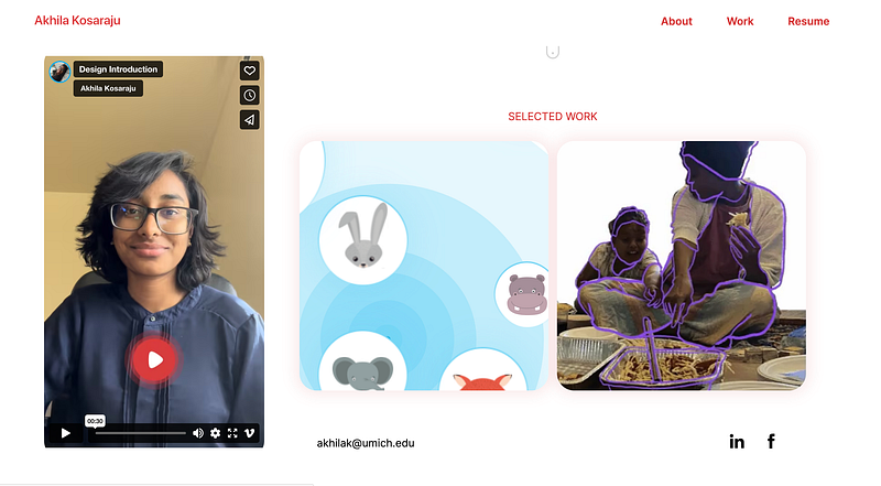
What I like: Akhila’s portfolio is outstanding because of how intentional she is with her work. Before I dived into her projects or her about page, I could immediately guess that sustainability and impact are very important principles in her work.
She documents her projects like a dream. While I don’t need all the details she listed in her work for screening, her meticulousness shows that she really cares about the things she designs.
Her initiatives are also strategically chosen and framed. One project focuses on application design, highlighting her competency in visual design and the mobile platform. The other highlights her research skills and competency in drawing insights in research. This prevented her from duplicating her work on the portfolio, and saves me time when I’m screening. Please learn from her.
Anuj Gupta
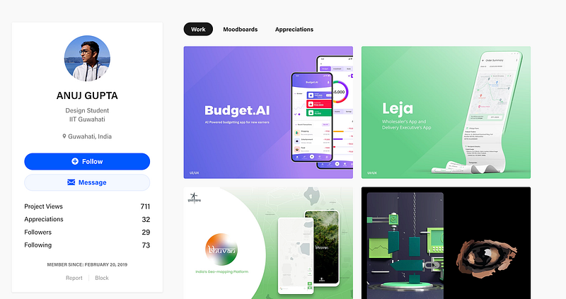
What I like: The first impression I got from Anuj’s Behance profile was that he knows what he is doing. My guess is that he has a platform-focus on mobile applications, and enjoys designing complex mobile solutions.
It is a really interesting career placement because I can see him fitting in really well in finance or logistics industries. His work reflects very well-thought out userflows, competent research capabilities and very good UI skills. The perfect trifecta that every hiring manager wants to see in a typical candidate.
Mujtaba Nadeem
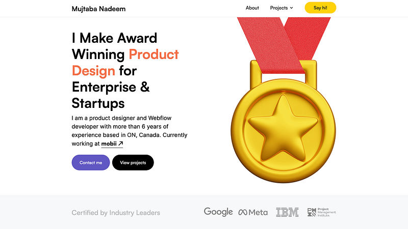
What I like: Mujtaba’s portfolio screams experience and personality. I don’t know who Mujtaba is, but I want to him to be my mentor.
His website is extremely intentional and breaks down his credentials and processes before diving into his projects. This is a common pattern for more senior portfolios, so seniors out there, take notes!
The overall information architecture of the site is extremely well-thought out, and the micro-interactions make this site good fun to navigate. His work is also exceptional, and you can see why he is an award-winning designer with only more potential to grow.
Olga Choi
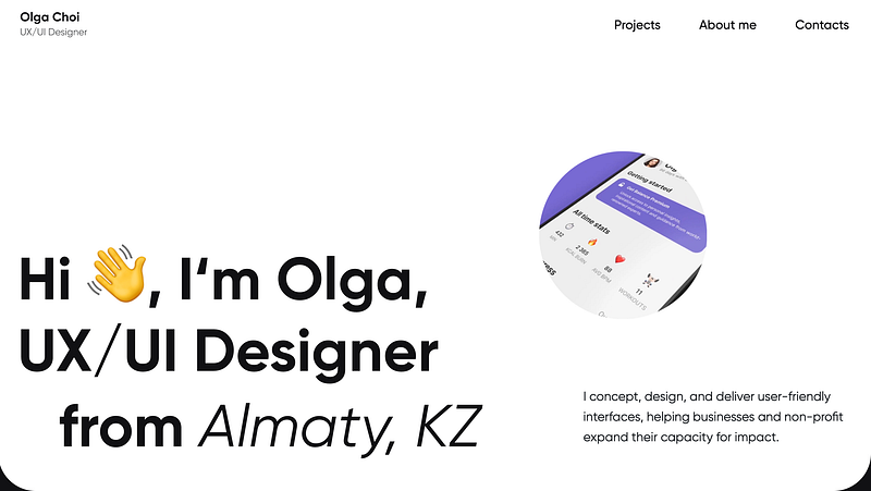
What I like: Olga’s work is very holistic and covers a wide range of industries. Her generalist focus can be clearly seen and my impression of her is that she is a very adaptable designer.
While the format of her projects look similar, upon closer inspection, you will realise that she chooses the UX methods she applies to her projects intentionally. Olga is very consistent, and that gives me confidence that she is an independent and high-potential hire that you can groom into leadership and management.
Honorable mention 💪
Shivangi Pande
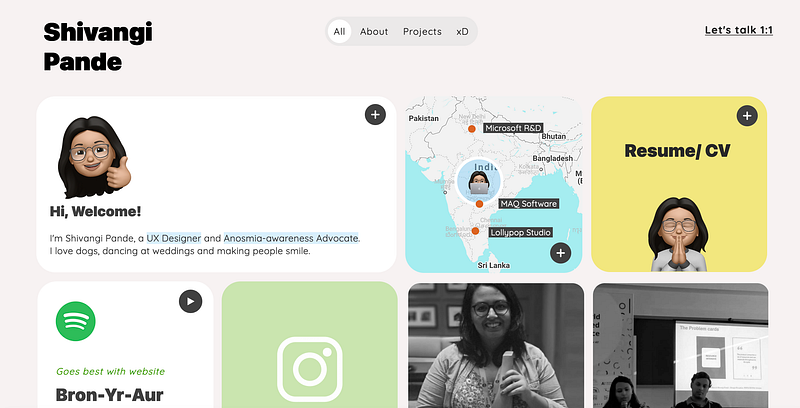
What I like: While this didn’t go to the portfolio spotlight because I found the navigation a bit confusing, Shivangi’s portfolio is an interesting mix between work, play and whimsy.
I relate a lot to her story (and to Mujtaba’s) about being born to an engineer parent and her humorous take on life and where it would lead you.
What’s next?
The world of portfolios is more than making a good website. The portfolios I feature is by no means the answer key to how you should create yours; they are merely the best ones I’ve gotten from one hundred and thirty-eight submissions that I have been very fortunate to review.
As you can see form the five (so far) that I’ve highlighted, they are all uniquely different to each designer and ultimately a reflection of their personalities and current focus in their design career.
For those that did not pass my screening, don’t be discouraged. Creating a good portfolio to call yours is a discovery process that requires time to reflect and experiment.
Ultimately, a portfolio’s utility is to make a good impression on the hiring manager so that you get an interview. Creating good impressions can come in various different mediums and strategies, there is no single successful way to do this.
So don’t fixate yourself on following what others do. Instead, ask yourself what you want to show off and how you would like to approach this problem.
The realistic aftermath of passing the screening
After you’ve submitted your application(resume, portfolio and all that jazz), and successfully passed screening, you will be invited for a series of interviews.
One of those interviews might be a portfolio review. So yes, even if you put a lot of effort documenting your work, you will be asked to present it verbally anyway.
My general advice for portfolio creation is to just ‘hackathon’ the process. Give yourself maybe a maximum of a week to create something, and see what you’ll end up with.
If you can’t come up with anything ‘complete’ within a week, it means you need to reduce the amount of content, and minimise your focus on certain areas of your projects. Keep simplifying until you get something that you’re proud to show-off, reflects your personality, and is quick and easy for hiring managers to screen.
Thank you for letting me review your portfolios! I hope the initiative has given you more insight about the portfolio topic and I can’t wait to see re-designs for 2023.
Till then, have a good rest of 2022, and let me know what other design career topics you’ll like me to cover.