
Information architecture for UX Designers
A guide to basic documentation and better design
I’ve seen a number of projects fail to go live, fail to get stakeholder sign off, or just fail to make any sense to users because the design team have sprinted off straight into Screen Design Mode, without any thought to the overall architecture of their product or experience.
This is not to say that you have to spend months on IA before you start making things, but having a basic idea of how the thing will work, how the content will hang together, and where everything fits is essential. Even if it’s just a sitemap on a piece of paper.
Define IA for me?
Information architecture is everything you do to research, understand and document:
- How the content of your product hangs together
- How the user will navigate around it
Do we need an actual Information Architect on our project?
Have you ever worked with an Information Architect on a project? If so, lucky you — they are awesome. You tend to encounter them on large-scale websites and especially government projects, where there is a problem big enough to need a number of specialists.
But you don’t have to wait for a project to come along where you get to hire a specialist. As a UX Designer there are lots of different IA documents you can create as part of your work that can help keep your project on track, even if you are not an absolute IA specialist.
When do we need to think about IA?
IA needs to be documented after you understand the problem space and before you start designing screens.
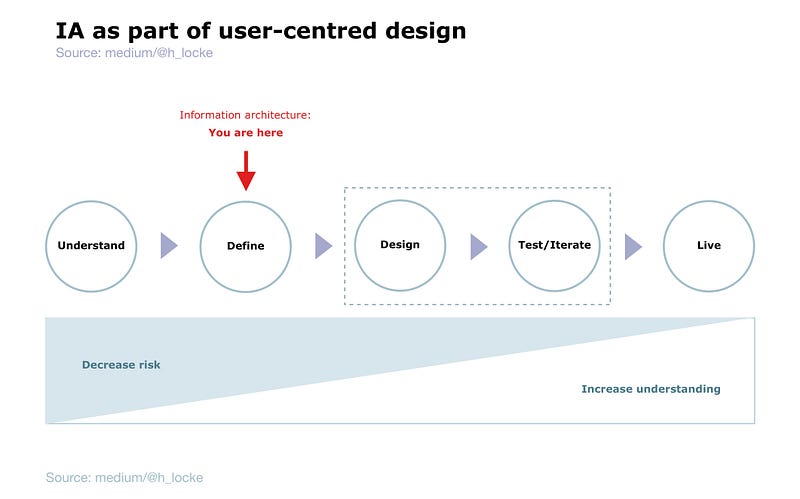
I have also used it during the “Understand” phase as stimulus to help gather requirements, but the final version of any IA documentation should be agreed and signed off BEFORE any screens start being produced. Read on to find out why.
So we’re doing a sitemap, right?
I work with people who often refer to “doing the IA” when what they mean is creating a sitemap. But there’s a lot more to information architecture than sitemaps. And the kind of thinking and documentation that this craft brings is critical to successful outcomes in product and platform design.
Here are some relatively simple examples you can learn to make for yourself. I make these every day, and I am definitely not a full time Information Architect.
Sitemap
What is it?
This is the first thing people often think of with IA. A sitemap is literally a map of the content on your site. It usually shows the main navigation or groups of content, and the content that sits (nested) beneath each group.
Normally, if I’m mapping at a specific page level, I would number each screen to be able to correlate the sitemap to the screen designs, through the design process.
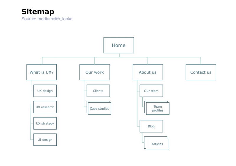
What is it for?
It shows the size and scale of the product’s content, and the logic of where things will live so that the user can find them. In order for this to be successful, it needs to reflect a balance of business needs (what clients, stakeholders and money men think is important) and user needs (what users think is important, and where they expect to go to find it).
Despite being called “site” map, I would use this for an app, web app, website etc. The principles remain the same.
Task flow
What is it?
A task flow literally shows the steps involved in completing a task. It is usually very simple and very functional. It does not normally contain complex branches or user decision points.
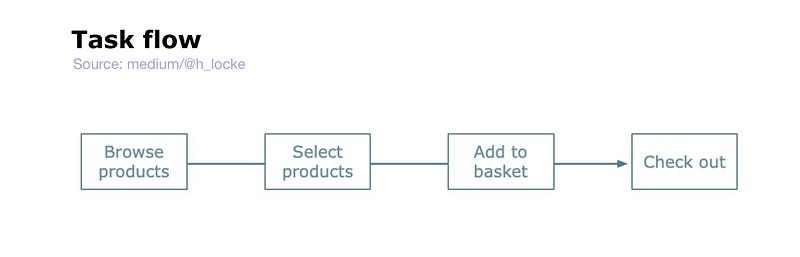
What is it for?
Helps to aligns clients and technical partners on What This Thing Actually Has To Do.
User flow
What is it?
Similar to a task flow in visual appearance, however it tends to represent a full journey including decision points, user actions etc. Sometimes one would create different user flows for different user groups (personas), whereas a task flow would always be universal and non-user group-specific.
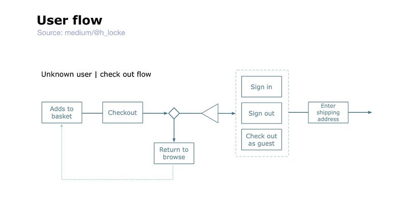
What is it for?
Mapping the steps, screens and key interactions which will be needed to carry the user through the task.
Wire flow
What is it?
Similar to a user flow, but usually with some kind of wireframe-esque graphic included. Often the wireframes are icon-level design or mostly representative of the type of screen, rather than fully thought through wireframes or UI.
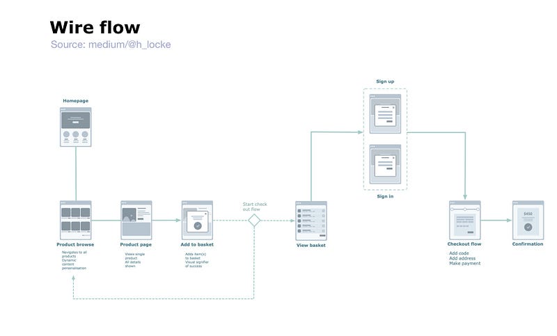
[Flow chart examples from Greg Lubacz on Sketch App Resources, reworked into Omnigraffle by author]
What is it for?
Used to get buy-in on the main happy path and screen purpose before full UX design or UI design gets under way. If you find yourself mapping wireflows of full, detailed wireframes or UI designs then either your client really likes documentation, or you might want to just make a prototype instead.
Content structure / hierarchy
What is it?
These take many forms, but usually it is some kind of graphic which shows the overall hierarchy of high-level content types, their purpose and how the users will encounter them within the experience. This example is super-simple:
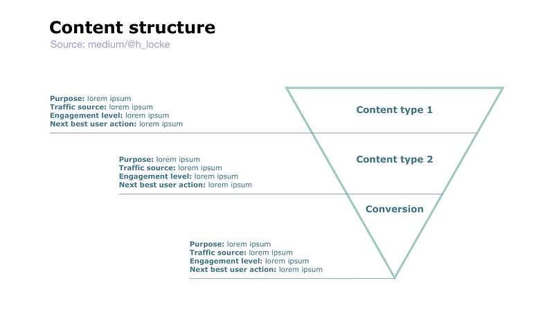
What is it for?
I have used these a lot in multichannel experiences, where the user may land on one or more experiences from different sources, with different mental models. For example, a Google search for a specific article lands on a different type of content (with a different mental model) than a user browsing across a homepage. And your product needs to show how it’s going to cater for all of those users… before you start designing screens.
Mental model
What is it?
A mental model describes how the user perceives the problem space you are designing for; what is the task, and how would they expect to approach, conduct and achieve it.
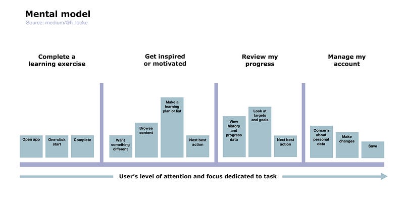
What is it good for ?
Assuming it’s based on research (of course it is), it helps to communicate to the team how the user perceives the task — rather than the client, the dev team, the interface or the designers. It builds empathy, keeps the focus on user needs and it keeps you honest.
Interaction model
What is it?
Here we start moving slightly away from pure content labelling, to thinking more about how something might work — those user transitions between content areas.
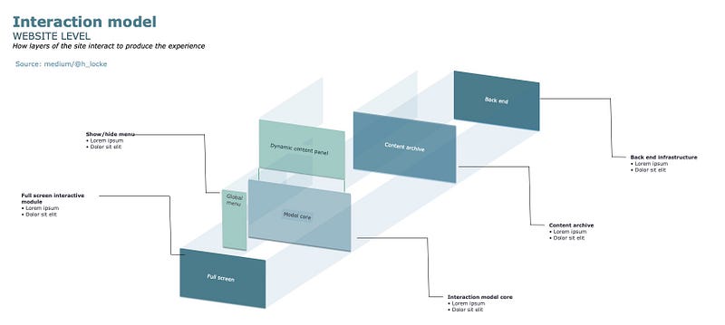
What is it for?
Communicating to dev teams what your intent is for the interactive experience, even when you’ve not yet created all the wireframes or prototypes. Useful on sites that are very reliant on shiny front end interactions. It can raise really important conversations and potential problems early on around the behaviour of dynamic content, overlays, transitions etc.
And more…
Those are just a few I use all the time. Obviously there are a lot more and it’s easy to drown in The Internet of Infinite Content. There are more resources at the end of this article, if you really want to blow your mind.
Ultimately, it really doesn’t matter what you are producing, or whether you ‘call it the right thing’ — so long as it successfully communicates your intent to team members who need to understand your solution.
Note: If you don’t have enough knowledge or information to inform the design of these deliverables, I propose you go back to requirements gathering or use any number of research methodologies which are designed specifically to inform information architecture work, for example using card sorting or tree testing to inform sitemaps. But that’s a post for another day.
What tools do you need to create these?
Don’t get me started on whether there’s a nice easy app where you press a button and it does all the work for you.
No.
You have two options:
- Grab a tool like Omnigraffle, Lucidchart or Axure. Learn some information design skills. (note: don’t try and use Sketch. If you want to know why not.. try it).
- Use a pen. Design and communication tool #1.
What happens if you skip this step?
Firstly, you can knock out a site map or some user flows in half a day, so stop being lazy.
Secondly, and because I’ve worked with people who absolutely refuse outright to produce any IA work (no, I don’t understand it either), here’s what I’ve seen actually happen on projects:
- The designers cannot follow the scrawled pencil scamps and cannot produce appropriate UI screens. They cannot understand what the purpose of each page is
- The devs don’t understand what you’re asking them to build
- No one on the team knows how big this thing is, so they just keep adding screens until they run out of time/money/will to live
- No one is mapping screen designs back to sitemaps, so arbitrary changes are made at a single screen level without thinking through the wider context — this can completely destroy a user journey
- The prototype that was created cannot be user tested because it cannot even be used or understood by the researcher, to design the study
- The prototype is just one long happy path of “and then… and then…” which again, is useless for testing and unrealistic for real-world use as a product
- Content does not sit in any logical location, leading to user confusion, duplication of content, broken journeys and general mayhem
- The client has no mental model of what you are designing or how it will work until they see the actual prototype or final designs — which is too late
- The client will ask questions about the journeys, and point out all of the errors in your thinking, when you’ve already designed the thing — which is too late
- The client will not understand how you have met their brief if they do not understand the key journeys. Surprisingly, they may not actually have the time to learn all your bolted together happy paths
- The project never ends.. because you are working to No Plan Whatsoever.
Welcome to UX design hell.
Can this really be fixed by a bit of documentation?
Yes.
Even if you create the most basic user flow, you get to align the rest of your team on what you are making and whether it will deliver the desired outcomes for users and business stakeholders.
Even if you create the most basic interaction model your devs will have some clue about what you want this thing to do.
Even if you create the most basic sitemap or content structure, you will generate so many helpful discussions around whether something is right or not, and even better… find out that something is just too complicated for your UX design team and you need to get in a proper Information Architect!
Surely it’s more complicated than this?
Well, yes of course it is. That’s why it’s a job in and of itself. If you want to know what it really involves, below are some outstanding resources for getting into the field.
Welcome to the world of Geek.
If you found this useful, consider subscribing for free to get email alerts when I post new articles, or you can join Medium for full access to my article archive, plus everything else on Medium.
References and resources:
- The framework— Eight Principles of Information Architecture by Dan Brown
- The polar bear book that everyone needs — Information Architecture: For the Web and Beyond by Louis Rosenfeld, Peter Morville, Jorge Arango
- The IA person you should have heard of — How to Make Sense of Any Mess: Information Architecture for Everybody by Abby Covert
- The book on multi-channel IA — Pervasive Information Architecture: Designing Cross-Channel User Experiences by Andrea Resmini and Luca Rosati
- How to understand what all the boxes and arrows mean — A visual vocabulary for describing information architecture and interaction design by the IA-OG Jesse James Garrett
- Finally an answer to that question — Task flow vs user flow by erika harano
- What NN have to say on research methods: Tree Testing to Evaluate Information Architecture Categories // Card Sorting: How to Best Organize Product Offerings
- The LinkedIn learning class — IA for UX foundations by Chris Nodder
If you found this useful, consider subscribing for free to get email alerts when I post new articles, or you can join Medium for full access to my article archive, plus everything else on Medium.


