
Quick Success Data Science
If the World Ends, What’s the Likelihood You Witnessed It?
Interpolating data gaps with SciPy

When Russia invaded Ukraine in 2022, I had an odd thought. If the world were to end today, what’s the probability that — of all the people who have ever lived — I would be here to see it?
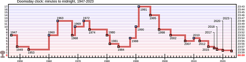
It’s not a strange question, given that WW III may already be in motion. And I’m not alone in my concerns. The “Doomsday Clock” was set to 90 seconds to midnight in 2023. That’s the closest it’s ever been.
Remarkably, this is a question within our reach. In this Quick Success Data Science project, we’ll use Python to calculate the probability of being alive now by estimating the total number of individuals who have ever lived. As part of the process, we’ll use the SciPy library’s valuable interpolate module, which helps address a common data science problem: gaps within datasets.
The Process
To calculate the probability of being alive right now, we need the following inputs:
- The year humanity “started.”
- The size of the population at various periods.
- The average birth rate over those same periods.
- The current population
If we know the human population for every year, we can multiply it by the average birth rate to determine the number of people born that year. We can then keep a running total of how many people have ever been born. To calculate the probability of being alive now, we can divide the current population by this total.
Fortunately for us, a lot of smart people have spent a lot of time studying these four factors, and we can leverage their work to find the solution.
The Year Humanity Started
While “humans” ostensibly go back 300,000 years or more, we’ll focus on anatomically modern humans, who date back between 190,000 and 195,000 years. To compromise, we’ll use a starting date of 192,000 years before the present.
Population Size Through Time
Estimating the size of the human population in prehistoric times is both an art and a science. Robust population data exist only for the last 300 years or so. Fortunately, so few people lived in the distant past, compared to today, that errors in these estimates have diminished impact on the results.
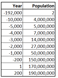
For the starting point of -192,000 years, we’ll assume a population of 2 individuals (you can change this to 10,000+ and it won’t make any material difference). We’ll then jump ahead to 12,000 years ago and begin using estimates compiled by the Gapminder Foundation, that can be found on Wikipedia.
We’ll end in 2022, the year I posed my question, though going through 2023 won’t make any real difference (we’re not having that many babies, anymore.
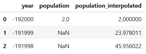
I’ve copied these numbers into a CSV file and stored them in a Gist for later use. The first 10 rows of this file are shown below:
Let’s load this dataset and look at it. You’ll need to install NumPy, pandas, Matplotlib, seaborn, and SciPy. You can find installation instructions in the hyperlinks.
import numpy as np
import matplotlib.pyplot as plt
import pandas as pd
import seaborn as sns
from scipy.interpolate import make_interp_spline
# Set the seaborn plotting style:
sns.set_style("darkgrid")
# Load the CSV file as a pandas DataFrame:
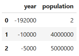
df = pd.read_csv('https://bit.ly/3TTjcSQ')
df.head(3)Here’s the output, showing the first three lines of the DataFrame:
Now let’s plot it using seaborn:
# Plot the DataFrame:
ax = sns.lineplot(data=df,
                  x='year',
                  y='population',
                  color='firebrick',
                  label='Original Data',
                  linestyle='',
                  marker='o')

plt.title('Estimated Human Population Through Time')
plt.legend()
plt.show()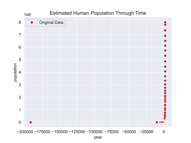
This graph tells us at least two things. First, the human population didn’t become significant until a few thousand years ago. Secondly, there are big gaps between the estimates. We’ll need to address those gaps going forward.
NOTE: Alternative population estimates are available on the source Wikipedia page and elsewhere on the World Wide Web. Feel free to substitute another set of estimates and compare the results.
Birth Rates Through Time
Birth rates, expressed as the number of live births per thousand people, have been high throughout most of human history, ranging from around 35/1000 in 1950 to 80/1000 before the start of the Common Era. Such high birth rates were needed to offset short life expectancy. In contrast, birth rates in the more civilized 21st century are on the order of 17/1000.
The Population Reference Bureau (PRB) publishes human birth rates over time. We’ll use their estimates, but there’s a problem. People have children every year, but our dataset, as shown in the previous figure, has large time gaps.
We’ll need to fill these gaps so that we have a population estimate for every year from 2022 to -192,000. We’ll do this using Python’s SciPy library which supplies algorithms for scientific computing.
NOTE: The pandas library comes with a built-in interpolation method, but I chose to use the SciPy module as it is more versatile and offers a more comprehensive set of tools. Further, the pandas method relies on multiple SciPy methods, including one (
scipy.interpolate.interp1d) that is deprecated.
The Current Population
For the current global population, we’ll use the 2022 United Nations estimate of 8 billion people (essentially the same as the 2023 estimate of 8.045 billion).
SciPy Interpolate Module
The scipy.interpolate module provides various interpolation techniques for smoothing or estimating values between a set of data points, such as our population estimates. It includes functions for both univariate and multivariate interpolation.
For our univariate problem, we can use the interpolate module’s make_interp_spine() method, which creates a B-spline interpolation object. B-spline (Basis spline) interpolation is a type of piecewise-defined polynomial interpolation that uses “flexible bands” to create smooth curves.
The make_interp_spine() method has a k parameter that represents the B-spline degree. The degree determines the order of the B-spline basis functions. The default, k=3, returns cubic splines. We’ll be fine with linear interpolation, so we’ll use k=1. Here’s the code:
# Generate the full sequence of years (skipping 0):
all_years = np.arange(-192000, 2023)
all_years_no_zero = all_years[all_years != 0]

# Create NumPy array of interpolated population values:
spline = make_interp_spline(df['year'],
                            df['population'],
                            k=1)  # k=1 for linear interpolation
interp_values = spline(all_years_no_zero)

# Make a new DataFrame of all the years and interpolated population:
df_interp = pd.DataFrame({'year': all_years_no_zero,
                          'population_interpolated': interp_values})

# Merge the interpolated DataFrame with the original DataFrame:
df = pd.merge(df, df_interp, on='year', how='right')

df.head(3)
Now we have a population estimate for every year:
Let’s plot this and compare it to the initial data points as a quality control measure.
# Plot the DataFrame:
ax = sns.lineplot(data=df,
                  x='year',
                  y='population',
                  color='firebrick',
                  label='Original Data',
                  marker='o')

ax = sns.lineplot(data=df,
                  x='year',
                  y='population_interpolated',
                  color='navy',
                  label='Interpolated Data')

plt.title('Estimated Human Population Through Time')
plt.legend()
plt.show()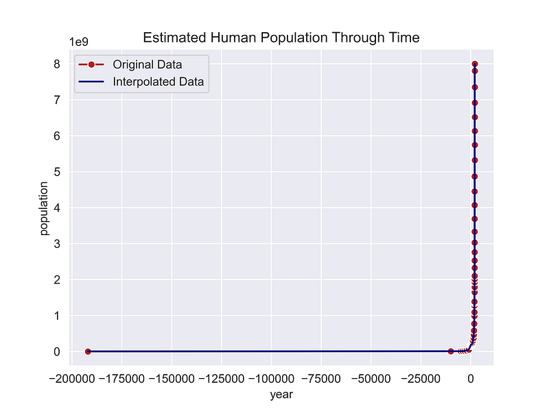
This looks good but it’s hard to see the details. Let’s zoom in on the last 1,000 years so we can better image the “heel” of the curve.
# Look at recent times to check interpolation:
recent = df[df['year'] >= 1000].copy()

# Plot the DataFrame:
ax = sns.lineplot(data=recent,
                  x='year',
                  y='population',
                  color='firebrick',
                  label='Original Data',
                  marker='o')

ax = sns.lineplot(data=recent,
                  x='year',
                  y='population_interpolated',
                  color='navy',
                  label='Interpolated Data')

plt.title('Estimated Human Population from 1000 to 2022')
plt.legend()
plt.show()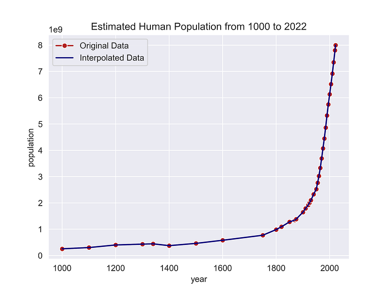
That looks great! Now we’re ready to calculate the number of people ever born.
Calculating the Number of People Ever Born
Now we’ll use historical birth rates to calculate the number of people born each year. We’ll use the NumPy select() method to create a new DataFrame column by matching a set of conditions to values.
The conditions variable will be a list of conditionals that bracket years in the DataFrame. For each of these conditions, we’ll use a corresponding list of birth rates (per person), which we’ll assign to the values variable.
After that, we just need to multiply the interpolated population for each year by the birth rate and use another column to keep a running total.
# Use historical birth rates to calculate the annual number born:
# Create a list of conditions for applying birth rates:
conditions = [(df['year'] < 1200),
(df['year'] >= 1200) & (df['year'] < 1750),
(df['year'] >= 1750) & (df['year'] < 1850),
(df['year'] >= 1850) & (df['year'] < 1950),
(df['year'] >= 1950) & (df['year'] < 2000),
(df['year'] >= 2000) & (df['year'] < 2010),
(df['year'] >= 2010) & (df['year'] < 2022),
(df['year'] >= 2022)]
# List the birth rates to assign for each condition:
values = [0.08, 0.06, 0.05, 0.04, 0.035, 0.022, 0.02, 0.017]
# Create a new column and use NumPy to apply the conditions:
df['birth_rate'] = np.select(conditions, values)
# Create a new column for the number of people born each year:
df['number_born'] = df['population_interpolated'] * df['birth_rate']
# Create a new column for summation of the 'number_born' column:
df['total_born'] = df['number_born'].cumsum()
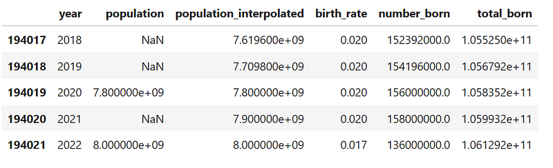
df.tail()Here’s the tail of the final DataFrame:
For fun, let’s plot the total number of humans ever born through time:
# Plot the estimated total number of humans born:
ax = sns.lineplot(data=df,
                  x='year',
                  y='total_born',
                  color='firebrick')

plt.title('Total Number of Humans Born')
plt.show()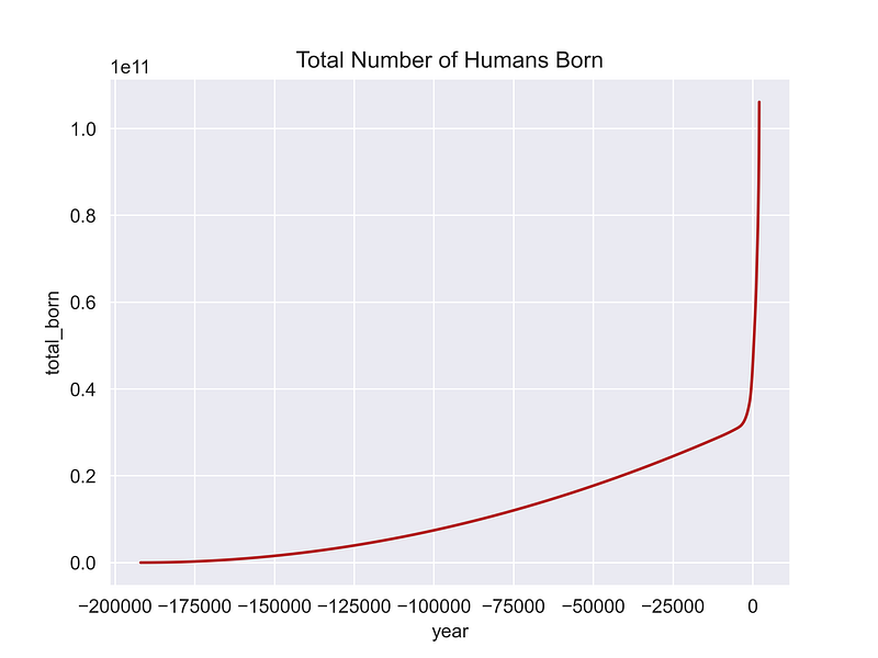
Because this is a cumulative sum, it quickly outpaces the population counts. Even so, in the brutish early days, the high birth rate of 80 live births per 1,000 people barely kept our species going!
What are the Chances???
So, what’s the probability that, if the world ends today, you were there to see it? It’s just the number of people alive today divided by all the people who ever lived.
This information is found in the last row of the DataFrame. You can access it using the index location (iloc) method, where -1 references the last row (i.e., the first row moving backward).
# Print the total number of humans ever born:
total_born_sum = df['total_born'].iloc[-1]
print(f"Total Number of Humans Ever Born: {total_born_sum:,.0f}")

# Calculate the probability of being alive now:
probability_result = df['population_interpolated'].iloc[-1] / total_born_sum
print(f"Probability of being alive now: {probability_result:,.3f}")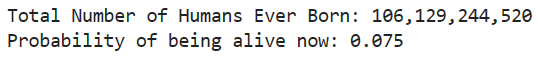
All of us alive today represent 7.5% of the total number of people who have ever lived. That’s 1 in 13, not at all a trivial number. It’s a function of the population explosion in the 20th century, and this skewing of the population distribution toward recent times lets us generate a “reasonable” estimate, given all the uncertainties involved.

The precision for our “total born” estimate is probably in the billions, yielding an estimate of 106 billion. This is close to the Population Reference Bureau’s estimate of 117 billion, using a similar dataset.
Summary
If the world ends tomorrow, the likelihood of you being present to witness it stands at 7.5%, equivalent to 1 in 13. We derived this probability using two steps. First, we used expert guidance on historical human birth rates and population data to estimate the total number of individuals who have ever lived. Then, we divided the result into the current global population.
This computation demanded continuous population estimates spanning every year since 190,000 BCE. The expert-generated population estimates were “spotty,” however, with gaps between them spanning thousands of years. To address this, we integrated the SciPy library into the analysis.
The SciPy library’s interpolate module includes handy methods for filling in gaps in datasets. In this example, we used a simple linear interpolation. For more demanding scenarios, the interpolate module provides additional algorithms, including splines and radial basis functions, for enhancing the precision of calculations.
Further Reading
If you’re interested in this subject and want to learn more, check out the following publications:
- “How Many People Have Ever Lived?” (Population Reference Bureau, 2022) by Toshiko Kaneda and Carl Haub.
- “Estimates of historical world population,” (Wikipedia, The Free Encyclopedia, accessed January 8, 2024) by Wikipedia contributors.
- “Number of Births in the Twentieth Century,” (Free Range Statistics, 2018) by Peter Ellis.
Thanks!
Thanks for reading and please follow me for more Quick Success Data Science projects in the future.


