
I tried to book a flight and ended up with hypertension: a UX review of Ryanair
It has been nearly an hour since I left the Ryanair website, and I’m still a little light-headed.
For those of you who don’t know, Ryanair is an infamously mega-cheap budget airline operating across Europe that no longer lets you bring anything larger than a handbag without charging you extra.
Over the years, their booking process has evolved into something that can only be described as one of the major wonders of the deceptive-patterns-in-UX world (which should totally be a thing).
So naturally, I decided to book myself a little holiday and review the process from a UX perspective.
And disclaimer: Yes, this post contains sarcasm, and maybe some exaggeration. These are also my opinions. And also I checked my blood pressure before and after and it did spike so the title’s definitely not clickbait.
With that said, let’s begin… ✈️
ALL THE CAPITALS AND NUMBERS AND OH GOD MY EYES
We’re starting subtly and seriously here.
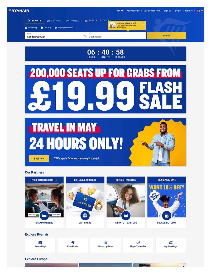
There’s so much going on here, and it’s all so bold. Let’s point out a couple of things here…
Firstly, capitalisation makes text less easy to read. It’s fine when users sparingly, but virtually every title and a lot of other random strings are entirely capitalised here, which slows down my reading speed and quite frankly, feels like I’m being shouted out.
Don’t get me wrong, from a brand perspective, this makes sense. If Ryanair were a person, they’d likely communicate exclusively by yelling. But also interestingly on second glance, I realise there’s a lot less text than I initially thought here. The combination of the bold graphics and omnipresent capitals makes it feel busier than it is.
Secondly, the countdown under the flight selection bar immediately gives me a sense of urgency. Initially, I’m not even sure what it relates to. It must be the countdown for the offer below, but the fact it’s in a block unattached to that offer and immediately below the booking menu makes me think for a moment PANIC I NEED TO BOOK MY FLIGHT NOW. I’m sure this urgency is effective in pushing users to book a flight, but it’s incredibly deceptive.
Not that that’s an issue for Ryanair — I don’t think many people exactly like Ryanair. We use them begrudgingly because they are (usually) cheap. So whereas ordinarily deceptive patterns can damage brand perception and cause customers to lose trust, Ryanair’s designed for people who already hate it and are there for the price, not the experience.
Greying out options that aren’t possible…
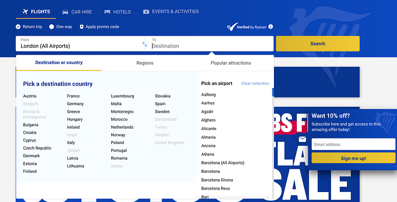
Props where props are due, there’s some good UX going on here. After having selected “London” as my departure location, the options for destinations that aren’t possible from London are greyed out. This makes it simple to go back and change London if I want to go somewhere that’s not possible directly from London. Plus, it avoids me experiencing frustration if I search for a combination that’s not possible.
Also, side note — that 10% box on the side is sticky, but it’s effective. “Want 10% off?” is casually phrased, and giving the input box for an email address directly here reduces friction entirely.
Obviously, you’d want people to sign up for a newsletter because they love your brand, but there’s a bit of value exchange going on here giving an immediate reward.
To fly or not to fly…
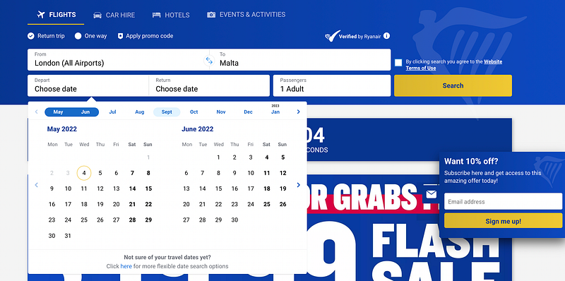
Date selection is intuitive, although being shown two months at once which both roughly align with the boxes for departure and return, I did initially think these were separate calendars, one for selecting departure and one for selecting return, rather than giving the option to choose a range. And that’s the short story of how I nearly booked to go to Malta for 2 months instead of a week.
The option to search for dates flexibly is also presented nicely here. It’s subtle, being under the date selection, but because of the length of the string, it’s not easily overlooked.
You may have noticed this option wasn’t visible before either. This was only shown once I had entered the locations, so the UI was shown only at the moment it became relevant. This is a great way of avoiding a multi-step flow looking like more work than it is, which may deter people from starting in the first place, although it doesn’t do much to avoid cluttering the UI overall given the rest of the page…
Gentle guidance…
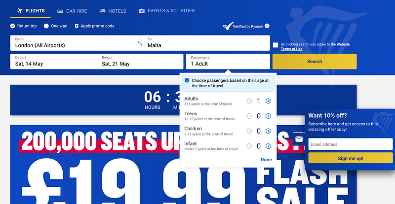
When it came to giving initial passenger numbers, I appreciated the tip here about choosing the categories based on age at the time of travel. This immediately answers potential and likely common questions from people booking, removing friction and the need to go scour forums and FAQs to find the information.
Choose your flights…
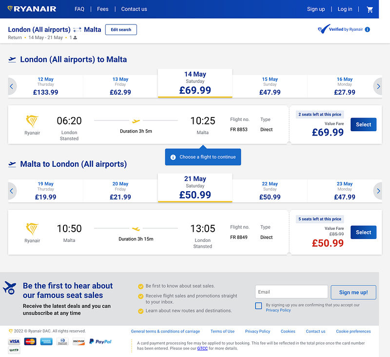
So, on the positive side — I love being able to see the price for different days here. This saves me from having to go back to the previous page, giving me flexibility during the booking process. Here, I’d probably choose to come back one day earlier since it’s less than half the price.
On the downside, there’s a lot of information displayed at once — and for London to Malta, there was only one flight a day. Imagine this page with multiple flights. I understand the need to remove friction, but separating the flights over two pages wouldn’t introduce much more friction and would lower the amount of information being presented at once.
There’s also terminology here that I’m not familiar with. Above the price, it says “Value Fare” — why? This makes me aware that there are going to be other options, but I wonder if having a non-branded name for this kind of fare (e.g. “Lowest fare” or “Base fare”) would be clearer here.
And there’s a little more deceptive design going on. The “seats left at this price” as far as I can tell is displayed for every single flight, so unless every flight really is nearly fully booked or they really do change prices, this feels like a cheap tactic to ensure I book now and don’t go off and research other airlines.
Additionally, I’m presented with a discount on the second flight, and I don’t know why. I didn’t know that the flight was supposedly £85.99 beforehand, but it’s irrelevant. From a behaviour perspective, this also increases the urgency to book now, as I don’t want to lose this discount (a nice bit of loss aversion bias perhaps?).
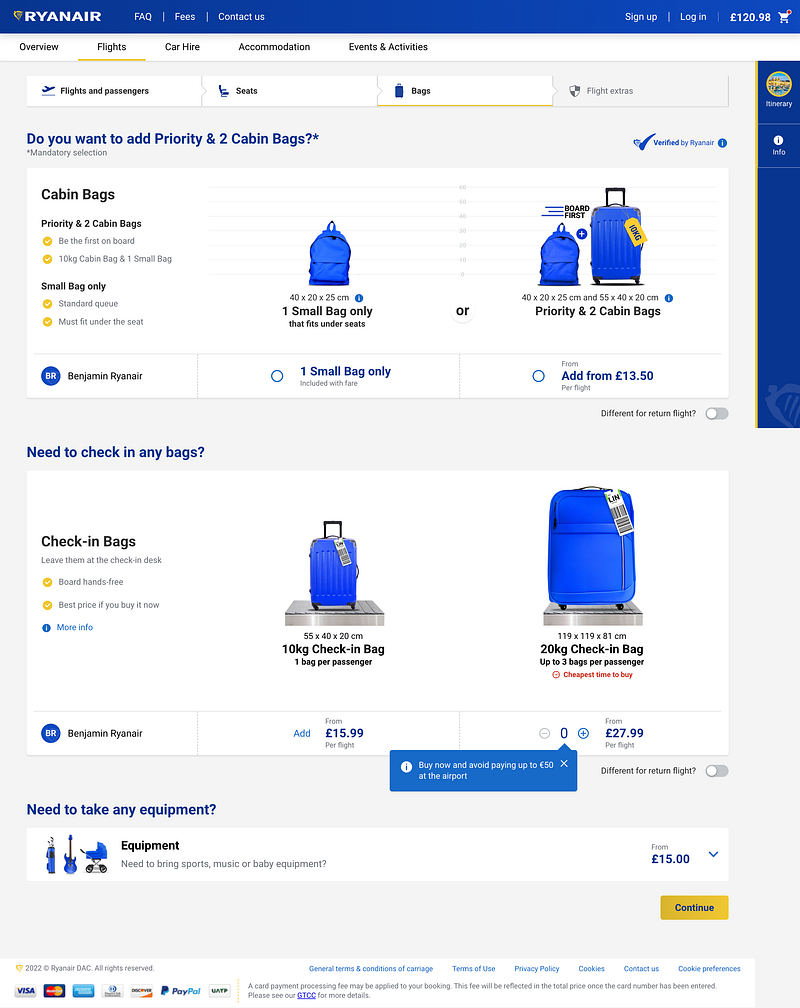
Flexi enterprise mega super premium plus plus super plus?
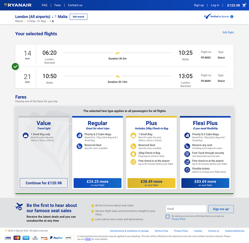
Oh lord. We knew this was coming. Those previous prices were Value Fares, and we see now they only include one small bag. Delightful.
Here, we start to see why Ryanair has the reputation it does. If I want to bring a bag for the overhead storage in-flight, I can book Regular. Note the naming — “Regular” is a premium option compared with “Value”. Rude.
And there’s some centre stage effect going on here too. Psychologically, and especially when it comes to paying, we humans a pre-disposed to going for the middle option. That’s why you’ll nearly always see three options on payment pages like this. And to reinforce this, it’s coloured gold, which likely means it’s more frequently selected.
On the subject of colours, the “Value” option being greyed out with an unfilled button makes it look like it can’t be selected (as opposed to being already selected). I had to spend a few seconds trying to find the option without paying extra.
It’s also expensive. Keeping “on each flight” in small text under each ticket is pure deception, as at first glance, you’d think “Ah, ok, it’s £30 extra in total” when it’s double that per passenger. But we already know Ryanair isn’t concerned with losing trust.
VALUE SUCKS BE REGULAR
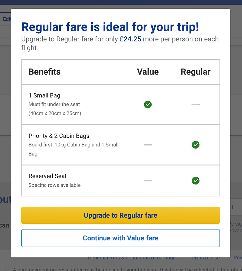
After choosing “Value”, I then got this pop-up, restating the fact that Value is sh*t and I should upgrade to Regular. I was annoyed. This is a masterclass in how to royally irritate your users.
The checklist doesn’t even make sense here, given the small bag technically is included in the regular fare. I’m sure they’ve done testing and find this boosts the amount of upsells, but wow. No. Naur. Nope. Nuh-uh.
Nearly booked…?
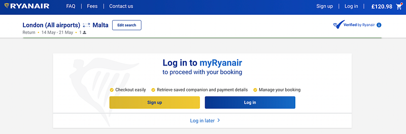
At this point, I’m then prompted to log in, which seems fitting as surely I must be about to pay.
There’s also the option to log in later, which is appreciated, especially for me who wants to avoid giving Ryanair my email for as long as possible or at least until it’s time to pay…
ENTER YOUR PRONOUNS
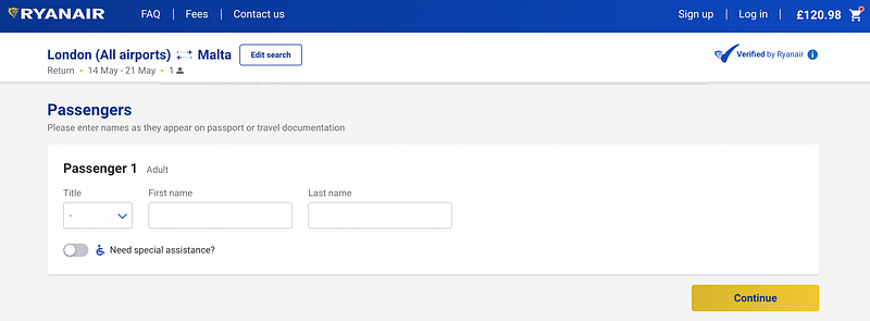
Not much to say here — except “title” is compulsory and there are just three options; “Mrs”, “Ms” and “Mr”. Nothing for lil’ non-binary me.
Seriously though — why ask for the title. Is it needed, especially if you’re just presenting these three options?
(Read this for a super expansion on the case for stopping the whole asking for titles.)
Accessibility in an inaccessible way
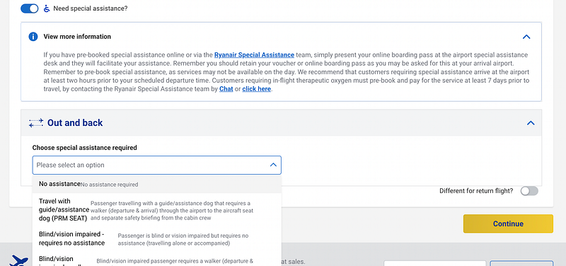
This is also where those who require it can request special assistance, and lord, apparently there’s no need to present this in any kind of easily digestible or accessible way.
As an individual with a visual impairment (no vision in my right eye), this gave me motion sickness. The long paragraph doesn’t have even a single heading to tell you what information it contains. The dropdown options are poorly aligned, extremely wordy and not in alphabetical order.
To be frank, this feels like an afterthought. ALL information ESPECIALLY ABOUT ACCESSIBILITY should be presented in the most accessible manner possible.
PAY MORE NOW
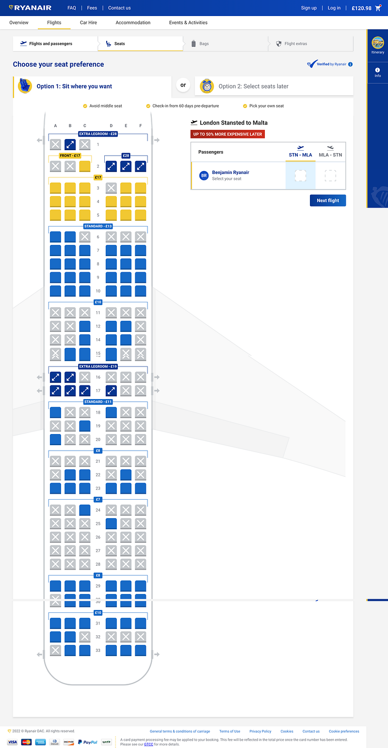
I was expecting to pay but nope, another upsell. At least they’ve included the prices of the seats on the diagram itself, but from a passenger perspective and seeing the fact that some of those seats are nearly 30 quid extra, I’m feeling very annoyed.
Let’s do some usability testing too — where do you click if you don’t want to pay extra and reserve a seat?
I spent two minutes looking for this option until I realised it was discretely placed near the top as an alternative tab. It doesn’t even look like a clickable button — it looks like the next step in the process. I almost thought I HAD to pay extra. The level of deception is off the scales at this point.
That’s without mentioning “50% more expensive later”, again adding urgency to the flow to get users to pay more and book now.
I’ll advise you where you can stick your seat.
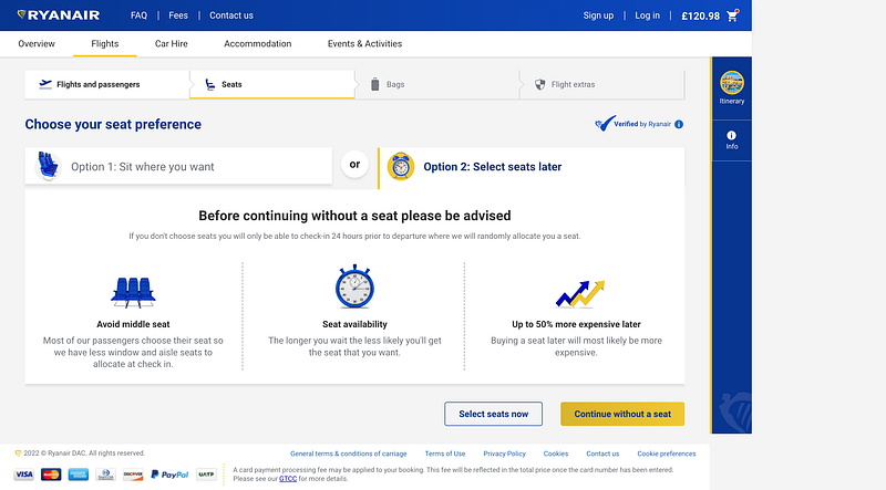
We’re familiar with Ryanair’s pattern now. What comes after using urgency to get users to take the upsell? Doubt! Ding ding ding! 🎉
Of course, it’s not as simple as continuing without. There’s information presented to warn me of the perils of not choosing a seat, and it’s almost like a mini landing page for seat picking in terms of how it’s presented. The 3 USPs of seat picking with Ryanair. It’s like I’m being threatened.
I’m surprised that “Continue without a seat” got the primary button highlight colour here, I would expect “Select seats now” to get that treatment (if you’re reading this Ryanair, I will be invoicing you if you make that change, and for £20 extra I won’t use Comic Sans on my invoice).
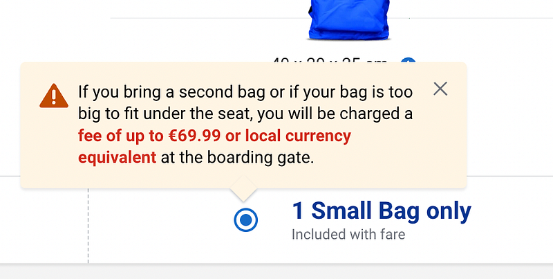
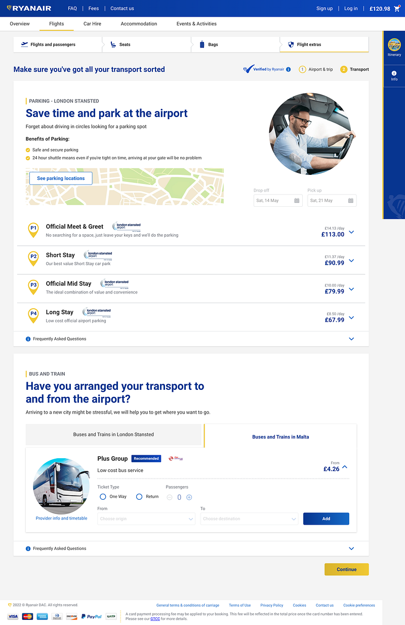
Size matters.
Bloody hell. It’s the same patterns we’ve seen already, but this time for bags. And they’re showing you a scrawny pathetic looking rucksack against a background that makes it look like a mugshot to plant the seeds of doubt that you can fit a week’s worth of clothing in there.
And we have the “Buy now and avoid paying up to €50 at the airport” pop-up here, threats and doubts all on one page, although I’m not sure why I’m seeing the incorrect currency here.
And yes, I did put my surname as “Ryanair”, because I wanted to see if it would unlock some special Ryanair family discount because that’s blatantly the surname of the founder.
More doubt
We expect this at this point. Here’s what you get when you don’t take the upsell, a threat — and it is a threat– of more charges further down the line. At least they mention “or local currency equivalent” here.
*Screams*
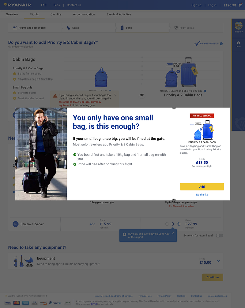
The in-screen tooltips weren’t enough, so let’s add a pop-up directly doubting my decision to only fly with a small bag. I love how one of the benefits presented here with a green check is just “Price will rise after booking this flight.” The title is in a conversational tone, which normally would be a positive, but here it’s just adding to the overall coercion to get me to spend more.
At least they’ve made it frictionless to add more luggage directly from the pop-up, but what’s that label with “This will sell out”? It’s past the point of ridiculous at this point.
THIS IS AN AIRPORT NOT DISNEY WORLD
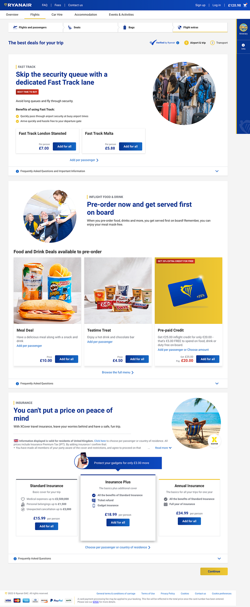
I KNOW RIGHT. Obviously, there was going to be some sort of fast pass option. AND you can pay to get food first on your flight. And then there’s insurance thrown in too, with more centre stage preference going on.
Ryanair has monetised everything possible at this point. If you’re offering the chance to buy €25.00 of credit for €20.00 to be used on your flight that’s not longer than a few hours, then you’re a pure extortionist at this point.
Save time, spend more
I know that this is important to book, but please just let me confirm my flight. I’m begging you.
And finally…
No comments. From “Flights” being presented as one of four possible steps in the booking process to repeating the options to add seats and bags, I’m done.
What did we learn?
I’ve been wanting to write this for a while not to disparage Ryanair, but because we often talk about deceptive patterns in UX, this is one of the most openly deceptive user flows I have ever seen.
Yes, Ryanair has done an outstanding job at likely getting their users to spend more than just the cost of their flights, and yes, the reason they can offer such cheap flights is that they make their money from other avenues.
However, the manipulation and employment of soft threats and the introduction of doubt throughout the process are appalling and contribute to Ryanair being one of the most hated brands in the world.
If you respect your potential customers at all, please do not resort to these tactics.
And no, I’m not going to Malta. I’m going to comfort eat a cake or three.
Ben Davies-Romano has a decade of product and UX experience, helping companies develop experiment-led cultures to create valuable and meaningful digital experiences. They’re the Founder at Tech Outcasts, a company building a community for individuals looking for their tribe in tech in addition to premium consultancy and online courses.


