
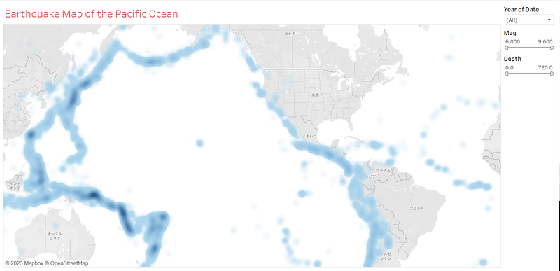
I created a dashboard of earthquake maps (magnitude 6 and above) in the Pacific Ocean in Tableau.
This time Tableau created a dashboard using sample data about earthquake maps.
All data are for magnitude 6 and above, from 1900 to 2014.
Reference data can be found at the following URL
https://public.tableau.com/app/resources/sample-data
Data is imported in CSV format.
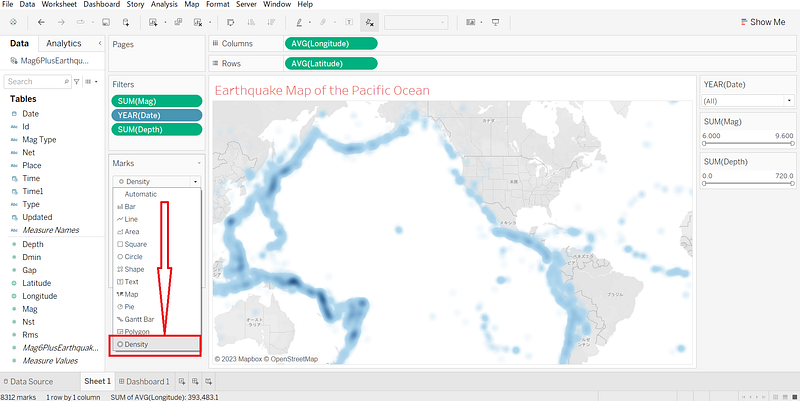
The notable feature this time is the frequency of occurrence, i.e., the color is designed to be darker in densely populated areas. The data is designed so that the color is darker in areas of high density.
By default, the following conditions apply.
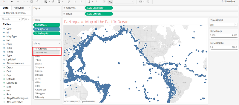
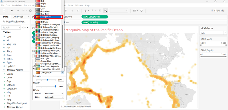
Colors can be easily changed. Simply select from the pull-down menu as shown below.
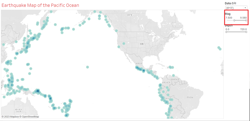
Narrowing down the filter to magnitude 7.5 or greater resulted in the following dashboard.
If you are interested in Tableau, please give it a try! Tableau public is free to use! We have been using Tableau public again this time.
Please look forward to it. Thank you very much for your interest.
I really appreciate it.