avatarJason Feller

Summary

The author describes the process of creating a medical dashboard for an Upwork client, which involved cleaning messy data, utilizing pivot tables and slicers, and focusing on key performance indicators.

Abstract

The author outlines the steps taken to build a medical dashboard for their Upwork client, starting with the challenging task of cleaning a disorganized spreadsheet. The data was riddled with multiple rows for single entries and inconsistent merging, which complicates data analysis. The author emphasizes the importance of having a single row for each data entry to maintain simple x,y relations. After cleaning the data, the author leveraged pivot tables and slicers to facilitate easy manipulation and analysis of the data within Excel or Google Sheets. They stress the necessity of adding pivot tables to the data model to ensure slicers effectively manipulate dashboard data. The dashboard's design was centered around the client's key performance indicators, with a focus on the relationship between two primary fields and other data points. The author highlights the importance of understanding stakeholder needs to tailor the dashboard effectively, ensuring it answers the key questions at hand.

Opinions

  • The author believes that data should be organized in a way that each entry has only one corresponding row cell for each column cell to simplify analysis.
  • Pivot tables and slicers are considered essential tools for creating interactive and user-friendly dashboards.
  • Adding pivot tables to the data model is seen as a critical step for enabling slicers to manipulate dashboard data correctly.
  • Identifying and focusing on the client's key performance indicators is crucial for building a dashboard that provides valuable insights.
  • The author values clear communication with stakeholders to ensure the dashboard meets their specific needs and answers their questions effectively.

I Built A Simple Medical Dashboard For My Upwork Client

Here’s the steps that I took and what I learned.

Cleaning the data

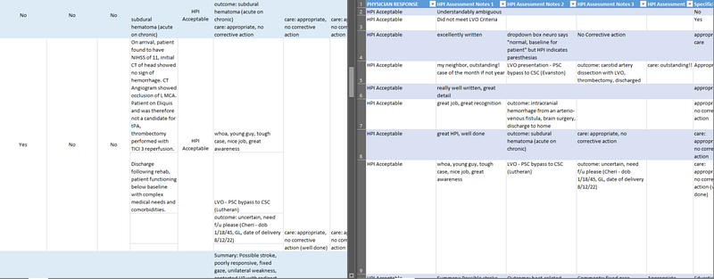
This customer had their own spreadsheet and it was a mess. Thankfully it was relatively small and I was able to manually clean this excel file. The biggest problem was they had multiple rows for each entry. Some were merged, some were not. This makes analysis of the data very difficult, you want simple x,y relations. That is, there should only be one corresponding row cell for each column cell. Their main culprit here was the notes. I spread them out horizontally in new columns rather than vertically in new rows.

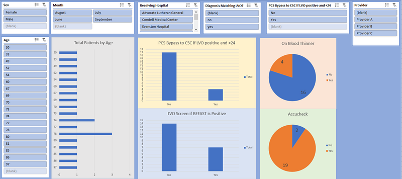
Pivot Tables & Slicers are your best friends

I created a new tab just for pivot tables. This is a common step for creating dashboards in Excel or Google Sheets. It makes creating a new a new graph or slicer a breeze.

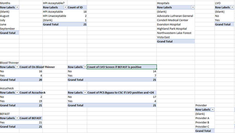
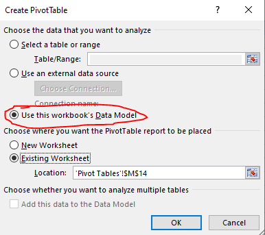
I fill my dashboard with as many slicers that could be useful. It’s important to add the pivot tables to the data model when prompted by Excel. Otherwise when you use a slicer it will not manipulate the data on your dashboard.

Find the Key Performance Indicator and build your dashboard around that

For instance, my client was mostly concerned about two field in particular. She wanted to see the relations between this key field and other fields. You can see the center of the dashboard is focused on this and I have built the sliders all around it.

This is why it’s important to get the necessary information from your stakeholders. Being clear about the questions they want answered will make your job easier.

Originally published at https://sheetfreek.com.

If you liked this article:

  • 👏 Clap for the story (up to 50!)
  • Follow me on Medium
Sheetfreek
Googlesheets
Dashboard
Upwork
Data Science
Recommended from ReadMedium