
![https://cdn-images-1.readmedium.com/v2/resize:fit:800/1*[email protected]">](https://cdn-images-1.readmedium.com/v2/resize:fit:800/1*_n0oJL5pJSTdRk1wQvDglA@2x.jpeg%22%3E)
Hows does India’s coronavirus surge compare with rest of world?
Europe, Brazil are still not out of the woods yet where COVID-19 cases remain at very high levels
It’s been weeks since all international channels have been sharing horrible images of the absolutely tragic COVID-19 situation in India. Some days I feel like my mind can’t compute the scale of the crises unfolding there, which only a few months back seemed to be on track of getting a grip on the virus after successfully developing vaccines in its own labs.
While it’s clear that India’s COVID-19 cases for each day are currently at its highest ever level — a truly grim milestone, what is consistently missing from the coverage is how the surge is correlated, or not, with the ongoing cases in the rest of the world, in particular places like Europe, the U.S., Brazil, the U.K. and South Africa which only until recently were seeing record number of cases. The following series of visualizations made by using data sourced from the international bodies Our World in Data/Johns Hopkins University is my attempt to fill that gap. (For this discussion, I’m limiting my data visualizations to India, Europe, South Africa, the U.K., the U.S. and Brazil.)
One can see in the graphic above that while it is true the first ever COVID-19 case was detected in China’s Wuhan province, India’s first coronavirus case was detected after the first cases were detected in the U.S., Europe and the U.K. early 2020. One can’t conclusively claim there is a definite link between them unless one studies more evidence, though it’s quite clear that all of these places are also where there is a large Indian diaspora. (Brazil and South Africa like India probably got their first cases from those parts of the world in the West but that’s not the subject of the discussion here.)
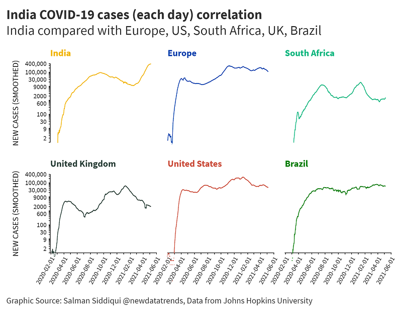
Among these territories, only India’s new cases curve appears to be on an upward trajectory (See graphic above). While new cases remain on the high end in Brazil and South Africa — the curve there seems to be plateauing now –new cases in the U.S. and Europe, especially in the U.K., new cases seem to be clearly on a downward trend, although they are still at the high end of the spectrum.
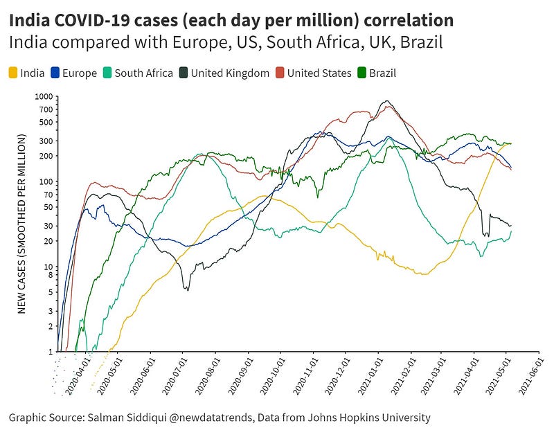
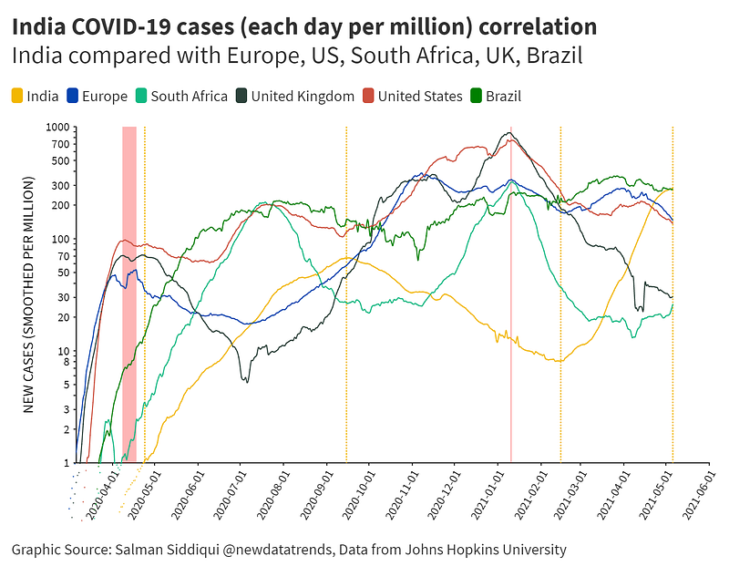
Media coverage that focuses just on the fact that new cases in India are at an all-time high takes away from another fact that new cases still remain quite high in other part of the world. In fact, if one looks at new cases per million of the country’s population, it is Brazil, not India, which tops that list as the visualization above shows.
It’s true that more investigation is needed to see the links, or lack of it, between surges in different parts of the world, but some trends can be observed quite outrightly like in these charts. For example, in 2020, India’s first wave of COVID-19 reached its peak sometime in September of the year, which was about five months after the first wave peaked in the U.S., U.K. and Europe in April (See above). In 2021, the second wave of new cases peaked in January for the U.K., the U.S. and South Africa; cases in India during that month were actually on the decline. But within a month in February, the curve in India began to rise again and has been continuing to rise ever since, four months after the surge in Europe and the U.S., breaking all previous records world over.
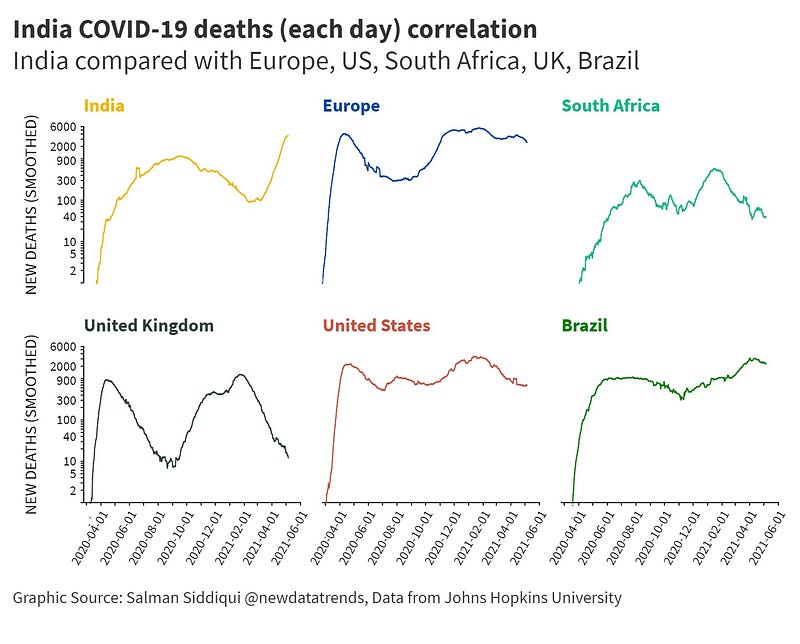
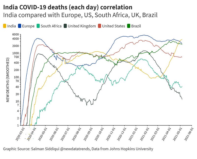
Deaths too began to rise dramatically during this period in February 2021 in India and continue to rise, while the U.K. and South Africa are witnessing a downward trend; it is still not definitely looking good at all in Brazil while Europe, which is keen to open up its borders for summer tourists, too is clearly not out of the woods yet.
In fact, in terms of new deaths per million of the country’s population, Brazil tops the list, followed by Europe. India is in third spot as the following graphic shows:
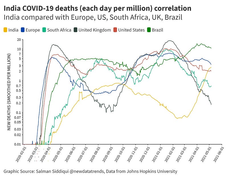
One possible visual evidence of a new COVID variant at play in India is the fact observed in these trend lines that show clearly that while new deaths in India were continuing to be on the decline in December 2020 till early February 2021, new deaths per day in the U.S., the U.K., Europe, Brazil, and South Africa were rising fast, many of which in fact peaked in January 2021 (See graphic below).
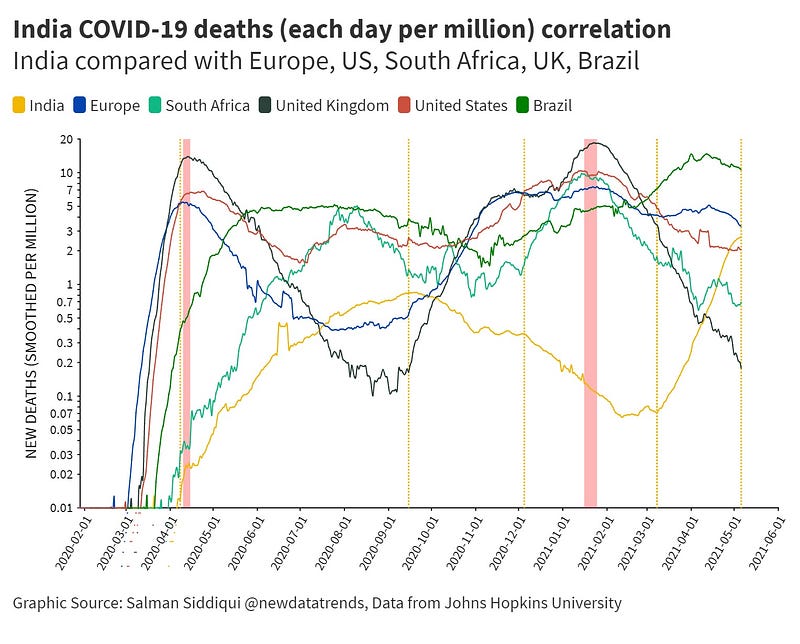
You can observe the second wave of coronavirus deaths in 2021 in India only began to rise when the curves in these other places (except for Brazil) were declining.
The data visualizations shown here are not intended to claim that they show the entire story or plug all the gaps in the media coverage. It is only meant to be a sample of the discussions that are being left out, which I intend to highlight in more such subsequent data visualizations in my next articles.