
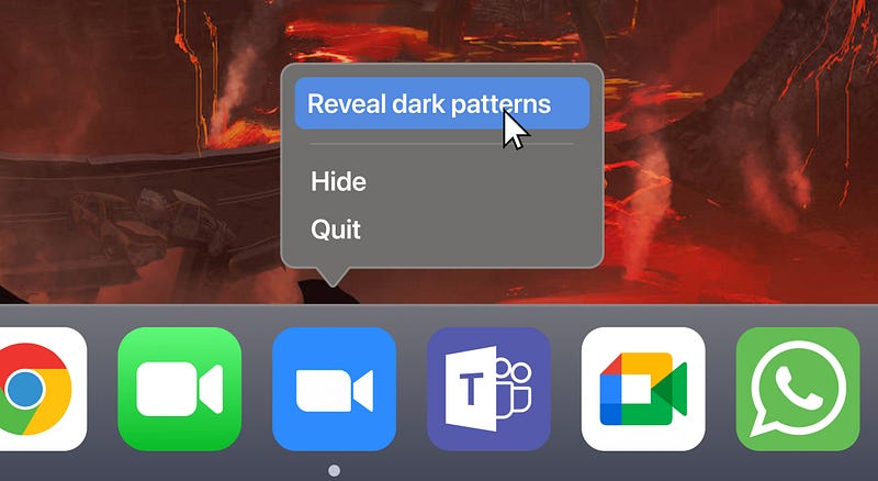
How Zoom uses dark patterns to increase app downloads 😧
There’s an unusual dynamic to video conferencing tools: the person who creates the meeting, decides which tool to use. It’s rarely a mutual decision.
i.e., as a regular Zoom user, I might love the core service.
But I invite someone to a meeting, without considering that they might get the ‘guest’ experience.
Note: I recently published an entire breakdown of the user experience of Zoom vs Teams vs Meet here.
But, let’s dive a little deeper into one aspect: the dark patterns of Zoom.
1. The host sends the invitation link…
The host has created a meeting link (perhaps in advance), and they need to send the URL to someone.
Even easier, their calendar software might auto-create a meeting, and attach meeting details.
2. The user clicks on the link, and it auto-downloads the app
If the user doesn’t have Zoom installed, then it’ll automatically start downloading.
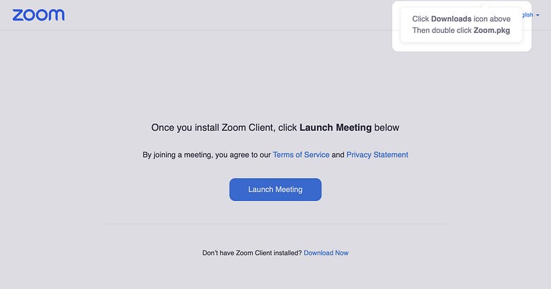
3. The content is designed to give you no choice
Remember, this is a sensitive moment.
The guest might have clicked to join the meeting at exactly the time they were supposed to meet. They might be late.
These circumstantial factors are likely to make you more compliant, and seek the fastest possible solution. You can’t risk being late.
Zoom don’t give you any choice. You need to install the app (that’s probably already downloaded), and then click this button.
The button itself says “launch meeting”, implying it loads the app.
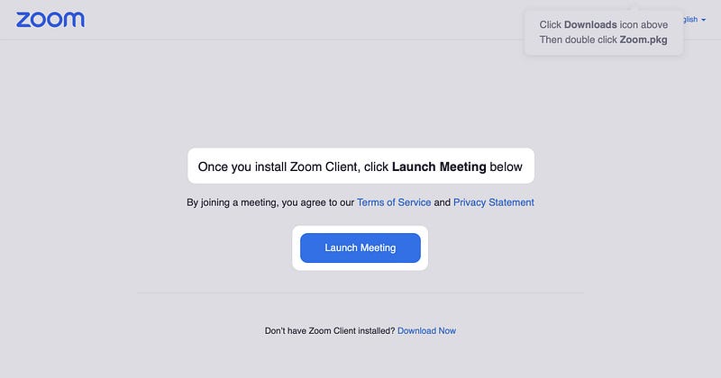
4. Except that’s a lie. You can join from your browser
If you click on the ‘Launch Meeting’ CTA without installing the app, a new option will quietly appear.
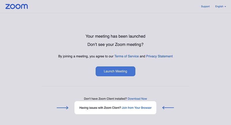
Importantly though, this requires an act of defiance.
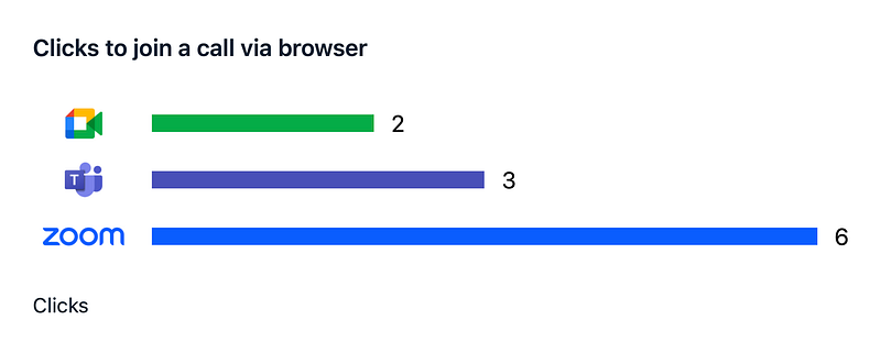
And you can measure this intentional friction, by comparing the effort required to join a call via browser.
Okay, what’s the big deal?
Let’s be clear:
Zoom are intentionally hiding their ‘join from browser’ option, knowing that many stressed guests will obediently just install the app.
This is a great example of a dark pattern. It’s terrible UX, likely designed to improve a core metric.
But what’s the risk of this? Long term trust? Maybe.
Instead, I think the more damaging effect is on the meeting host.
It’s time to consider the consequences of starting a meeting, where the other person has just suffered through a few minutes of random updates, installations, errors and creating accounts they didn’t want.
I’m not suggesting you leave Zoom. Their core service is great, and once you’re in a call it’s usually fantastic.
Instead, I want the design industry to use this as a case study of a dark pattern that does two things:
- Increases the business’ core metrics (downloads go up)
- Worsens the customer experience (hosts start each meeting with a stressed guest).
If you’re interested in how Teams and Meet stacked up, check out the full thing here.


