How We Build a Brand Identity for Coffee Shop that Celebrates Individuality
Food and beverage industry in Indonesia have always been a fast paced and evergrowing industry. Local Coffee Industry however, have been slowing gradually since it’s golden days in the years of 2017 — 2018. It has been a bitter-sweet truth that nowadays, simply there are too many coffee shops, offering similar product and experiences. That is why we cant help but feels a little nervous, when Abraham (The client) comes to us and says that he needs a brand identity for his new brand of coffee shop.
The Product
We were anxious, and agitated, “What if the brand of coffee shops that we will built, will just act as another coffee shop chain that have little to no differences with the current players within the local industry of coffee shops?” Fortunately, the client are willing to sit down with our subsidiary firm, Further.Work to formulate a deeper brand strategy, and translate it into a tangible value proposition that differs themselves from the other coffee shops.
Here are the main value propositions that further have developed for Qualia:
Wider Array of Coffee Choices
In the industry of commercial coffee shops, we’ve seen more and more of them serving casual coffee drinkers. Relying heavily on variants of latte, or sweeteners. Here in Qualia, we will cater not only the casuals, but also those who prefer a more serious cup of coffee. Serving Picollo, Doppio, Magic, Ristretto, and other coffee byproducts that will attract wider range of customers. We will also develop menu lists that consists of coffee based mocktails, We design it to attract a new segments of customers. We don’t judge One’s preference when it comes to coffee, we dedicate ourselves to invent the perfect cup, for everyone’s preference.
There is no perfect cup of coffee for everyone, but everyone would have their own version of “a perfect cup of coffee” Qualia is here to help all customers invent their own perfect cup through wide array of menu, and coffeee experience.
Friendly Barista that put People First
In a world where ordering online and contactless delivery is a new normal. We would like to go back to the old ways, and make sure that everybody who opens our doors are feeling welcomed, respected, and more importantly, treated humane. These words means that we dedicate our efforts, training our Barista to make our space felt more like “your friend’s home“rather than a neighborhood cafe.
A Perfect Ambiance
It was a truly meaningful experience for us to collaborate with Bitte, one of the leading interior and architect design firm in Jakarta to develop Qualia’s space. We wanted to create a space that highlight’s one’s relationship with coffee. A place that can feel super intimate, but is also felt friendly and welcoming
The Problems That We See
In Deed, we believe that visual design, are a process to find solution in order to answer specific sets of problems. After we discusss with further, we list down these sets of problem to be addressed within the Brand Identity:
- How To Stand Out in a Saturated Market
- - How to Translate the Value Proposition into a Design System
- - How to create an identity that adds value into the whole experience of Coffee Drinking
The Explorations
From the get go, we knew instantly that the core idea of Qualia’s Brand Identity lies within it’s own name. We understand that Qualia means “Individual instances of subjective, conscious experience”. Immediately we see the red lining between this, and the value proposition that qualia tries to offer, in which we basically try to serve a perfect cup of coffee for everyone, despite their varied preferrence.
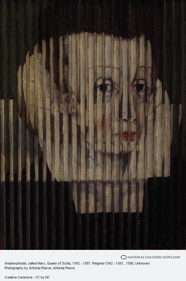
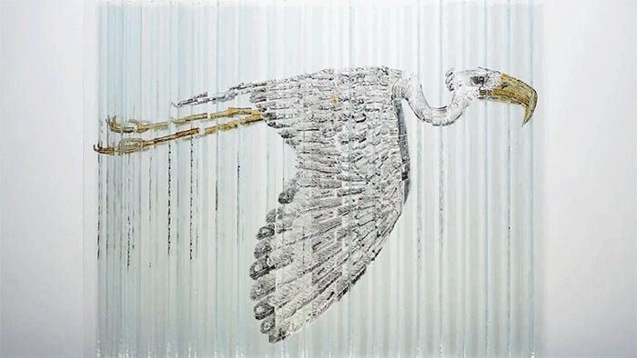
In order to visualize that sense of individuality, a sense of subjectivity within each coffee drinkers, we start to explore different visual languages, art style, and even illustration. We seek for inspiration through many sources, before we finally put our mind and pursue the visual treatment of an anamorphic images. An image that can be seen as different object, depends on the vantage point of the audience.
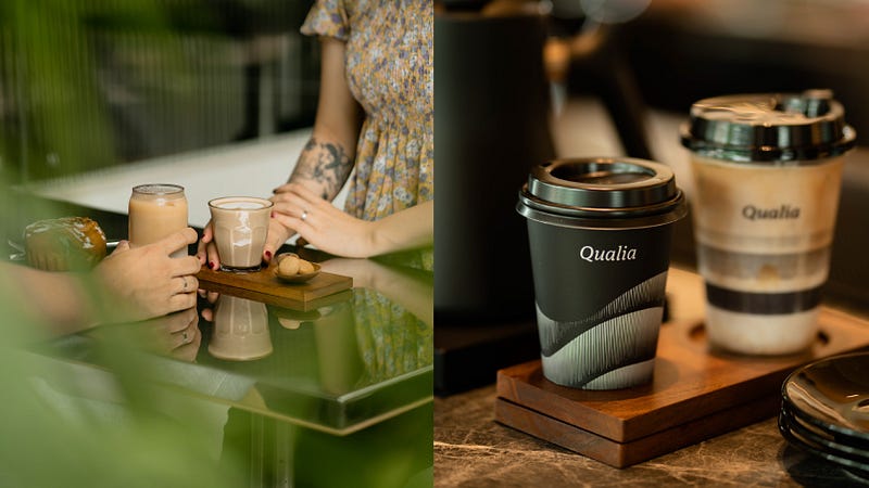
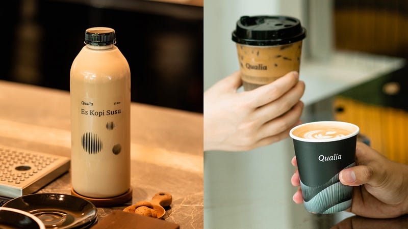
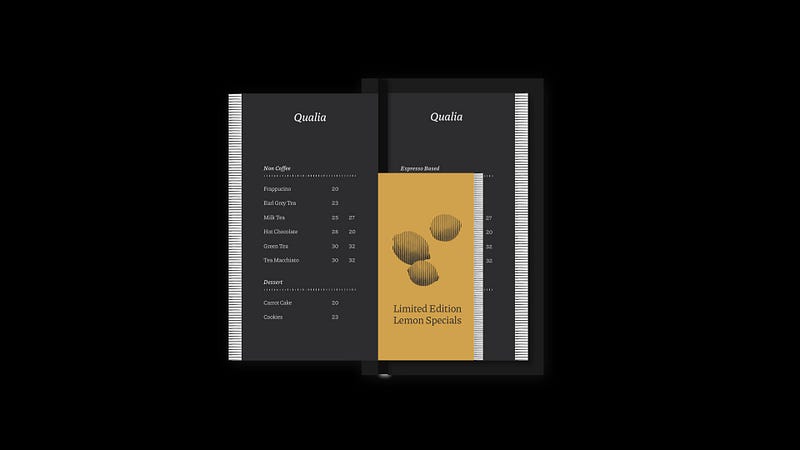
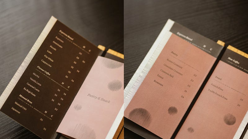
While exploring this style, we then move to create the typography for the brand. We seek for something that looks bold yet can still be seen as warm, inviting, and cordial. Hence we create the logotype that looks like this:
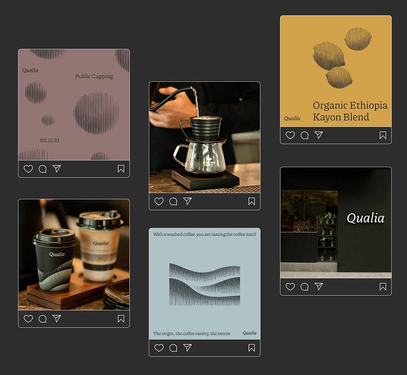
Once the logotype is finished, we then move on into each physical evidence that happens along the experience of visiting a coffee shop; an Instagram look and feel, A Menu Board, The packaging, and The Supergraphic that will exist along the customer’s experience
The Output
We interpreted the notion of subjective conscious experience into a composition of lines that takes shape into various graphical elements that can be perceived differently depending on the viewer’s perspective.

Coherent with the name Qualia, our supergraphic depicts various lines and strokes that can be interpreted relatively, depends on the eye of the audience.
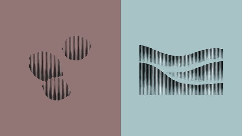
These lines, composed of different weights and opacity, would represent a spectrum to depict different stages of coffee production. From Green Beans Processing, Roasting Profile, Grind profile, etc.
① The lines were shaped as waves to represent Washed Processing.
② The grinding process is represented using different sizes of the shapes combined with different weights and opacity. This is done to depict the different states of the coffee bean in this process; Coarse, Medium, and Fine.
③ Different weights were used to represent three main types of roasts; Light, Medium, and Dark Roast.
④ These lines were also used to create graphic elements to represent the unique natural taste notes in coffee beans.

We chose a color palette that relies on black as it’s focal point, accentuated with selection of muted, neutral colors. This are a deliberate choice that we do, in order to put the product, the ambiance, and the overall coffee drinking experience as the strongest element. We use the same decision in order to pick the materials of all branding collaterals. Choosing a subtle, yet impactful brand touchpoint. We wanted the branding output to act subtly, but enhances the overall experience in a unique, and remarkable way.
This is How We Create an identity for a Coffee Shop that Celebrate Individuality, This is Qualia, By DEED — Part of Riposte Group
Special Thanks to Our Team Art Director // Silvia Isabella Graphic Designer // Silvia Isabella Illustrator & Animator // Maria Nonita Brand Strategist // Adrianus Killian Photographer // Refi Fahreza Supporting Designers // Aurel Elizabeth
Since you guys are here, kindly visit our behance post about the same project. Leave a comment, input, discussion, or even share it if you find this useful! See you on other posts! https://www.behance.net/gallery/151374681/Qualia