
How to Visualize Football Data Using R
Tutorials on creating shots, passes, and heat maps

Introduction
Football analytics has grown rapidly in recent years. With data, we can understand the game from a different perspective.
In this article, I will show you how to visualize football data using R. At the end of this article, you will be able to create visualizations like this:
Without further ado, let’s get started!
Implementation
Data source
We will use the open data from StatsBomb, which I’ve got permission to use the data as an example. StatsBomb is a football analytics company that provides event data and analytics services for football clubs.
Since the event data is different than regular tabular data, StatsBomb provides free data to help us learn more about how to analyze football using the data.
The leagues that we can choose from the open data are the UEFA Champions League, the World Cup, Indian Super League, and many more.
For this article, we’ll create visualizations based on a match from the 2012/13 Champions League final between Bayern Munich and Borussia Dortmund.
The StatsBomb data format is like a JSON file, so it will be challenging to analyze data using it. But thankfully, we can retrieve the data easily by using a function called StatsBombR.
Install and load the libraries
We need several libraries to help us create the visualization. Those libraries are:
- StatsBombR => Retrieving the StatsBomb data
- Tiduverse => A library that compiles libraries for preprocessing and visualizing the data
- Ggsoccer => A library to generate the football pitch on our visualization
Let’s install the library. Here is the code for doing that:
# Install the necessary libraries
install.packages('devtools')
devtools::install_github("statsbomb/SDMTools")
devtools::install_github("statsbomb/StatsBombR")
install.packages('tidyverse')
install.packages('ggsoccer')
After that, you can load the library by running these lines of code:
# Load the libraries
library(tidyverse)
library(StatsBombR)
library(ggsoccer)
Now we’re ready to get our hands dirty.
Preprocess the data
Since StatsBomb provides open data from different leagues, we need to specify the competition ID and the season that we want to analyze.
First, we need to look at all competitions that StatsBomb provides. Here is the code for doing that:
# Retrieve all available competitions
Comp <- FreeCompetitions()
From that code, you will see a data frame comprising all leagues they cover.
As I’ve mentioned before, we’ll analyze the match between Bayern and Dortmund at the Champions League final. The corresponding competition ID and the season are 16 and 2012/2013, respectively.
Let’s filter the data by running this code below:
# Filter the competition
ucl_german <- Comp %>%
  filter(competition_id==16 & season_name=="2012/2013")
Next, we retrieve all matches that correspond to that league and season. Here is the code for doing that:
# Retrieve all available matches
matches <- FreeMatches(ucl_german)
After we get all matches, we can retrieve the event data by running this line of code:
# Retrieve the event data
events_df <- get.matchFree(matches)
And lastly, we clean the data. Here is the code for doing that:
# Preprocess the data
clean_df <- allclean(events_df)
Now we have the data. Let’s create the visualizations!
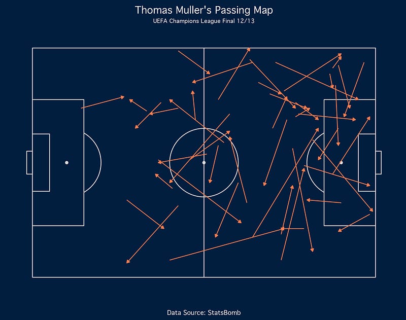
Pass map
The first one is the pass map. Passes map shows all passes created by a player or a team. In this example, we’ll create a passes map of Thomas Muller.
Let’s filter the data by taking all passes made by Muller. Here is the code for doing that:
# Passing Map
muller_pass <- clean_df %>%
  filter(player.name == 'Thomas Müller') %>%
  filter(type.name == 'Pass')
Now here comes the fun part. To create the viz, we will use a library called ggplot and ggsoccer. Here is the code for creating the basic viz:
ggplot(muller_pass) +
  annotate_pitch(dimensions = pitch_statsbomb) +
  geom_segment(aes(x=location.x, y=location.y, xend=pass.end_location.x, yend=pass.end_location.y),
               colour = "coral",
               arrow = arrow(length = unit(0.15, "cm"),
                             type = "closed")) +
  labs(title="Thomas Muller's Passing Map",
       subtitle="UEFA Champions League Final 12/13",
       caption="Data Source: StatsBomb")
If you’re an R user, I believe you have been familiar with ggplot.
The ggsoccer extends the ggplot library, so we can build a visualization on event data that comprises the start and end coordinates.
The library provides the annotate_pitch to create the football pitch and the geom_segment to create lines of passes, which you can see from the code above. And the rest is the one that you see on ggplot.
And here is the result:
Well, it seems not visually aesthetic. Let’s add the theme function to customize the look of the viz. Here’s the complete code, along with the theme function:
ggplot(muller_pass) +
  annotate_pitch(dimensions = pitch_statsbomb, fill='#021e3f', colour='#DDDDDD') +
  geom_segment(aes(x=location.x, y=location.y, xend=pass.end_location.x, yend=pass.end_location.y),
               colour = "coral",
               arrow = arrow(length = unit(0.15, "cm"),
                             type = "closed")) +
  labs(title="Thomas Muller's Passing Map",
       subtitle="UEFA Champions League Final 12/13",
       caption="Data Source: StatsBomb") +
  theme(
    plot.background = element_rect(fill='#021e3f', color='#021e3f'),
    panel.background = element_rect(fill='#021e3f', color='#021e3f'),
    plot.title = element_text(hjust=0.5, vjust=0, size=14),
    plot.subtitle = element_text(hjust=0.5, vjust=0, size=8),
    plot.caption = element_text(hjust=0.5),
    text = element_text(family="Geneva", color='white'),
    panel.grid = element_blank(),
    axis.title = element_blank(),
    axis.text = element_blank()
  )
And here is the result:
Now it looks great!
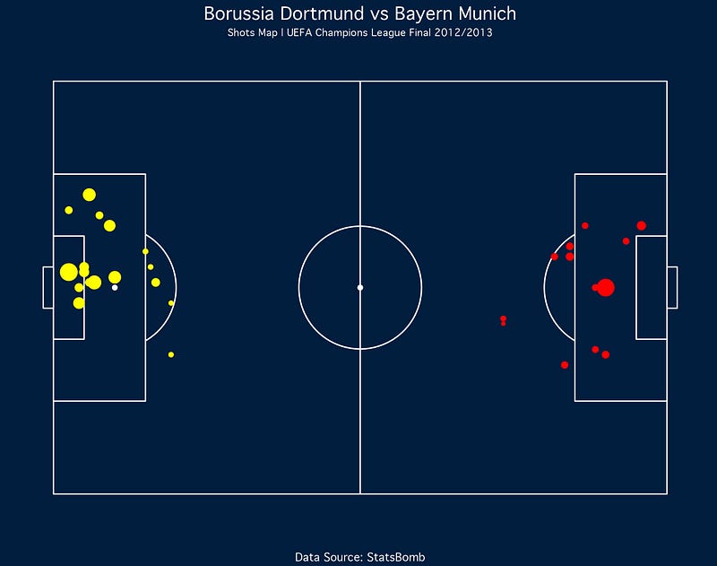
Shots map
In this section, we’ll create the shot map for both teams. But we’ll plot the shots generated by each club on different coordinates.
Therefore, we’ll create two data frames of Bayern and Dortmund’s shot data. Let’s run these lines of code:
dortmund_shot <- clean_df %>%
  filter(type.name == 'Shot') %>%
  filter(team.name == 'Borussia Dortmund') %>%
  select(player.name, location.x, location.y, shot.end_location.x, shot.end_location.y, shot.statsbomb_xg)
bayern_shot <- clean_df %>%
filter(type.name == 'Shot') %>%
filter(team.name == 'Bayern Munich') %>%
select(player.name, location.x, location.y, shot.end_location.x, shot.end_location.y, shot.statsbomb_xg)Creating the shot map is also similar to creating the pass map. We change the geom_segment function with the geom_point function. If you know, that’s the function for plotting the scatter plot.
We apply the function to each data frame. And for Dortmund’s shot data, we reflect the x coordinates by subtracting the value by 120.
Have a look at this code:
ggplot() +
  annotate_pitch(dimensions = pitch_statsbomb, colour='white', fill='#021e3f') +
  geom_point(data=dortmund_shot, aes(x=location.x, y=location.y, size=shot.statsbomb_xg), color="red") +
  geom_point(data=bayern_shot, aes(x=120-location.x, y=location.y, size=shot.statsbomb_xg), color="yellow") +
  labs(
    title="Borussia Dortmund vs Bayern Munich",
    subtitle = "Shots Map | UEFA Champions League Final 2012/2013",
    caption="Data Source: StatsBomb"
  ) +
  theme(
    plot.background = element_rect(fill='#021e3f', color='#021e3f'),
    panel.background = element_rect(fill='#021e3f', color='#021e3f'),
    axis.title.x = element_blank(),
    axis.title.y = element_blank(),
    axis.text.x = element_blank(),
    axis.text.y = element_blank(),
    panel.grid.major = element_blank(),
    panel.grid.minor = element_blank(),
    text = element_text(family="Geneva", color='white'),
    plot.title = element_text(hjust=0.5, vjust=0, size=14),
    plot.subtitle = element_text(hjust=0.5, vjust=0, size=8),
    plot.caption = element_text(hjust=0.5),
    plot.margin = margin(2, 2, 2, 2),
    legend.position = "none"
  )
Let’s see the result from the code:
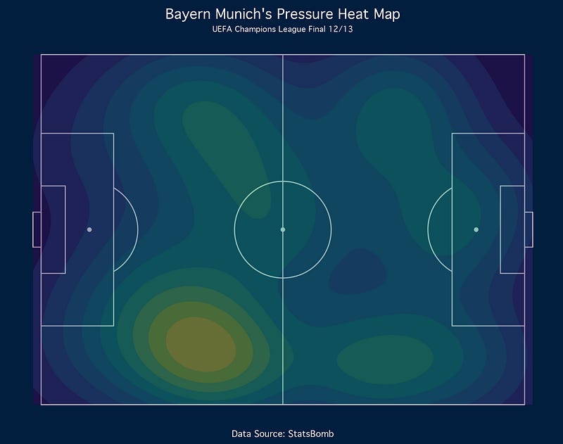
Pressures heat map
Lastly, we’ll create the pressure heat map conducted by Bayern Munich. Let’s filter the data by using these lines of code:
# Pressure Heat Map
bayern_pressure <- clean_df %>%
  filter(team.name == 'Bayern Munich') %>%
  filter(type.name == 'Pressure')
To generate the viz, it’s similar to the previous one. Please have a look at this code:
ggplot(bayern_pressure) +
  annotate_pitch(dimensions = pitch_statsbomb, fill='#021e3f', colour='#DDDDDD') +
  geom_density2d_filled(aes(location.x, location.y, fill=..level..), alpha=0.4, contour_var='ndensity') +
  scale_x_continuous(c(0, 120)) +
  scale_y_continuous(c(0, 80)) +
  labs(title="Bayern Munich's Pressure Heat Map",
       subtitle="UEFA Champions League Final 12/13",
       caption="Data Source: StatsBomb") +
  theme_minimal() +
  theme(
    plot.background = element_rect(fill='#021e3f', color='#021e3f'),
    panel.background = element_rect(fill='#021e3f', color='#021e3f'),
    plot.title = element_text(hjust=0.5, vjust=0, size=14),
    plot.subtitle = element_text(hjust=0.5, vjust=0, size=8),
    plot.caption = element_text(hjust=0.5),
    text = element_text(family="Geneva", color='white'),
    panel.grid = element_blank(),
    axis.title = element_blank(),
    axis.text = element_blank(),
    legend.position = "none"
  )
We change the geom_point function with the geom_density2d_filled to generate the heat map. Also, we add the scale function to specify the heat map range.
Here’s the result of the code:
Final Remarks
Well done! You have learned how to visualize football data using R. We have created passes, shots, and a pressure heat map.
I hope you can learn lots of stuff here. And also, please apply the knowledge to your favorite teams.
If you are interested in this article, please look at my Medium profile for more football analytics and data science-related tutorials.
Thank you for reading my article!


