
How to Visualize Data in the Most Effective Way

Ever wondered how a chart can reveal customer desires, or a map show what’s hot on social media?
I’m Richard Warepam, here to guide you through the world of data storytelling.
How do we turn numbers into clear, engaging stories? Why does a bar chart or a line graph matter so much?
Join me as we dive into the art of data visualization. I’ll show you how to choose the right chart, use colors and scales effectively, and make your data not just informative, but truly captivating.
Ready to unlock the stories hidden in your data?
Understanding Your Data: The First Step to Visualization
The journey to effective visualization begins with a deep understanding of your data.
Ask yourself: What story does my data tell? Is it categorical, showing qualitative differences, or numerical, revealing quantitative measures?
The nature of your data dictates your visualization strategy.
Choosing the Right Visualization
1. Bar Charts: Simplifying Comparisons
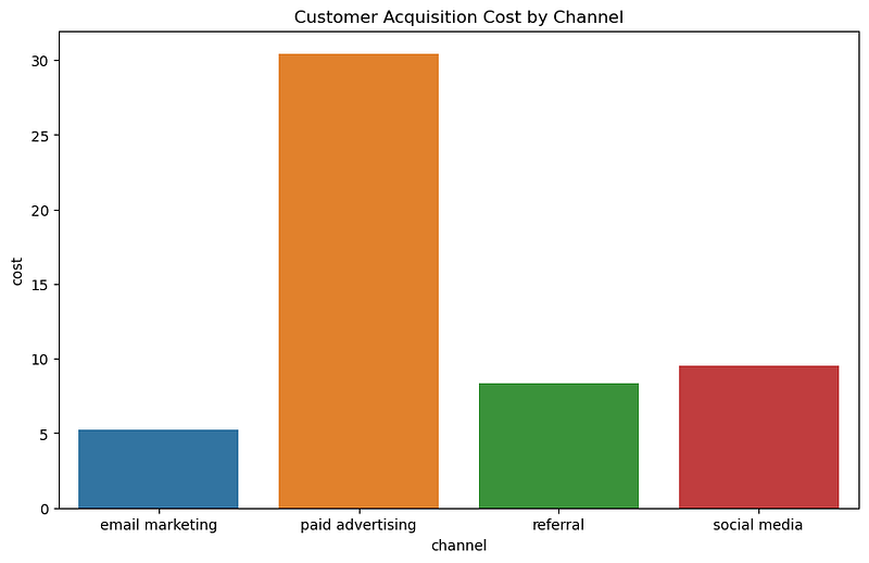
- Use when: Comparing categories or groups is your primary goal. Bar charts are ideal when you have discrete data and need to show clear differences between categories.
- Specific Scenarios: 1. Comparing sales figures across different products or regions. 2. Showing survey results, like customer satisfaction levels across various services. 3. Visualizing demographic data, such as population distribution across different age groups.
Example: In a recent project analyzing retail sales, I used bar charts to compare monthly sales across different store locations. This simple yet effective visualization immediately highlighted the top-performing stores, guiding the client’s resource allocation decisions.
2. Line Graphs: Tracking Trends
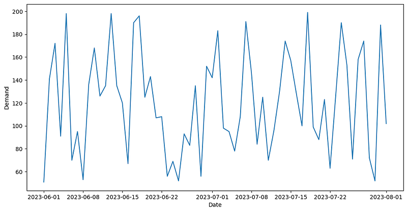
- Use when: Your main focus is to display data trends over time. Line graphs are perfect for continuous data and for showing how a variable changes at equal intervals.
- Specific Scenarios: 1. Monitoring stock market trends over months or years. 2. Tracking the progression of key metrics like website traffic or sales over time. 3. Observing changes in temperature or other environmental data across different seasons.
Example: While examining website traffic data, I employed line graphs to depict the growth in monthly user visits. This visualization made it easy to spot peak periods and analyze the effectiveness of marketing campaigns.
3. Pie Charts: Showcasing Proportions
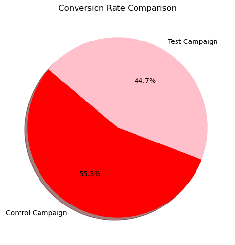
- Use when: You need to illustrate how parts make up a whole. Pie charts are best when you want to show percentage or proportional data and the total of your segments equals 100%.
- Specific Scenarios: 1. Displaying market share of different companies within an industry. 2. Showing the breakdown of expenses in a budget. 3. Illustrating the composition of a population by categories like language or nationality.
Example: In a project on market analysis, I used pie charts to display the market share of various competitors. This helped in quickly grasping the competitive landscape.
4. Scatter Plots: Uncovering Relationships
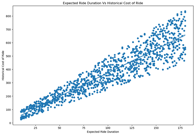
- Use when: Your objective is to explore relationships or correlations between two variables. Scatter plots are excellent for visualizing patterns, concentrations, and outliers.
- Specific Scenarios: 1. Investigating the relationship between advertising spend and sales revenue. 2. Studying correlations between variables like age and cholesterol levels in medical research. 3. Analyzing the relationship between hours of study and exam scores.
Example: To explore the relationship between advertising spend and sales, I utilized scatter plots. This revealed a strong positive correlation, a crucial insight for budget planning.
5. Heat Maps: Visual Complexity Made Simple

- Use when: You are dealing with complex data sets, especially geographical data or data matrices, and want to show variations in density or intensity.
- Specific Scenarios: 1. Visualizing geographic data, like population density or weather patterns across different regions. 2. Displaying website traffic or user activity heat maps to identify most visited areas on a webpage. 3. Analyzing data matrices in scientific research, like gene expression levels in different samples.
Example: Analyzing social media engagement across different regions, I used heat maps to show areas with the highest engagement levels, guiding targeted marketing strategies.
6. Histograms: Understanding Distributions
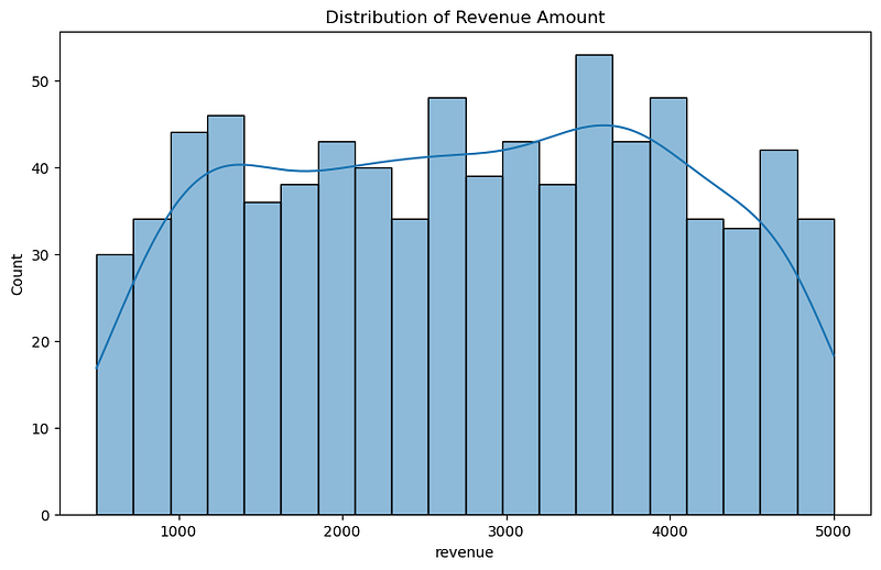
- Use when: You need to understand the distribution of your data, particularly to see the frequency of data points within certain ranges.
- Specific Scenarios: 1. Analyzing the distribution of customer ages or incomes in market research. 2. Measuring the frequency of a particular measurement in quality control processes. 3. Understanding the distribution of exam scores to identify common performance trends.
Example: To understand customer age distribution for a retail client, histograms were used. This helped in tailoring marketing strategies to the most prevalent age groups.
Tips for Effective Data Visualization
Keep It Simple
In one of my early projects, I created a complex chart with multiple variables to showcase a business’ sales data. However, during the presentation, I noticed my manager struggling to grasp the key message.
This experience taught me the importance of simplicity.
In subsequent projects, I focused on using straightforward bar or line graphs, which significantly improved comprehension and engagement.
“The lesson here is that simplicity in design often leads to better understanding and retention of information.”
Right Scale Matters
I recall working on a project where the client wanted to highlight a slight year-over-year growth in their annual report.
Initially, I used a scale that minimized the growth.
After adjusting the scale to zoom in on the year-over-year change, the growth became more apparent, pleasing the client.
This experience underscored the importance of choosing a scale that accurately reflects the data’s story.
“The right scale can either reveal or obscure critical insights in your data.”
Strategic Use of Color
In a project analyzing social media sentiment, I used a color scheme that varied from cool to warm tones to represent sentiment from negative to positive.
This not only made the visualization aesthetically pleasing but also intuitively understandable.
The strategic use of color can significantly enhance the readability and effectiveness of your data visualization.
“It’s crucial to use colors that align with the data’s context and help in distinguishing data points clearly.”
The Power of Annotation
During a presentation of market research data, I used annotations to highlight key trends and outliers in the data.
This approach helped everyone to quickly focus on the most critical aspects of the data.
“Annotations, such as labels, arrows, or brief notes, can act as a guide, leading the audience to the most important parts of your visualization. “
They are particularly useful in complex charts where the key takeaways might not be immediately obvious.
Storytelling with Data
One of my most successful projects involved using a line graph to narrate the story of a startup’s growth.
By plotting their milestones along the timeline, the graph told a compelling story of their journey.
This approach resonated well with the audience, as it transformed abstract numbers into a narrative.
“Every visualization should aim to tell a story. “
Whether it’s the journey of a company, the trend of a market, or the pattern of user behavior, effective storytelling with data can turn a simple chart into a memorable narrative.
Conclusion: Your Path to Effective Visualization
Effective data visualization is a blend of art and science.
It’s about clarity, simplicity, and storytelling.
As you embark on your journey, remember these principles and the examples from my projects. Experiment with different types of visualizations and see what works best for your data.
The goal is not just to present data, but to make it speak, to tell its story in the most engaging and insightful way possible.
In your hands, data can become a compelling narrative, a tool for decision-making, and a canvas for innovation. Happy visualizing!
If you enjoy my writings, Support Me:
⭐️ My Gumroad Shop: https://codewarepam.gumroad.com/
Join my newsletter to get regular free eBooks, AI trends, and Data Science Case Studies. Subscribe now! — https://ai-codehub.beehiiv.com/
Best-selling eBook:
Top 50+ ChatGPT Personas for Custom Instructions


