How to Visualise Causal Inference Models with Intuitive Conditional Probability Tables
How to generate intuitive and comprehensive Conditional Probability Tables to visualise and understand causal inference models in 1 line of Python code

Background
Causal Inference is a hot topic at the moment but the various libraries that exist can be complicated with inconsistent documentation and examples and most of the available articles and posts focus on a particular aspect of causal inference without covering all the things a data scientist needs to know.
This led to me writing a series of articles with this latest one diving into “Conditional Probability Tables” and how to generate them easily in a format that is intuitive and meaningful.
What You Will Learn
By the end of this article you will be able to generate visually rich conditional probability tables in just one line of Python and you will have full access to the source code and documentation!
Before we dive into the CPT visualisations please consider …
Joining Medium with my referral link (I will receive a proportion of the fees if you sign up using this link).
Subscribing to a free e-mail whenever I publish a new story.
Taking a quick look at my previous articles.
Downloading my free strategic data-driven decision making framework.
Visiting my data science website — The Data Blog.
… and if you are interested in causal inference here are the other articles in this series -
A Quick Refresher on Causal Inference Models
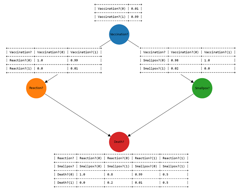
A causal inference model consists of two key components -
- A “Directed Acyclic Graph” (DAG) that describes what causes what, sometimes referred to as a causal inference diagram.
- A set of “Conditional Probability Tables” (CPTs) that describe the probabilities of moving from one node to another.
Here is an example that shows how both components work together to in a causal inference model (the number in the cells are probabilities).
My previous article (https://towardsdatascience.com/how-to-visualise-causal-inference-models-with-interactive-directed-acyclic-graphs-8dd648a64915) dealt with visualising the DAG, the rest of this article will show how to produce the CPTs in a visually rich and intuitive way.
Getting Started
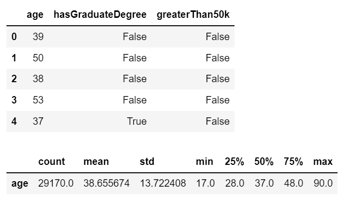
Let’s get started by choosing some data to model.
The data I have selected relates to the impact of having a graduate degree on salary and has been obtained from the UCI Machine Learning Repository (https://archive.ics.uci.edu/ml/datasets/census+income) which is free to use with an acknowledgement (see References section).
Building a Causal Model
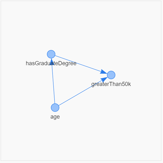
I have chosen to build a causal model using the pgmpy library (https://pgmpy.org/) as follows ...
It is very useful to visualise the causal relationships and the structure. To get the full details and the source code for dag_tools.py please head over to my article on "How to Visualise Causal Inference Models with Interactive Directed Acyclic Graphs".
The final step in building the model is to fit the data as follows -
Conditional Probability Tables
It is very easy to use the native functionality in the pgmpy library to take a quick look at the CPTs ...
+---------+-------------+
| age(17) | 0.0128214   |
+---------+-------------+
| age(18) | 0.0179637   |
+---------+-------------+
| age(19) | 0.0225917   |
+---------+-------------+
| age(20) | 0.0236202   |
+---------+-------------+
| age(21) | 0.0223174   |
+---------+-------------+
| age(22) | 0.0234145   |
+---------+-------------+
| age(23) | 0.0264313   |
+---------+-------------+
...
+---------+-------------+
| age(88) | 0.000102845 |
+---------+-------------+
| age(90) | 0.00126843  |
+---------+-------------+
+--------------------------+-----+---------+---------------------+
| age                      | ... | age(88) | age(90)             |
+--------------------------+-----+---------+---------------------+
| hasGraduateDegree(False) | ... | 1.0     | 0.8918918918918919  |
+--------------------------+-----+---------+---------------------+
| hasGraduateDegree(True)  | ... | 0.0     | 0.10810810810810811 |
+--------------------------+-----+---------+---------------------+
+-----------------------+-----+-------------------------+
| age                   | ... | age(90)                 |
+-----------------------+-----+-------------------------+
| hasGraduateDegree     | ... | hasGraduateDegree(True) |
+-----------------------+-----+-------------------------+
| greaterThan50k(False) | ... | 0.25                    |
+-----------------------+-----+-------------------------+
| greaterThan50k(True)  | ... | 0.75                    |
+-----------------------+-----+-------------------------+
… but the output is very unsatisfactory!
- The CPT representing the probabilities for
ageis spread out vertically (because age has many stages, one for each age between 17 and 90) - The CPT for the probabilities of
hasGraduateDegreeis even worse. Because this table is spread out horizontallypgmpyhas truncated all of the columns for ages 17 - 87 and just left ages 88 and 90 in the display. This might have fitted the table in the cell but the resulting truncation makes it impossible to understand what is going on. - The CPT for
greaterThan50khas the same problems ashasGraduateDegree. - The last problem with the
pgmpyoutput for CPTs is that they are "upside-down". If you are a reader of Judea Pearl who has published many seminal works on causality (including “The Book of Why”) you will have read examples where Pearl expresses his CPTs with the "Probability" expressed across the columns and the "Given" conditions expressed down the rows ...
A Much Better Solution …
All of these issues make it very difficult to visualise what is going on in a causal model and that leads to a lack of understanding which in turn leads to an inability to use these models to solve real-world problems for customers.
So the un-intuitive output of pgmpy led me to develop my own cpt_tools library to resolve all the issues (a link to the full source code is provided below).
Let’s take a look at the output generated using cpt_tools ...
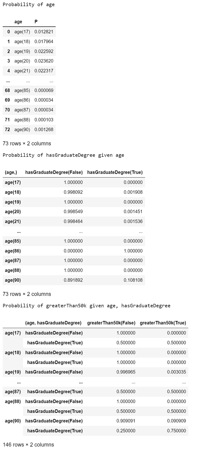
This is looking much nicer in just 1 line of Python code from the cpt_tools library!
The tables are returned as pandas DataFrames and the truncation has taken place against the Y-axis (rows) to give the best compromise between readability and space-utilisation.
If you would like to see the whole CPT without the horizontal truncation, simply change the pandas display.max_rows parameter and then use cpt_tools.display_cpt as follows -
Source Code
The full source code can be found here -
https://gist.github.com/grahamharrison68/1187c53d078c3c899b534852fe8edf9c
… the documentation can be found here -
If you do decide to download and use the cpt_tools or dag_tools code it would be really nice if you would consider buying me a coffee -


Lastly, if you want all of the code and data in one place from this notebook please head over to this link …
https://github.com/grahamharrison68/Public-Github/tree/master/Causal%20Inference
Conclusion
Causal inference is a great tool to have in your data science toolkit but to use causal inference to solve a business problem you need to be able to visualise the directed acyclic graphs and the conditional probability tables.
The pgmpy library is comprehensive and easy to use but the functionality for visualising the models can benefit from being extended and improved.
This article has shown how to visualise the Conditional Probability Tables in a way that is visually powerful, intuitive and easy to understand in just one line of Python code.
If you enjoyed this article please consider …
Joining Medium with my referral link (I will receive a proportion of the fees if you sign up using this link).
Subscribing to a free e-mail whenever I publish a new story.
Taking a quick look at my previous articles.
Downloading my free strategic data-driven decision making framework.
Visiting my data science website — The Data Blog.

References
Dua, D. and Graff, C. (2019). UCI Machine Learning Repository [http://archive.ics.uci.edu/ml]. Irvine, CA: University of California, School of Information and Computer Science.


