
How to Use Images like a Badass.
A Photographer’s Instruction on Using Images, Photos, and Graphics with Your Written Work like a Pro
Introduction
Hello there everyone! Allow me to introduce myself: I’m Johnny Silvercloud, the Vicious Abolitionist. The Downtown Defenestrator. The Analytical Ocular, Badass Photographer.
I’ll stop — just wanted to make a few smiles happen.
I’ve been doing photography since 2014, but probably been doing it in my head since I left high school; I just didn’t have the tools to document how I view things around me. I’ve been building my sense of artistic vision ever since. Everyone has sight; view have vision.
I’ve been writing online since 2012. The subjects I touch on might be similar to yours. Or not. Racism, sexism, you can check that out later. Right now, what I want to focus on is image selection for articles you’re writing. One more thing to note is the fact that I was a U.S. Army Instructor for the last five years of my career, so my style of instruction and tone might be radically honest in its attempt to cover every single way you can do it wrong, and I might be brutal with my tough-love language — tolerate me for a moment of your time. Trust me when I tell you that I have your best interests at heart at the end of this lecture. While I’m speaking for Medium writers, the same logic applies anywhere else, so feel free to use and share this anywhere.
Vocabulary
I will use article and column — the overall thing you’re writing — interchangeably. I will not call our work “blogs.”
An image is a visual representation of something. It’s any visual representation you would use. I won’t use the word picture, however. People tend to conflate all pictures into photos, and I want to spare the confusion.
Speaking of photos, expect this word to be present. A photo or photograph is a still-shot image taken from a camera. Still-shot and photo-stills are the terms used for a single-frame collection from a camera. Think of this term as “not video.” The still-shot photo doesn’t move. A shot is photographer-talk for photos.
A video still is a photo of something that’s off of a rolling video. You might have heard of “production stills,” which are still-shots from the movie producers and studios. If you saw a picture taken from a movie, which is most memes, you dealt with a video still. You might see the term modified as cinema still or movie still. If you opt for an animated short video of a graphic, it’s a gif (I don’t care how you pronounce it).
A graphic, in the spirit of this lecture, is an image someone created. These are not like photos, even though one can modify a photo enough to become a graphic. A graphic can be anything coming from graphic design. A drawing is the cornerstone of a graphic in this case. One can use various programs or applications to draw something.
All of these are images.
Images? Photos? Graphics? Why use them?
The first thing you might ask is, why add an image to your work in the first place? Well, an image essentially adds a “face” to your article. People interact with things online by what they see first. Having at least one image will give your article a thumbnail. A thumbnail is a very small or concise description, representation, or summary of your article. Unless you specify under more settings, your thumbnail will be your first image.
“A picture is worth a thousand words.” ~ Unknown
If a picture is worth a thousand words, then the first image you use is significant as an attempt to represent your article which you probably worked very hard on. Perhaps it’s helpful to act like your selected image operates as your lawyer in the court of public opinion. Your selected image represents you and your work, so it’s best to choose intelligently.
Keep in mind that you are always communicating with people. You are communicating with people before they even get to read your work. If you use a bad image, you stand a chance to misrepresent what your work means or distract people from understanding you and your point.
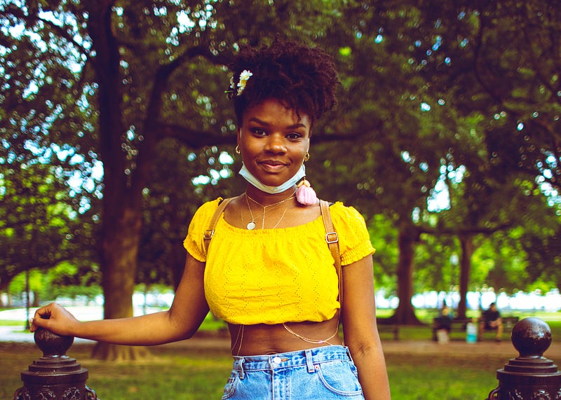
Lesson #1: Horizontal (Landscape) Orientation as Thumbnail Images
First Lesson: [1] NEVER use vertically-oriented (portrait) images as the first image of your column. I genuinely do not understand why people don’t think about this, so this is lesson one. Always use horizontally-oriented (landscape) images as your first one.
When I say landscape, I don’t mean outdoor shots of the Grand Canyon or a bunch of trees or a city skyline (even though those might be awesome depending on your topic). In imagery-talk, “landscape” means horizontally-oriented, as is, the image is longer left and right than it is up and down.
The vertically-oriented images are the ones that are longer up and down than they are left and right. They seem tall as images. These are also called portrait orientation, so when editors like myself say portrait or landscape, we aren’t talking about actual landscapes and actual portraits. A “portrait” of a person can be of landscape orientation, and that’s simply the superior image type to use as your first.
There’s a couple of reasons why you should use a landscape-oriented image as your first image of an article. The first reason is that you want people to read your work as soon as possible, and scrolling down longer, with multiple swipes on an interface, is simply a dumb thing to make people do. You’re best served using a horizontally-oriented image as your first, top image. People get to your work quicker. The second reason involves human nature; folks’ eyes are oriented horizontally. Human eye-sight is optimized for horizontal observation. This is the same reason why all movie theatres show movies horizontally-oriented. The majority of television or monitor screens are engineered to this orientation. Something to think about.
Another thing about using vertically-oriented images on Medium: Understand that it’s possible to task Medium to shift images to the side.
The image will always be on your left side, with no option to shift the image on the right. If you use a vertically-oriented image, it’s best to do this because, as a vertically-oriented image, the image is very tall and may prove as a distraction to your written work because a person still has to stroll down a lot.
If you are compelled to use a vertically-oriented image as your thumbnail/first, it’s best to shift the image to the left (newspapers do this if you notice it) so people can get to reading your work and not scrolling down forever. In addition to that note, you can also crop the image so it is longer horizontally than it is vertically. If you are getting your images for free from hosts like Unsplash (which 98% of Medium writers do) you can crop the image. The photographer you will credit shouldn’t be mad you cropped their photo being that they themselves left their photo to be used for free.
Lesson #2: Resolution of your First Image Matters
[2] The second lesson — do not use images that are too small. Images that are too small have horrible resolution. If you don’t know what resolution is, think of it as how clear your image is. Low-resolution images are blurry, and when you use blurry, unclear images, you essentially add a distraction to your work. Distractions are the worst thing to add to your articles.
Resolution of imagery online is typically measured in pixels. A pixel is the smallest addressable element in digital imagery; zoom in hard enough you’ll see them as colored squares. The more pixels an image has in it, the clearer it appears. The lesser, the more blurry. Also, take note that resolution tends to govern the size of an image, and the size of an image dictates resolution. So in layman’s terms, a small image is a low-resolution one, and a large image is a high-resolution one.
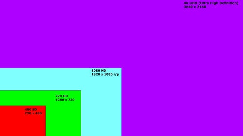
Pixel-count is measured on an x- and y-axis (height and width of an image), with the width being the first and largest number. Let’s take a look at those.
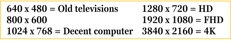
You probably won’t need a 4K resolution image all the time. As a matter of fact, Medium will not let you use an image that’s too large. If you hang around images that are between a decent computer screen and high definition (a.k.a., HD or high-def), your images will be just fine. Full high definition (FHD) is what I aim for. Images that are 4K (also known as Ultra High Definition or UHD) might be too large as a file size for Medium, so if you have a 4K image it’s best to use a program/application that resizes/resamples images. IrfanView is freeware that serves this purpose.
Another thing to note is the fact that a blurry image might not be due to having a low resolution. Blurry images may also come from motion blur of a photograph. Motion blur in photography happens when the shutter-speed is slower than whats moving in the frame, or if someone’s hand is shifting and shaking the camera as a whole. Whether the blur is from the image collection or the file size, you don’t want it in your image.
When you use a blurry, small image (especially as your thumbnail) it communicates that you’re not even trying regardless of the effort you may have put into your written work.
Lesson #3: Use the Image Description text
[3] Always use the image description text to add context with your image. Definitely do this with photographs. If you do not add image description, your work will come off appearing unprofessional, looking amateur, and may contribute to confusion in your article. We do not want that.
Always credit the actual photographer or graphic designer. Hyperlink their name to their work. If you cannot find the actual photographer, this web app called TinEye is outstanding in finding the originator of a photograph. Adding the dates to when a photograph is shot adds a lot of character to your selection, especially when your photograph is 30+ years in the past, possibly tying your work down to specific moments in world history. I use a military form of date writing (day month year), but the traditional English/American form can be used as well (month day year), as long as the messaging is clear. I suggest writing in the month with letters, not numbers, to eradicate any confusion.
Lesson #4: Show, Don’t Tell
[4] Lesson Four: Let the Image do the talking.
When I say “let the image do the talking,” I mean keep the image itself clean of text.
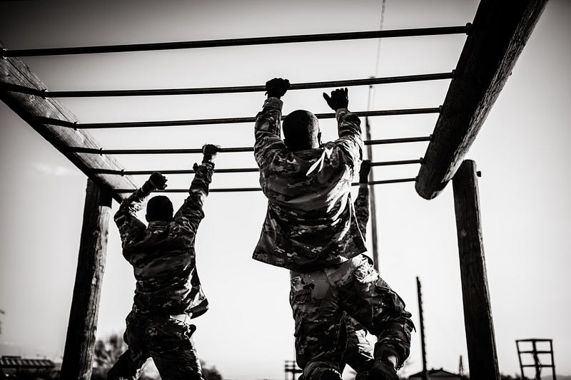
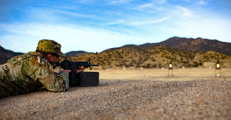
Say for the sake of argument, I was writing an article called “How to Shoot Weapons Like a Pro.” What would be better as a face-image for this concept article? An image of a Soldier or seasoned professional shooting a rifle? Or a graphic that has text saying “Shooting Like a Pro?”
Don’t argue; the image of the Soldier shooting is better. It’s in fact, superior to text telling you the title. Show, don’t tell.
Show, Don’t Tell.
Imagine watching a James Bond, Jason Bourne, or Bruce Lee movie with the movie opting to explain how good the character is at fighting versus actually showing the audience how cool those close-quarters combat fighting styles are. Show, don’t tell. Movies that rely on heavy narration concerning dynamic character moments typically suck or make the character suffer. Narrating the subject, or worse, repeating the title of your article in the graphic, is the worst thing you can do.
On Medium when your article is shown on publications, the publication system will add title text on the thumbnail anyway. Adding text to your graphics will clutter the look of the article.
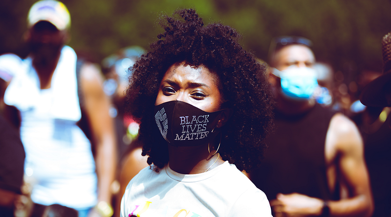
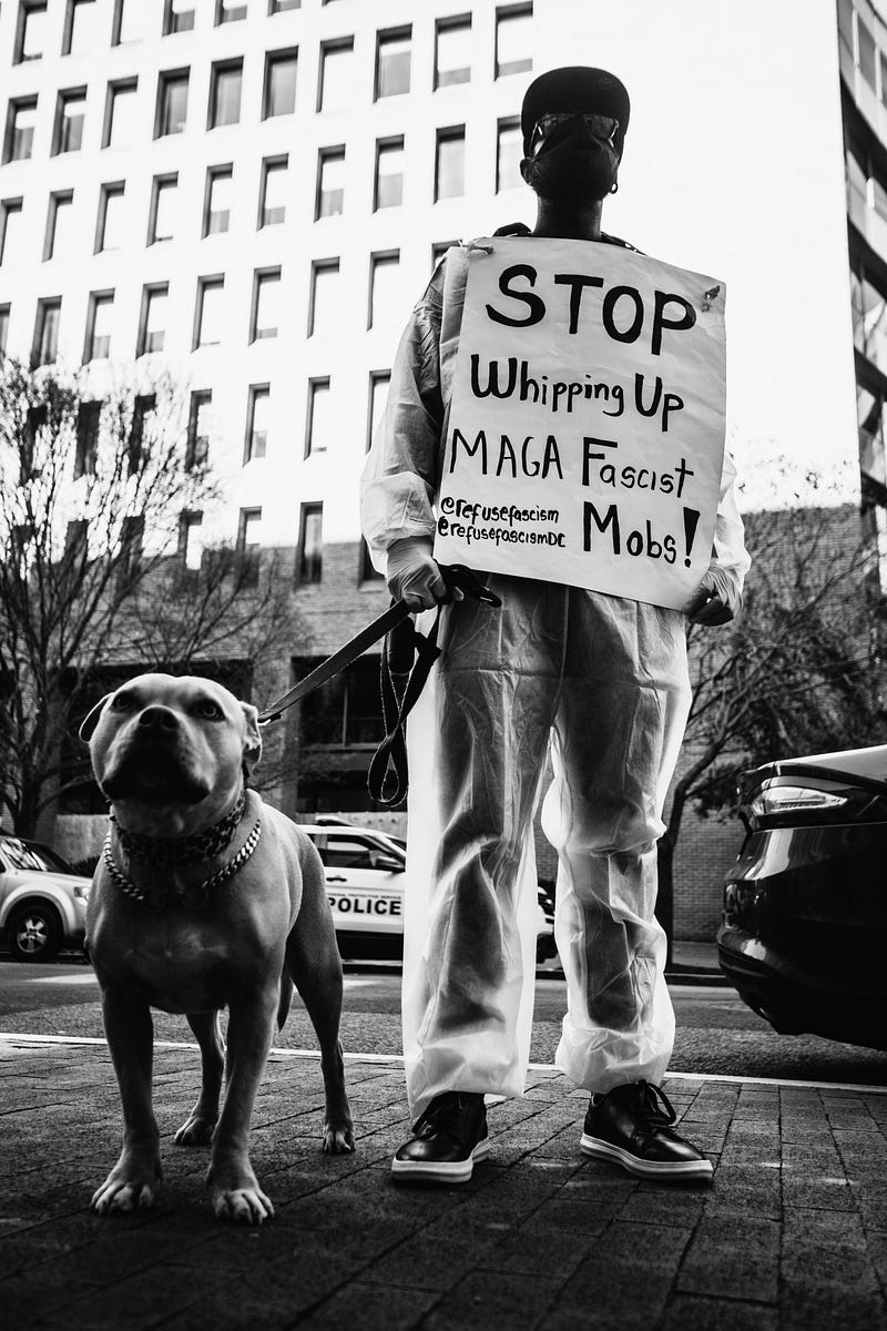
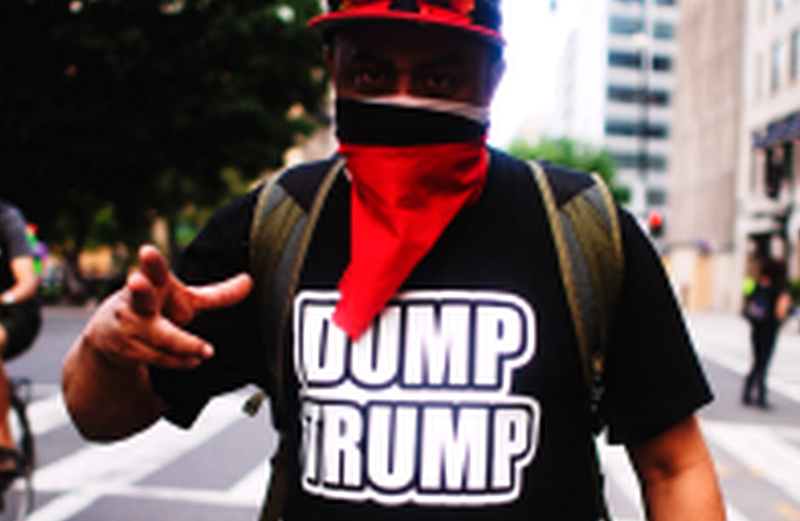
Keep in mind that photographs of people holding signs, or environmental photos with “words and text” somewhere in the environment don’t suffer from this issue. The difference is that the person, people, or environment is the subject, and when you add text to the image, the text becomes the subject. For example, look at this:
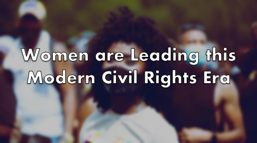
If the article title is “Black Women are Leading this Modern Civil Rights Era,” which image is better for that concept article? The one with the face of the Black woman clear with the Black Lives Matter mask, or the one that has her in it with the text in the forefront? Even if we kept her photo clear, the text is a distraction, and on top of Medium’s publication system, the text will be a bigger distraction. Show, don’t tell.
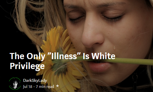
An example of this issue was when Juneteenth became a Federal Holiday in America in the year 2021. Everyone and their mother on Medium used a graphic that simply had a few Afrocentric colors and said “Juneteenth” on the graphic. Wouldn’t it be a better idea to show American Black people (past or present) versus a graphic of mere word-art saying “Juneteenth”? If a picture is worth a thousand words, using words as your picture diminishes those thousand words to the few words you’ve chosen in your word-art. Do NOT rely on word-art for graphics, especially your main thumbnail. Show; don’t tell.
Lesson #5: Never Use Watermarked Content
Um, uhh… I shouldn’t have to say this, but if an instructor calls it out, that means someone did it before. Um, NEVER use images with watermarks. Ever. And even after that.
Nothing screams I don’t care more than using an image with a watermark. A watermark is a thing on images where it came from, who is the owner or distributor, and typically exists to deter (or show) intellectual content thieves. I cannot say this with stronger emphasis — don’t use watermarked images. All this does is shoves a middle finger to any editor or reader of your work, and people are going to give you a middle finger right back.
Conclusion
So there it is.
1. Do use horizontally-oriented images as thumbnail
2. Do use a decent high-resolution image
3. Do use image description text (context/credit)
4. Don’t rely on word-art (show, don’t tell)
5. Never use watermarked images
With these five basic guidelines, you will begin using images like a pro. So go out there and slay the internet, writers.
Johnny Silvercloud is a U.S. Army vet turned civil rights/conflict photographer and anti-racism/sexism writer. Not a fan of intentional stupidity or passive-aggressive racism supporters, which tends to overlap. You can subscribe to Johnny here, and get his street photography, here. Twitter, here. Instagram, here. Facebook fan page, here. His publication of like-minded educational activists, here.