
How to style your Dataframe with Python
How to highlight, format or colour your data frame with Python

I love Excel conditional formatting, it is a simple and elegant way to highlight the key takeaways in your table. Can we do the same in the pandas data frame? Absolutely!
In this article, we are going to learn how to format the data frame in:
- Colour the numbers based on conditions
- Highlight Min/Max/Null
- Bar Chart in a data frame
- Heatmap
Getting Started
Let’s import the required library and create a dataframe with random numbers and NaNs (Not a Number).
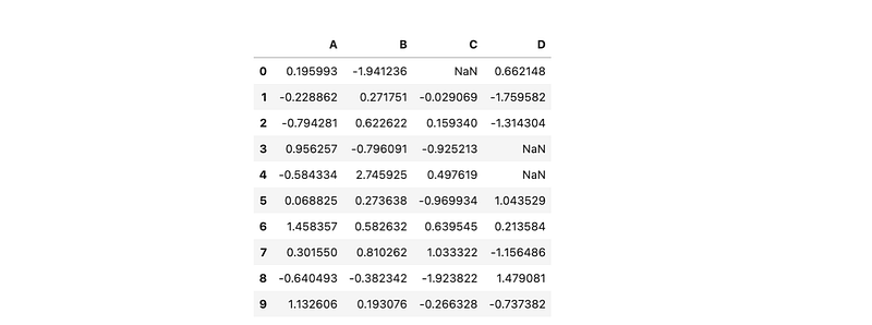
We are going to use this dataframe to apply the format and style.
Colour the numbers based on the condition
We are going to colour the number based on the condition. For instance, we want red colour on negative values, green colour on position values and blue colour on NaN.
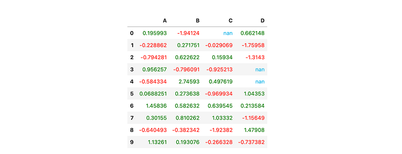
First, we have to define a apply_colour function to return the colours we want. Then we use apply_map to apply the colour to the dataframe’s style.
For
Styler.applymapyour function should take a scalar and return a single string with the CSS attribute-value pair.
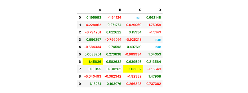
Highlight Min/Max/Null
There is a build in function ready to highlight the min/max/Null of the data in the series.
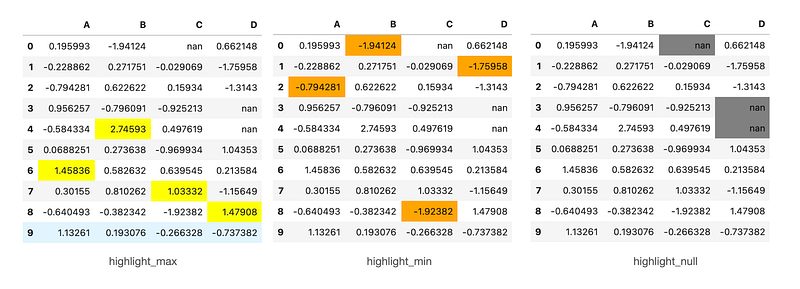
It is pretty straightforward to apply the build in function, we just have to pass in the colour parameter to the function, and it will highlight the min/max/null in each series.
Apply to the subset
We can use the subset parameter if we only want to highlight a certain column or certain rows.
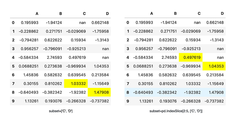
For example, we can pass subset=['C','D'] to the highlight_max so it will only highlight column C and D.
We could also define the range of the rows in the subset too. We can use subset = pd.IndexSlice[2:5, ['C','D']] to slice row 2 to row 5 in column C and D.
For row and column slicing, any valid indexer to
.locwill work.
Apply Together
We could also apply the highlight_max and applymap(apply_colour) together to the dataframe.
Ta Dang! Now you have both highlight_max and applycolour style on your dataframe!
Bar Chart in the dataframe
I am a big fan of data bar conditional format in Excel, and yes we could do that in the dataframe too!
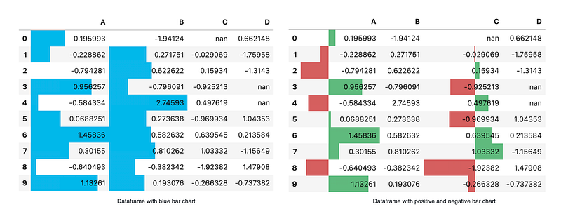
style.bar is used to create bar chart in the dataframe. Same as highligh_max, we can pass in the subset or color parameter to it.
In the latest version, we are able to further customise the bar chart. Now we can use align = 'mid’ to center the bar on the midpoint. Also, we can pass a list[color_negative, color_positive] to the colour parameter.
Heatmap
We can create a heatmap on a dataframe too!
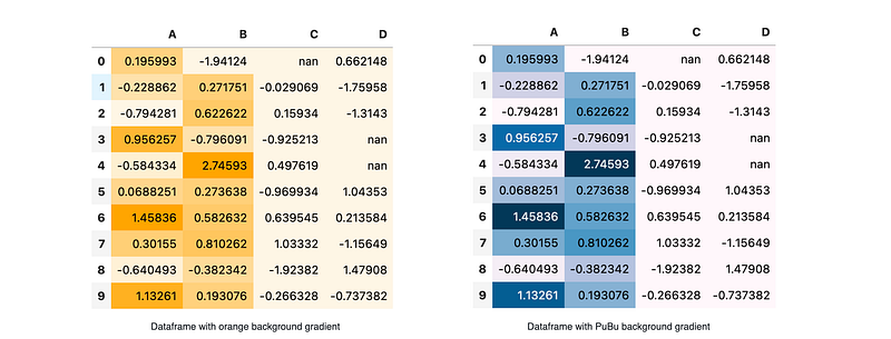
We can use seaborn to get a nice colourmap!
Else it accepts any colourmap from Matplotlib, you may check this out in this colourmap reference! Same as the previous function, the background_gradient accept subset as a parameter too.
Now you have learnt how to style your dataframe with Python. I hope this article is useful to you. You can view the complete Jupyter notebook in my Github. Cheers!
PS: The style doesn't render properly in Github directly, you may want to try it on your local machine.
If you enjoyed reading this piece, you might also enjoy these:
You can find links to my other works on Medium and follow me here. Thanks for reading!


